
Communicating your carbon saving
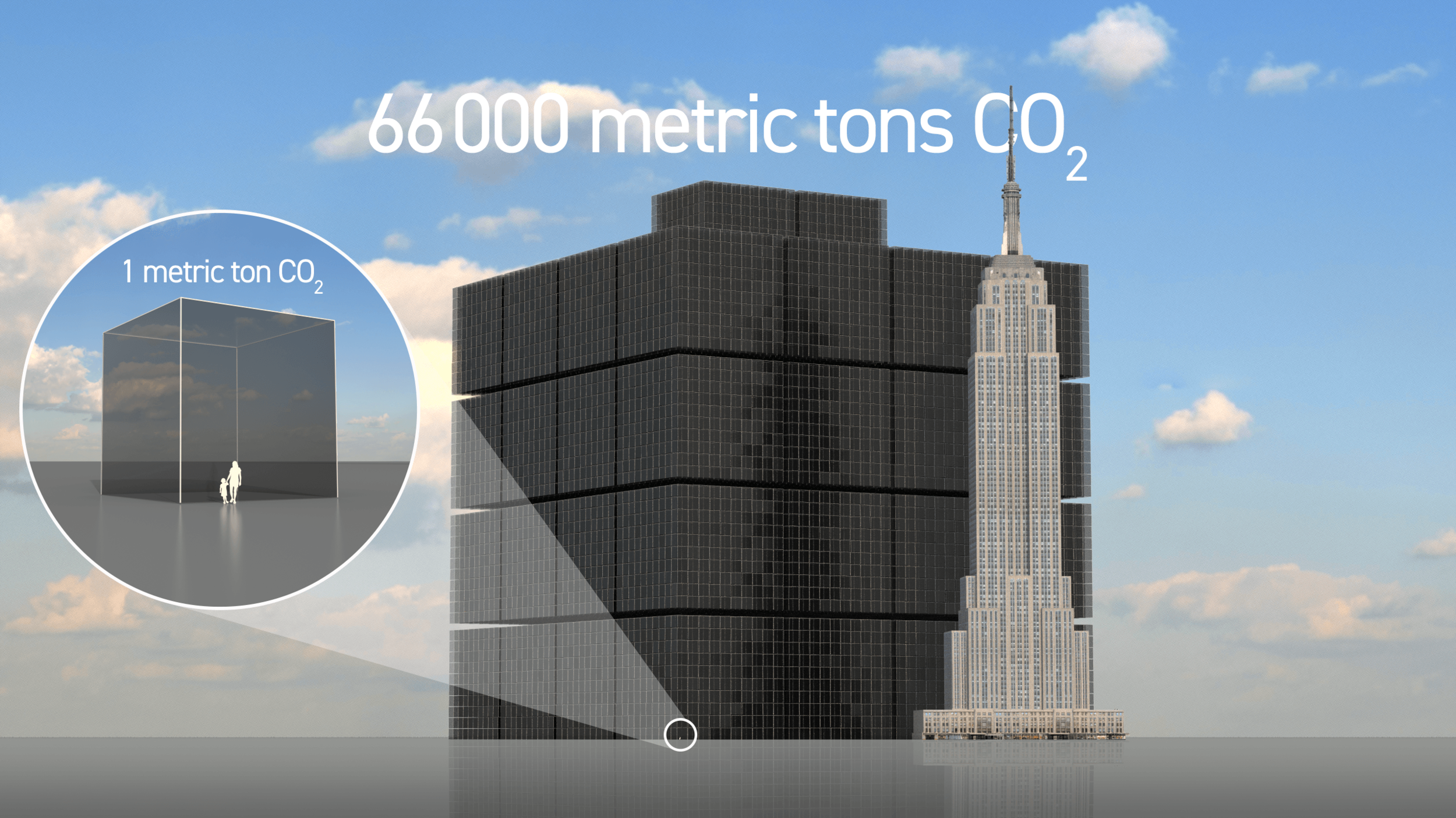
What does 66,000 metric tons of CO2 look like? That was the question asked by Belgian company MAZARO who wanted to show the annual carbon savings associated with fitting their innovative transmission technology to a client’s 350 large cooling fans.
How do you communicate the carbon reduction benefit of an innovative new industrial product?

This was the challenge faced by Belgian company MAZARO who have developed an innovative transmission technology that makes conventional and electric transport systems, as well as industrial drivelines, up to 20% more efficient and less polluting.
Having just finished road tests proving that their technology extends the driving range of an electric truck by 16.8% they were asked by a multinational client what the effect of the transmission would be on the large cooling fans they sell. The answer was an efficiency gain of 83% which for their 350 large cooling fans would amount to a yearly saving of 66,000 metric tons of CO2.
The image shows this volume next to the Empire State building in New York. It has been used to grab attention in sales presentations and will be displayed on the company’s new website in coming weeks.
If you have an impressive carbon savings amount that you want to communicate to investors, clients or other stakeholders please get in touch.

Fossil fuel contribution to the climate crisis
State-owned and multinational businesses have continued to expand their fossil fuel extraction operations since 1965 despite being aware of the industry’s devastating impact on the planet. In this 20 second film we show what 480bn tonnes of carbon dioxide equivalent (GtCO₂e) looks like.
The Guardian today revealed the 20 fossil fuel companies whose exploitation of the world’s oil, gas and coal reserves can be directly linked to more than one-third of all greenhouse gas emissions in the modern era.
The science community has known of the dangers posed by continuing to burn fossil fuels for over fifty years, as evidenced by a report authored by the Environmental Pollution Panel of the US President’s Science Advisory Committee, which set out the likely impact of continued fossil fuel production on global heating.
We have created a short video to help people understand the scale of this, and an animated chart that shows the history of emissions since 1965.
Cumulative emissions 1965-2017 (MtCO₂e)
New data from Richard Heede at the Climate Accountability Institute in the USA reveals how state-owned and multinational businesses have continued to expand their fossil fuel extraction operations since 1965 despite being aware of the industry’s devastating impact on the planet.
The analysis shows that the top 20 companies on the list have contributed to 35% of all energy-related carbon dioxide and methane worldwide, totalling 480bn tonnes of carbon dioxide equivalent (GtCO₂e) since 1965.
“One of the most important predictions of the [president’s report] is that carbon dioxide is being added to the Earth’s atmosphere by the burning of coal, oil and natural gas at such a rate by the year 2000 the heat balance will be so modified as possibly to cause marked changes in climate beyond local or even national efforts.”
“These companies and their products are substantially responsible for the climate emergency, have collectively delayed national and global action for decades, and can no longer hide behind the smokescreen that consumers are the responsible parties.”

High resolution image with Creative Commons license here: https://flic.kr/p/2huYMqz
See Guardian article here
What's in a phone?
Mobile phones have become a huge part of our daily lives, but what are they made of? We made an animation showing the different elements including rare earth minerals for one phone, and also in all the phones made in a year (that’s 1,475 million smartphones)

Materials in a mobile phone with pennies for scale
Mobile phones have become a huge part of our daily lives, but what are they made of? And could the materials they are made of be visualised? This was the challenge set for us by an initiative organised by the Sustainable Earth Institute at the University of Plymouth - to enable researchers to communicate with wider audiences by partnering with creative organisations.
The video shows Dr Arjan Dijkstra from The University of Plymouth putting an iPhone into a blender (DON’T TRY THIS AT HOME) and analysing the contents. The second half features our animation showing the different elements he found including rare earth minerals.
Geologists Dr Arjan Dijkstra and Dr Colin Wilkins from the University’s School of Geography, Earth and Environmental Sciences were investigating how we are using earth’s resources, especially the metals known as and rare earth elements in our most often-used technology. They wanted an animation that could be educational for the general public on the future of sustainable systems, as well as useful for students and researchers. The answer was an exploding phone whose contents re-arranged to show quantities of materials to scale. Audiences are able to ‘see’ the quantities of these materials in one phone, and in all the phones made in a year (that’s 1,475 million smartphones)
The first step for Dijkstra and Wilkins was to carry out a full elemental analysis of a mobile phone in their labs. For this, they crushed a mobile phone in a blender, dissolved the scrap, and analysed the solution in Plymouth University’s trace metal laboratory. The results showed that everyday phones are rich in gold, neodymium, tungsten and cobalt, to name a few critical materials. For instance, concentration-wise a phone has 100 times more gold, or 10 times more tungsten, than an ore that geologists would call ‘high-grade’.
“I now view the phone in my pocket not just as a window on the world but also as a store of precious metals.”
The ‘exploding phone’ aims to inform and stimulate further discussion on renewable and sustainable sourcing of materials. It is important that consumers are more aware of the materials that make everyday technology work, where they come from, and their environmental or social costs.
More information: https://www.plymouth.ac.uk/news/scientists-use-a-blender-to-reveal-whats-in-our-smartphones

60 Million Unwanted Christmas Gifts
What does a pile of 60million unwanted Christmas presents look like? This image supported a campaign which called on UK shoppers to give more meaningful gifts at Christmas.

What does a pile of 60million unwanted Christmas presents look like? That’s exactly what Sendacow.org asked us to create for their new Christmas campaign which calls on on shoppers to give more meaningful gifts this Christmas.
Millions of pounds are wasted on unwanted gifts which will likely end up in the bin.
A new survey from YouGov has found that over half (57%) of Brits who celebrate Christmas receive at least one unwanted gift on average at this time of year, with 37% claiming they would be happy to receive a charitable donation as a present [1].
Nearly half (48%) admitted they struggle to find good presents for their family and friends and bath products topped the given list of the nation’s least loved Christmas presents.
Top unwanted Christmas gifts:
Bath products (38%)
A film/ boxset (18%)
Candles (16%)
Chocolate (16%)
Socks (14%)
The average person spends between £10 - £20 on unwanted Christmas presents for friends and loved ones. Instead they could buy:
Two chickens that can provide malnourished families with eggs to eat and sell (£16)
Garden tools for two families so they can grow their own vegetables (£14)
Fruit trees to help people establish their own orchards (£20)
With nearly half of shoppers admitting they struggle to find good presents for loved ones, charity gifts could be the way forward for a less wasteful and more meaningful Christmas this year.
To find out more and donate to this great cause visit Sendacow.org.
[1] All figures, unless otherwise stated, are from YouGov Plc. Total sample size was 2,182 adults, of which 1965 celebrate Christmas. Fieldwork was undertaken between 1st - 2nd November 2018. The survey was carried out online. The figures have been weighted and are representative of all GB adults (aged 18+).
[2] Based on findings of YouGov survey when extrapolated to the GB population of 50,644,094 million people, 90% of which celebrate Christmas and 94% of whom gave an opinion. The survey found that, on average, Brits who celebrate Christmas received 1.4 unwanted presents in an average Christmas – 59,982,864 overall.
[3] Based on findings of YouGov survey when extrapolated to the GB population of 50,644,094 million people, 90% of which celebrate Christmas and 97% of whom gave an opinion. The survey found that, on average, Brits who celebrate Christmas and give Christmas presents to friends spent £18.31 – £380,477,739 on a Christmas present for a friend. Calculations by Greenhouse PR.

Playing with Ultrasonic Levitation
If you had a magic levitation device, what would you use it for? In this bespoke project with Sussex University we brought together artists and engineers working on an ultrasonic levitating device.

If you had a magic levitation device, what would you use it for? Every nascent technology confronts its developers with a question like this. In August 2018 Real World Visuals managed a bespoke project; to bring artists and engineers together for a workshop that enabled them to play with an ultrasonic levitating device.
Of course, the apparatus in question isn't really magic: it just looks like it. The device is able to levitate small, lightweight objects (solid and liquid) in an ultrasonic field of 40,000 Hz. Across the country, university engineers and technologists are researching this device and its affordances.
Our brief was to coordinate a workshop that initiated a collaboration between art and science. As artists often look at the world in an unusual and unexpected way, the workshop aimed to provide a space where scientists could tap into different approaches and ideas.
How did this come about?
In 2014, we began talking to Professor Sri Subramanian from Sussex University (who was then at Bristol University) about his bubble machine. As a data visualisation company, we were interested in ways in which we could use the machine to physically show greenhouse gas emissions like our carbon bubbles. Following this initial conversation, Sri came to us to see if we would like to be involved with a new proposal involving acoustic levitation and the potential of being able to visualise ‘things’ with it.
The Workshop
The Levitation Workshop took place over two days at Sussex University and brought together 8 artists and 9 engineers. Over the course of the workshop, artists were introduced to the technology to explore what the device could do, talk to engineers and experiment with their ideas. Watch the video of the workshop on Youtube.
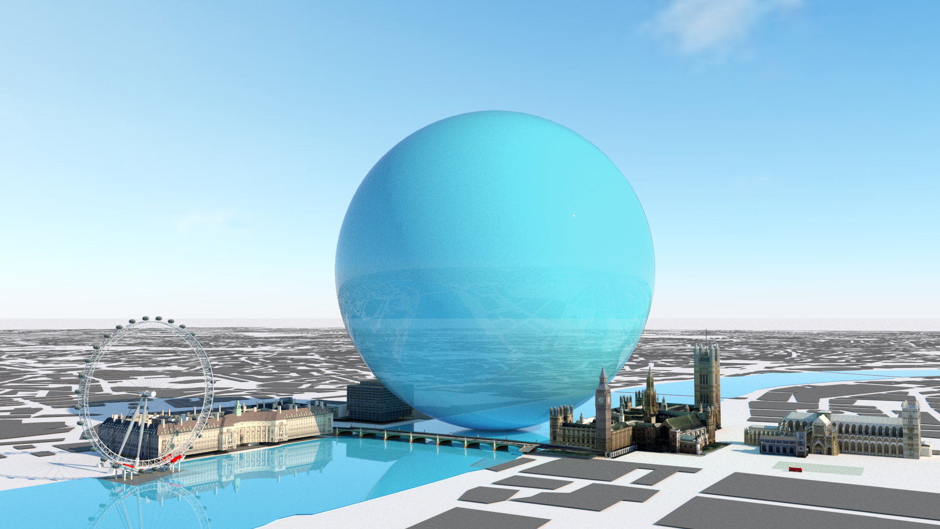
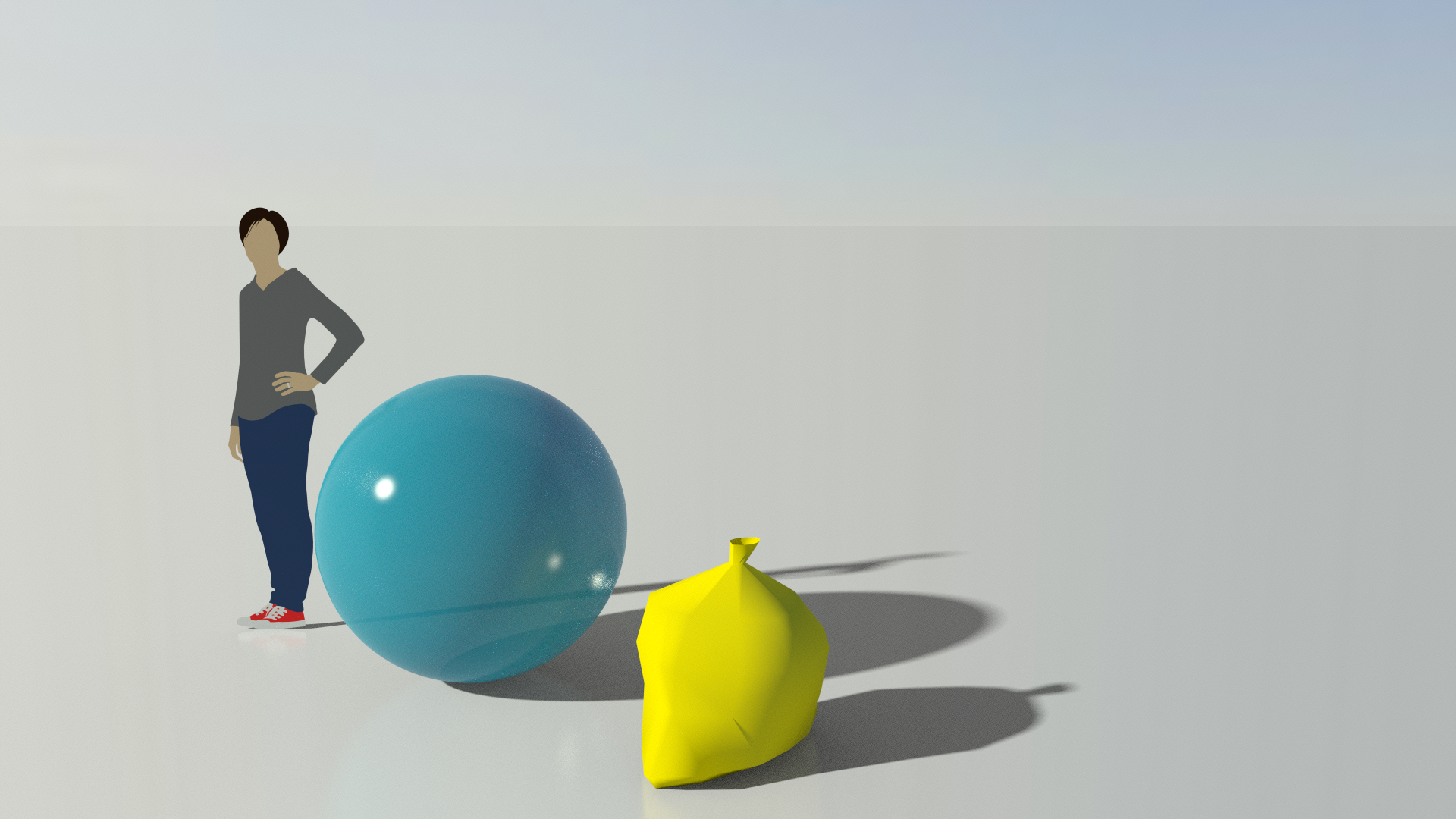
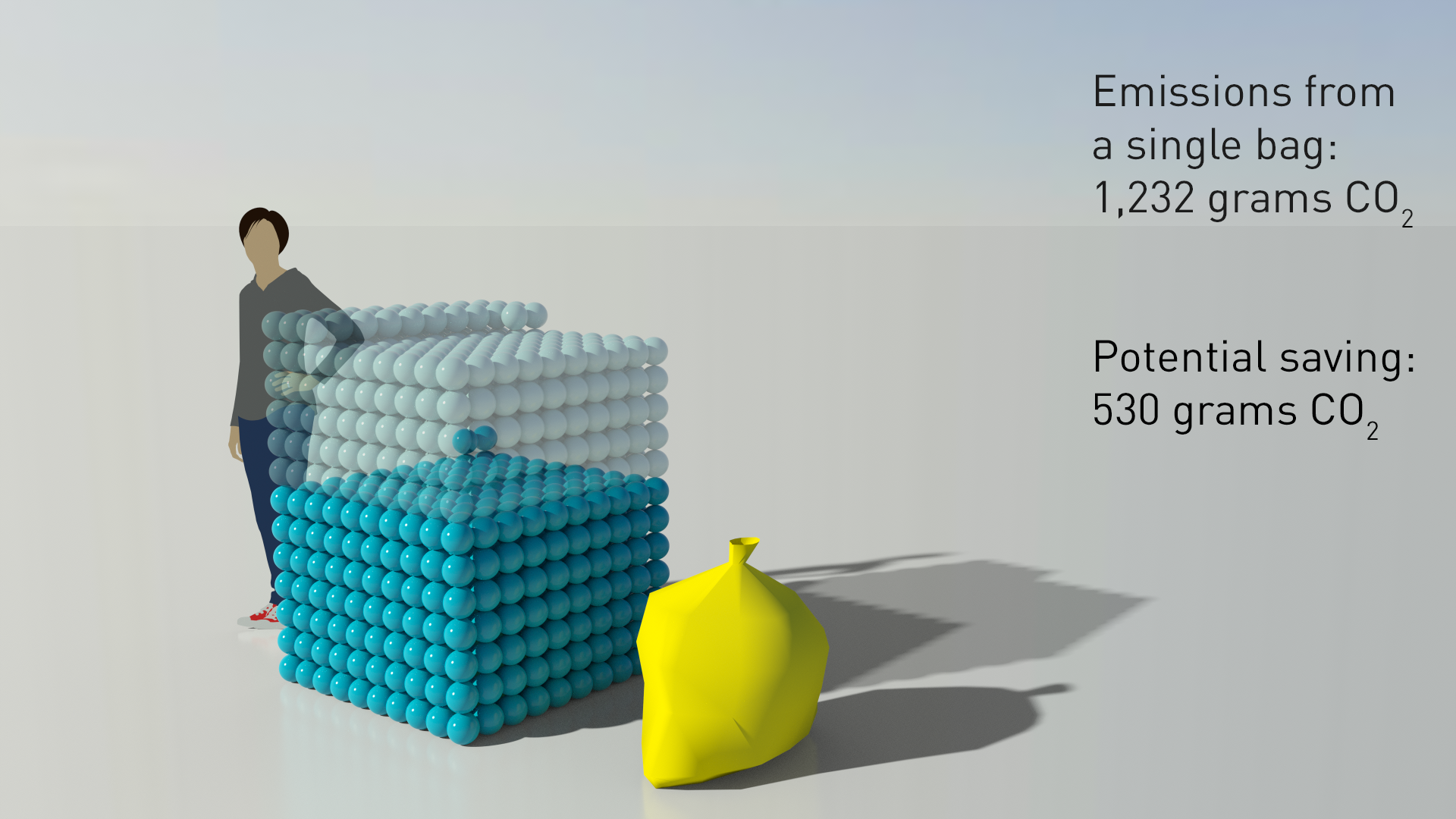
Carbon Saving in NHS Clinical Waste
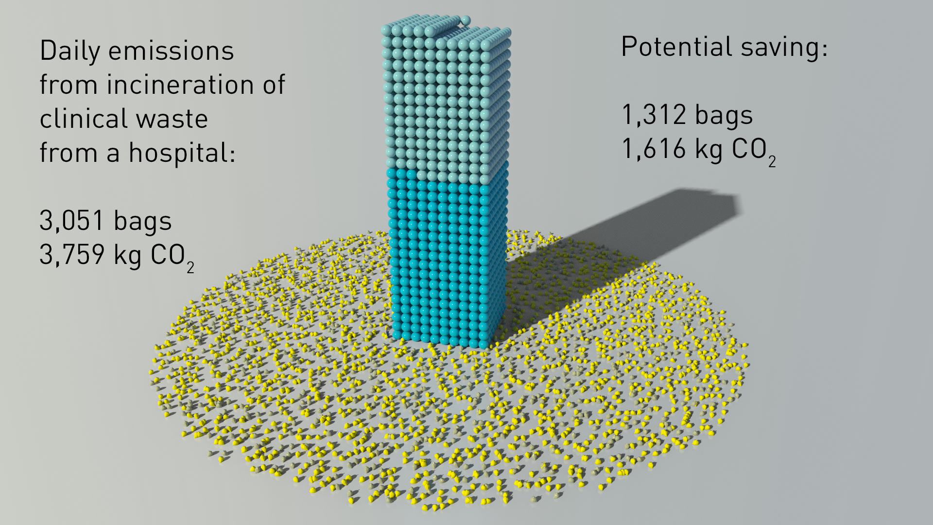
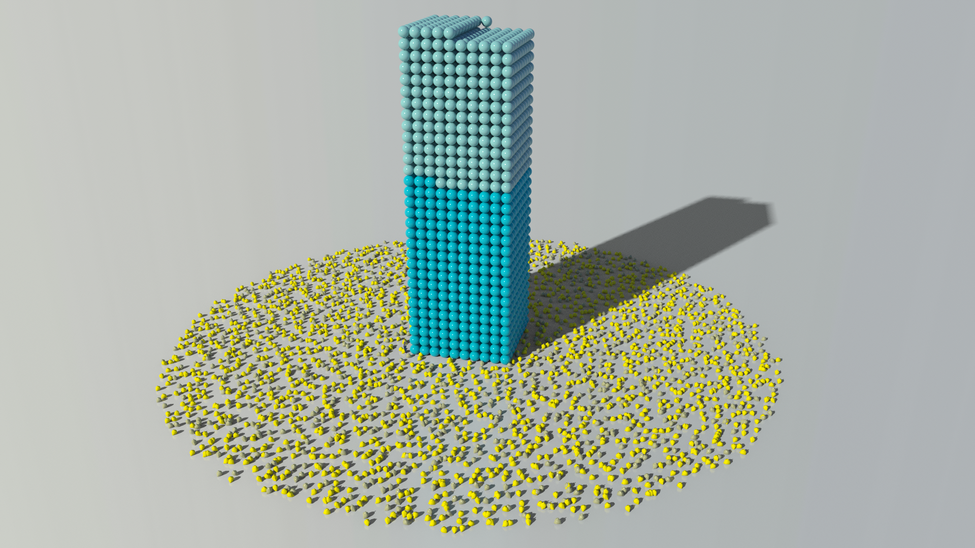
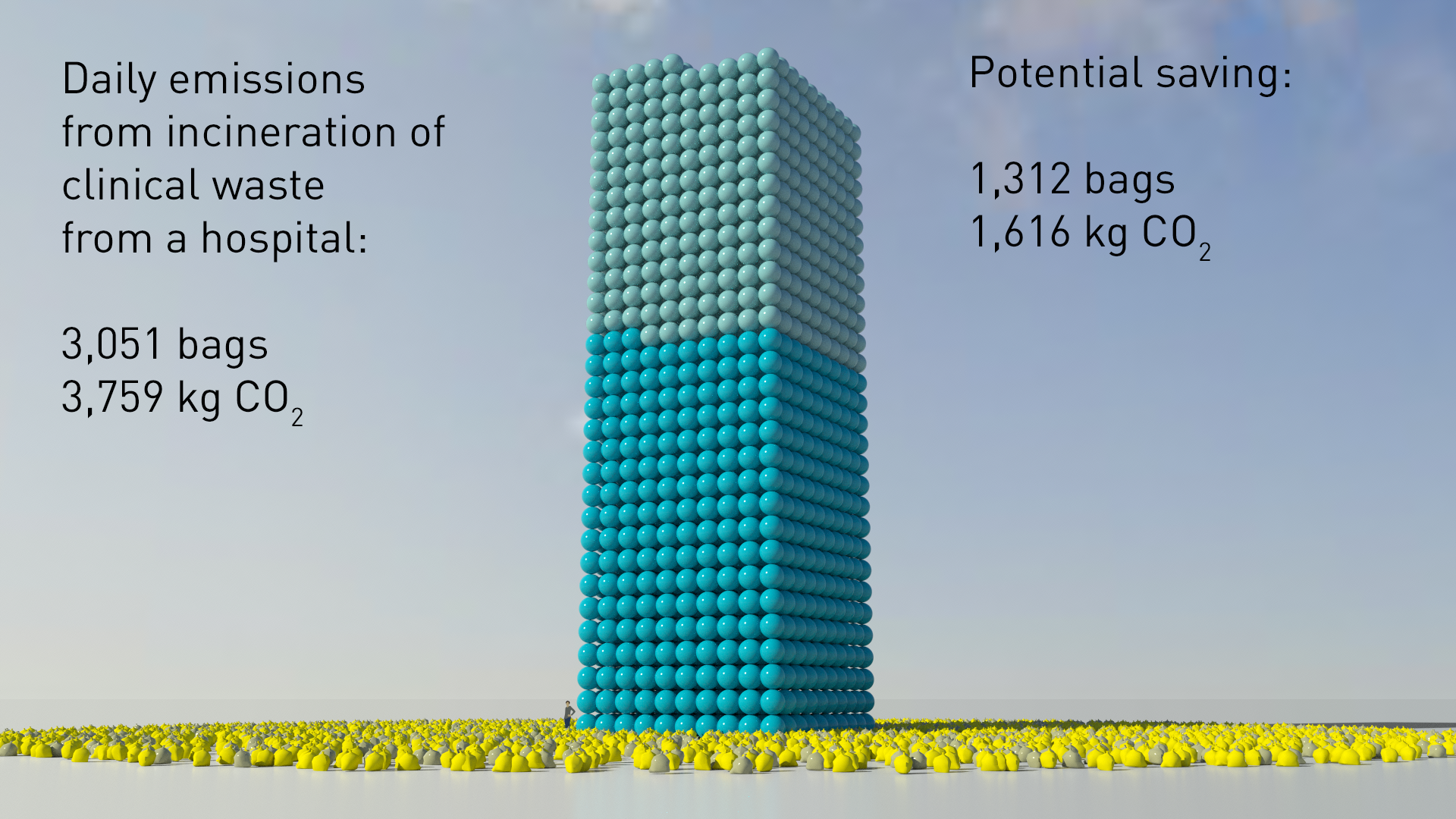
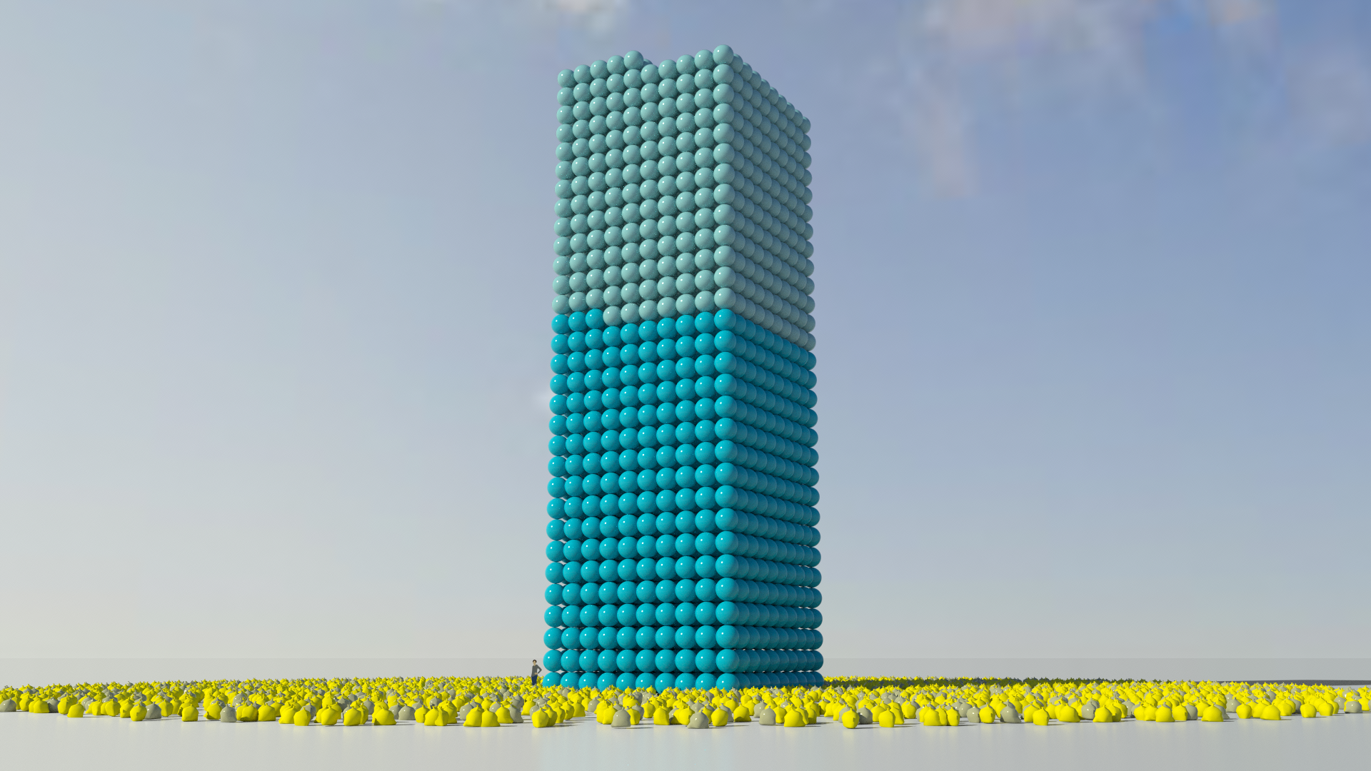
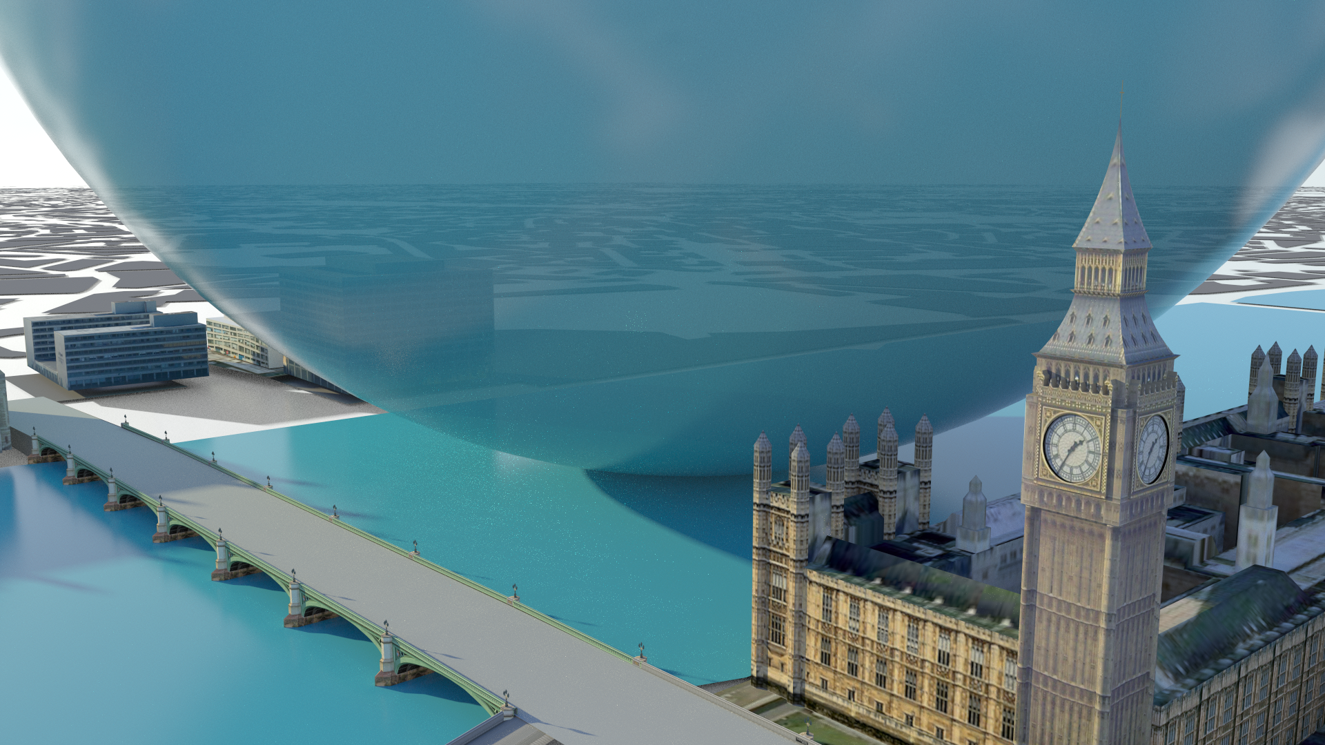
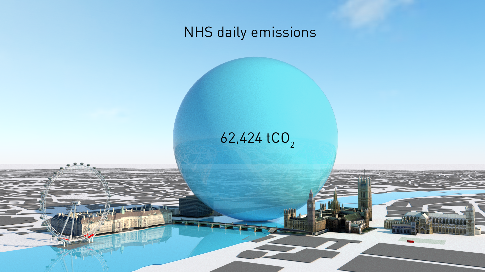
NurSus need an educational resource for current and future healthcare professionals that communicates the carbon emissions and reductions that could be achieved in the NHS.
NurSus needed an educational resource for current and future healthcare professionals that communicates the carbon emissions and reductions that could be achieved in the NHS. One of the challenges of promoting sustainable practices is communicating abstract data and presenting it in a way that audiences can relate to. In this case, we needed to make carbon dioxide visible and real - not just a number. The project had a tight budget but demonstrates effectively that even basic animation can bring data to life. NurSus were able to take our image set and tailor it to their educational narratives and tools which you can see in the above film.
About the Project
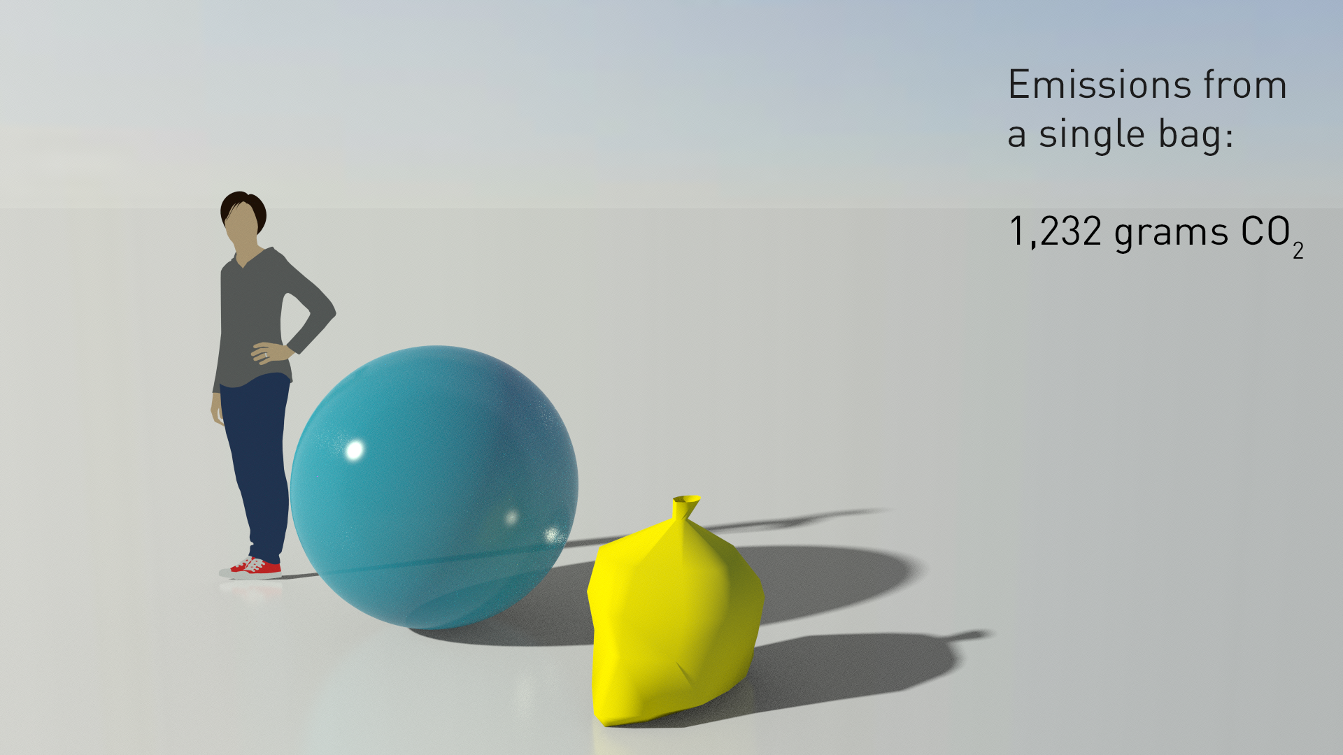
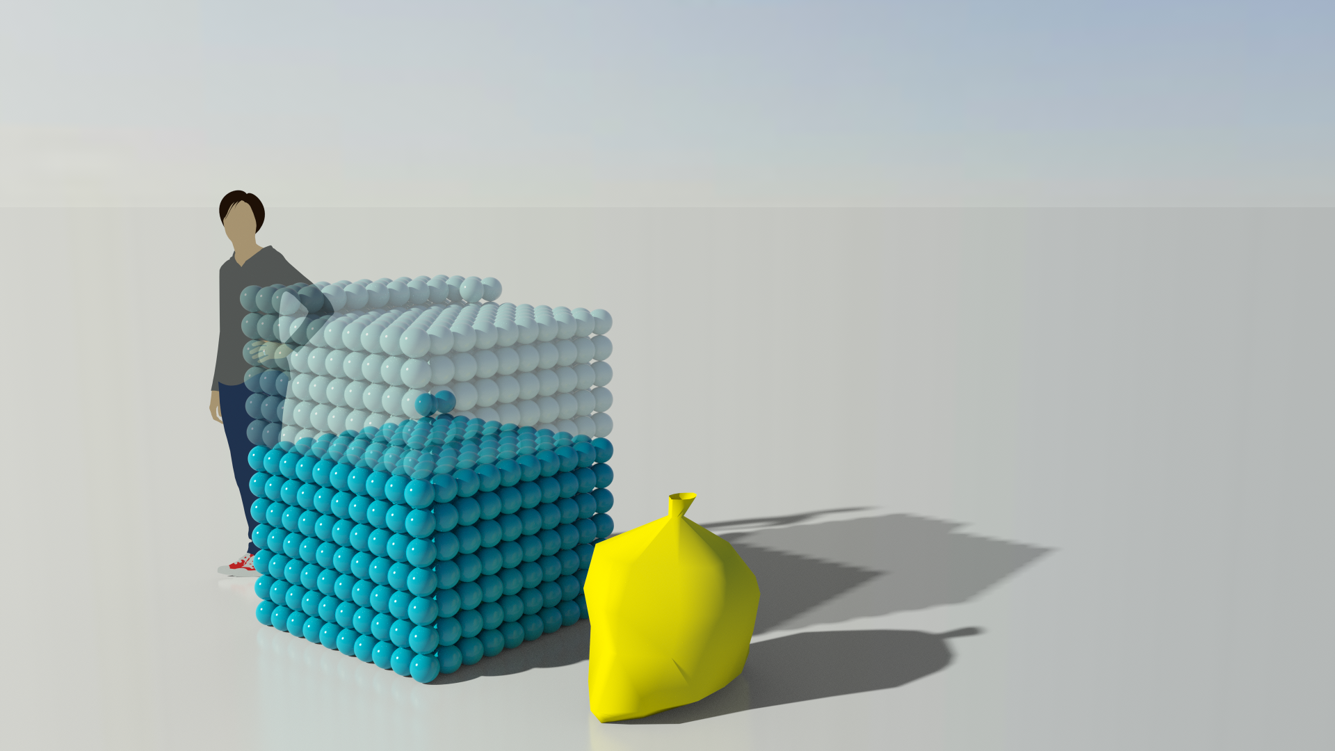
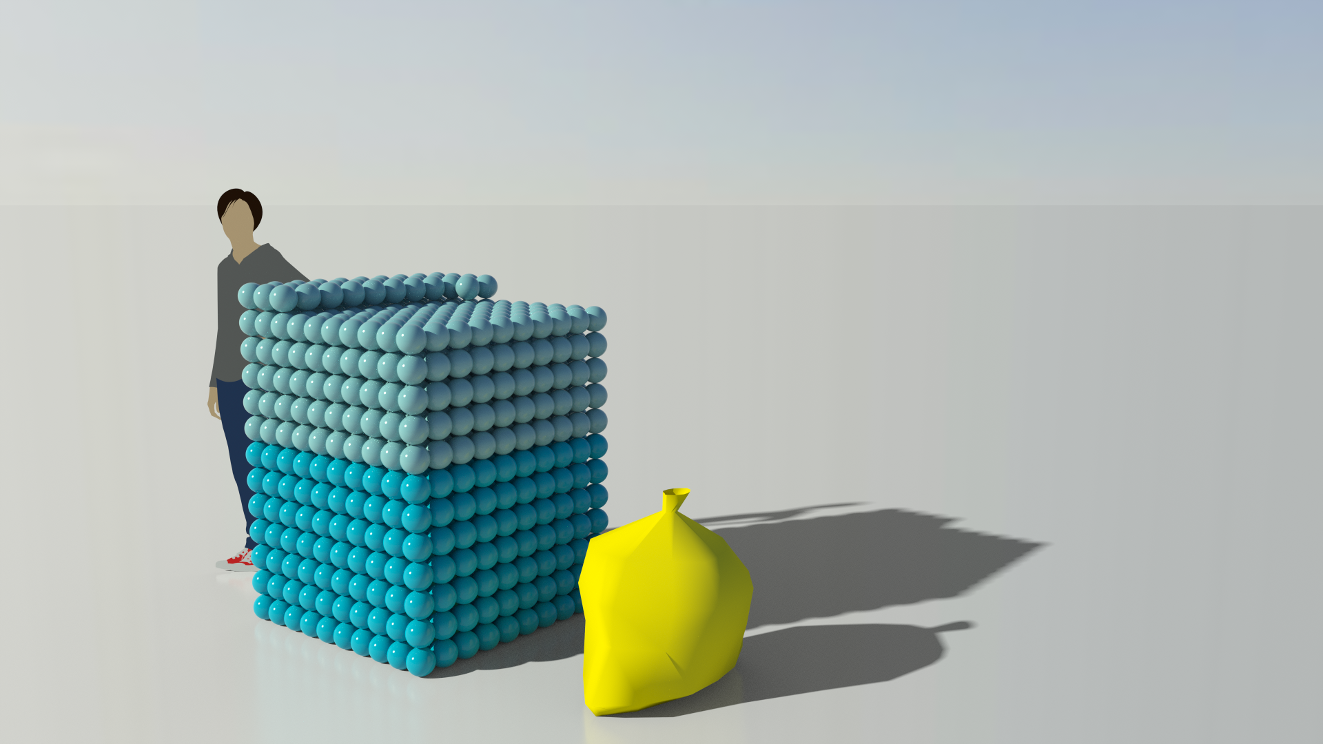
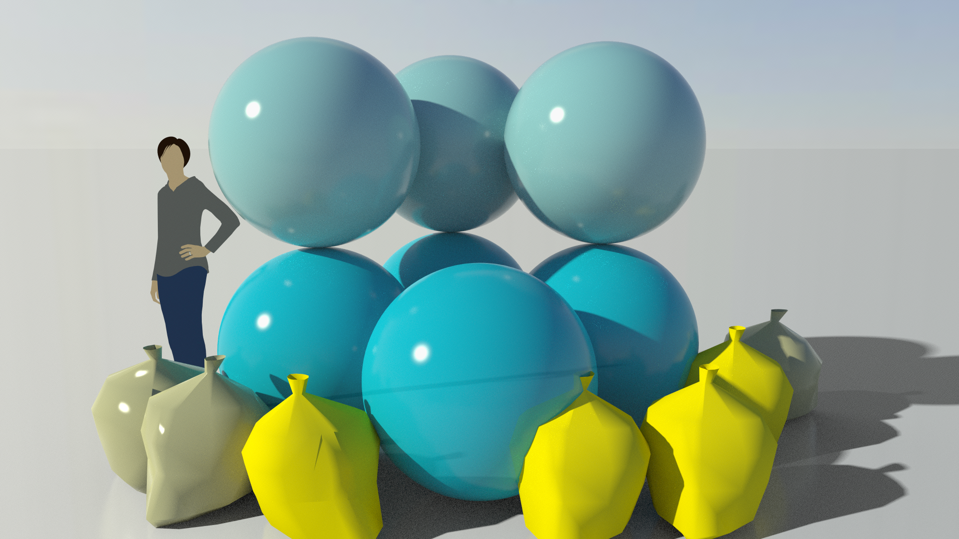
NurSus conducted an audit of NHS clinical waste. The data showed the achievable carbon and financial savings based on appropriate waste segregation. Currently, a bag of waste for incineration produces 1.2 kg of CO2. However, items often end up in this bag that don't need incinerating. NurSus wanted to demonstrate that if waste habits changed and the appropriate segregation of waste was made then the potential carbon saving of incinerated waste could be reduced to 530 g CO2 (43% reduction).
Real World Visuals were able to take the abstract data from NurSus and translate this into a set of visually meaningful images. Using various points of scale, the slideshow animation demonstrates the potential emissions saved per bag, per hospital and per day in the NHS. This enables audiences to clearly identify with the problem of waste in micro and macro volumes. The image set communicates the achievable carbon saving that is possible by changing daily habits within the NHS.
Our basic image sets can enhance educational methods for presentations and animations to engaging audiences on environmental issues. Below is the final edit of what we delivered for the NurSus project.

The NurSus TOOLKIT project is an EU funded collaboration of four Universities: Plymouth (UK), Maastricht (The Netherlands), Jaen (Spain), Esslingen (Germany) that has produced teaching and learning resources related to health and sustainability in a range of languages.

Carbon in peatland
Dartmoor is a wild peatland landscape in Devon, England, know for its wild horses and sheep that wander freely. This animated slideshow illustrates the amount of carbon that is ‘sequestered’ by the peat and shows the importance of these landscapes as natural carbon stores.
Real World Visuals worked with Paul Lunt from Plymouth University in a scheme that brings academics and creative agencies together. He needed to visualise data that had been gathered on the carbon sequestration in peatlands, in particular Fox Tor Mire, Dartmoor. The project needed a film and a set of images to help visualise the quantitative data they had collected that could communicate the benefits of carbon storage in peatlands to the public and landowners.
Working within a tight budget we produced an animated slideshow of images that differs from our usual animations but continues to give a good visual narrative to the data. We used a combination of CO2 bubbles and a variety of perspectives to help viewers to ‘see’ carbon. Using the landscape of Fox Tor Mire and using a single person as a real life scaling object brings added meaning and understanding to the volume of carbon sequestration in peatlands and how important it is as biological system that can store carbon.

Visualising Plastic in the Mediterranean
Our client wanted to show the scale of the problem of ocean plastic to an audience at the Cannes Lions Festival. So we made a film to show the rate of plastic waste in the Mediterranean Sea every second, and every day. And we liked the idea of filling the bay of Cannes with toy ducks!
Like many of us, Project Everyone are concerned about plastic in our oceans. They needed an animation that would bring the scale of the problem home to an audience at Cannes Lions Festival 2018. We considered a number of ideas, including a Godzilla-like monster made from plastic litter that would emerge from the sea and start attacking people on the Boulevard de la Croisette. Our calculations indicated that a day's plastic day's litter would assemble itself into a monster 121 metres tall. Nice!
The option we finally went for gives the audience several physical insights, and allows them to use their direct experience of the world to make sense of what would otherwise be just another number. We could have shown the quantity of plastic waste by modelling the waste itself, but there's too much variety to get a feel for it. More importantly, there is something disgusting about litter, which creates a barrier to relating to it on a physical level. A 'duck' is a friendly unit of plastic, and one just about everyone has experience of handling, which makes it useful for physical insight.
The film gives a sense of the rate we are adding plastic to the sea in real-time, which is a time scale most of us can relate to. On average, 170 ducks a second - all day, every day. Viewers make sense of that rate in two ways: they 'count' the individual ducks (make a visual judgement about the scale of the number) and they also see the area they occupy grow. Counting and area are a powerful combination.
We spaced the ducks so that a day's plastic litter fits neatly in the bay. Viewers can combine a close-up view that provides a sense of the density of ducks with a sense of a familiar area. A day is also a useful unit of time to represent a rate - it's a period of time we can 'inhabit' as a whole. A year is a good unit for accounting, but it's not something we can experience as a unit, so daily quantities usually provide more insight into a rate than annual quantities. Real-time, combined with area per day, gives two different ways of making sense of the rate.
The whole film is constructed with the aim in mind of leaving the audience with a sense of scale. The child in the boat helps establish the size of the ducks and also prompts viewers to consider what a duck feels like. The diagrammatic, colourless appearance is deliberate. We want to keep viewers focused on the ducks and want to avoid provoking any irrelevant questions.
Project Everyone is a not-for-profit agency that seeks to put the power of great communications behind The Sustainable Development Goals (also known as the Global Goals), accelerating the creation of a fairer world by 2030, where extreme poverty has been eradicated, climate change is properly addressed and injustice and inequality are unacceptable.

Reducing global carbon emissions
A film that shows in real time the current rate of global CO2 production - a million tons every thirteen minutes - as well as the reductions needed by 2030 and 2050 to meet the Paris climate target. The film was shown at the 44th G7 summit in Charlevoix, Quebec, Canada in June 2018.

Getting the attention of world leaders at G7 summits is difficult. Particularly if the subject is the urgent need to address global carbon emissions. That's why Project Everyone commissioned us to make a short film with our iconic carbon bubbles to show at the 44th G7 summit 2018 in Charlevoix, Quebec, Canada in June 2018.
The model of Toronto city is used as a real-life scaling landscape to show the rate of global greehouse gas emissions in realtime. The film begins with 1000 metric tonne bubbles of carbon dioxide appearing in real-time. In 13 minutes the rate of production is 1 million metric tonnes of CO2 and in a day the global rate of production is 112 million metric tons.
The film demonstrates the urgent climate action that world leaders need to take in reducing global carbon emissions, and urges them to keep to their reduction targets by 2030 and beyond. As well as showing the exponential decrease needed (halved then halved again) the film also shows the benefits of reduction in terms of the Global Goals - including reducing energy costs by 75% and preventing more than 4 million air pollution related deaths.
“This film contextualises the scale of the greenhouse gas emission reductions the world needs to make. Importantly, it also explains that making this effort has enormous benefits that will accrue in tandem with these reductions. We want to impress upon everyone who sees it that tackling climate change not only pays for itself in savings but also improves global well being”- Claire Byers, Project Everyone”
Project Everyone is a not-for-profit agency that seeks to put the power of great communications behind The Sustainable Development Goals (also known as the Global Goals), accelerating the creation of a fairer world by 2030, where extreme poverty has been eradicated, climate change is properly addressed and injustice and inequality are unacceptable.
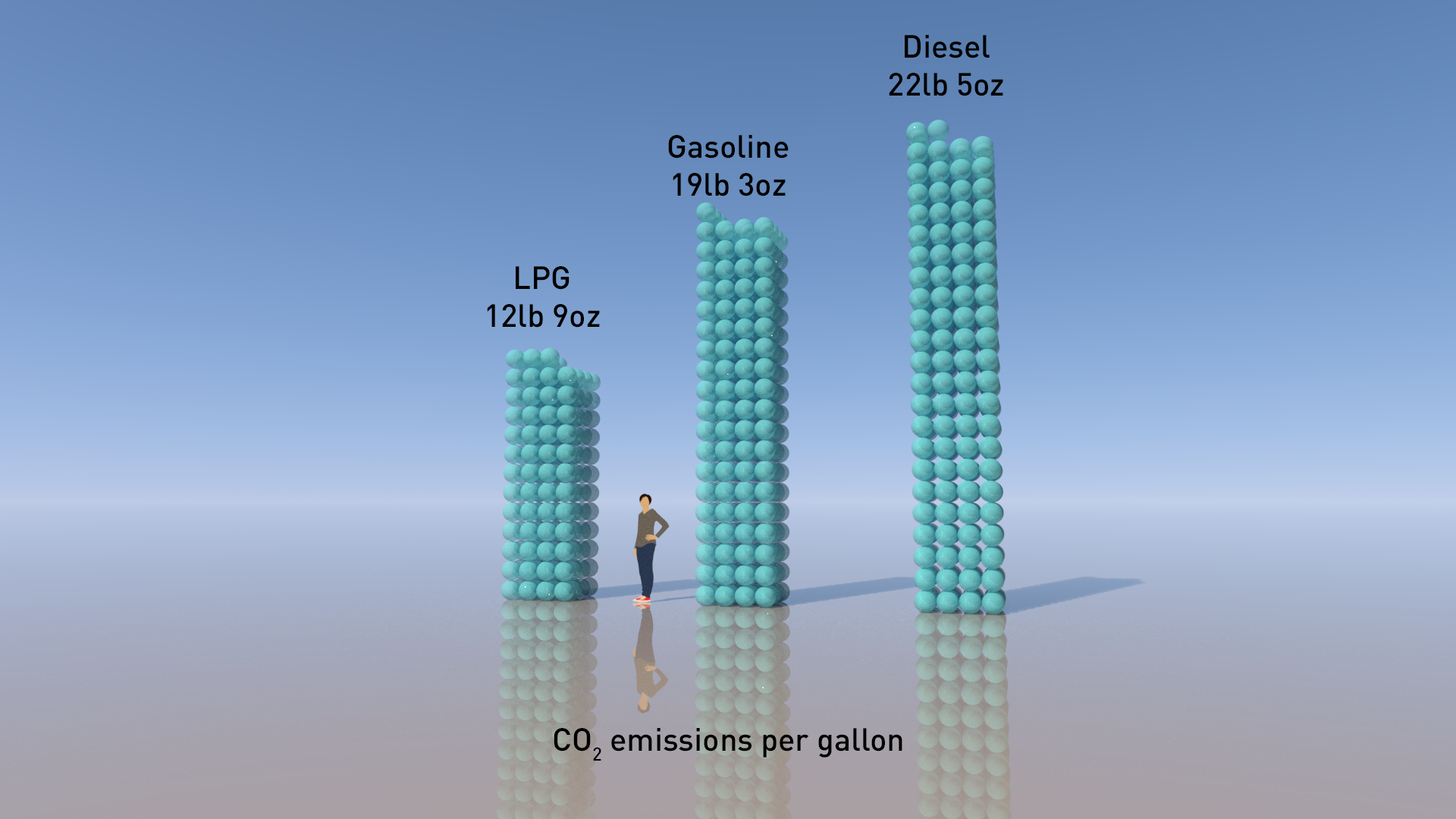
The LPG advantage
How do you show the carbon saving from running vehicles on liquid petroleum gas (LPG)? A US company that converts taxi and bus fleets to run on propane / LPG needed help to show potential clients the carbon saving compared to petrol or diesel.
What’s the carbon saving from running vehicles on liquid petroleum gas (LPG)? Wilcon Energy, a company in Colorado, USA that converts taxi and bus fleets to run on propane / LPG needed accurate answers. They wanted to have engaging imagery to show potential clients the carbon saving compared to petrol or diesel.
It was a straightforward brief, but needed care in choosing exactly what to compare with what. And, as ever, we needed to look closely at who can provide accurate numbers that we could use to build the images.

We might have used the savings in CO2 emissions per gallon of fuel from LPG use, like the image above. But that comparison is unhelpful as LPG has lower energy density than diesel or petrol.
Much better to compare like with like, which suggests comparing the emissions per unit of energy. As we are dealing with vehicles, a distance travelled is a sensible substitute for energy used. So we created this image (below) to show the difference over 100 miles of driving .

Easy, then, to reframe to show the CO2 saving per 100 miles - as in this sketch.

Yes, but where do the numbers come from?
The summary makes it sound simple, but that’s only true if you can find definitive data on which to base the calculations. Not so easy in this case. In the past we have relied on the US Environmental Protection Agency (EPA) website. However there have been changes at the EPA - to understate the situation - and we found many links broken. So we went for UK Government figures instead. Click here for UK Government GHG Conversion Factors for Company Reporting
The difference between EPA values and UK Government values will be tiny, and certainly won’t affect the visuals.
The 100 mile calculation is a bit more complicated. As we said, comparing like with like means comparing the emissions per unit of energy, rather than per gallon of fuel. But we consider emissions per unit of energy too abstract for most audiences - hence our opting to show the energy needed to drive 100 miles. Here we started with a 2010 EPA study that showed average fuel consumption in gasoline cars was 21.5 miles per gallon. Combining this with EPA values for the energy content of gasoline gives a value of 157.3 kWh for 100 miles, so we converted that into CO2 emissions for each fuel, using the UK conversion factors. And then we convert again to non-metric units for a US audience. And that is what you see in the image above.
From UK Government GHG Conversion Factors for Company Reporting:
LPG: 0.21451 kg CO2e/kWh
Gasoline: 0.24048 kg CO2e/kWh
Diesel: 0.27588 kg CO2e/kWh
To find out more about Wilcon Energy see here
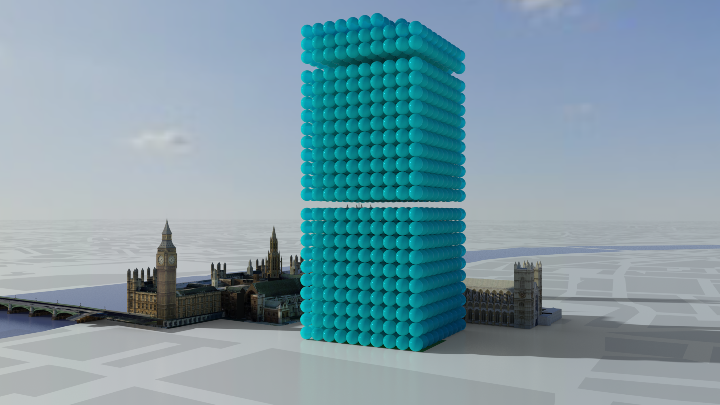
Promoting Carbon Savings
How do you add a ‘wow’ factor to a major bid or proposal where carbon saving is important? This image set was designed to help a global IT company communicate the carbon savings associated with their products.
How do you add a ‘wow’ factor to a major bid or proposal where carbon saving is important? That was the dilemma facing a global IT company who approached us to enhance a major bid to a UK Government Department.

What's the carbon saving from use of client's IT equipment? 2,278 tonnes as one-tonne spheres grouped into blocks of 1000.
“We love these images and will use them or similar from yourself again when the need arises”
In response we quickly created a collection of images that enabled their project on carbon savings to ‘come alive’. The images use the Real World Visuals data visualisation approach by showing volumes of carbon dioxide as stacks of one tonne bubbles. The use of real buildings, such as Big Ben and the Houses of Parliament were relevant to the target audience and draw on people's day to day experience of the world. The use of these real-life scaling objects brings a better sense of scale and relativity to the carbon dioxide bubbles.

Image showing 220 tonnes CO2 saving from a separate IT equipment project
Often we produce various angles of a scene for our clients. In this image, for example, we use an eye level perspective to enable the viewer to relate to the visualisation and information in the image from a bodily point of view.
Real World Visuals now has the capability to produce this kind of image set - showing any CO2 amount - for less than £1,000 in a matter of days. Contact sales@realworldvisals.com for an initial chat and quotation.

Visualising people not numbers
Many of us find it hard to make sense of people in statistics. So we created a ‘crowd visualisation’ tool for an NGO that allows people to explore data about their full and associate members by type of organisation, region, country, language and other characteristics in 3D and 2D.

We were asked by Global Network of Civil Society Organisations for Disaster Relief (GNDR) to provide a crowd visualisation that helped people better understand their membership profile. We designed a tool that makes individual GNDR members visible, and so brings a table of numbers to life. The tool allows people to explore data about full and associate members by type of organisation, region, country, language and other characteristics.
Our crowd visualisation can be viewed in 3D and 2D. These different perspectives allow users to interpret the data from different angles.
Feel free to interact with this product below.
First click on 'load full members' and then use your mouse to play with the 3D or 2D options to explore the people in the crowd visualisation.
Or you can visit the project page here
Visualising waste worth £3 million
West Sussex County Council wanted to draw attention to the recycling that residents don't do, but could. We created an animation for a public engagement campaign using social media, and a range of still and print materials for bill-boards and local news advertising.
How do you draw attention to the recycling we don't do (but could)? And how can you show people the benefits? West Sussex County Council Waste Management Service wanted an innovative way to reach out to households and approached us for ideas. Starting point was the strap line for the campaign - Think before you throw - and a giant spreadsheet which was trawled for usable data.
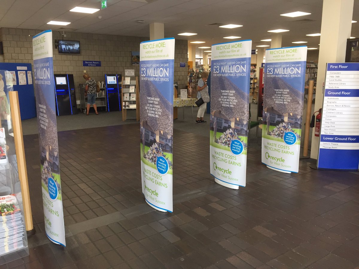
Real World Visuals produced a video, GIF, video extract films and a range of still and print materials for the public engagement campaign. This material is currently being used on social media, in entrances to public libraries, on bill-boards and local news advertising.
“From concepts to finished assets, it has been a really positive experience to work with Real World Visuals.”
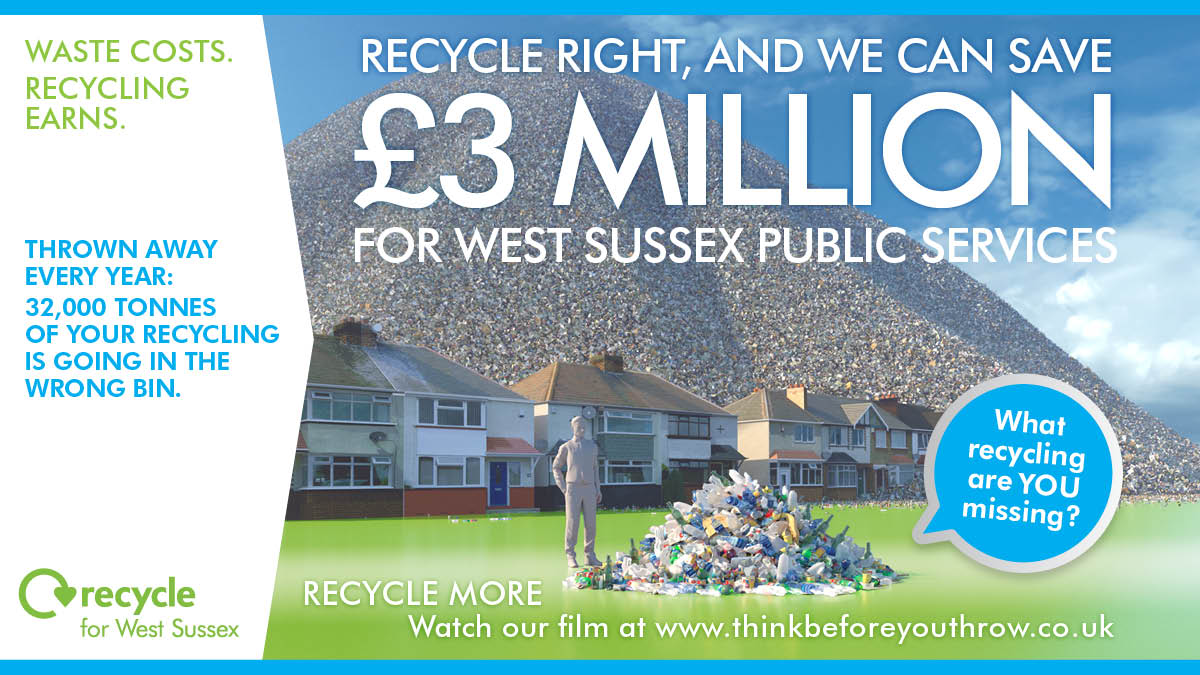
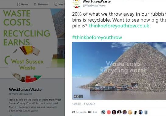
The material produced by Real World Visual focused on the central £3 million saving that could be made if more waste was diverted from landfill. Visuals shows the 32,000 tonnes of material wasted each year that could be recycled on a Council-wide as well as house-hold level.
“At this point the main campaign film has had over 43,000 views on Facebook alone, with other posts and ads from the campaign receiving over 130,000 Facebook engagements and impressions from targeted West Sussex residents. The campaign has had 17,989 reactions on Twitter. The analysis for the website engagement is being processed and we look forward to similar hugely positive stats.”
To read an interview with the client about the development of this campaign, click here.
For more information about Think Before You Throw, from West Sussex County Council Waste Management Service.
Bio-Buildings are carbon 'banks'
Building with bio materials like straw and wood locks up carbon. Seeing the ‘carbon-capture’ potential of these sorts of buildings could help architects, insurers and contractors consider the full potential of working with these natural materials.
We have been visualising how material in construction can have a positive impact on carbon dioxide levels. This is how a building can ‘bank’ carbon through natural construction materials.
UPDATE: July 2021 - we recently updated the video we made for Agile Property and Homes. See below.


Building with bio materials like straw and wood locks up carbon. The visualisation below shows the amount of carbon captured within different materials. The use of bio-based materials has been met with scepticism from architects, insurers and contractors. That is now changing as bio materials become mainstream in the construction industry. Seeing the ‘carbon-capture’ potential of these sorts of buildings could help those in the sector consider the full potential of working with these materials. The bubbles here represent a carbon saving.

TAM in Knowle West, Bristol
Innovative bio building specialists Agile Property and Homes asked us to create a set of images that show the actual embedded carbon dioxide in a typical modular TAM building. The imagery is being used to illustrate the carbon benefits of the companies high quality affordable social housing and alternative lodge homes.
Carbon sequestration in the Severn Estuary
We think of estuaries primarily in terms of nature and wildlife. But estuaries also provide important ecosystem services, for instance the saltmarsh sequesters and stores carbon dioxide from the atmosphere. Communicating this to the public is a challenge, but we wanted to have a go…
We think of estuaries primarily in terms of nature and wildlife. But estuaries also provide important ecosystem services, for instance the saltmarsh sequesters and stores carbon dioxide from the atmosphere. Communicating this to the public is a challenge, but we wanted to have a go…


Real World Visuals was commissioned by WWT Consulting on behalf of the Severn Estuary project partners* to create simple sketches to show how much carbon dioxide is sequestered in the estuary. But how much carbon dioxide is sequestered by a salt marsh? It turns out to be 21 kg per hectare per day. And the estuary represents the largest aggregation of salt marsh habitat in the south and southwest of the UK, covering about 1,400 hectares.
Note that these sketches were created to help the group consider options for communication with the public. These would augment existing words and maps, and would help explore how to broaden the discussion about benefits of ecosystem services provided by the estuary.
*The Severn Estuary project partners are a coalition of organisations that seek to restore the estuary as a healthy functioning ecosystem, valued for its wildlife, habitats and landscapes and also benefiting local communities, places, and economies.
Further information from the Severn Estuary project partners website. WWT Consulting website here.
Simple images to bring data alive
Often a simple image set can get across a positive message better than any amount of words, helping people really see success, aspiration and change. This is particularly true in the case of stories of carbon reduction and carbon targets.
Often a simple image set can get across a positive message better than any amount of words, helping people really see success, aspiration and change. This is particularly true in the case of stories of carbon reduction and carbon targets. Image sets like the one below can be used for internal communications campaigns, in annual reports, at corporate events and converted to GIFs for use on social media.


This simple image set illustrates the daily carbon emissions from energy use of a single car dealership as stacks of one pound spheres, and the saving made from the solar PV and LED lighting.
Boulder Nissan is the largest volume dealer for the Nissan LEAF electric vehicles in the central part of the USA. But the dealership is also determined to be 'green' in terms of its own building. So in 2016 the company installed 50kw of solar PV on the roof and fitted LED lighting inside and out in order to reduce its own carbon footprint. You can see the difference it makes!
Download our PDF on simple images here for further information and an introduction to pricing.
Exploring Ireland’s energy future
Ireland has agreed to cut carbon emissions by at least 80% by 2050, compared to 1990 levels. We provided the visual interface for a web-tool that allows anyone to access and explore different future electricity and energy supply and demand options for the country.
Ireland has agreed to cut emissions from electricity generation, buildings and transport by at least 80% by 2050, compared to 1990 levels. But shifting to a sustainable energy system requires both political and societal support. An easy way to visually explore energy options was needed.
Real World Visuals provided the visual interface for the Ireland 2050 web-tool, part of an educational project developed and coordinated by The Energy Institute in Ireland. The web-tool allows anyone to access and explore different future electricity and energy supply and demand options for the country.
“We believe in empowering people to participate in the discussion about Ireland’s energy system; by knowing how it works, what it takes to have a secure and stable supply of energy to people’s homes and businesses, whether it is fair and competitive, how it has developed over time, and how it could continue to develop with greater efficiency and synergy with our community and our environment.”
As different options are selected the reduction in carbon dioxide emissions is shown as a real volume (m3 per second). From the beginning a key part of the brief was to allow the tool to be used on smart-phones and tablets as well as conventional computer screens.
Making a tool like this work on such a wide variety of devices imposes quite strict constraints. We were very limited, for instance, in what we could do in 3D - a library such as Three.js won’t work on all devices, many of which have no 3D hardware and can’t handle WebGL. Because 3D is so important to the way we make quantities visible, we built our own very simple system for generating isometric diagrams - a simplified 3D engine.

The excellent Ireland 2050 website provides detailed yet accessible information on the past and present energy generation and use in Ireland, as well as the My2050 tool and the specialist Irish 2050 Calculator.
The My2050 tool can be explored here. To see how it works on smaller screens open in a new browser window.
University campus emissions brought to life
How do you raise help students and staff better understand the carbon emissions associated with all the different buildings at their university? This prototype carbon and energy visualiser shows the real-time, monthly and annual carbon emissions associated with every building on the different campuses of the University of the West of England (UWE).
Students and staff at the University of the West of England (UWE) can now see the real-time, monthly and annual carbon emissions associated with every building on the different campuses in and around Bristol. Our prototype carbon and energy visualiser has been improved to give faster and smoother operation and also allow viewing on smart phones, tablets and full-sized screens.
Open in full-width new window.
UWE has made a commitment to reduce absolute carbon emissions by 22.5% and a 50% relative reduction of energy by 2020 (over 2005 baseline). This means that no matter how many buildings, or students, are at UWE Bristol overall carbon emissions must be reduced. The university is on course to meet this ambitious target but to reach it everyone on campus needs to be aware of the challenge and actions they can take to help.
“This is a really practical tool for our colleagues and students here at UWE Bristol, helping people make a connection between their day-to-day actions and carbon reduction. The beauty of the visualiser is it will work for staff, students, academics and also the thousands of visitors to the University every year. The potential for impact in meeting our commitment of a 50% carbon reduction is significant.”
“It is hard to act on a problem when its cause is invisible. Building managers and building users both understand the importance of energy efficiency and reducing greenhouse gas emissions, but only building managers have a feel for the scale of the problem and the impact of changing behaviour. This visualiser helps make emissions real for building users, which is the first step to proper engagement with the problem.”
Invisible payments made real
An unusual request from a successful USA start-up - could we find a simple way to show investors the exponential growth of their mobile phone money transactions in Mexico? Using dates and geo-location data for all transactions we created this simple short video.
An unusual request comes from a successful start-up business in the USA. Could we visualise the exponential growth of mobile phone money transactions using their app?
PayClip have quickly become market-leaders for smart phone payment in Mexico and wanted a simple way to show potential investors this growth pattern. An intriguing challenge. Armed with a substantial spreadsheet giving dates and geo-location of all transactions we created this simple short video. We like it and are looking forward to visualising other geographic and time-based data sets.

Visualising Bristol's Waste
Bristol Waste Company is keen to engage directly with households about the benefits of waste and litter minimisation and recycling. Real World Visuals has created two films that show the actual volumes of litter, recycling and recycling opportunities. The goal of the project is to elicit a measurable increase in waste minimisation and recycling and provide direct cost benefits to the council.
Bristol Waste Company is keen to engage directly with households about the benefits of waste and litter minimisation and recycling. Real World Visuals has created two films that show the actual volumes of litter, recycling and recycling opportunities. The goal of the project is to elicit a measurable increase in waste minimisation and recycling and provide direct cost benefits to the council.
This film shows the volume of litter collected from Bristol's street every day - 10 tonnes, and every year - 350,000 tonnes.
This film shows the volume of material recycled by households every week and annually. The film also shows the amount of material that is NOT recycled. - the wasted recycling opportunity for helping the environment and saving costs for the council.
“The films have been invaluable in helping establish the Bristol Waste brand and our company objectives. The visuals have allowed us to present a complex dataset to a wide audience in an intelligible, striking and immediately engaging way.
”


We started the project with a data analysis and scoping process to determine different visual options, bearing in mind the launch of the initiative at the International Balloon Fiesta in August 2016 where Bristol Waste sponsors the Solar Balloon.
Because the event took place at the Ashton Court estate on the edge of Bristol, we decided to commission drone aerial photography of the estate as the background scene, rather than using a computer generated background.
Bristol Waste Company is the city’s local recycling, waste collection and street cleansing company. The company employs 450 people who make 17 million scheduled collections every year, operate 180 vehicles, collect 140,000 tonnes of waste and recycling per annum of which 53,000 tonnes is sent for composting or recycling. BWC cleans 800 miles of streets and footpaths and deals with 180,000 ad hoc job requests and service queries annually.
See more at www.bristolwastecompany.co.uk
See blog about how these films were made here.
All our images are licensed under Creative Commons and available to download on our Flickr page.