

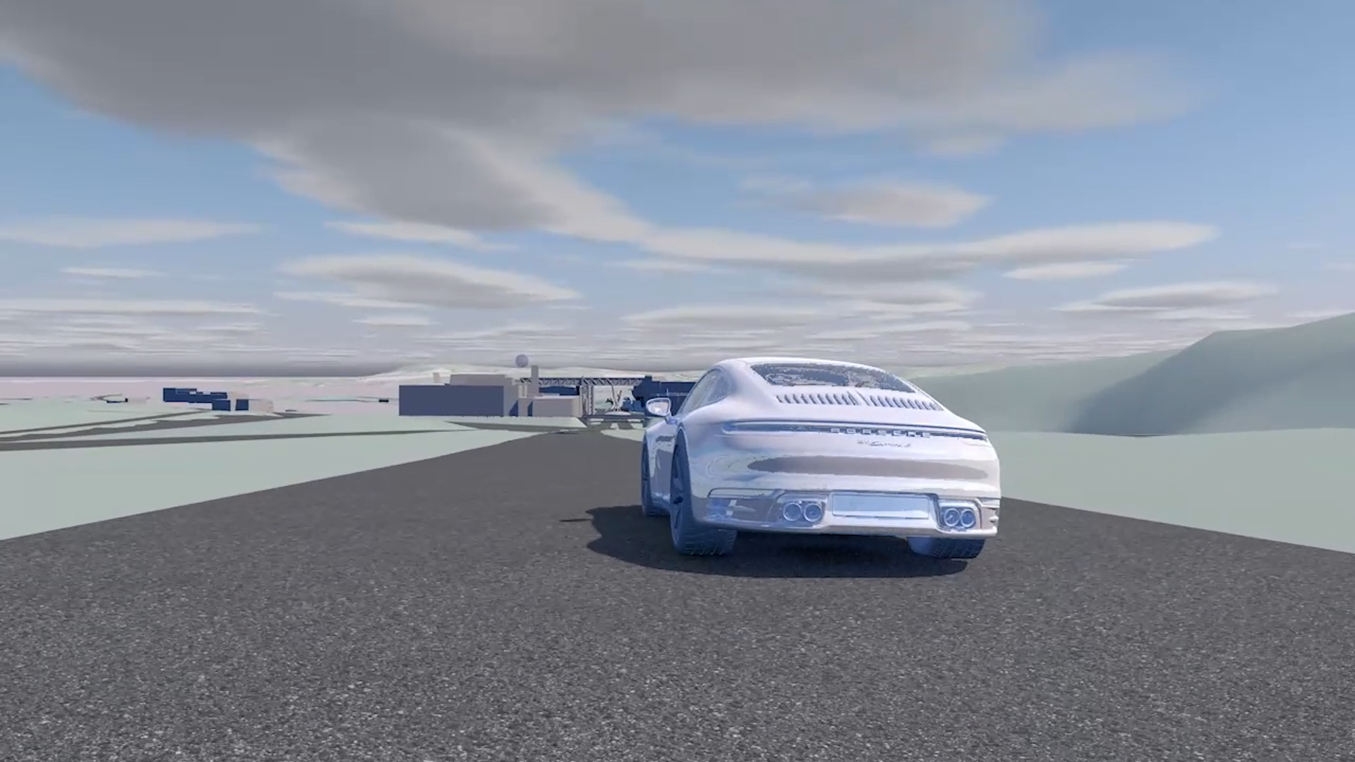
Helping tell Porsche’s carbon story
How can global car manufacturers show climate change leadership? Phasing out petrol and diesel vehicles alone is not enough as making electric cars uses a lot of energy, particularly in the manufacture of the batteries. So the challenge is to engage with the supply chain and get them also to reduce emissions - primarily by only using renewable electricity.
How can global car manufacturers show climate change leadership? Phasing out petrol and diesel vehicles alone is not enough as making electric cars uses a lot of energy, particularly in the manufacture of the batteries. So the challenge is to engage with the supply chain and get them also to reduce emissions - primarily by only using renewable electricity.
Porsche is now doing this by calling on its approximately 1,300 direct series suppliers to use only renewable energy in new projects for the manufacture of Porsche components. It’s a big ask and requires a huge engagement programme with staff and suppliers.
That is why in 2021 Real World Visuals were approached to make an animation to explain the carbon reduction strategy to employees and selected suppliers, backed up by detailed data. The full video is naturally confidential, but the above is an extract to give a flavour of what can be done to get across the message.
“We did fully utilize the video during our face to face training programs and I feel it added value for our participants.”


UK Household emissions
A set of simple images showing the carbon emissions associated with an average UK home.
How would it feel if we could see the invisible carbon emissions associated with our daily lives?


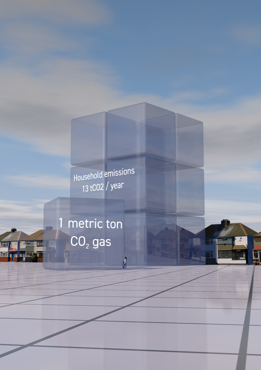

We created a set of simple images showing the carbon emissions associated with an average UK home. These were designed for A3 Posters for an exhibition organised by Teignbridge Action on Climate (ACT). They show the carbon emissions associated with energy, transport e.g. car use, food, goods and services. Data has come from here: Impact Tool
Feel free to download and use for education or training. Images are licensed for use under Creative Commons.

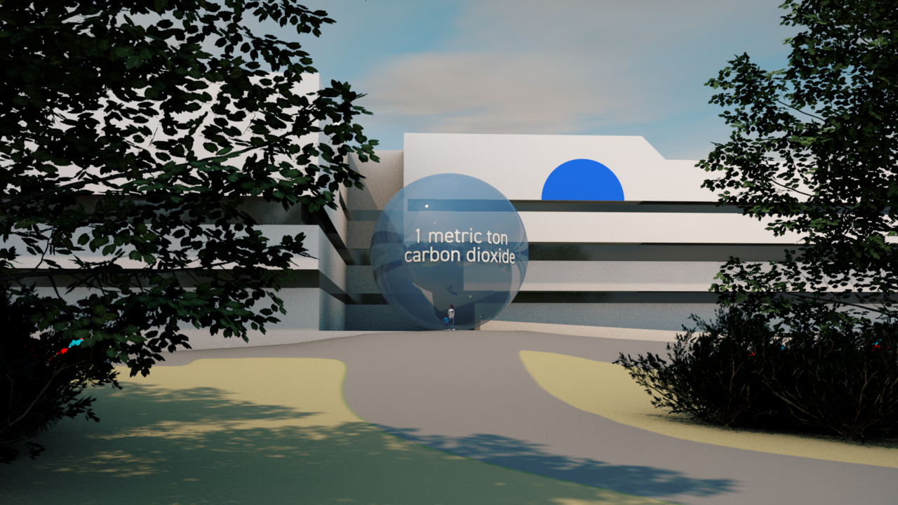
Commuting to work - what is the carbon footprint?
The Western Australia Water Corporation wanted to help employees understand the carbon footprint associated with their commuting to work.

Should commuting to work be counted as part of an organisation’s carbon footprint? Technically employee commuting is classified as indirect (Scope 3) emissions. But responsible organisations can help employees engage with the climate challenge by helping them understand their commuting carbon footprint.
The Western Australia Water Corporation did just that. They hoped to encourage employees to change commuter behaviour or offset their commuting carbon emissions. But to do that they wanted to make their emissions ‘real’, and so came to us for help.
We created a set of still images together with two short animations showing the commuting carbon emissions set next to the Water Corporation headquarters in downtown Perth. This is a good example of a simple and fast project using the in-house enhanced capabilities we have developed over last two years.
“Thank you very much for your help and great work. The story published in our intranet and internal news has had an immediate strong response. Very impactful.”

Client: www.watercorporation.com.au
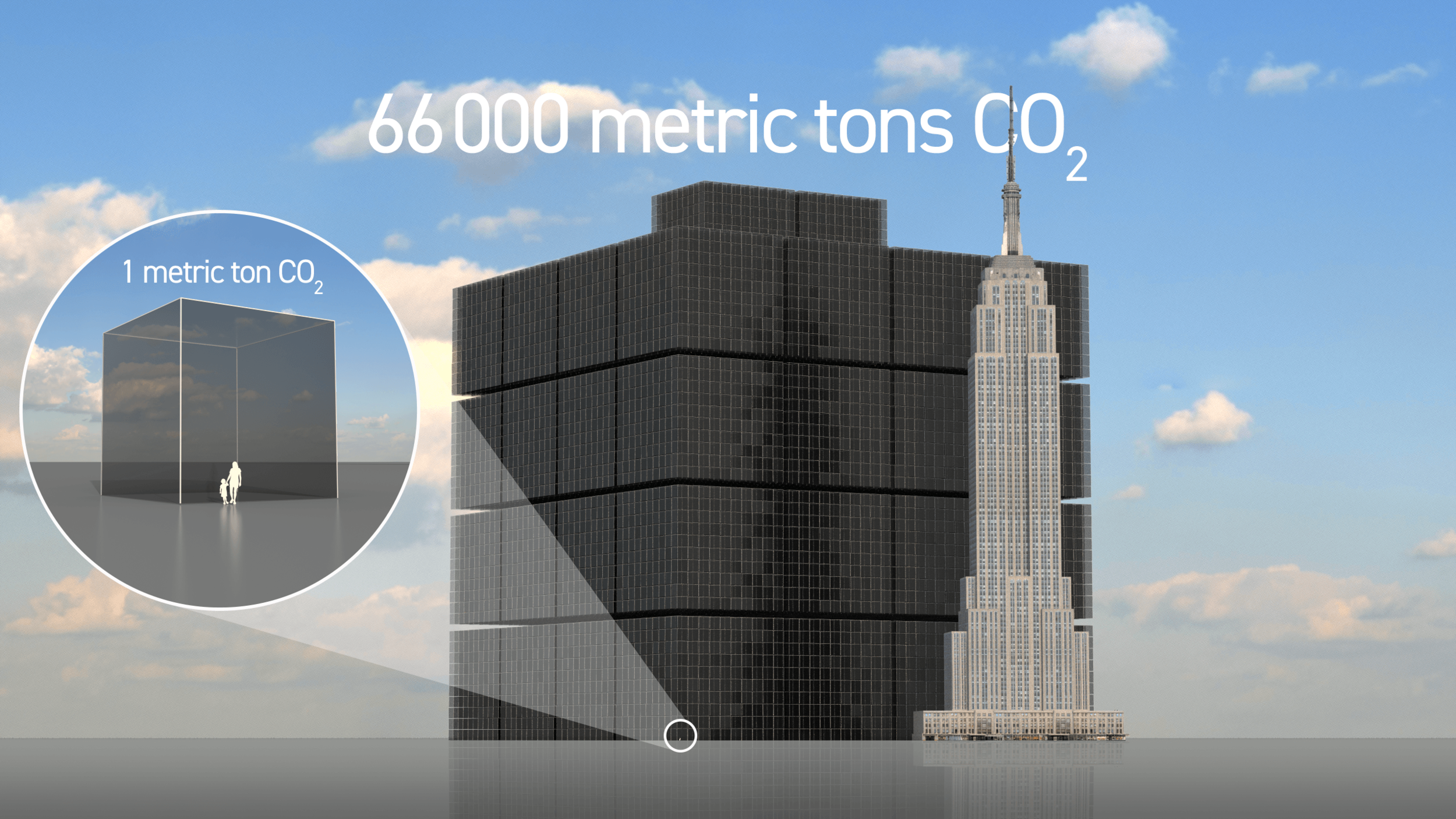
Communicating your carbon saving
What does 66,000 metric tons of CO2 look like? That was the question asked by Belgian company MAZARO who wanted to show the annual carbon savings associated with fitting their innovative transmission technology to a client’s 350 large cooling fans.
How do you communicate the carbon reduction benefit of an innovative new industrial product?

This was the challenge faced by Belgian company MAZARO who have developed an innovative transmission technology that makes conventional and electric transport systems, as well as industrial drivelines, up to 20% more efficient and less polluting.
Having just finished road tests proving that their technology extends the driving range of an electric truck by 16.8% they were asked by a multinational client what the effect of the transmission would be on the large cooling fans they sell. The answer was an efficiency gain of 83% which for their 350 large cooling fans would amount to a yearly saving of 66,000 metric tons of CO2.
The image shows this volume next to the Empire State building in New York. It has been used to grab attention in sales presentations and will be displayed on the company’s new website in coming weeks.
If you have an impressive carbon savings amount that you want to communicate to investors, clients or other stakeholders please get in touch.
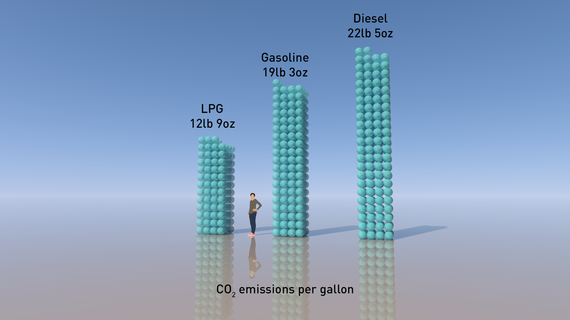
The LPG advantage
How do you show the carbon saving from running vehicles on liquid petroleum gas (LPG)? A US company that converts taxi and bus fleets to run on propane / LPG needed help to show potential clients the carbon saving compared to petrol or diesel.
What’s the carbon saving from running vehicles on liquid petroleum gas (LPG)? Wilcon Energy, a company in Colorado, USA that converts taxi and bus fleets to run on propane / LPG needed accurate answers. They wanted to have engaging imagery to show potential clients the carbon saving compared to petrol or diesel.
It was a straightforward brief, but needed care in choosing exactly what to compare with what. And, as ever, we needed to look closely at who can provide accurate numbers that we could use to build the images.

We might have used the savings in CO2 emissions per gallon of fuel from LPG use, like the image above. But that comparison is unhelpful as LPG has lower energy density than diesel or petrol.
Much better to compare like with like, which suggests comparing the emissions per unit of energy. As we are dealing with vehicles, a distance travelled is a sensible substitute for energy used. So we created this image (below) to show the difference over 100 miles of driving .

Easy, then, to reframe to show the CO2 saving per 100 miles - as in this sketch.

Yes, but where do the numbers come from?
The summary makes it sound simple, but that’s only true if you can find definitive data on which to base the calculations. Not so easy in this case. In the past we have relied on the US Environmental Protection Agency (EPA) website. However there have been changes at the EPA - to understate the situation - and we found many links broken. So we went for UK Government figures instead. Click here for UK Government GHG Conversion Factors for Company Reporting
The difference between EPA values and UK Government values will be tiny, and certainly won’t affect the visuals.
The 100 mile calculation is a bit more complicated. As we said, comparing like with like means comparing the emissions per unit of energy, rather than per gallon of fuel. But we consider emissions per unit of energy too abstract for most audiences - hence our opting to show the energy needed to drive 100 miles. Here we started with a 2010 EPA study that showed average fuel consumption in gasoline cars was 21.5 miles per gallon. Combining this with EPA values for the energy content of gasoline gives a value of 157.3 kWh for 100 miles, so we converted that into CO2 emissions for each fuel, using the UK conversion factors. And then we convert again to non-metric units for a US audience. And that is what you see in the image above.
From UK Government GHG Conversion Factors for Company Reporting:
LPG: 0.21451 kg CO2e/kWh
Gasoline: 0.24048 kg CO2e/kWh
Diesel: 0.27588 kg CO2e/kWh
To find out more about Wilcon Energy see here
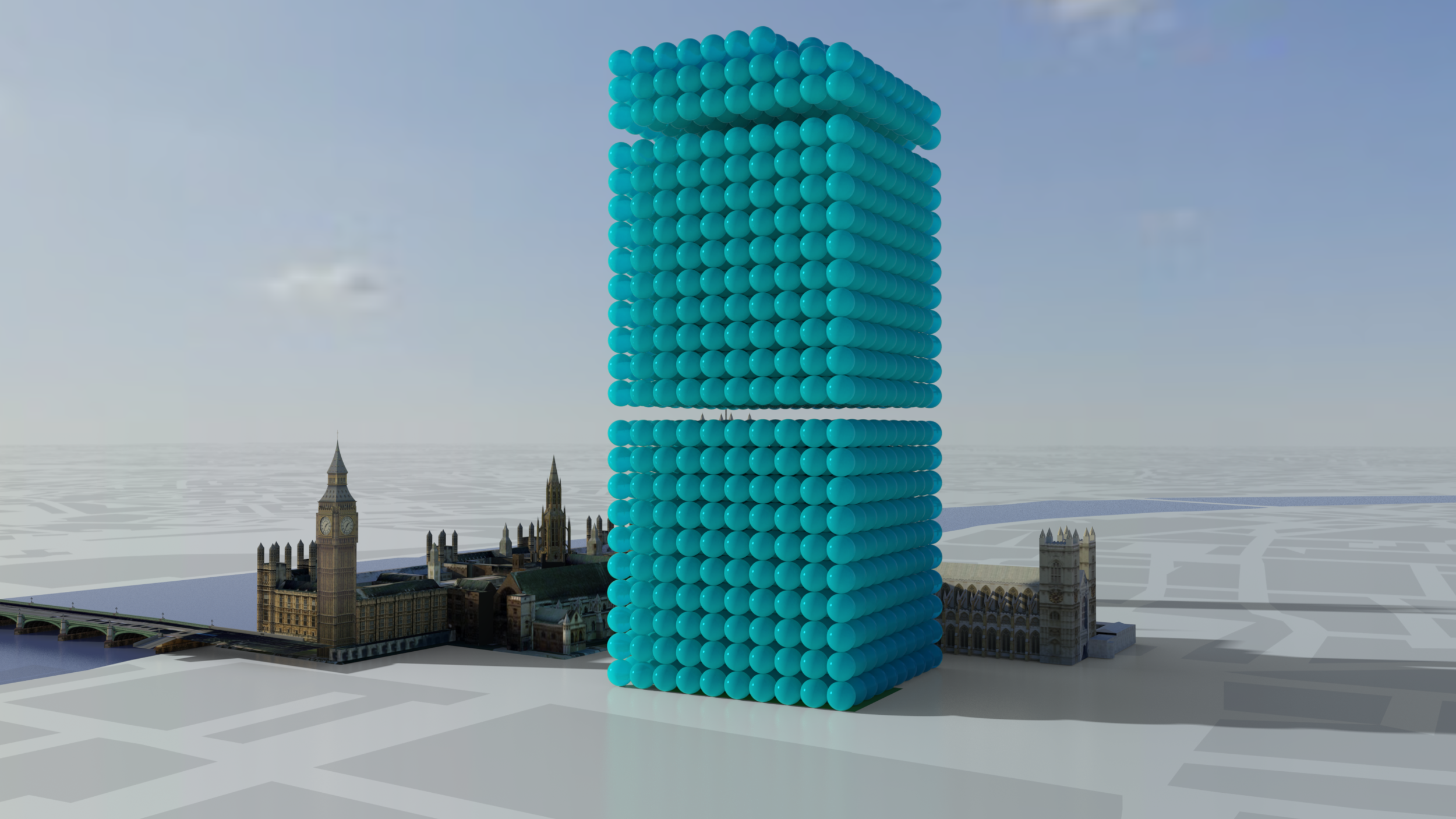
Promoting Carbon Savings
How do you add a ‘wow’ factor to a major bid or proposal where carbon saving is important? This image set was designed to help a global IT company communicate the carbon savings associated with their products.
How do you add a ‘wow’ factor to a major bid or proposal where carbon saving is important? That was the dilemma facing a global IT company who approached us to enhance a major bid to a UK Government Department.

What's the carbon saving from use of client's IT equipment? 2,278 tonnes as one-tonne spheres grouped into blocks of 1000.
“We love these images and will use them or similar from yourself again when the need arises”
In response we quickly created a collection of images that enabled their project on carbon savings to ‘come alive’. The images use the Real World Visuals data visualisation approach by showing volumes of carbon dioxide as stacks of one tonne bubbles. The use of real buildings, such as Big Ben and the Houses of Parliament were relevant to the target audience and draw on people's day to day experience of the world. The use of these real-life scaling objects brings a better sense of scale and relativity to the carbon dioxide bubbles.

Image showing 220 tonnes CO2 saving from a separate IT equipment project
Often we produce various angles of a scene for our clients. In this image, for example, we use an eye level perspective to enable the viewer to relate to the visualisation and information in the image from a bodily point of view.
Real World Visuals now has the capability to produce this kind of image set - showing any CO2 amount - for less than £1,000 in a matter of days. Contact sales@realworldvisals.com for an initial chat and quotation.
Bio-Buildings are carbon 'banks'
Building with bio materials like straw and wood locks up carbon. Seeing the ‘carbon-capture’ potential of these sorts of buildings could help architects, insurers and contractors consider the full potential of working with these natural materials.
We have been visualising how material in construction can have a positive impact on carbon dioxide levels. This is how a building can ‘bank’ carbon through natural construction materials.
UPDATE: July 2021 - we recently updated the video we made for Agile Property and Homes. See below.


Building with bio materials like straw and wood locks up carbon. The visualisation below shows the amount of carbon captured within different materials. The use of bio-based materials has been met with scepticism from architects, insurers and contractors. That is now changing as bio materials become mainstream in the construction industry. Seeing the ‘carbon-capture’ potential of these sorts of buildings could help those in the sector consider the full potential of working with these materials. The bubbles here represent a carbon saving.

TAM in Knowle West, Bristol
Innovative bio building specialists Agile Property and Homes asked us to create a set of images that show the actual embedded carbon dioxide in a typical modular TAM building. The imagery is being used to illustrate the carbon benefits of the companies high quality affordable social housing and alternative lodge homes.
Simple images to bring data alive
Often a simple image set can get across a positive message better than any amount of words, helping people really see success, aspiration and change. This is particularly true in the case of stories of carbon reduction and carbon targets.
Often a simple image set can get across a positive message better than any amount of words, helping people really see success, aspiration and change. This is particularly true in the case of stories of carbon reduction and carbon targets. Image sets like the one below can be used for internal communications campaigns, in annual reports, at corporate events and converted to GIFs for use on social media.


This simple image set illustrates the daily carbon emissions from energy use of a single car dealership as stacks of one pound spheres, and the saving made from the solar PV and LED lighting.
Boulder Nissan is the largest volume dealer for the Nissan LEAF electric vehicles in the central part of the USA. But the dealership is also determined to be 'green' in terms of its own building. So in 2016 the company installed 50kw of solar PV on the roof and fitted LED lighting inside and out in order to reduce its own carbon footprint. You can see the difference it makes!
Download our PDF on simple images here for further information and an introduction to pricing.
University campus emissions brought to life
How do you raise help students and staff better understand the carbon emissions associated with all the different buildings at their university? This prototype carbon and energy visualiser shows the real-time, monthly and annual carbon emissions associated with every building on the different campuses of the University of the West of England (UWE).
Students and staff at the University of the West of England (UWE) can now see the real-time, monthly and annual carbon emissions associated with every building on the different campuses in and around Bristol. Our prototype carbon and energy visualiser has been improved to give faster and smoother operation and also allow viewing on smart phones, tablets and full-sized screens.
Open in full-width new window.
UWE has made a commitment to reduce absolute carbon emissions by 22.5% and a 50% relative reduction of energy by 2020 (over 2005 baseline). This means that no matter how many buildings, or students, are at UWE Bristol overall carbon emissions must be reduced. The university is on course to meet this ambitious target but to reach it everyone on campus needs to be aware of the challenge and actions they can take to help.
“This is a really practical tool for our colleagues and students here at UWE Bristol, helping people make a connection between their day-to-day actions and carbon reduction. The beauty of the visualiser is it will work for staff, students, academics and also the thousands of visitors to the University every year. The potential for impact in meeting our commitment of a 50% carbon reduction is significant.”
“It is hard to act on a problem when its cause is invisible. Building managers and building users both understand the importance of energy efficiency and reducing greenhouse gas emissions, but only building managers have a feel for the scale of the problem and the impact of changing behaviour. This visualiser helps make emissions real for building users, which is the first step to proper engagement with the problem.”