
Communicating vital scientific services
How do you communicate complex services for the scientific community in ways that are not only true to the science but also make sense to a general, non-scientific audience? These two films show the services provide by Copernicus, the EU satellite monitoring programme.
A Carbon Visuals Project
CLIENT
ECMWF (European Centre for Medium-Range Weather Forecasts)
PURPOSE
Create a set of short films that explain the Copernicus Climate Change and Atmosphere Monitoring Services that ECMWF carries out on behalf of the European Commission.
DESCRIPTION
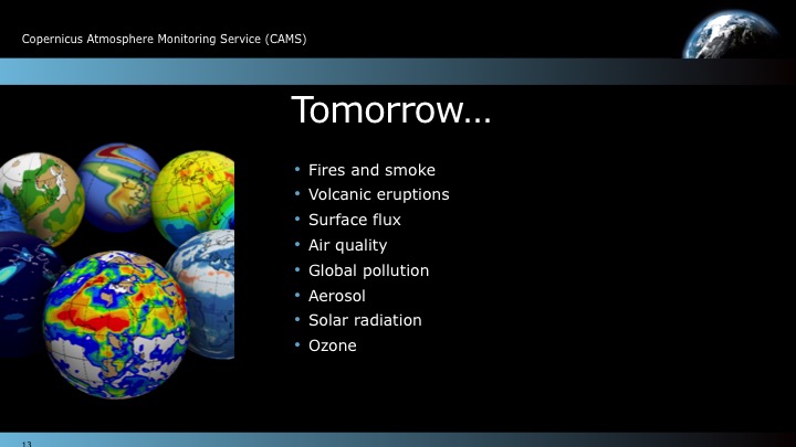
Carbon Visuals created a film that shows the overall Copernicus services, as well as separate films for each service. These films highlight our ability to help communicate complex services for the scientific community in ways that are not only true to the science but also make sense to a general, non-scientific audience. In addition we designed a set of PowerPoint slides for ECMWF scientists to use at key events.
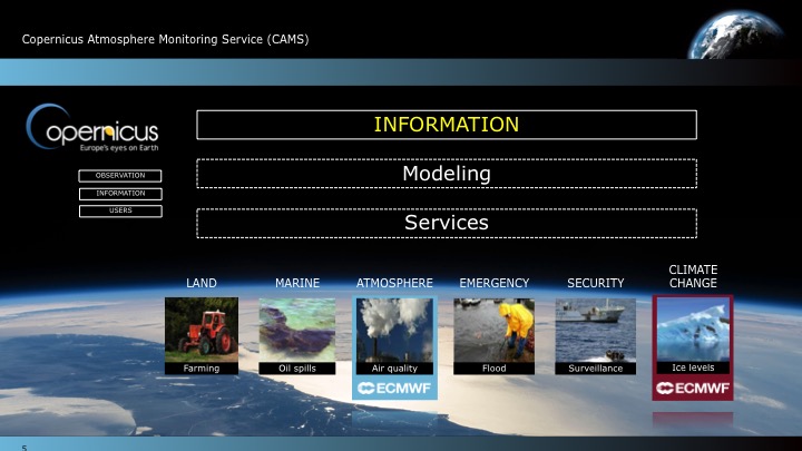
Copernicus is the European Union's (EU) flagship programme on monitoring the Earth’s environment using satellite and in-situ observations. Copernicus delivers operational data and information services on a range of topical areas.
See more at: http://climate.copernicus.eu/ / http://atmosphere.copernicus.eu/


Creating a digital campaign for UNEP
We created digital campaign resources for UNEP to celebrate 30 years of international effort to protect the ozone layer. A key film highlights the dangerous global warming potential of replacement gases, and the 135 billion tonnes of CO2e that the Montreal Protocol has kept out of the atmosphere.
A Carbon Visuals Project
Carbon Visuals won the contract to provide resources for a digital campaign for UNEP who wanted to communicate and celebrate 30 years of international effort in protecting the ozone layer. During 2015 we created a series of animations, visual images, print and online interactive communication tools to help communicate what the ozone layer is, where it is in the atmosphere and what has been achieved under the ozone protection regime.
Ozone campaign meets climate change
A short animation that shows the global warming potential of ozone depleting substances and the 135 billion tonnes of carbon dioxide equivalent that the Vienna Convention has kept out of the atmosphere. The film also shows the huge potential climate damage that could be caused by increasing use of HFC gases as substitutes.
“‘The Precious Ozone - the climate connection film’ produced by Carbon Visuals powerfully showed the Montreal Protocol’s contribution to the protection of the ozone layer and the climate and underscored the need to build on this success for further climate benefits, thus enhancing the ability of a range of stakeholders to understand this need and support the ongoing work. ”
Precious Ozone - the size of it
A short animation that gives viewers a sense of scale for how much air there is in the atmosphere and how much of it is ozone.
The Ozone Song
We commissioned a playful song from science composer David Haines which was performed by schoolchildren on World Ozone Day 2015 at the National Marine Aquarium at Plymouth.
Ozone globe

We have created an interactive and self-running globe that displays current ozone distribution and also celebrates each country’s ratification of the Vienna Convention and implementation of the Montreal Protocol.
Click here to visit the interactive Ozone Globe.
2D Air map
This interactive 2D map of the atmosphere allows users to explore the distribution of ozone for themselves. Each white spot represents 10 billion billion billion molecules of ozone. It allows for questions to be raised, such as 'what effect does ozone have on atmospheric temperature?' or 'why does ozone sit where it does in the atmosphere?'. The buttons turn elements of the map on and off, and you can drag the map to explore vertically.
3D Air map
This 3D map of the ozone layer shows a 20 km x 20 km area of land (centered over the peak of Mount Everest) and all the air above it extending to an altitude of 100 km (the edge of space). Each floating particle represents 10 billion billion billion molecules of ozone. The region marked in orange indicates the ozone layer.
Synthesis report design
An additional part of the campaign package was the graphic design and layout of the 2014 Synthesis Report. Download the report here.
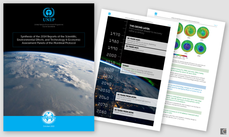
The report was VERY well received. We got a lot of compliments not only on the content but also on the layout and readability. Thanks a million for your excellent work.
Professor A.R. Ravishankara, Report Lead Author
Departments of Chemistry and Atmospheric Science
Colorado State University
Glass sculpture mementoes
We designed and supplied original sculptures depicting the ozone layer in the atmosphere for the chair, co-chair and hosts of the Meeting of the Parties 2-4th November in Dubai.

Photo credit: IISD
See more details of this work by clicking on images below. UNEP web page here.

Resource efficiency in Asia Pacific
A Carbon Visuals Project
CLIENT
United Nations Environment Programme, undertaken by Carbon Visuals
PURPOSE
To convey the scale and complexity of resource use in the Asia Pacific region at a conference of Environment Ministers and subsequently to other audiences.
DESCRIPTION
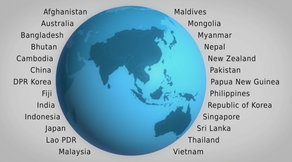
A high impact video and interactive web-tools to introduce and enable easy exploration of a database covering 26 Asia Pacific countries, 157 indicators and 40 years.
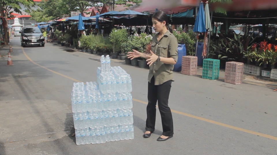
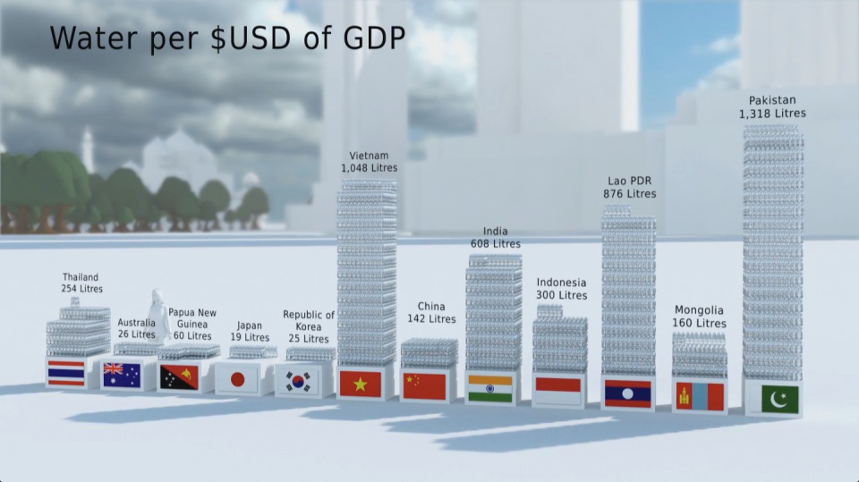
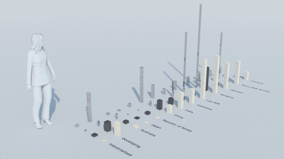
How much natural resources are used to earn one dollar in developing countries in the Asia Pacific region? How do you effectively show water, metal and biomass usage rates across 26 Asian countries - and make it personal and real? What is the best way to visualise a range of environmental resource indicators ‘per GDP’ across countries?
These were some of the challenges set for us by the United Nations Environment Programme (UNEP) in a project undertaken in conjunction with our not-for-profit partner CarbonSense Foundation.
This video has taken our communications to a higher level, and improved our ability to cut across a crowded policy landscape to really help decision makers reflect on resource efficiency.
Janet Salem, UNEP, Bangkok
The brief from the UNEP Bangkok office was to design and create a short, high impact video to convey the scale and complexity of resource use in the Asia Pacific region. In addition a set of interactive web-tools is being provided to complement the film and allow easy exploration of the data.
The film is supporting a database of resource efficiency data covering 26 Asia Pacific countries, 157 indicators and 40 years (1970-2010). The indicators are designed to inform policy development in the region based on the principles of circular economy, sustainable consumption and production principles.*
Resource efficiency is crucial for sustainability but how do you make it real and meaningful at a national and a personal level? To bring such a huge subject up front and personal, we combined live action film introducing very real piles of materials on a table-top with national and regional resource use and impacts made tangible with CGI graphics. And uniquely this project allowed us to explore ways that our creative techniques could be combined with economic data.
Because of the complexity of data and fast-track time schedule the project was carried out in a highly collaborative way, with UNEP staff in Bangkok supporting our creative team throughout the scoping, design and production phases.
The film was used to launch the UNEP Report at a conference on 19th May 2015 attended by Achim Steiner, Executive Director of UNEP, and Environment Ministers and policy makers from the Asia Pacific region.
See the UNEP webpage on project here
Finally - a very special thanks to Janet Salem of UNEP, Bangkok and our film presenter / narrator Patchari Raksawong.
*The database has been developed as a result of a three-year science-based consultative process mandated by countries in the region and coordinated by UNEP, the CSIRO and the Asia-Pacific Roundtable on Sustainable Consumption and Production (APRSCP), with support from the European Union's SWITCH-Asia Programme.
An important part of this project was the creation of an interactive web-tool (see above) allowing policymakers to explore the database in detail in an intuitive way. We created a 'heat map' that allows comparison between a wide range of economic indicators for different countries. Mousing over the countries reveals the actual data. See in new and larger window here.
Carbon Visuals has shown us different techniques to visualize data in a way that can resonate on a meaningful human level, while still giving us creative space for collaboration. We had a lot of fun with the team and it's been a really wonderful partnership.
Janet Salem, UNEP, Bangkok
Ireland's carbon footprint
Ireland's Environmental Protection Agency (EPA) wanted simple visuals to show the country’s carbon footprint. We created a short animation showing the daily emissions in Dublin bay to inform and engage a wide range of audiences, from policymakers to the general public.
CLIENT
Environmental Protection Agency
PURPOSE
To help the EPA inform a range of audiences, from policymakers to the general public, about Ireland’s greenhouse gas emissions.
DESCRIPTION
A short animation showing Ireland’s daily emissions as a large pile of one tonne carbon dioxide bubbles beside the Poolbeg towers in Dublin bay.
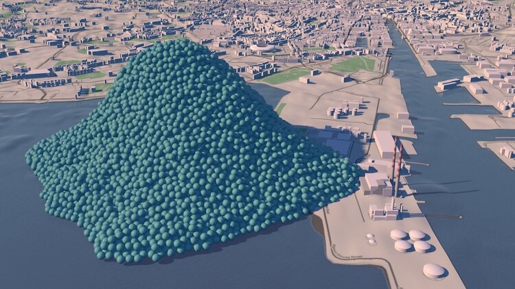

How do you show the carbon footprint of a country? That was the task set by Ireland's Environmental Protection Agency (EPA). The EPA compiles Ireland's annual greenhouse gas emission inventories and projections, which allows the Government to assess progress against key targets, report to the European Commission and UNFCCC and informs policy development and mitigation measures. The EPA also aims to provide up-to-date scientific information to a wide range of audiences, from policymakers to the general public. A simple visual would help to get more people engaged in the issue.
Carbon Visuals created a short animation showing the daily emissions as a large pile of one tonne carbon dioxide bubbles - sitting next to the Poolbeg towers in Dublin bay.
See the EPA webpage here.
TECHNICAL NOTE
The data source for this visualisation is the EPA’s Greenhouse Gas Inventory for 2012 which calculates annual emissions from Agriculture, Energy, Transport, Industry and commercial, Residential and Waste sectors, and was released in 2014.
Each sphere represents one tonne of greenhouse gas as carbon dioxide equivalent - Co2(e). Greenhouse gases other than CO2 (i.e. methane, nitrous oxide and so-called F-gases) may be converted to CO2 equivalent using their global warming potentials.
For 2012, Ireland’s total national greenhouse gas emissions are estimated to be 58,531,238 tonnes or 160,359 tonnes per day.
Carbon dioxide gas at 15 °C and standard pressure has a density of 1.87 kg/m3. At standard pressure and 15 °C a metric ton of carbon dioxide gas would fill a sphere approximately 10 metres across. The video shows a pile of 160,359 spheres 10 metres in diameter located near the Poolbeg Towers in Dublin Bay, with the city behind.
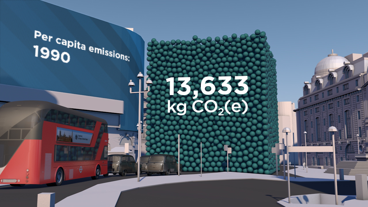
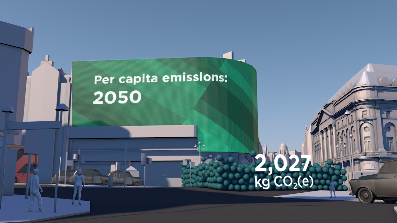
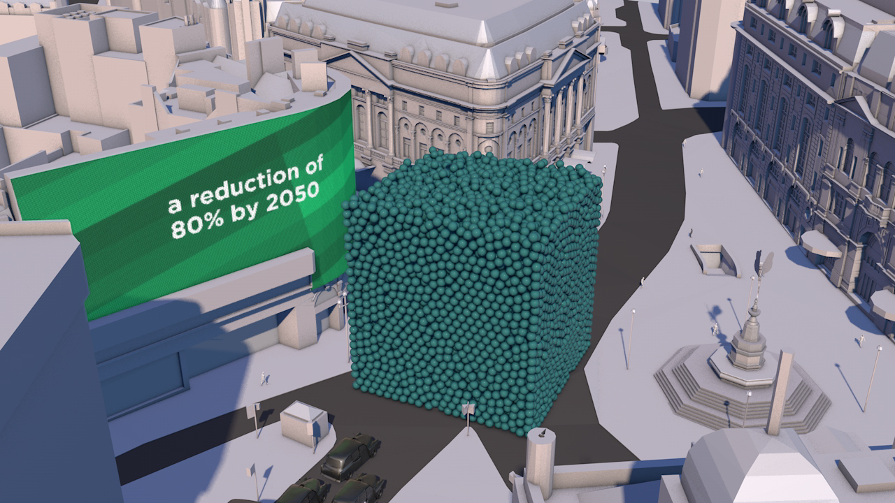
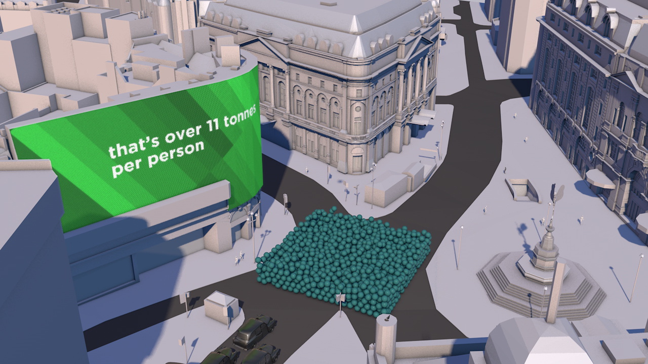
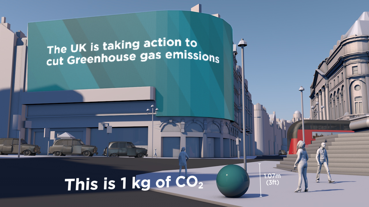
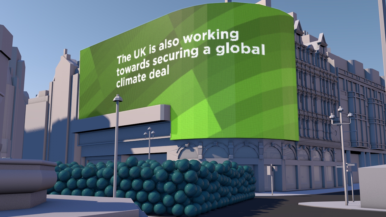
UK 80% reduction target – in Piccadilly Circus
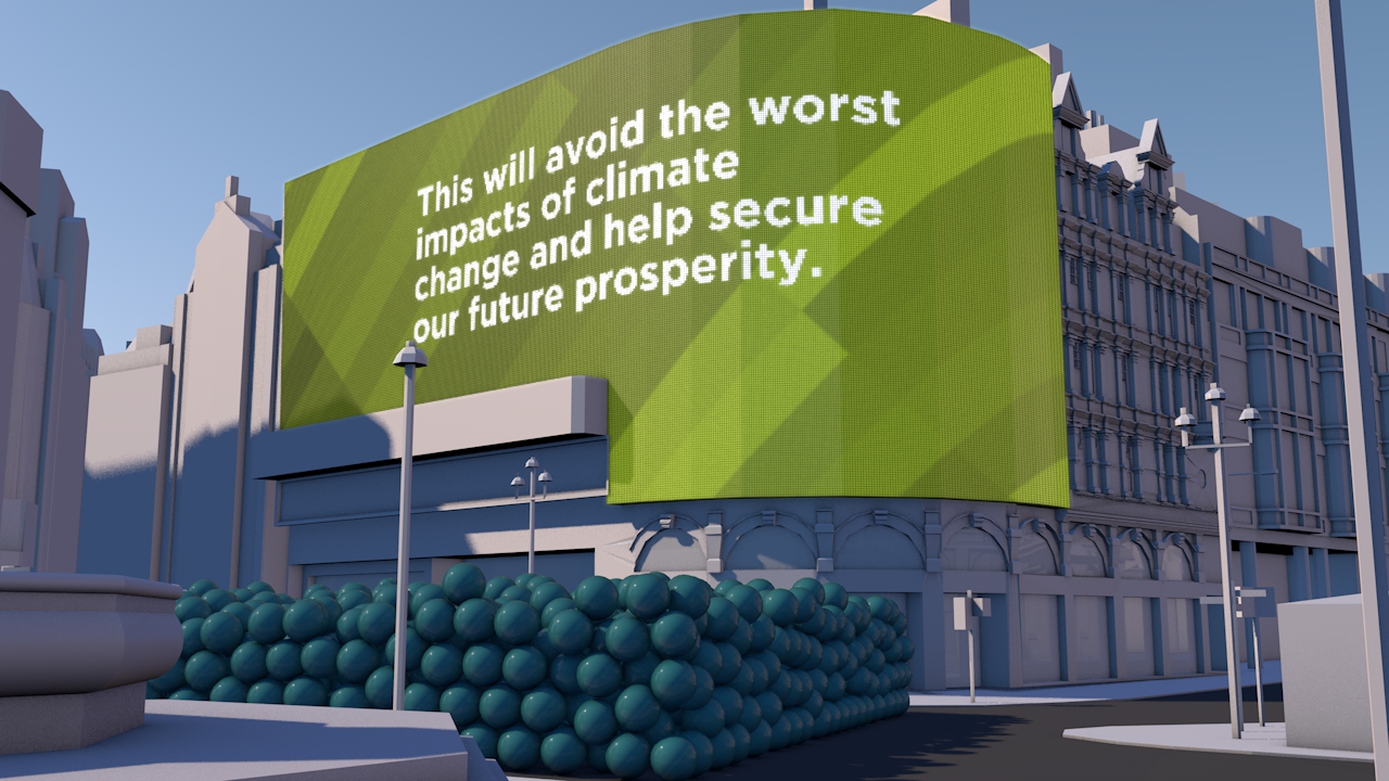
This simple animation was created to highlight the UK Government’s 2050 carbon reduction target of 80%. By using Piccadilly Circus and shifting the scale to that of a single person we were able to create a stir on social media about a 70 page Report.
A Carbon Visuals Project
CLIENT
UK Department of Energy & Climate Change (DECC)
PURPOSE
Use social media to get young people interested in a 70 page report.
DESCRIPTION
An animated drama set in Piccadilly Circus – a popular and iconic gathering place for young and all. The scene is transformed into a memorable moving picture that shows the UK Government’s 2050 target on the scale of one person.
We are very happy with the film, and particularly thrilled that it was our first Vine and had 5000 loops in 5 days.
David Armstrong, Head of eCommunication & Digital Media, DECC

How do you create a stir on Twitter and other social media to get interest in a 70 page Report?
That was the task facing the UK Department of Energy & Climate Change (DECC) who wanted to commission a compelling image set and short animation to draw attention to a new Report - Paris 2015: Securing Our Prosperity Through a Global Climate Change Agreement.
A fast turn-round meant an immediate focus on a key compelling message that could be visualised. Fortunately the UK government has a particularly positive message on carbon - with an 80% reduction target for 2050 enshrined in law. So we set about clarifying the data and thinking through visualisation ideas.
The result: a visual drama set in Piccadilly Circus – a popular gathering place for young and all and itself a unique and iconic location. With captions and messaging appearing as adverts, this immediately recognisable scene is transformed into an eye-catching and memorable moving picture that shows the target on the scale of one person.
See Number 10 Storify page for these images in use.
See video on YouTube. See VINE version
Technical Notes
Raw numbers:
UK Population 1990: 57,237,500
UK Population 2050 (projection): 77,000,000
GHG Emissions 1990: 777.6 MtCO2e
Derived values:
2050 target emissions (80% reduction): 155.52 MtCO2e
Per capita emissions 1990: 13,586 kg
Per capita emissions target 2050: 2,020 kg
Per capita saving target (1990 to 2050): 11,566 kg
Population figures and projections come from Office for National Statistics (ONS); GHG emissions from DECC.
The world’s fossil fuel use and emissions
We made this high budget film to show actual quantities of the current global fossil fuel consumption and carbon emissions. It was shown to world leaders, industry experts, campaigners and scientists at the UN Climate Summit, New York, September 2014 to catalyse and inform conversations about reducing carbon emissions. Jump to the fossil fuel extract here.
A Carbon Visuals Project
CLIENT
World Business Council for Sustainable Development, undertaken by Carbon Visuals
PURPOSE
To engage world leaders, industry experts, campaigners and scientists at the UN Climate Summit, New York, September 2014 and to catalyse and inform conversations about reducing carbon emissions.
DESCRIPTION
Film showing actual quantities of global fossil fuel consumption and carbon emissions, and the part that carbon capture and storage can play in limiting global climate change to 2 degrees.
Among all of the documents, reports and images being released around the UN summit, we hope that this film will stand out and benefit all participants, as well as anyone who watches it around the world.
Peter Bakker President, WBCSD
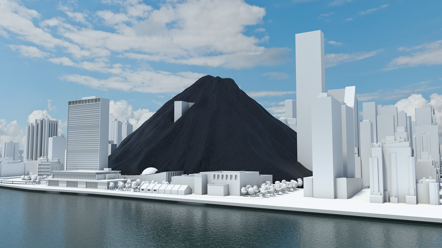
A coal pile buries the UN General Assembly, gas races down 42nd Street and then New York is lost under a blue mountain. These dramatic CGI scenes, depicting actual quantities, create an immersive journey that brings home the scale of global carbon emissions and fossil fuel consumption.
This dynamic four-minute film, being launched at the UN Climate Change Summit in New York September 2014, shows the part that carbon capture and storage can play in limiting global climate change to 2 degrees.
Commissioned by WBCSD and produced by Carbon Visuals, the animation is being shown to world leaders, industry experts, campaigners and scientists at the Summit to help catalyse and inform conversations about reducing carbon emissions.
Key messages of the film:
use of renewables is increasing
but energy use is rising faster
fossil fuel use is increasing not decreasing
if carbon stored in fossil fuel reserves is burnt we exceed 2 degrees warming by 2055
carbon capture & storage (CCS) is an essential part of the 2 degrees solution
Technical note
The volumes of coal, oil, gas and CO2 shown in the film are accurate volumes based on best available data. A detailed Technical Data Methodology document has been produced to accompany the film. This shows all data sources, assumptions on future global renewable and non-renewable energy requirements and the potential of carbon capture and storage technology.
See the Methodology Document for more details
In 2012 we added over 39 billion metric tons of carbon dioxide to the atmosphere. That’s 1,237 metric tons a second.
It is like a ‘bubble’ of carbon dioxide gas 108 metres across entering the atmosphere every second of every day. We could fill a volume the size of the UN Secretariat Building with our carbon dioxide emissions in less than half a second. We could fill it 133 times a minute.
The pile of one metric ton spheres in the film, which represents one day’s emissions, is 3.7 km high (2.3 miles) and 7.4 km across (4.6 miles).
The world gets through a lot of fossil fuels:
7,896.4 million metric tons of coal a year (21.6 million metric tons per day, 250 metric tons per second)
91,330,895 barrels of oil per day (168 m3 per second)
3,347.63 billion m3 of natural gas per year (9.2 km3 per day, 106,082 m3 per second)
This film tries to make those numbers physically meaningful – to make the quantities real; more than ‘just numbers’.
The coal we use each day would form a pile 192 metres high and 546 metres across. We could fill a volume the size of the UN Secretariat Building with coal every 17 minutes. At the rate we use oil, we could fill an Olympic swimming pool every 15 seconds.
This would fill a volume the size of the UN Secretariat Building with oil every 30 minutes.
The rate at which we use natural gas is equivalent to gas travelling along a pipe with an internal diameter of 60 metres at hurricane speeds (135 km/h / 84 mph). We could fill a volume the size of the UN Secretariat Building with natural gas in under 3 seconds.
We use a cubic kilometre of gas every 2 hours 37 minutes and a cubic mile of the stuff every 10 hours 54 minutes.
A set of shorter clips has also been released, featuring some of the most impactful scenes of the main film. These are intended for use by everyone, from industry through to educators and campaigners. Get in touch if you would like hi-res versions.
Main film and extract films can be viewed on YouTube:
All images are available under Creative Commons licence to download on our Flickr page


Making sense of carbon, trees and timber
How much carbon is stored in a tree? How does that translate into cut timber and wood products? And how much carbon can be ‘banked’ by using timber for building houses? This communication project showed the carbon benefits of using wood and timber in the UK construction sector.
A Carbon Visuals Project
CLIENT
Wood for Good, undertaken by Carbon Visuals
PURPOSE
To find a new way to communicate the carbon benefits of using wood and timber in the UK construction sector.
DESCRIPTION
A series of short animated films and case study images using Wood for Good’s data to reach construction professionals, policy makers and the public.
How much carbon is stored in a tree? How does that translate into cut timber and wood products? And how much carbon can be ‘banked’ by using timber for building houses in the UK? These questions are raised and answered in a communication project that includes a series of short animated films and set of case study images created by Carbon Visuals for Wood for Good, the UK's wood promotion campaign. The aim was to find a new way to communicate the positive carbon benefits of using wood and timber in the UK construction sector not just to construction professionals but also policy makers and the public.
“The competence and skill you have in handling large data sets is absolutely fantastic. And you still delivered a wonderful set of visuals for us that we can continue to use for a long time to come.”
Given the wide nature of the brief we agreed with the client to start the project with a scoping phase. During this, it was decided to split the film into three separate sections that could each work as short stand-alone films, rather than only as one single complex narrative. In addition we agreed to create a set of case study best practice images showing the carbon ‘banked’ in high profile buildings and timber products.
“It has been very satisfying to shape and create a project which has both a business focus and important educational potential. I would like to see us working with more trade bodies and campaigns that have an important carbon message to get across.”
By liaising closely with the client in this initial phase we were able to spend time working up a communications plan, sourcing and examining appropriate data and creating draft film storyboards. This established a sound basis for the production schedule, culminating in all visual materials being ready for the campaign launch.
Data Sheet with methodology, data and references available here.
See Wood for Good website page here.
See our post-production video (giving insight from our clients on the project) here.
Illustrating a 90% carbon reduction
A Carbon Visuals Project
CLIENT
Interface, undertaken by Carbon Visuals
PURPOSE
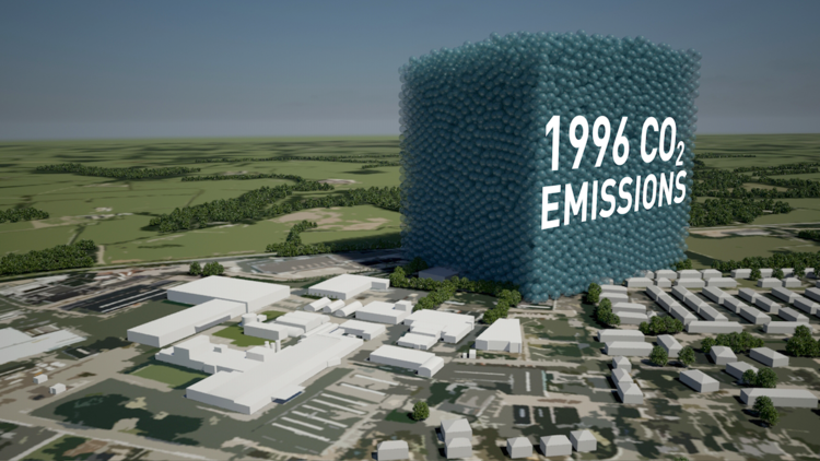
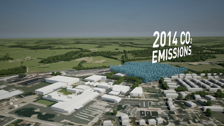
To show the 90% carbon reduction achieved since 1996 at the European manufacturing facility in the Netherlands.
DESCRIPTION
Short animation that can be used on social media together with before and after images showing the Scherpenzeel factory and surroundings with the dramatic reduction in emissions.
In the past three years we have taken huge strides towards our Mission Zero goal.
To put it in context, we are now operating our European factories with a 90% reduction in greenhouse gas emissions compared to 1996 while the EU Commission has set an EU carbon reduction target of 40% by 2030.
Rob Boogaard, CEO Interface Europe
Carbon Visuals has helped Interface, the carpet tile manufacturer and pioneer in corporate sustainability, show the impressive 90% carbon reduction achieved since 1996 at its European manufacturing facility in the Netherlands.
We created a 3D model of the Scherpenzeel factory and surrounding area and populated it with our trademark ‘carbon bubbles’. Deliverables included volumetrically accurate ‘before’ and ‘after’ images as well as a short animation that can be used on social media or as part of a longer video.
Interface info on achieving 90 carbon reduction
Infographic illustrating how the emissions reduction has been achieved.
Video: A better way - Interface Europe achieves 90% CO2 reduction


Visualising a 90% carbon reduction
How do you demonstrate a 90% carbon reduction? We provided a short animation to show this impressive 90% achievement at the European manufacturing facility of Interface, the carpet tile manufacturer and pioneer in corporate sustainability.
A Carbon Visuals Project
CLIENT
Interface
PURPOSE
To show the 90% carbon reduction achieved since 1996 at the European manufacturing facility in the Netherlands.
DESCRIPTION
Short animation that can be used on social media together with before and after images showing the Scherpenzeel factory and surroundings with the dramatic reduction in emissions.
“In the past three years we have taken huge strides towards our Mission Zero goal.
To put it in context, we are now operating our European factories with a 90% reduction in greenhouse gas emissions compared to 1996 while the EU Commission has set an EU carbon reduction target of 40% by 2030.”
Carbon Visuals has helped Interface, the carpet tile manufacturer and pioneer in corporate sustainability, show the impressive 90% carbon reduction achieved since 1996 at its European manufacturing facility in the Netherlands.
We created a 3D model of the Scherpenzeel factory and surrounding area and populated it with our trademark ‘carbon bubbles’. Deliverables included volumetrically accurate ‘before’ and ‘after’ images as well as a short animation that can be used on social media or as part of a longer video.
Interface info on achieving 90 carbon reduction
Infographic illustrating how the emissions reduction has been achieved.
Video: A better way - Interface Europe achieves 90% CO2 reduction
Illustrating the world’s first Carbon Neutral Engine Oil
How do you visualise carbon offsetting for a consumer product? This animation was created to demonstrate that although the amount of CO2 offset for a single one litre pack of engine oil might be small, it adds up. Particularly when seen from the point of view of a whole country, or indeed world sales.
A Carbon Visuals Project
CLIENT
Castrol Professional, undertaken by Carbon Visuals
PURPOSE
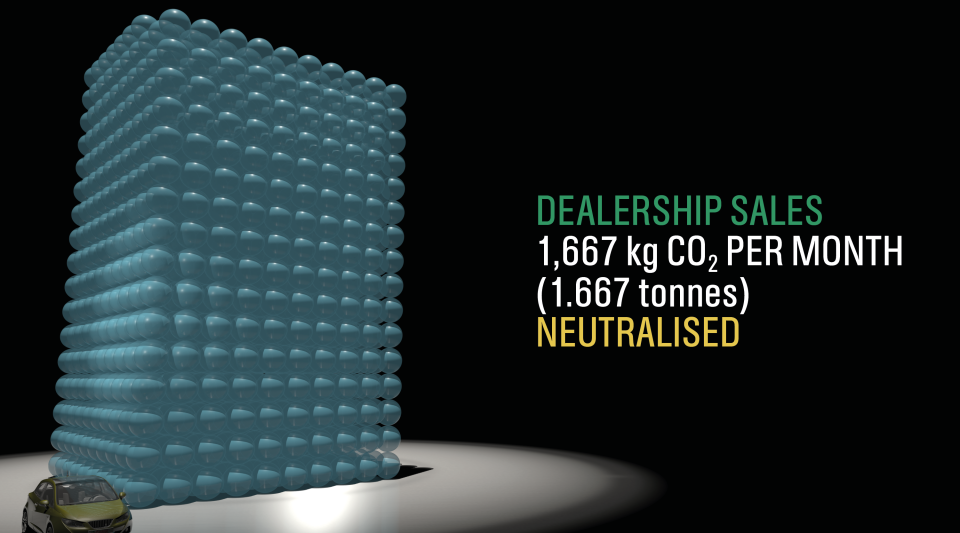
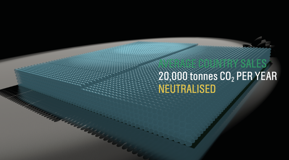
To help their dealers understand that although the amount of CO2 offset for a single one litre pack of engine oil might be small (2 kg), it adds up. Particularly when seen from the point of view of a whole country, or indeed world sales.
DESCRIPTION
An animated film for the European dealer launch at CERN in Switzerland of ‘the world’s first CO2 Neutral Engine Oil’.
A resounding success - thank you for turning this round so quickly. We are very happy with the final product and it was well received last week at CERN.
Adrian Pask, Global OEM Offer Development Manager Castrol Professional
How do you visualise carbon offsetting? This is, after all, carbon removed from the air to mitigate actual emissions. That was the challenge facing us when asked by Castrol Professional to create an animated film for the European dealer launch at CERN in Switzerland of ‘the world’s first CO2 Neutral Engine Oil’.
Castrol wanted a way to help their dealers understand that although the amount of CO2 offset for a single one litre pack of engine oil might be small (2 kg), it adds up. Particularly when seen from the point of view of a whole country, or indeed world sales.
Rather than showing the CO2 emitted in the manufacture of a consumer product, our role was to show that Castrol ‘neutralised’ those emissions. We set about writing and developing a story-board that could be animated in record time (we had less than a month to complete the project).
Background
Castrol Professional products have become the first CO2 neutral engine oils in Europe. EDGE Professional, MAGNATEC Professional and GTX Professional have all been certified CO2 neutral according to BSI PAS2060, a standard for measuring and managing the CO2 footprint of a product’s life cycle.
The company underpins its CO2 neutral claims with good science including reduction in the manufacturing process. It offsets the remaining CO2 by investing in a portfolio of emission reduction projects such as reforestation in Kenya, clean electricity generation in China and wind farms in New Caledonia.
In 2014, 200,000 tonnes of CO2 are likely to be neutralised globally by Castrol Professional. This figure is expected to grow to nearly half a million tonnes annually the following year.
More on Castrol Professional
More on CO2 reduction projects being supported by Castrol Professional
Tackling CO2 emissions is a major issue for the automotive industry globally and Castrol Professional has made this a central part of our working relationship with manufacturers and dealers, as we develop ever-more sophisticated engine oil formulations.
This is a practical step towards a longer commitment to innovate sustainably through continued technological and scientific advancement.
John Ward-Zinski, Global Brand Director Castrol Professional
To cover so many visualisations in 90 seconds with a strong product focus was potentially a tall order. Looping our narrative through a virtual world within the pack itself encourages viewers to explore and re-explore this complex story.
Dave Forman, Project Manager / Designer Carbon Visuals
The brevity and directness of this film gives staff, dealers and consumers an easy and quick feel for the product and emissions saved on a range of scales from a litre to half a million tonnes.
Antony Turner, CEO Carbon Visuals


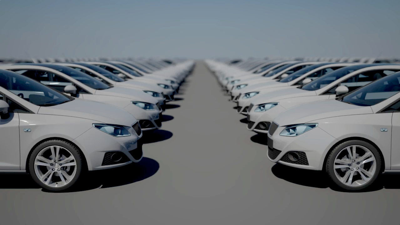
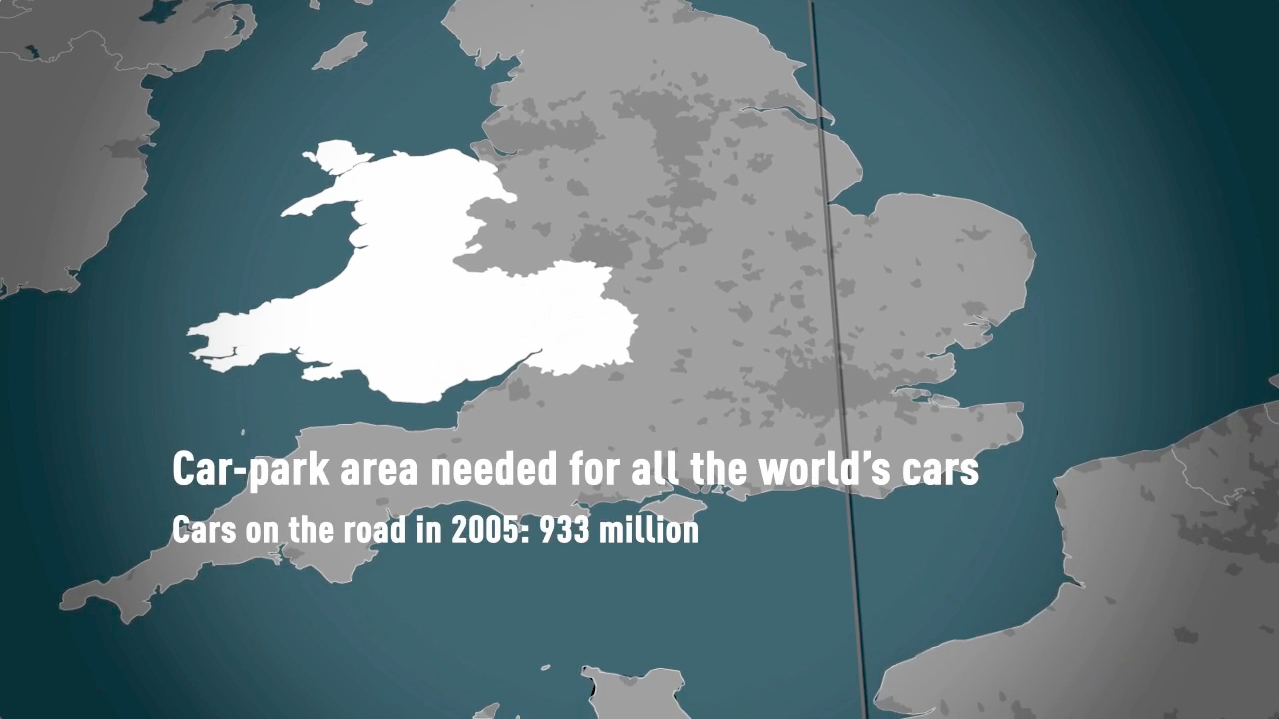
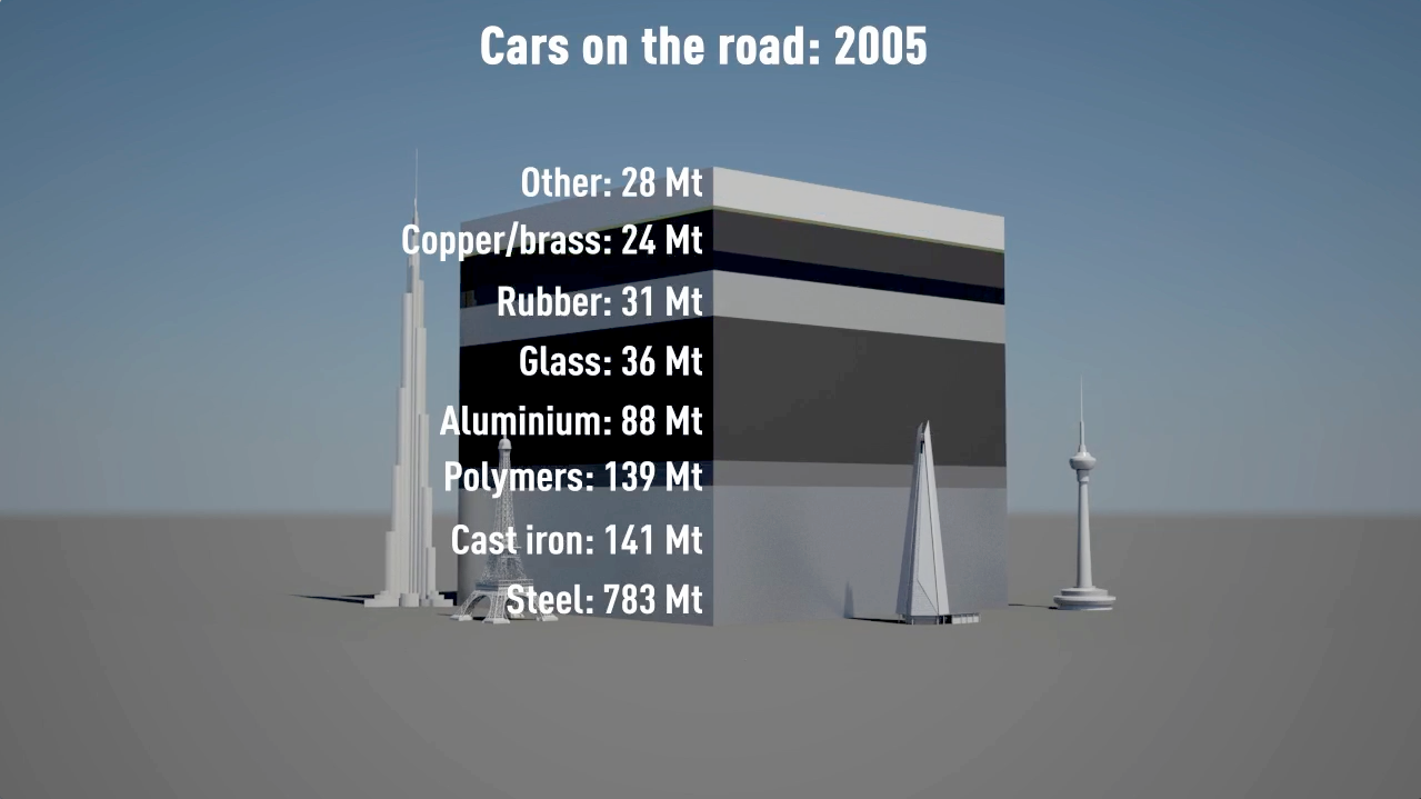
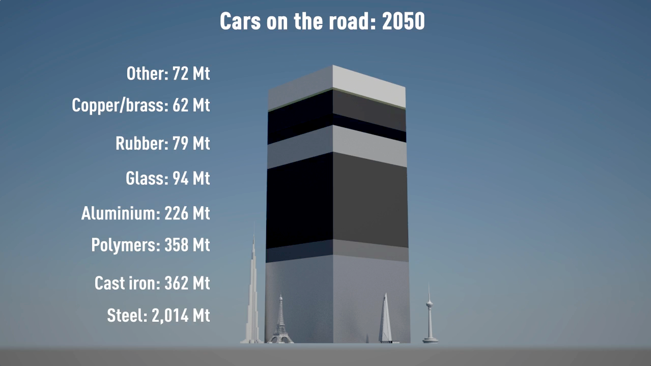
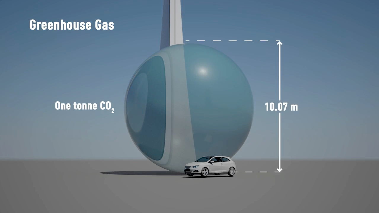
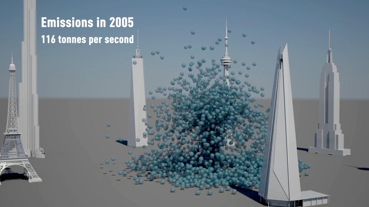
Animating the world's cars
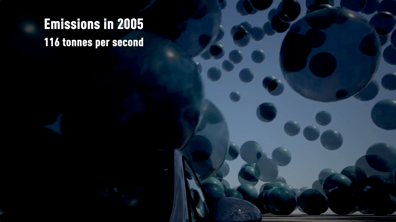
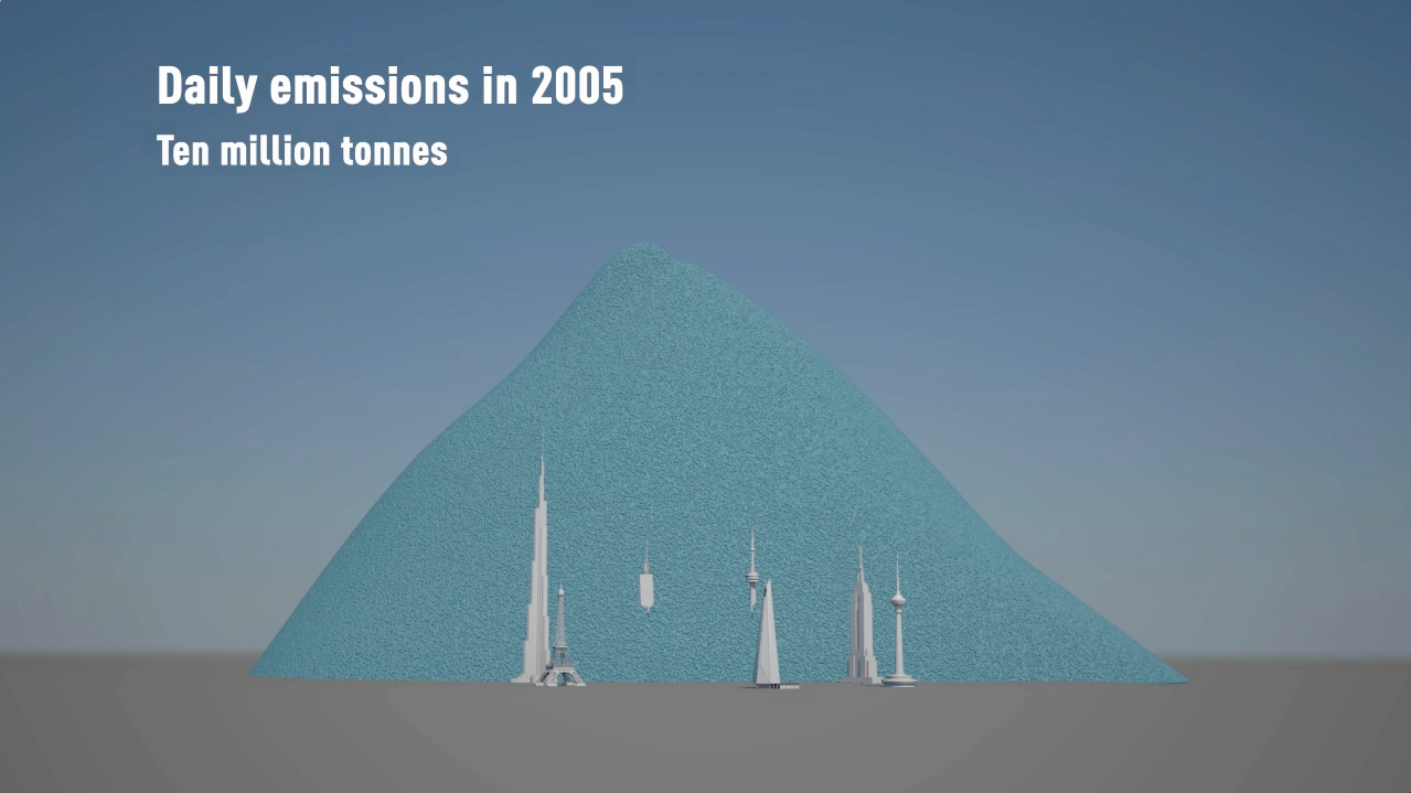
Watch a car explode into pieces! The film dramatically shows the current and expected resource use and parking spaces required for all the world’s cars. It also shows the carbon emissions of cars today and what those would be in 2050.
A Carbon Visuals Project
CLIENT
University of Cambridge
PURPOSE
Film for an on-line, interactive training programme aimed at mid-career, high-potential and senior managers using data collated in collaboration with the University of Cambridge Department of Engineering.
DESCRIPTION
Film showing the current and expected resource use of all the world’s cars, as well as the CO2 emissions of cars today using data collated in collaboration with the Department of Engineering.
...the digital masters at Carbon Visuals are back with a whirlwind tour of the world's cars and the resulting resource and climate pollution impacts. More
Barry Saxifrage Vancouver Observer
A short animated film from Carbon Visuals is being used to engage managers around the world about the fundamentals of sustainability, how sustainability is relevant to their role and its importance to business success.
Created for the University of Cambridge Institute for Sustainability Leadership (CISL), the film shows the current and expected resource use and parking space of all the world’s cars, as well as the CO2 emissions of cars today.
The film is being used as part of an on-line, interactive training programme developed by CPSL and aimed at mid-career, high-potential and senior managers, the majority located outside of Europe and North America. It allows users to explore a simplified automotive industry value chain using data collated in collaboration with University of Cambridge Department of Engineering.
The idea from the beginning was to make a film that was simple and fun. Our aim was to provide genuine new insight into the industry – not mere statistical insight but a powerful sense of scale that fills the gap between direct experience and numerical reasoning.
And we hoped that the film would stimulate a hunger for answers to the question “what can we do to change course?”
Dr Adam Nieman, Creative Director, Carbon Visuals
See here for information on CISL's Business & Sustainability Programme (BSP) Online training.
Note: 2005 data was used as this is most recent verifiable.
Carbon Visuals brings radical emissions data to life
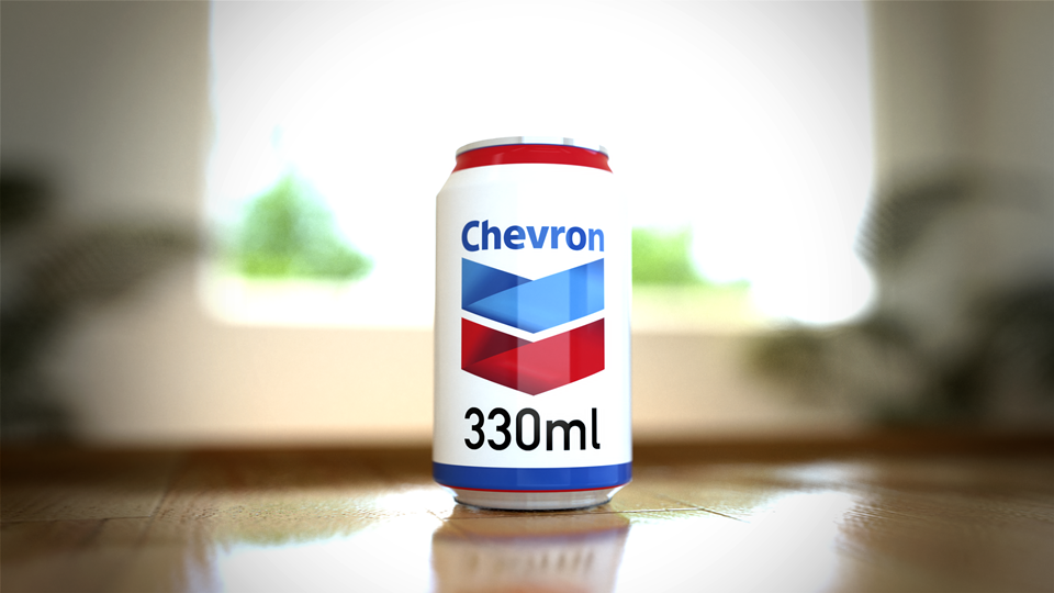
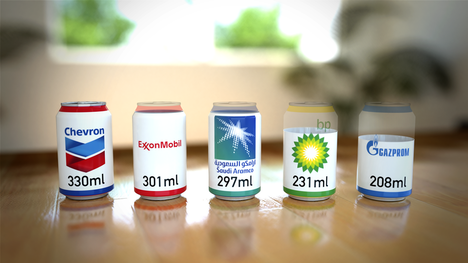
We created a range of striking graphic images to highlight the institutions responsible for extracting the oil, coal and gas that’s causing warming of the planet. This included drink cans part-filled with carbon dioxide gas to show by volume precisely how much is in a typical small room as a consequence of these companies’ extractions.
A Carbon Visuals Project
CLIENT
Carbon Majors
PURPOSE
To give a feel for the scale of the cumulative emissions and show the extent to which corporations are responsible.
DESCRIPTION
Key information from a huge array of data, conveyed in both conventional and novel ways.
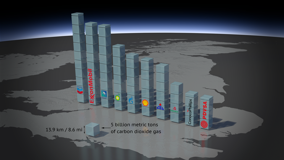
The Carbon Majors report, launched November 2013, is accompanied by striking graphics from Carbon Visuals which show the extent to which corporations are responsible for the cumulative emissions causing climate change.
Key information from a huge array of data has been conveyed by Carbon Visuals in both conventional and novel ways to give a feel for the scale of the cumulative emissions involved.


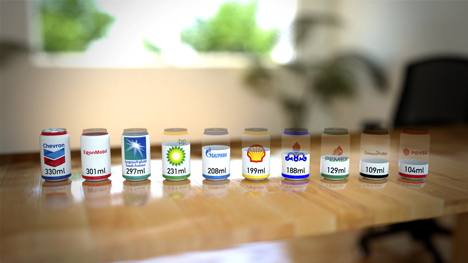
Amongst the visuals, perhaps most novel of all are the drink cans branded with well known names such as Chevron, Exxon, Aramco, BP and Gazprom which are presented as if filled – in the case of Chevron – or part-filled with carbon dioxide gas to show by volume precisely how much carbon dioxide is in a typical small room as a consequence of these companies’ extractions.
At the other end of the scale, 2010 emissions alone are shown at a real-time rate over the course of one minute.
The Carbon Majors project is the culmination of eight years of combing through publicly available records about fossil fuel extraction from all across the globe and detailed analysis of the data. It covers oil, coal, natural gas and cement production from the 1850s through 2010.
For the first time, the Carbon Majors report names the institutions responsible for extracting the oil, coal and gas that’s causing warming of the planet. Instead of allocating between countries, as has up to now been the case, any institution that produced more than eight million tonnes of carbon dioxide in any given year is identified in the study together with their cumulative contribution to the problem we all now face.
This research report shows that 90 companies, countries and nationally-owned operations are responsible for extracting nearly two-thirds of industrial carbon and methane. Fifty of these are investor-owned companies, thirty one are state-owned companies and nine are countries.
In order to help communicate the findings of this important new research, Carbon Visuals has worked closely with the Carbon Majors team to create a number of different and engaging images, animations and infographics. The aim is to help introduce a wide range of audiences to data within the report, including that important audience - the person in the street who has yet to make sense of carbon emissions and climate change.
This interactive allows you to explore the Carbon Majors data, but also shows the remaining atmospheric carbon budget available to have a reasonable chance of keeping average global warming below 2 degrees Celcius. Move the slider to see the rapidly diminishing global carbon budget.
A short video experiment to show the realtime CO2 emissions attributed to 'Carbon Majors'.
To enable easy access to visuals that accurately represent the data in the report all high resolution visuals are available for download under Creative Commons licence at Flickr:
More information on the Carbon Majors Project including downloadable report and data here.
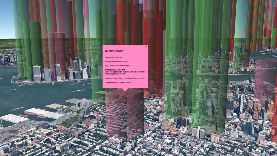
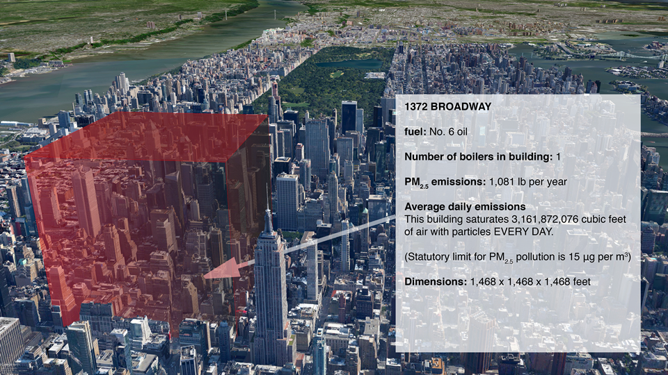
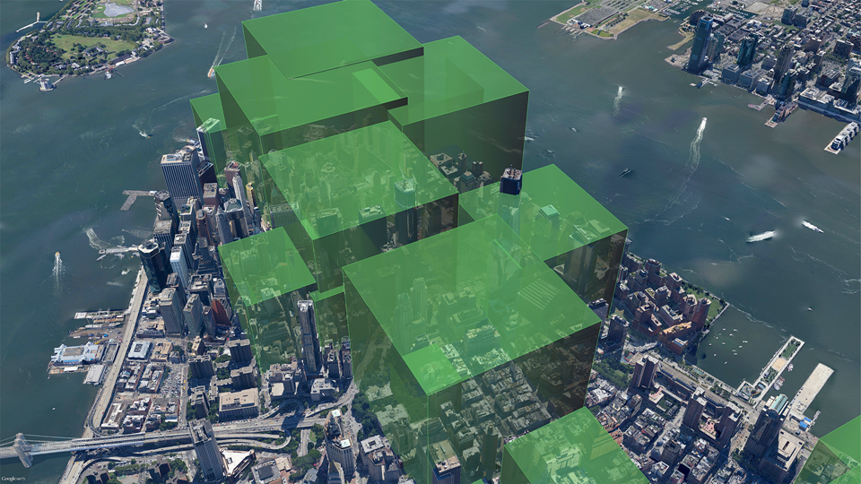
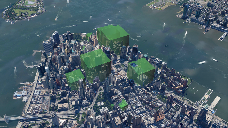
Mapping local air pollution in New York
We created a set of images pinpointing the air pollution from burning heavy heating oil at 8,000 buildings in New York City. Individual images showed property managers, building co-op boards and community groups their resulting air pollution and encouraged them to make positive changes.
A Carbon Visuals project
CLIENT
New York City Clean Heat Program
PURPOSE
To help New York property managers, building co-op boards and community groups reduce local air pollution from their buildings.
DESCRIPTION
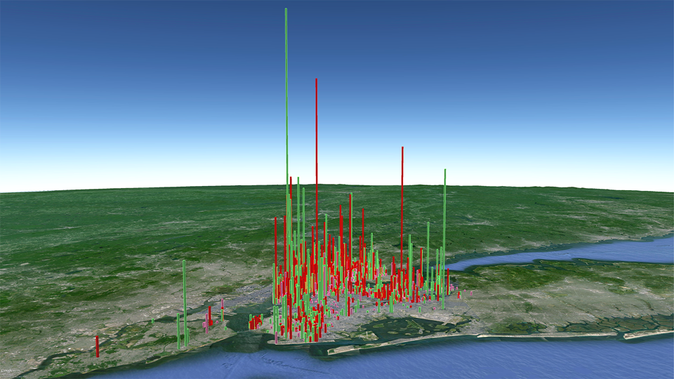
A set of before and after images showing volumes of air saturated with particulates, created using our Google Earth Visualiser tool.
Visual images created by Carbon Visuals are being used to help New York property managers, building co-op boards and community groups reduce local air pollution from their buildings.
Around 8,000 buildings in New York City have been burning heavy heating oil. These contribute more soot pollution than all cars and trucks on the City’s roads. The NYC Clean Heat program seeks to improve air quality and save lives in New York by eliminating heavy oil use and accelerating the adoption of cleaner fuels.
Carbon Visuals was asked by Clean Heat project partner Environmental Defense Fund to look at ways to visualise the emissions of fine particulate matter (PM2.5) in order to encourage building owners and operators to sign up to the program.
Visualising quantities of particle pollution is not easy. The air that supports the particles plays a part in making them dangerous to health (by itself, a pile of powder is not a threat)!
The Clean Heat project team have used the visuals for individual building outreach and in presentations. They have found that those buildings that receive visual prompts are very likely to get in touch with the program.
How we created the images
We used our Google Earth Visualiser tool in a new way. Usually we use it to show volumes of carbon dioxide emissions but we chose to visualise particle pollution in terms of the volume of air it 'saturates' up to the legal limit*. The coloured volumes represent air that is 'full' of particles.
Of course, particle pollution doesn't actually work so neatly. It gets mixed up and you will find an uneven distribution in city air, but the object here is to visualise the scale of emissions.
More info on EDF's Clean Heat Project. Dedicated NYC Clean Heat website
* Max density of PM2.5 pollution averaged over an annual period: 15 μg/m3 EPA Regulator ref: 40 CFR 50.7(a)
Thank you so much for your wonderful work! We have found your visuals an incredibly useful tool both for direct building outreach as well as for our marketing campaign. Our colleagues at the Mayor’s Office have also let me know how impressed they are.
Abbey Brown , NYC Clean Heat Coordinator, Environmental Defense Fund
A comprehensive set of images can be seen in this downloadable PDF Presentation.
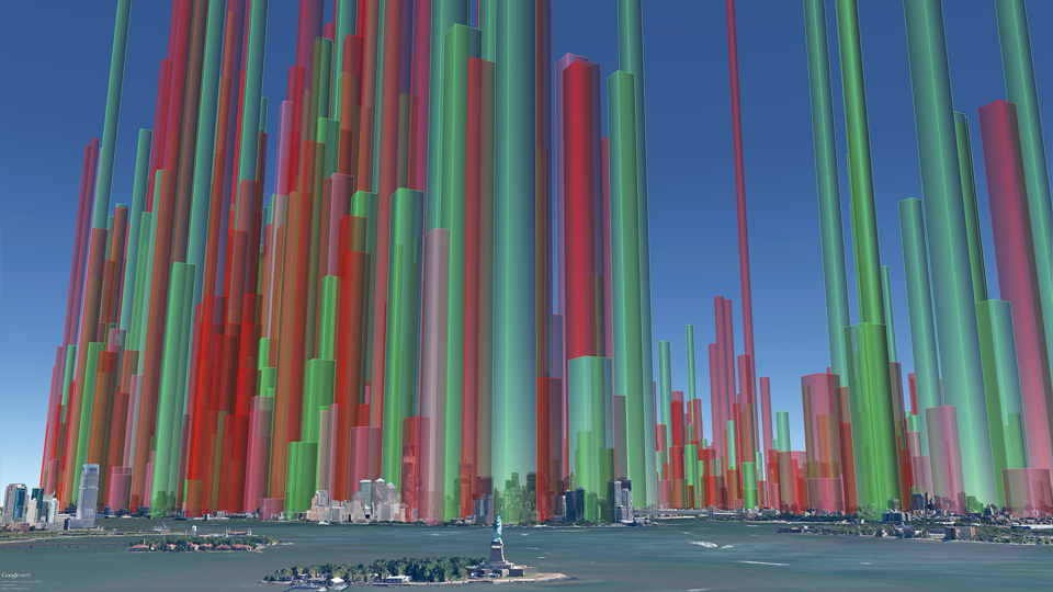
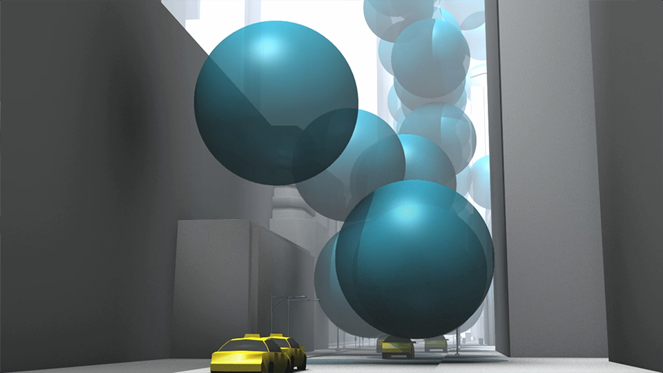
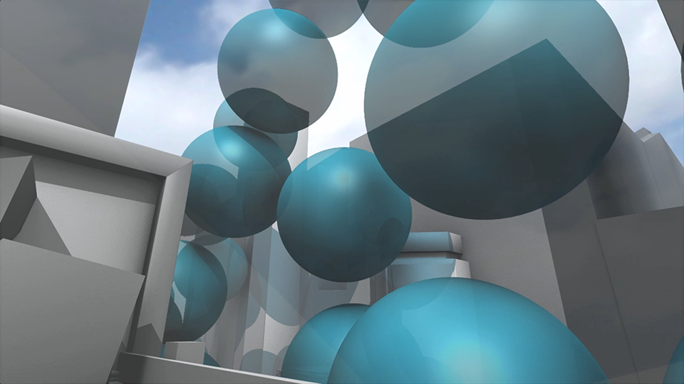
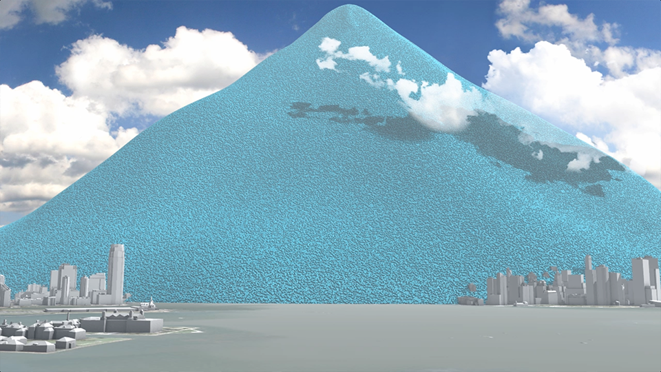
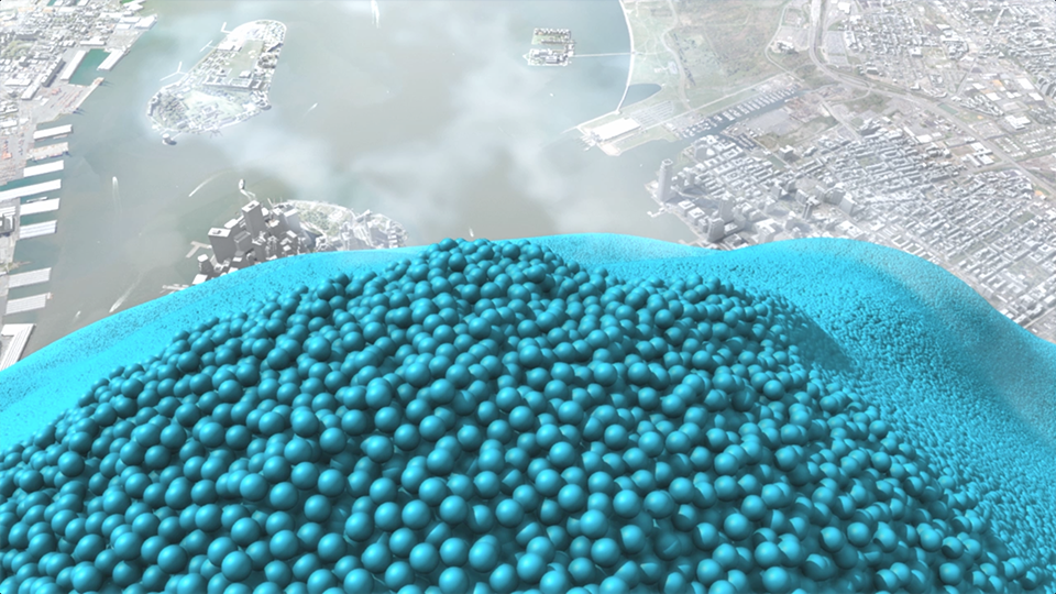
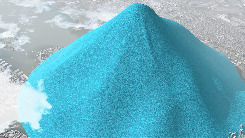
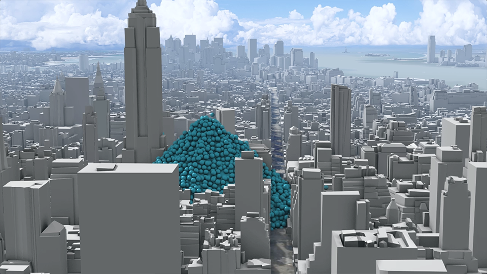
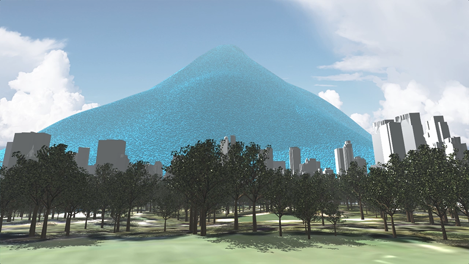
New York's carbon emissions
Our 2012 award-winning three minute animated film shows the carbon emissions of New York City. Featured by over 100 media organisations including Scientific American, Mashable, New Scientist and Daily Mail Online the film does not even mention climate change. Yet it’s been viewed over 380,000 times on YouTube.
A Carbon Visuals Project
CLIENT
Exploratory project supported by Environmental Defense Fund
PURPOSE
To apply our developing visualisation approach to the challenge of engaging the ‘person on the street’.
DESCRIPTION
Dynamic animation showing total emissions and the rate of emissions of New York City and viewed over 450,000 times.
In 2010 New York City added 54 million metric tons of carbon dioxide to the atmosphere (75% from buildings, the bulk of the rest from transport) but that number means little to most people because few of us have a sense of scale for atmospheric pollution.
Carbon Visuals, supported by Environmental Defense Fund, have created a film that makes those emissions feel more real - the total emissions and the rate of emission. Designed to engage the ‘person on the street’, this version is exploratory and still work in progress.
Emissions in 2010 were 12% less than 2005 emissions. The City of New York is on track to reduce emissions by 30% by 2017 - an ambitious target. Mayor Bloomberg’s office has not been involved in the creation or dissemination of this video.
See how we can help cities engage their citizens in carbon issues.
For the technically minded:
In 2010 (the latest year for which data is available) New York City added 54,349,650 metric tons of carbon dioxide to the atmosphere = 148,903 tons a day = 6,204 tons an hour = 1.72 tons a second.
City of New York, Inventory of New York City Greenhouse Gas Emissions, September 2011, by Jonathan Dickinson and Andrea Tenorio. Mayor’s Office of Long-Term Planning and Sustainability, New York, 2011
At standard pressure and 59 °F a metric ton of carbon dioxide gas would fill a sphere 33 feet across (density of CO₂ = 1.87 kg/m³).
If this is how carbon dioxide gas was actually emitted in New York we would see one of these spheres appear every 0.58 seconds.
This is how the size of the piles was calculated:
CO2 volume for a year: 29,063,983,957 metres cubed (= cube with sides 3,075 metres) CO2 volume for a day: 79,627,353 metres cubed (= cube with sides 430 metres)
packing density for unordered spheres: 0.64
Spheres volume for a year: 45,412,474,933 metres cubed (= cube with sides 3,568 metres) Spheres volume for a day: 124,417,739 metres cubed (= cube with sides 499 metres)
A 'pile' is somewhere between a hemisphere and a cone that has equal radius and height. So the height will be somewhere between the height of a hemisphere and height of a cone which each have the spheres volume:
Height of annual hemisphere: 2,789 metres; height of annual cone: 3,513 metres Height of daily hemisphere: 390 metres; height of daily cone: 492 metres

A selection of websites and blog posts where the New York emissions video has been displayed
MEDIA INFORMATION
The Carbon Visuals video of New York's emissions features in over 100 articles and blogs. Here is a selection:
New York's carbon emissions visualised - as giant spheres, Simon Rogers,Guardian Data Blog
Think New York Has a Small Carbon Footprint? Watch This Video, Eric Larson, Mashable
NYC Carbon Footprint: Imagining Gotham's Greenhouse Gas Emissions As One-Ton Spheres, Huffington Post
Video: What does NYC’s carbon footprint “look” like? Melissa C. Lott,Scientific American
Mountain of balls engulfs New York to show emissions, Sandrine Ceurstemont, New Scientist TV
What If You Replaced All of New York City’s Carbon Dioxide Emissions with Big Blue Bouncy Balls? Smithsonian Blog
NYC’s carbon footprint visualized in turquoise bubbles, Jordana Divon,Daily Buzz
NYC’s Carbon Footprint Visualized As Blue Blobs, Carl Franzen, TPM Livewire
The Mayor Warns Us Of NYC's Carbon Emissions... With Balls!John Surico,The Village Voice
New video shows New York City's carbon footprint as turquoise bubbles, Daniel Martin, The Weather Network
This Week’s Scariest Video Comes From New York’s Mayor, Randall Gross,Little Green Footballs
New York City's greenhouse gas emissions visualized, Lucinda Broad,2 Degrees Network
Stunning video shows how quickly streets of New York would be buried up to Empire State Building by just on day's emissions MailOnline
The Co-director of the New York carbon emissions film was: Chris Rabét
A set of high resolution stills is available on Carbon Visuals Flickr page
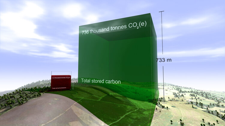
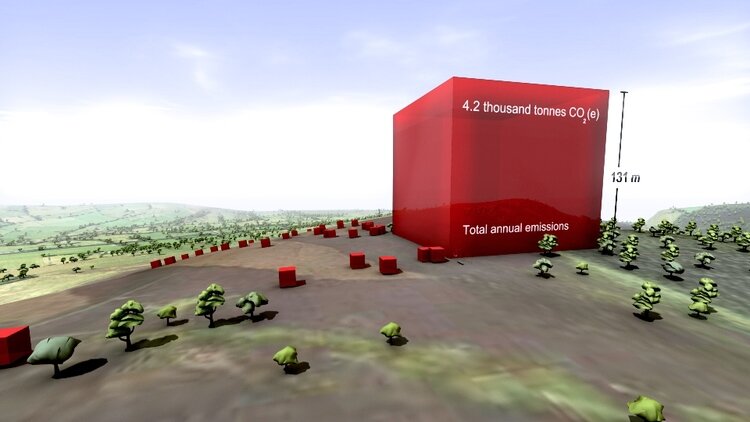
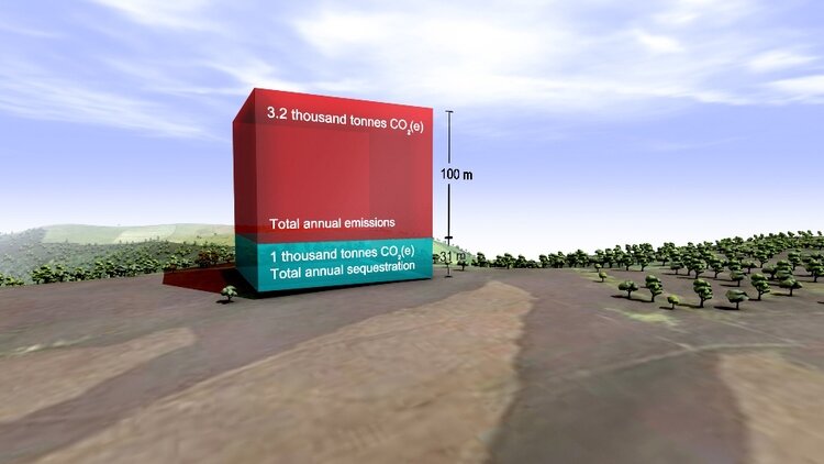
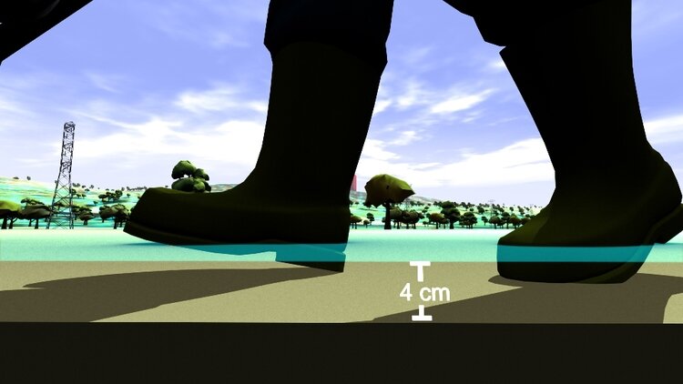
Emissions, sequestration & stored carbon on upland farms
The first animation film from Carbon Visuals shows the emissions, sequestration & stored carbon on ten upland farms in the Peak District National Park, UK. The core message is that these farms are performing an important role as guardians of a huge carbon store that is best kept in soils and vegetation.
A Carbon Visuals Project
Carbon Visuals have created this short animation film to show the emissions, sequestration & stored carbon on ten upland farms in the Peak District National Park. The farms extend over 1,500 hectares and comprise part moorland, part pasture.
The data was taken from ADAS Report Environmental Quality Mark (EQM) Farm Carbon Footprint and Water Audit Pilot Project.
The core message from the film is that these farms are not only producing food and preserving the landscape. They are performing an important role as guardians of a huge carbon store that is best kept in soils and vegetation.
We believe that this is a 'world first' for this type of medium. Created for the consultancy ADAS, the film demonstrates the potential for moving animation to communicate complex carbon stories.
The film is being used to engage a variety of stakeholders including ADAS staff, farm managers and agricultural policymakers.
If you like this approach, and feel that it would suit your particular carbon communication challenge, then please contact us.