
Ireland's carbon footprint
Ireland's Environmental Protection Agency (EPA) wanted simple visuals to show the country’s carbon footprint. We created a short animation showing the daily emissions in Dublin bay to inform and engage a wide range of audiences, from policymakers to the general public.
CLIENT
Environmental Protection Agency
PURPOSE
To help the EPA inform a range of audiences, from policymakers to the general public, about Ireland’s greenhouse gas emissions.
DESCRIPTION
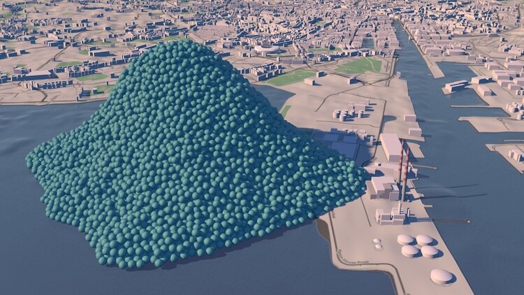
A short animation showing Ireland’s daily emissions as a large pile of one tonne carbon dioxide bubbles beside the Poolbeg towers in Dublin bay.

How do you show the carbon footprint of a country? That was the task set by Ireland's Environmental Protection Agency (EPA). The EPA compiles Ireland's annual greenhouse gas emission inventories and projections, which allows the Government to assess progress against key targets, report to the European Commission and UNFCCC and informs policy development and mitigation measures. The EPA also aims to provide up-to-date scientific information to a wide range of audiences, from policymakers to the general public. A simple visual would help to get more people engaged in the issue.
Carbon Visuals created a short animation showing the daily emissions as a large pile of one tonne carbon dioxide bubbles - sitting next to the Poolbeg towers in Dublin bay.
See the EPA webpage here.
TECHNICAL NOTE
The data source for this visualisation is the EPA’s Greenhouse Gas Inventory for 2012 which calculates annual emissions from Agriculture, Energy, Transport, Industry and commercial, Residential and Waste sectors, and was released in 2014.
Each sphere represents one tonne of greenhouse gas as carbon dioxide equivalent - Co2(e). Greenhouse gases other than CO2 (i.e. methane, nitrous oxide and so-called F-gases) may be converted to CO2 equivalent using their global warming potentials.
For 2012, Ireland’s total national greenhouse gas emissions are estimated to be 58,531,238 tonnes or 160,359 tonnes per day.
Carbon dioxide gas at 15 °C and standard pressure has a density of 1.87 kg/m3. At standard pressure and 15 °C a metric ton of carbon dioxide gas would fill a sphere approximately 10 metres across. The video shows a pile of 160,359 spheres 10 metres in diameter located near the Poolbeg Towers in Dublin Bay, with the city behind.
UK 80% reduction target – in Piccadilly Circus
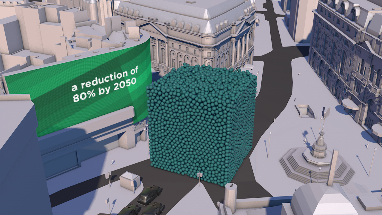
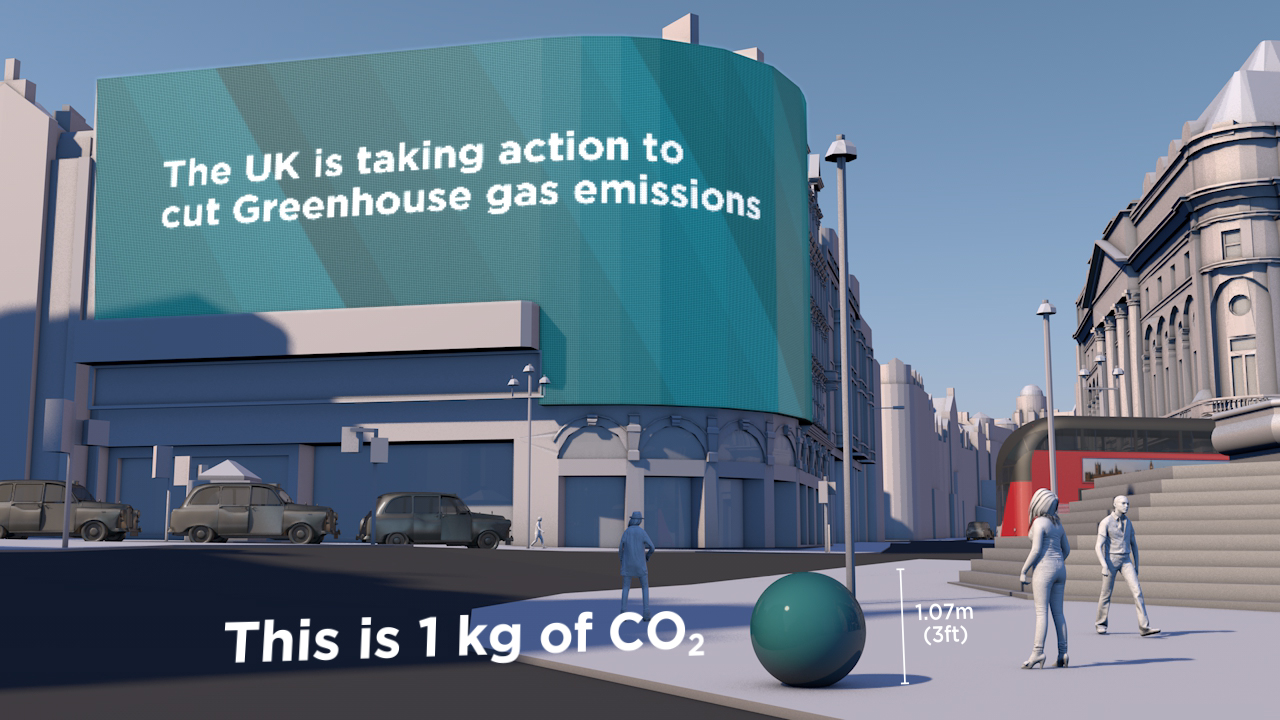
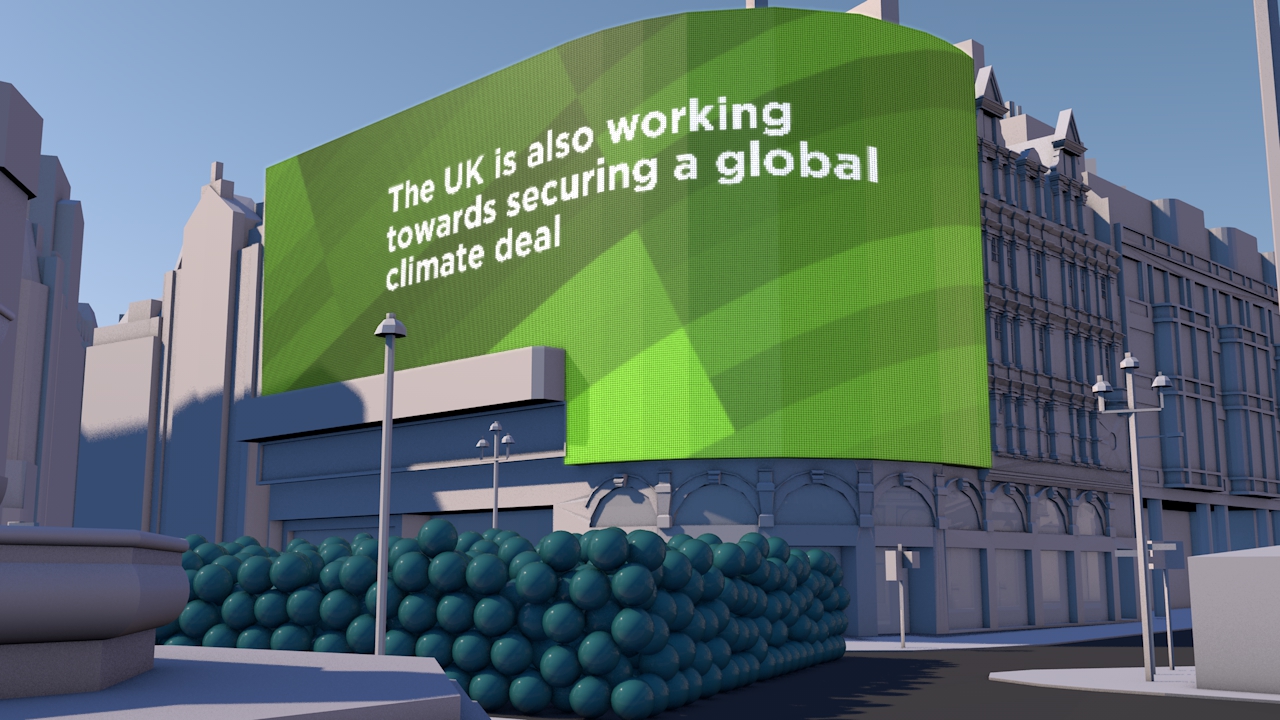
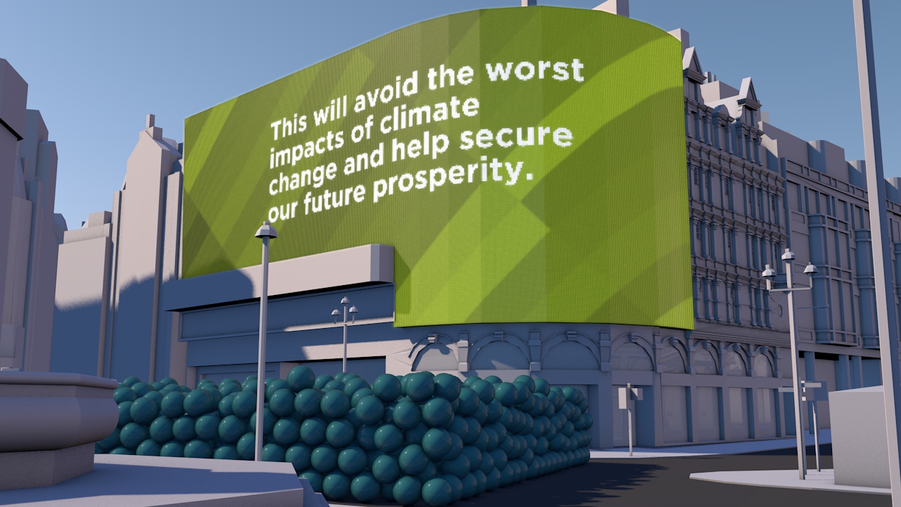
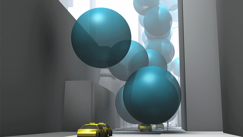
This simple animation was created to highlight the UK Government’s 2050 carbon reduction target of 80%. By using Piccadilly Circus and shifting the scale to that of a single person we were able to create a stir on social media about a 70 page Report.
A Carbon Visuals Project
CLIENT
UK Department of Energy & Climate Change (DECC)
PURPOSE
Use social media to get young people interested in a 70 page report.
DESCRIPTION
An animated drama set in Piccadilly Circus – a popular and iconic gathering place for young and all. The scene is transformed into a memorable moving picture that shows the UK Government’s 2050 target on the scale of one person.
We are very happy with the film, and particularly thrilled that it was our first Vine and had 5000 loops in 5 days.
David Armstrong, Head of eCommunication & Digital Media, DECC


How do you create a stir on Twitter and other social media to get interest in a 70 page Report?
That was the task facing the UK Department of Energy & Climate Change (DECC) who wanted to commission a compelling image set and short animation to draw attention to a new Report - Paris 2015: Securing Our Prosperity Through a Global Climate Change Agreement.
A fast turn-round meant an immediate focus on a key compelling message that could be visualised. Fortunately the UK government has a particularly positive message on carbon - with an 80% reduction target for 2050 enshrined in law. So we set about clarifying the data and thinking through visualisation ideas.
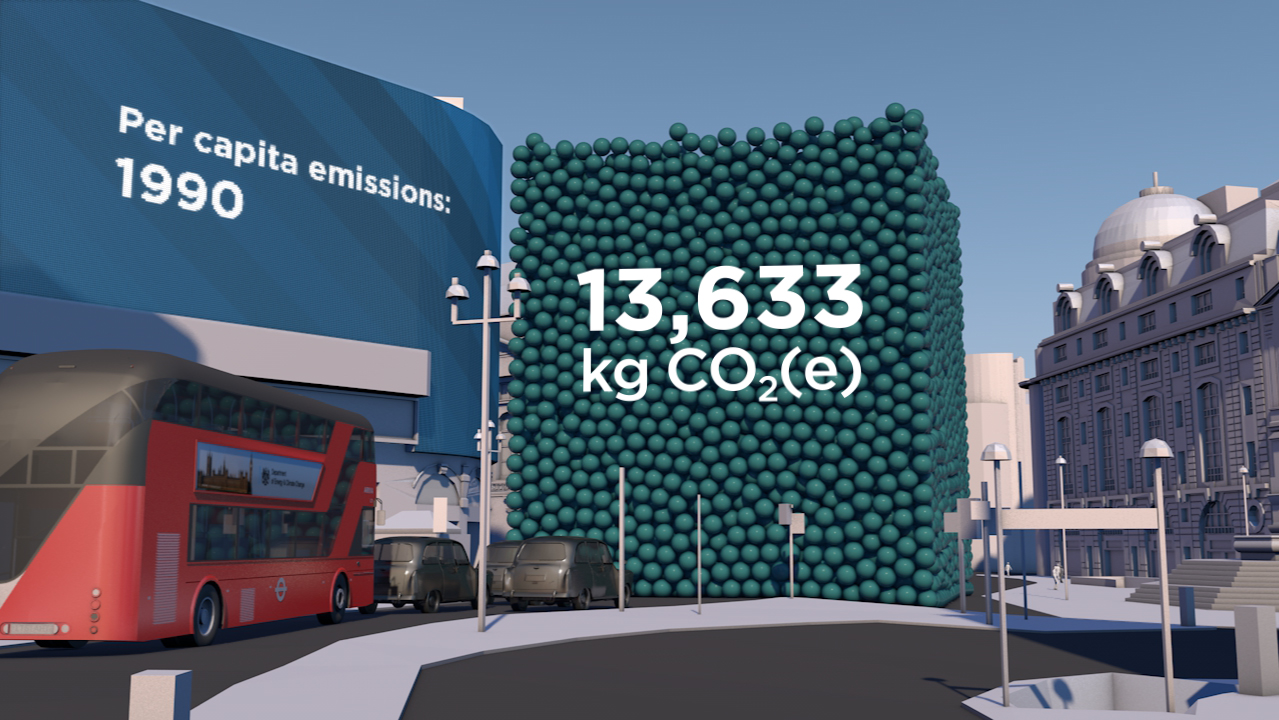
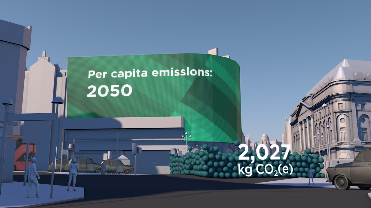
The result: a visual drama set in Piccadilly Circus – a popular gathering place for young and all and itself a unique and iconic location. With captions and messaging appearing as adverts, this immediately recognisable scene is transformed into an eye-catching and memorable moving picture that shows the target on the scale of one person.
See Number 10 Storify page for these images in use.
See video on YouTube. See VINE version
Technical Notes
Raw numbers:
UK Population 1990: 57,237,500
UK Population 2050 (projection): 77,000,000
GHG Emissions 1990: 777.6 MtCO2e
Derived values:
2050 target emissions (80% reduction): 155.52 MtCO2e
Per capita emissions 1990: 13,586 kg
Per capita emissions target 2050: 2,020 kg
Per capita saving target (1990 to 2050): 11,566 kg
Population figures and projections come from Office for National Statistics (ONS); GHG emissions from DECC.
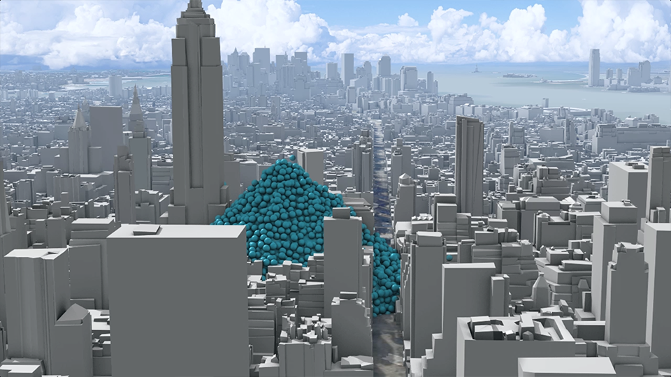
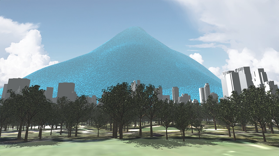
New York's carbon emissions
Our 2012 award-winning three minute animated film shows the carbon emissions of New York City. Featured by over 100 media organisations including Scientific American, Mashable, New Scientist and Daily Mail Online the film does not even mention climate change. Yet it’s been viewed over 380,000 times on YouTube.
A Carbon Visuals Project
CLIENT
Exploratory project supported by Environmental Defense Fund
PURPOSE
To apply our developing visualisation approach to the challenge of engaging the ‘person on the street’.
DESCRIPTION
Dynamic animation showing total emissions and the rate of emissions of New York City and viewed over 450,000 times.
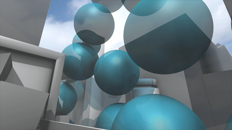
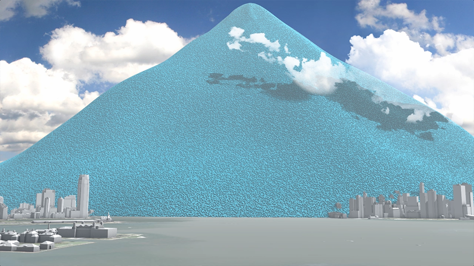
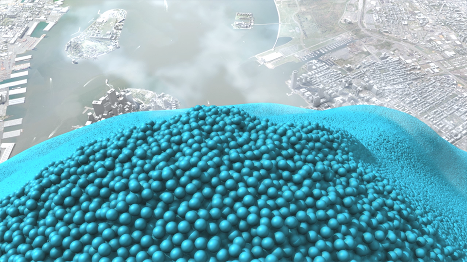
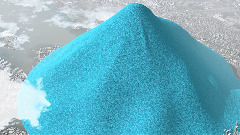
In 2010 New York City added 54 million metric tons of carbon dioxide to the atmosphere (75% from buildings, the bulk of the rest from transport) but that number means little to most people because few of us have a sense of scale for atmospheric pollution.
Carbon Visuals, supported by Environmental Defense Fund, have created a film that makes those emissions feel more real - the total emissions and the rate of emission. Designed to engage the ‘person on the street’, this version is exploratory and still work in progress.
Emissions in 2010 were 12% less than 2005 emissions. The City of New York is on track to reduce emissions by 30% by 2017 - an ambitious target. Mayor Bloomberg’s office has not been involved in the creation or dissemination of this video.
See how we can help cities engage their citizens in carbon issues.
For the technically minded:
In 2010 (the latest year for which data is available) New York City added 54,349,650 metric tons of carbon dioxide to the atmosphere = 148,903 tons a day = 6,204 tons an hour = 1.72 tons a second.
City of New York, Inventory of New York City Greenhouse Gas Emissions, September 2011, by Jonathan Dickinson and Andrea Tenorio. Mayor’s Office of Long-Term Planning and Sustainability, New York, 2011
At standard pressure and 59 °F a metric ton of carbon dioxide gas would fill a sphere 33 feet across (density of CO₂ = 1.87 kg/m³).
If this is how carbon dioxide gas was actually emitted in New York we would see one of these spheres appear every 0.58 seconds.
This is how the size of the piles was calculated:
CO2 volume for a year: 29,063,983,957 metres cubed (= cube with sides 3,075 metres) CO2 volume for a day: 79,627,353 metres cubed (= cube with sides 430 metres)
packing density for unordered spheres: 0.64
Spheres volume for a year: 45,412,474,933 metres cubed (= cube with sides 3,568 metres) Spheres volume for a day: 124,417,739 metres cubed (= cube with sides 499 metres)
A 'pile' is somewhere between a hemisphere and a cone that has equal radius and height. So the height will be somewhere between the height of a hemisphere and height of a cone which each have the spheres volume:
Height of annual hemisphere: 2,789 metres; height of annual cone: 3,513 metres Height of daily hemisphere: 390 metres; height of daily cone: 492 metres

A selection of websites and blog posts where the New York emissions video has been displayed
MEDIA INFORMATION
The Carbon Visuals video of New York's emissions features in over 100 articles and blogs. Here is a selection:
New York's carbon emissions visualised - as giant spheres, Simon Rogers,Guardian Data Blog
Think New York Has a Small Carbon Footprint? Watch This Video, Eric Larson, Mashable
NYC Carbon Footprint: Imagining Gotham's Greenhouse Gas Emissions As One-Ton Spheres, Huffington Post
Video: What does NYC’s carbon footprint “look” like? Melissa C. Lott,Scientific American
Mountain of balls engulfs New York to show emissions, Sandrine Ceurstemont, New Scientist TV
What If You Replaced All of New York City’s Carbon Dioxide Emissions with Big Blue Bouncy Balls? Smithsonian Blog
NYC’s carbon footprint visualized in turquoise bubbles, Jordana Divon,Daily Buzz
NYC’s Carbon Footprint Visualized As Blue Blobs, Carl Franzen, TPM Livewire
The Mayor Warns Us Of NYC's Carbon Emissions... With Balls!John Surico,The Village Voice
New video shows New York City's carbon footprint as turquoise bubbles, Daniel Martin, The Weather Network
This Week’s Scariest Video Comes From New York’s Mayor, Randall Gross,Little Green Footballs
New York City's greenhouse gas emissions visualized, Lucinda Broad,2 Degrees Network
Stunning video shows how quickly streets of New York would be buried up to Empire State Building by just on day's emissions MailOnline
The Co-director of the New York carbon emissions film was: Chris Rabét
A set of high resolution stills is available on Carbon Visuals Flickr page