

Creating a digital campaign for UNEP
We created digital campaign resources for UNEP to celebrate 30 years of international effort to protect the ozone layer. A key film highlights the dangerous global warming potential of replacement gases, and the 135 billion tonnes of CO2e that the Montreal Protocol has kept out of the atmosphere.
A Carbon Visuals Project
Carbon Visuals won the contract to provide resources for a digital campaign for UNEP who wanted to communicate and celebrate 30 years of international effort in protecting the ozone layer. During 2015 we created a series of animations, visual images, print and online interactive communication tools to help communicate what the ozone layer is, where it is in the atmosphere and what has been achieved under the ozone protection regime.
Ozone campaign meets climate change
A short animation that shows the global warming potential of ozone depleting substances and the 135 billion tonnes of carbon dioxide equivalent that the Vienna Convention has kept out of the atmosphere. The film also shows the huge potential climate damage that could be caused by increasing use of HFC gases as substitutes.
“‘The Precious Ozone - the climate connection film’ produced by Carbon Visuals powerfully showed the Montreal Protocol’s contribution to the protection of the ozone layer and the climate and underscored the need to build on this success for further climate benefits, thus enhancing the ability of a range of stakeholders to understand this need and support the ongoing work. ”
Precious Ozone - the size of it
A short animation that gives viewers a sense of scale for how much air there is in the atmosphere and how much of it is ozone.
The Ozone Song
We commissioned a playful song from science composer David Haines which was performed by schoolchildren on World Ozone Day 2015 at the National Marine Aquarium at Plymouth.
Ozone globe

We have created an interactive and self-running globe that displays current ozone distribution and also celebrates each country’s ratification of the Vienna Convention and implementation of the Montreal Protocol.
Click here to visit the interactive Ozone Globe.
2D Air map
This interactive 2D map of the atmosphere allows users to explore the distribution of ozone for themselves. Each white spot represents 10 billion billion billion molecules of ozone. It allows for questions to be raised, such as 'what effect does ozone have on atmospheric temperature?' or 'why does ozone sit where it does in the atmosphere?'. The buttons turn elements of the map on and off, and you can drag the map to explore vertically.
3D Air map
This 3D map of the ozone layer shows a 20 km x 20 km area of land (centered over the peak of Mount Everest) and all the air above it extending to an altitude of 100 km (the edge of space). Each floating particle represents 10 billion billion billion molecules of ozone. The region marked in orange indicates the ozone layer.
Synthesis report design
An additional part of the campaign package was the graphic design and layout of the 2014 Synthesis Report. Download the report here.
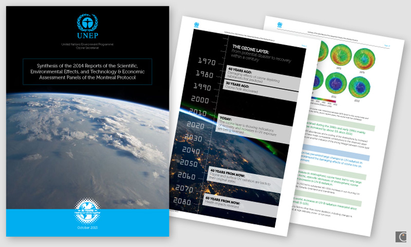
The report was VERY well received. We got a lot of compliments not only on the content but also on the layout and readability. Thanks a million for your excellent work.
Professor A.R. Ravishankara, Report Lead Author
Departments of Chemistry and Atmospheric Science
Colorado State University
Glass sculpture mementoes
We designed and supplied original sculptures depicting the ozone layer in the atmosphere for the chair, co-chair and hosts of the Meeting of the Parties 2-4th November in Dubai.

Photo credit: IISD
See more details of this work by clicking on images below. UNEP web page here.

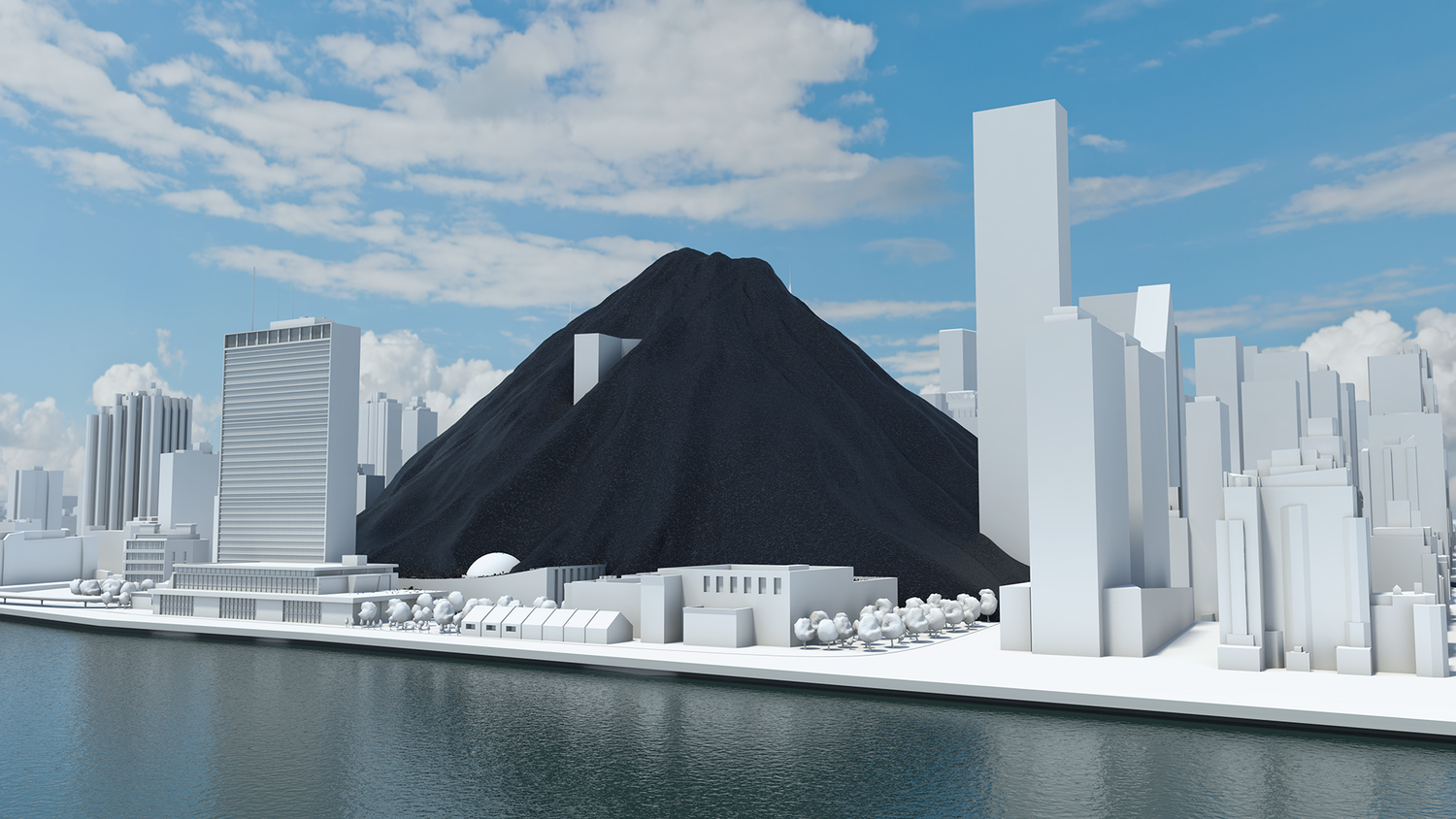
The world’s fossil fuel use and emissions
We made this high budget film to show actual quantities of the current global fossil fuel consumption and carbon emissions. It was shown to world leaders, industry experts, campaigners and scientists at the UN Climate Summit, New York, September 2014 to catalyse and inform conversations about reducing carbon emissions. Jump to the fossil fuel extract here.
A Carbon Visuals Project
CLIENT
World Business Council for Sustainable Development, undertaken by Carbon Visuals
PURPOSE
To engage world leaders, industry experts, campaigners and scientists at the UN Climate Summit, New York, September 2014 and to catalyse and inform conversations about reducing carbon emissions.
DESCRIPTION
Film showing actual quantities of global fossil fuel consumption and carbon emissions, and the part that carbon capture and storage can play in limiting global climate change to 2 degrees.
Among all of the documents, reports and images being released around the UN summit, we hope that this film will stand out and benefit all participants, as well as anyone who watches it around the world.
Peter Bakker President, WBCSD
A coal pile buries the UN General Assembly, gas races down 42nd Street and then New York is lost under a blue mountain. These dramatic CGI scenes, depicting actual quantities, create an immersive journey that brings home the scale of global carbon emissions and fossil fuel consumption.
This dynamic four-minute film, being launched at the UN Climate Change Summit in New York September 2014, shows the part that carbon capture and storage can play in limiting global climate change to 2 degrees.
Commissioned by WBCSD and produced by Carbon Visuals, the animation is being shown to world leaders, industry experts, campaigners and scientists at the Summit to help catalyse and inform conversations about reducing carbon emissions.
Key messages of the film:
use of renewables is increasing
but energy use is rising faster
fossil fuel use is increasing not decreasing
if carbon stored in fossil fuel reserves is burnt we exceed 2 degrees warming by 2055
carbon capture & storage (CCS) is an essential part of the 2 degrees solution
Technical note
The volumes of coal, oil, gas and CO2 shown in the film are accurate volumes based on best available data. A detailed Technical Data Methodology document has been produced to accompany the film. This shows all data sources, assumptions on future global renewable and non-renewable energy requirements and the potential of carbon capture and storage technology.
See the Methodology Document for more details
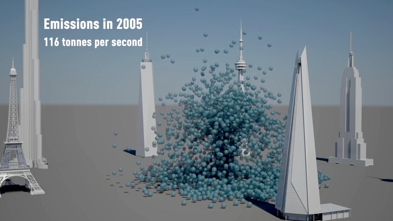
In 2012 we added over 39 billion metric tons of carbon dioxide to the atmosphere. That’s 1,237 metric tons a second.
It is like a ‘bubble’ of carbon dioxide gas 108 metres across entering the atmosphere every second of every day. We could fill a volume the size of the UN Secretariat Building with our carbon dioxide emissions in less than half a second. We could fill it 133 times a minute.
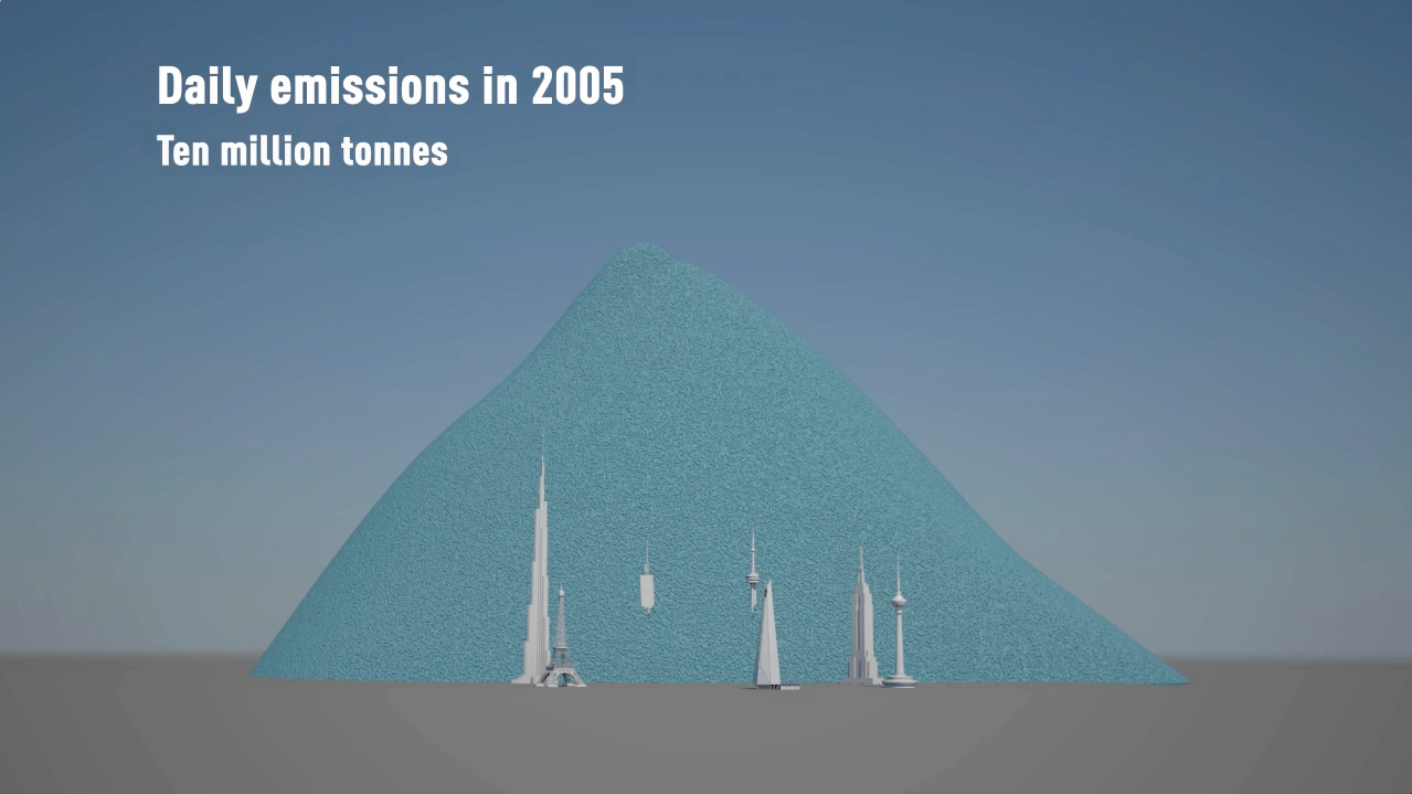
The pile of one metric ton spheres in the film, which represents one day’s emissions, is 3.7 km high (2.3 miles) and 7.4 km across (4.6 miles).
The world gets through a lot of fossil fuels:
7,896.4 million metric tons of coal a year (21.6 million metric tons per day, 250 metric tons per second)
91,330,895 barrels of oil per day (168 m3 per second)
3,347.63 billion m3 of natural gas per year (9.2 km3 per day, 106,082 m3 per second)
This film tries to make those numbers physically meaningful – to make the quantities real; more than ‘just numbers’.
The coal we use each day would form a pile 192 metres high and 546 metres across. We could fill a volume the size of the UN Secretariat Building with coal every 17 minutes. At the rate we use oil, we could fill an Olympic swimming pool every 15 seconds.
This would fill a volume the size of the UN Secretariat Building with oil every 30 minutes.
The rate at which we use natural gas is equivalent to gas travelling along a pipe with an internal diameter of 60 metres at hurricane speeds (135 km/h / 84 mph). We could fill a volume the size of the UN Secretariat Building with natural gas in under 3 seconds.
We use a cubic kilometre of gas every 2 hours 37 minutes and a cubic mile of the stuff every 10 hours 54 minutes.
A set of shorter clips has also been released, featuring some of the most impactful scenes of the main film. These are intended for use by everyone, from industry through to educators and campaigners. Get in touch if you would like hi-res versions.
Main film and extract films can be viewed on YouTube:
All images are available under Creative Commons licence to download on our Flickr page


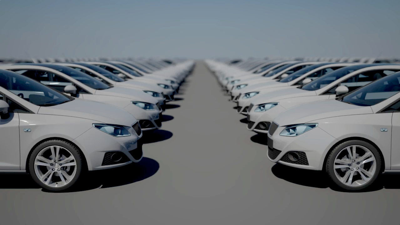
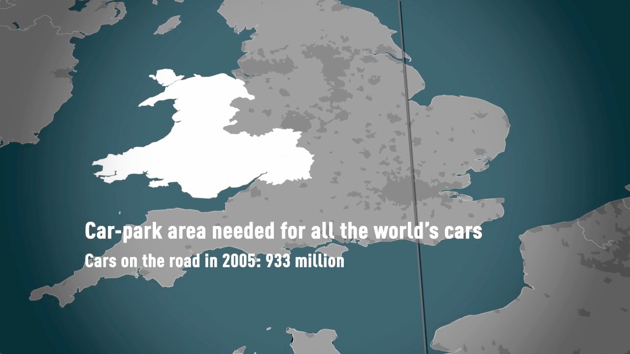
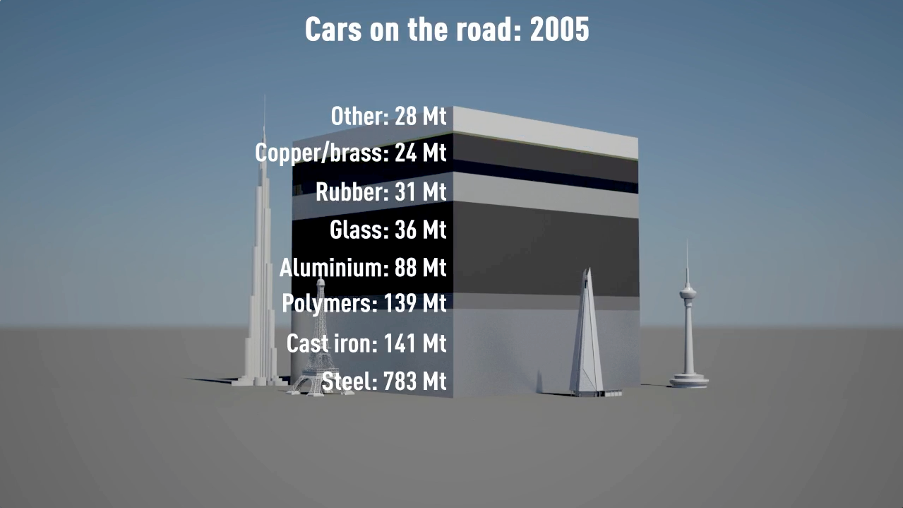
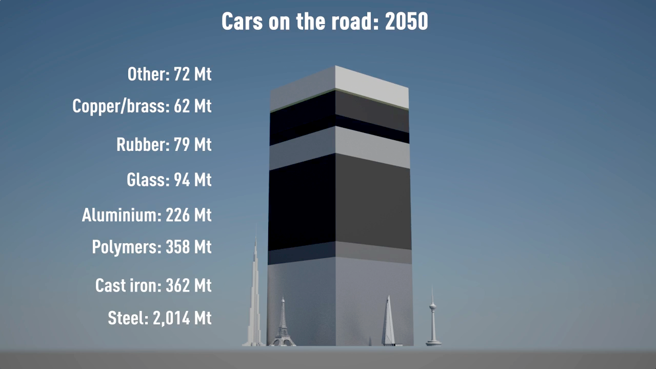
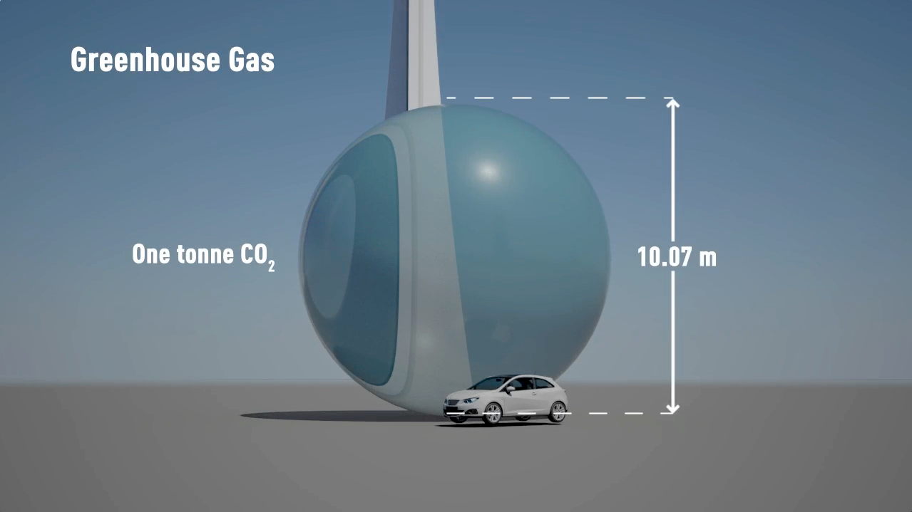
Animating the world's cars
Watch a car explode into pieces! The film dramatically shows the current and expected resource use and parking spaces required for all the world’s cars. It also shows the carbon emissions of cars today and what those would be in 2050.
A Carbon Visuals Project
CLIENT
University of Cambridge
PURPOSE
Film for an on-line, interactive training programme aimed at mid-career, high-potential and senior managers using data collated in collaboration with the University of Cambridge Department of Engineering.
DESCRIPTION
Film showing the current and expected resource use of all the world’s cars, as well as the CO2 emissions of cars today using data collated in collaboration with the Department of Engineering.
...the digital masters at Carbon Visuals are back with a whirlwind tour of the world's cars and the resulting resource and climate pollution impacts. More
Barry Saxifrage Vancouver Observer
A short animated film from Carbon Visuals is being used to engage managers around the world about the fundamentals of sustainability, how sustainability is relevant to their role and its importance to business success.
Created for the University of Cambridge Institute for Sustainability Leadership (CISL), the film shows the current and expected resource use and parking space of all the world’s cars, as well as the CO2 emissions of cars today.
The film is being used as part of an on-line, interactive training programme developed by CPSL and aimed at mid-career, high-potential and senior managers, the majority located outside of Europe and North America. It allows users to explore a simplified automotive industry value chain using data collated in collaboration with University of Cambridge Department of Engineering.
The idea from the beginning was to make a film that was simple and fun. Our aim was to provide genuine new insight into the industry – not mere statistical insight but a powerful sense of scale that fills the gap between direct experience and numerical reasoning.
And we hoped that the film would stimulate a hunger for answers to the question “what can we do to change course?”
Dr Adam Nieman, Creative Director, Carbon Visuals
See here for information on CISL's Business & Sustainability Programme (BSP) Online training.
Note: 2005 data was used as this is most recent verifiable.
Carbon Visuals brings radical emissions data to life
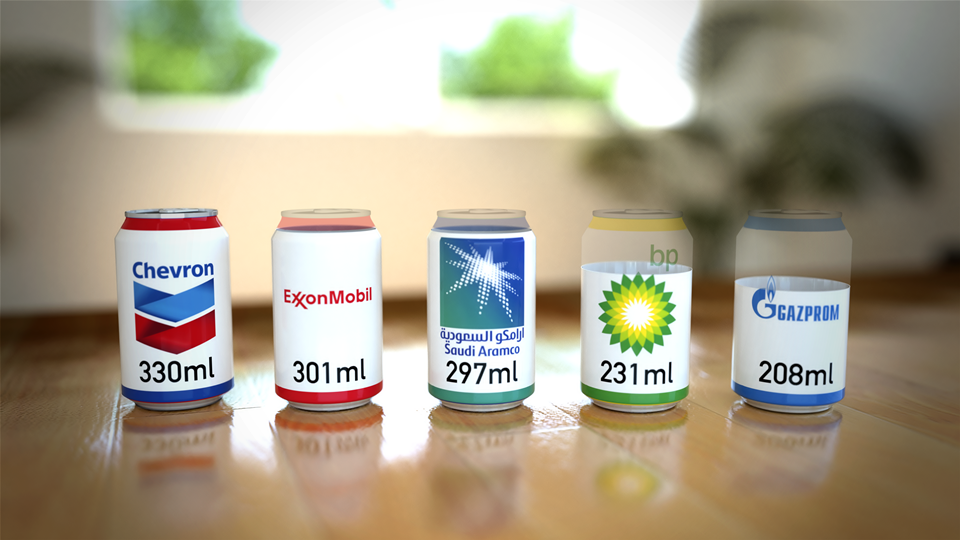
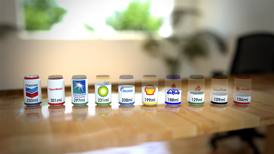
We created a range of striking graphic images to highlight the institutions responsible for extracting the oil, coal and gas that’s causing warming of the planet. This included drink cans part-filled with carbon dioxide gas to show by volume precisely how much is in a typical small room as a consequence of these companies’ extractions.
A Carbon Visuals Project
CLIENT
Carbon Majors
PURPOSE
To give a feel for the scale of the cumulative emissions and show the extent to which corporations are responsible.
DESCRIPTION
Key information from a huge array of data, conveyed in both conventional and novel ways.
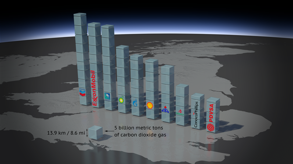
The Carbon Majors report, launched November 2013, is accompanied by striking graphics from Carbon Visuals which show the extent to which corporations are responsible for the cumulative emissions causing climate change.
Key information from a huge array of data has been conveyed by Carbon Visuals in both conventional and novel ways to give a feel for the scale of the cumulative emissions involved.


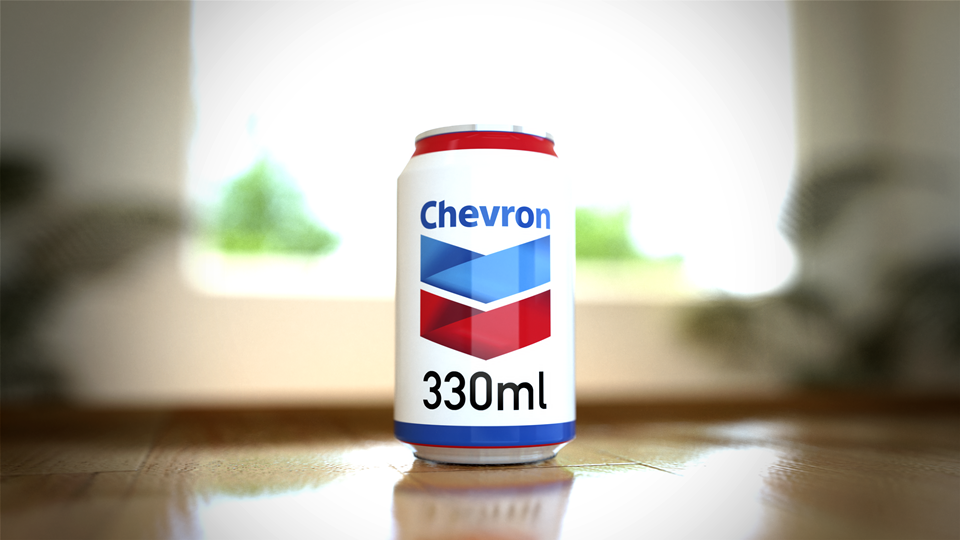
Amongst the visuals, perhaps most novel of all are the drink cans branded with well known names such as Chevron, Exxon, Aramco, BP and Gazprom which are presented as if filled – in the case of Chevron – or part-filled with carbon dioxide gas to show by volume precisely how much carbon dioxide is in a typical small room as a consequence of these companies’ extractions.
At the other end of the scale, 2010 emissions alone are shown at a real-time rate over the course of one minute.
The Carbon Majors project is the culmination of eight years of combing through publicly available records about fossil fuel extraction from all across the globe and detailed analysis of the data. It covers oil, coal, natural gas and cement production from the 1850s through 2010.
For the first time, the Carbon Majors report names the institutions responsible for extracting the oil, coal and gas that’s causing warming of the planet. Instead of allocating between countries, as has up to now been the case, any institution that produced more than eight million tonnes of carbon dioxide in any given year is identified in the study together with their cumulative contribution to the problem we all now face.
This research report shows that 90 companies, countries and nationally-owned operations are responsible for extracting nearly two-thirds of industrial carbon and methane. Fifty of these are investor-owned companies, thirty one are state-owned companies and nine are countries.
In order to help communicate the findings of this important new research, Carbon Visuals has worked closely with the Carbon Majors team to create a number of different and engaging images, animations and infographics. The aim is to help introduce a wide range of audiences to data within the report, including that important audience - the person in the street who has yet to make sense of carbon emissions and climate change.
This interactive allows you to explore the Carbon Majors data, but also shows the remaining atmospheric carbon budget available to have a reasonable chance of keeping average global warming below 2 degrees Celcius. Move the slider to see the rapidly diminishing global carbon budget.
A short video experiment to show the realtime CO2 emissions attributed to 'Carbon Majors'.
To enable easy access to visuals that accurately represent the data in the report all high resolution visuals are available for download under Creative Commons licence at Flickr:
More information on the Carbon Majors Project including downloadable report and data here.