
Carbon Visuals brings radical emissions data to life
A Carbon Visuals Project
CLIENT
Carbon Majors
PURPOSE
To give a feel for the scale of the cumulative emissions and show the extent to which corporations are responsible.
DESCRIPTION
Key information from a huge array of data, conveyed in both conventional and novel ways.
The Carbon Majors report, launched November 2013, is accompanied by striking graphics from Carbon Visuals which show the extent to which corporations are responsible for the cumulative emissions causing climate change.
Key information from a huge array of data has been conveyed by Carbon Visuals in both conventional and novel ways to give a feel for the scale of the cumulative emissions involved.


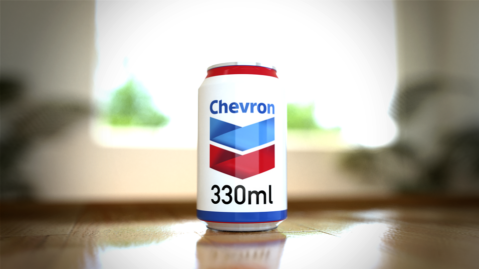
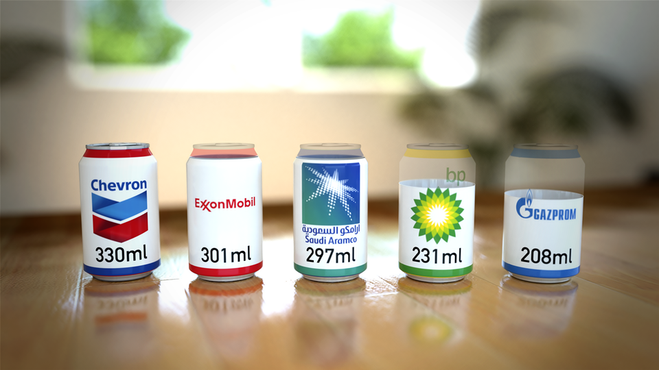
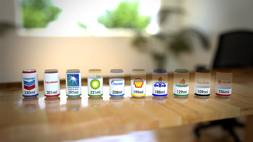
Amongst the visuals, perhaps most novel of all are the drink cans branded with well known names such as Chevron, Exxon, Aramco, BP and Gazprom which are presented as if filled – in the case of Chevron – or part-filled with carbon dioxide gas to show by volume precisely how much carbon dioxide is in a typical small room as a consequence of these companies’ extractions.
At the other end of the scale, 2010 emissions alone are shown at a real-time rate over the course of one minute.
The Carbon Majors project is the culmination of eight years of combing through publicly available records about fossil fuel extraction from all across the globe and detailed analysis of the data. It covers oil, coal, natural gas and cement production from the 1850s through 2010.
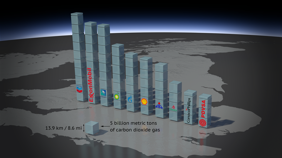
For the first time, the Carbon Majors report names the institutions responsible for extracting the oil, coal and gas that’s causing warming of the planet. Instead of allocating between countries, as has up to now been the case, any institution that produced more than eight million tonnes of carbon dioxide in any given year is identified in the study together with their cumulative contribution to the problem we all now face.
This research report shows that 90 companies, countries and nationally-owned operations are responsible for extracting nearly two-thirds of industrial carbon and methane. Fifty of these are investor-owned companies, thirty one are state-owned companies and nine are countries.
In order to help communicate the findings of this important new research, Carbon Visuals has worked closely with the Carbon Majors team to create a number of different and engaging images, animations and infographics. The aim is to help introduce a wide range of audiences to data within the report, including that important audience - the person in the street who has yet to make sense of carbon emissions and climate change.
This interactive allows you to explore the Carbon Majors data, but also shows the remaining atmospheric carbon budget available to have a reasonable chance of keeping average global warming below 2 degrees Celcius. Move the slider to see the rapidly diminishing global carbon budget.
A short video experiment to show the realtime CO2 emissions attributed to 'Carbon Majors'.
To enable easy access to visuals that accurately represent the data in the report all high resolution visuals are available for download under Creative Commons licence at Flickr:
More information on the Carbon Majors Project including downloadable report and data here.