
Communicating vital scientific services
How do you communicate complex services for the scientific community in ways that are not only true to the science but also make sense to a general, non-scientific audience? These two films show the services provide by Copernicus, the EU satellite monitoring programme.
A Carbon Visuals Project
CLIENT
ECMWF (European Centre for Medium-Range Weather Forecasts)
PURPOSE
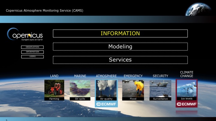
Create a set of short films that explain the Copernicus Climate Change and Atmosphere Monitoring Services that ECMWF carries out on behalf of the European Commission.
DESCRIPTION
Carbon Visuals created a film that shows the overall Copernicus services, as well as separate films for each service. These films highlight our ability to help communicate complex services for the scientific community in ways that are not only true to the science but also make sense to a general, non-scientific audience. In addition we designed a set of PowerPoint slides for ECMWF scientists to use at key events.
Copernicus is the European Union's (EU) flagship programme on monitoring the Earth’s environment using satellite and in-situ observations. Copernicus delivers operational data and information services on a range of topical areas.
See more at: http://climate.copernicus.eu/ / http://atmosphere.copernicus.eu/


Creating a digital campaign for UNEP
We created digital campaign resources for UNEP to celebrate 30 years of international effort to protect the ozone layer. A key film highlights the dangerous global warming potential of replacement gases, and the 135 billion tonnes of CO2e that the Montreal Protocol has kept out of the atmosphere.
A Carbon Visuals Project
Carbon Visuals won the contract to provide resources for a digital campaign for UNEP who wanted to communicate and celebrate 30 years of international effort in protecting the ozone layer. During 2015 we created a series of animations, visual images, print and online interactive communication tools to help communicate what the ozone layer is, where it is in the atmosphere and what has been achieved under the ozone protection regime.
Ozone campaign meets climate change
A short animation that shows the global warming potential of ozone depleting substances and the 135 billion tonnes of carbon dioxide equivalent that the Vienna Convention has kept out of the atmosphere. The film also shows the huge potential climate damage that could be caused by increasing use of HFC gases as substitutes.
“‘The Precious Ozone - the climate connection film’ produced by Carbon Visuals powerfully showed the Montreal Protocol’s contribution to the protection of the ozone layer and the climate and underscored the need to build on this success for further climate benefits, thus enhancing the ability of a range of stakeholders to understand this need and support the ongoing work. ”
Precious Ozone - the size of it
A short animation that gives viewers a sense of scale for how much air there is in the atmosphere and how much of it is ozone.
The Ozone Song
We commissioned a playful song from science composer David Haines which was performed by schoolchildren on World Ozone Day 2015 at the National Marine Aquarium at Plymouth.
Ozone globe

We have created an interactive and self-running globe that displays current ozone distribution and also celebrates each country’s ratification of the Vienna Convention and implementation of the Montreal Protocol.
Click here to visit the interactive Ozone Globe.
2D Air map
This interactive 2D map of the atmosphere allows users to explore the distribution of ozone for themselves. Each white spot represents 10 billion billion billion molecules of ozone. It allows for questions to be raised, such as 'what effect does ozone have on atmospheric temperature?' or 'why does ozone sit where it does in the atmosphere?'. The buttons turn elements of the map on and off, and you can drag the map to explore vertically.
3D Air map
This 3D map of the ozone layer shows a 20 km x 20 km area of land (centered over the peak of Mount Everest) and all the air above it extending to an altitude of 100 km (the edge of space). Each floating particle represents 10 billion billion billion molecules of ozone. The region marked in orange indicates the ozone layer.
Synthesis report design
An additional part of the campaign package was the graphic design and layout of the 2014 Synthesis Report. Download the report here.
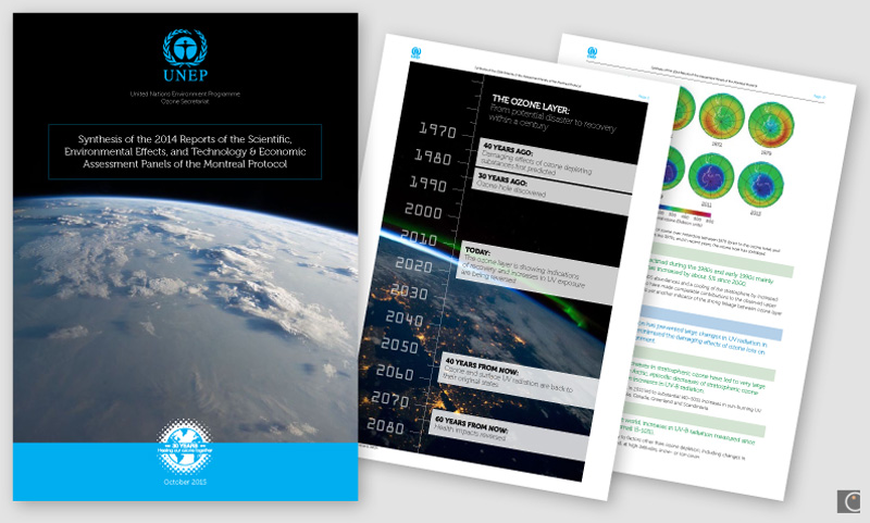
The report was VERY well received. We got a lot of compliments not only on the content but also on the layout and readability. Thanks a million for your excellent work.
Professor A.R. Ravishankara, Report Lead Author
Departments of Chemistry and Atmospheric Science
Colorado State University
Glass sculpture mementoes
We designed and supplied original sculptures depicting the ozone layer in the atmosphere for the chair, co-chair and hosts of the Meeting of the Parties 2-4th November in Dubai.

Photo credit: IISD
See more details of this work by clicking on images below. UNEP web page here.

Resource efficiency in Asia Pacific
A Carbon Visuals Project
CLIENT
United Nations Environment Programme, undertaken by Carbon Visuals
PURPOSE
To convey the scale and complexity of resource use in the Asia Pacific region at a conference of Environment Ministers and subsequently to other audiences.
DESCRIPTION
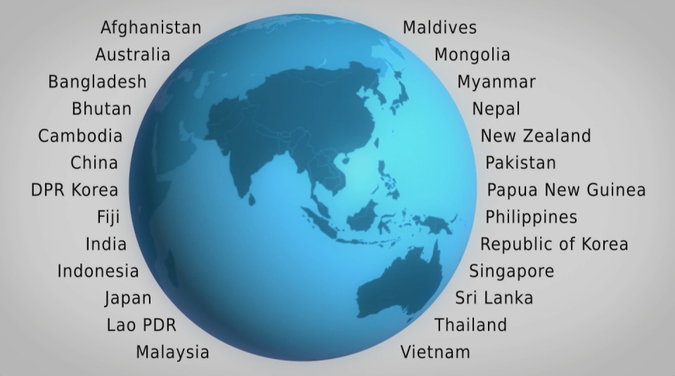
A high impact video and interactive web-tools to introduce and enable easy exploration of a database covering 26 Asia Pacific countries, 157 indicators and 40 years.
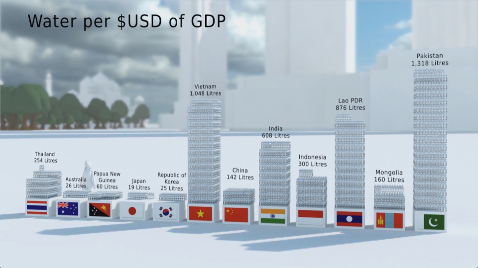
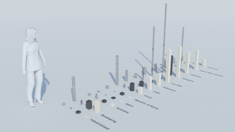
How much natural resources are used to earn one dollar in developing countries in the Asia Pacific region? How do you effectively show water, metal and biomass usage rates across 26 Asian countries - and make it personal and real? What is the best way to visualise a range of environmental resource indicators ‘per GDP’ across countries?
These were some of the challenges set for us by the United Nations Environment Programme (UNEP) in a project undertaken in conjunction with our not-for-profit partner CarbonSense Foundation.
This video has taken our communications to a higher level, and improved our ability to cut across a crowded policy landscape to really help decision makers reflect on resource efficiency.
Janet Salem, UNEP, Bangkok
The brief from the UNEP Bangkok office was to design and create a short, high impact video to convey the scale and complexity of resource use in the Asia Pacific region. In addition a set of interactive web-tools is being provided to complement the film and allow easy exploration of the data.
The film is supporting a database of resource efficiency data covering 26 Asia Pacific countries, 157 indicators and 40 years (1970-2010). The indicators are designed to inform policy development in the region based on the principles of circular economy, sustainable consumption and production principles.*
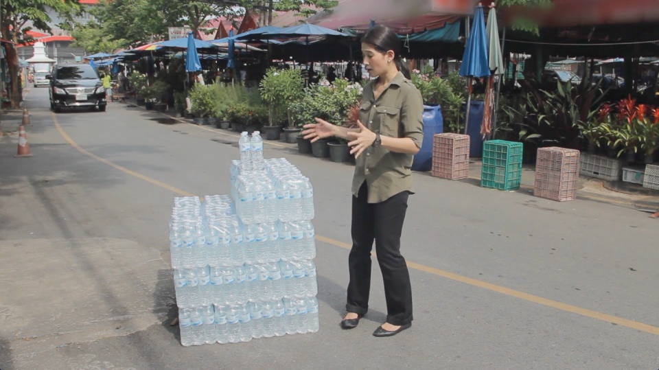
Resource efficiency is crucial for sustainability but how do you make it real and meaningful at a national and a personal level? To bring such a huge subject up front and personal, we combined live action film introducing very real piles of materials on a table-top with national and regional resource use and impacts made tangible with CGI graphics. And uniquely this project allowed us to explore ways that our creative techniques could be combined with economic data.
Because of the complexity of data and fast-track time schedule the project was carried out in a highly collaborative way, with UNEP staff in Bangkok supporting our creative team throughout the scoping, design and production phases.
The film was used to launch the UNEP Report at a conference on 19th May 2015 attended by Achim Steiner, Executive Director of UNEP, and Environment Ministers and policy makers from the Asia Pacific region.
See the UNEP webpage on project here
Finally - a very special thanks to Janet Salem of UNEP, Bangkok and our film presenter / narrator Patchari Raksawong.
*The database has been developed as a result of a three-year science-based consultative process mandated by countries in the region and coordinated by UNEP, the CSIRO and the Asia-Pacific Roundtable on Sustainable Consumption and Production (APRSCP), with support from the European Union's SWITCH-Asia Programme.
An important part of this project was the creation of an interactive web-tool (see above) allowing policymakers to explore the database in detail in an intuitive way. We created a 'heat map' that allows comparison between a wide range of economic indicators for different countries. Mousing over the countries reveals the actual data. See in new and larger window here.
Carbon Visuals has shown us different techniques to visualize data in a way that can resonate on a meaningful human level, while still giving us creative space for collaboration. We had a lot of fun with the team and it's been a really wonderful partnership.
Janet Salem, UNEP, Bangkok
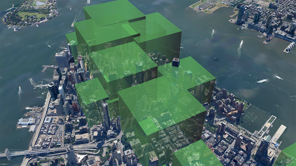
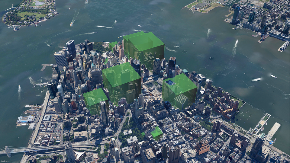
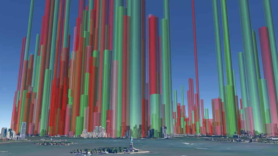
Mapping local air pollution in New York
We created a set of images pinpointing the air pollution from burning heavy heating oil at 8,000 buildings in New York City. Individual images showed property managers, building co-op boards and community groups their resulting air pollution and encouraged them to make positive changes.
A Carbon Visuals project
CLIENT
New York City Clean Heat Program
PURPOSE
To help New York property managers, building co-op boards and community groups reduce local air pollution from their buildings.
DESCRIPTION
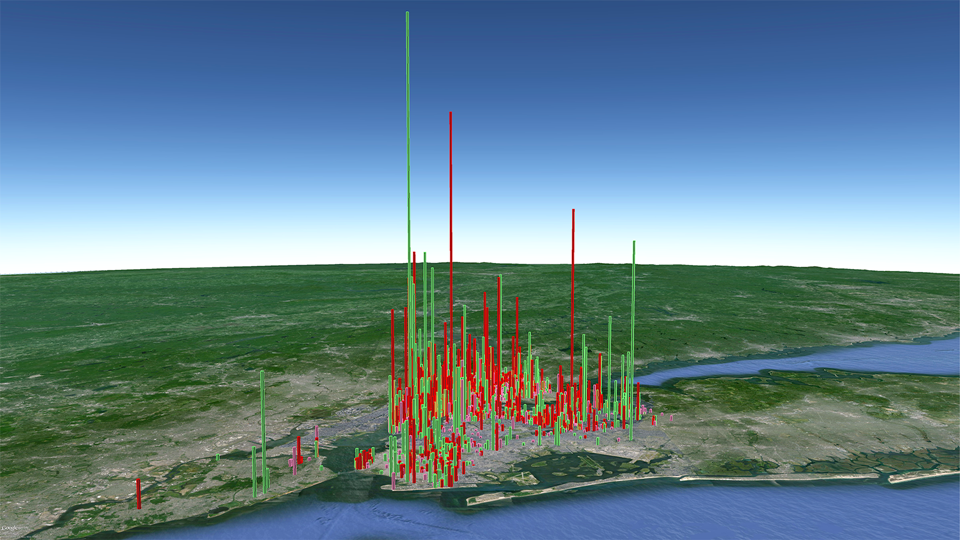
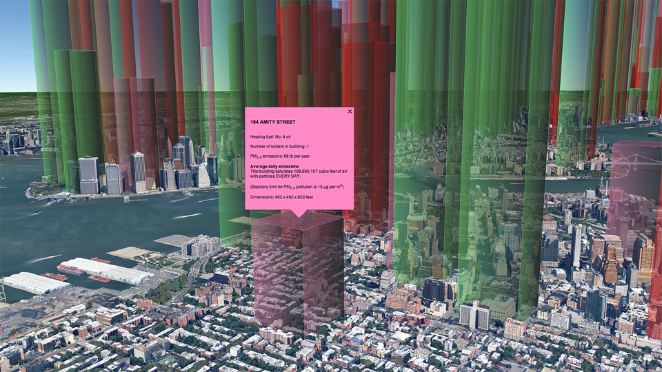
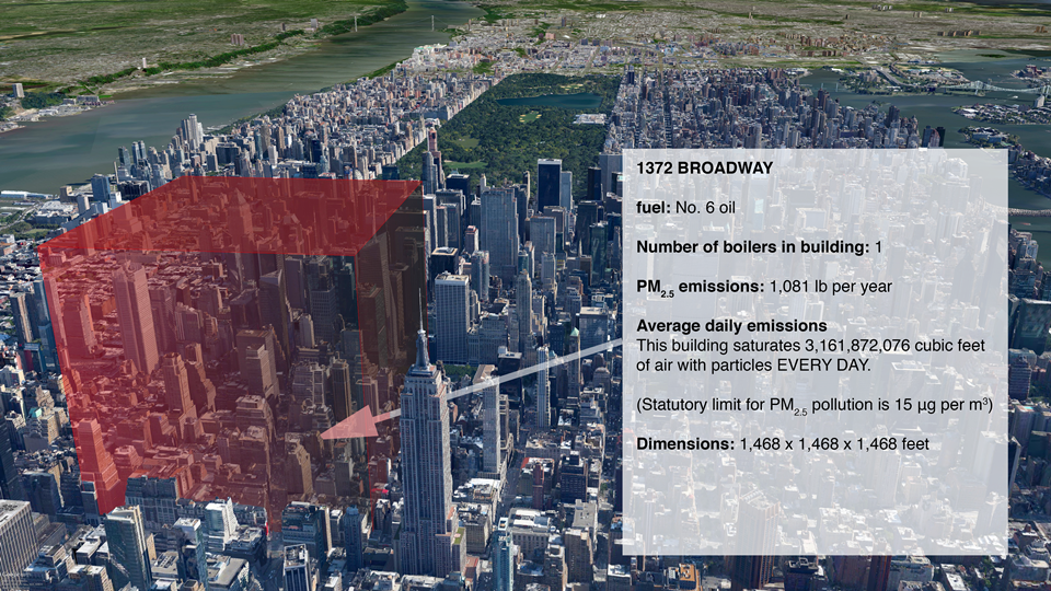
A set of before and after images showing volumes of air saturated with particulates, created using our Google Earth Visualiser tool.
Visual images created by Carbon Visuals are being used to help New York property managers, building co-op boards and community groups reduce local air pollution from their buildings.
Around 8,000 buildings in New York City have been burning heavy heating oil. These contribute more soot pollution than all cars and trucks on the City’s roads. The NYC Clean Heat program seeks to improve air quality and save lives in New York by eliminating heavy oil use and accelerating the adoption of cleaner fuels.
Carbon Visuals was asked by Clean Heat project partner Environmental Defense Fund to look at ways to visualise the emissions of fine particulate matter (PM2.5) in order to encourage building owners and operators to sign up to the program.
Visualising quantities of particle pollution is not easy. The air that supports the particles plays a part in making them dangerous to health (by itself, a pile of powder is not a threat)!
The Clean Heat project team have used the visuals for individual building outreach and in presentations. They have found that those buildings that receive visual prompts are very likely to get in touch with the program.
How we created the images
We used our Google Earth Visualiser tool in a new way. Usually we use it to show volumes of carbon dioxide emissions but we chose to visualise particle pollution in terms of the volume of air it 'saturates' up to the legal limit*. The coloured volumes represent air that is 'full' of particles.
Of course, particle pollution doesn't actually work so neatly. It gets mixed up and you will find an uneven distribution in city air, but the object here is to visualise the scale of emissions.
More info on EDF's Clean Heat Project. Dedicated NYC Clean Heat website
* Max density of PM2.5 pollution averaged over an annual period: 15 μg/m3 EPA Regulator ref: 40 CFR 50.7(a)
Thank you so much for your wonderful work! We have found your visuals an incredibly useful tool both for direct building outreach as well as for our marketing campaign. Our colleagues at the Mayor’s Office have also let me know how impressed they are.
Abbey Brown , NYC Clean Heat Coordinator, Environmental Defense Fund
A comprehensive set of images can be seen in this downloadable PDF Presentation.