

From datavis to data physicalisation
Data physicalisation and how it can be used to give people a feel - sometimes literally - for unfamiliar quantities.

Image Credit: EcoMotion
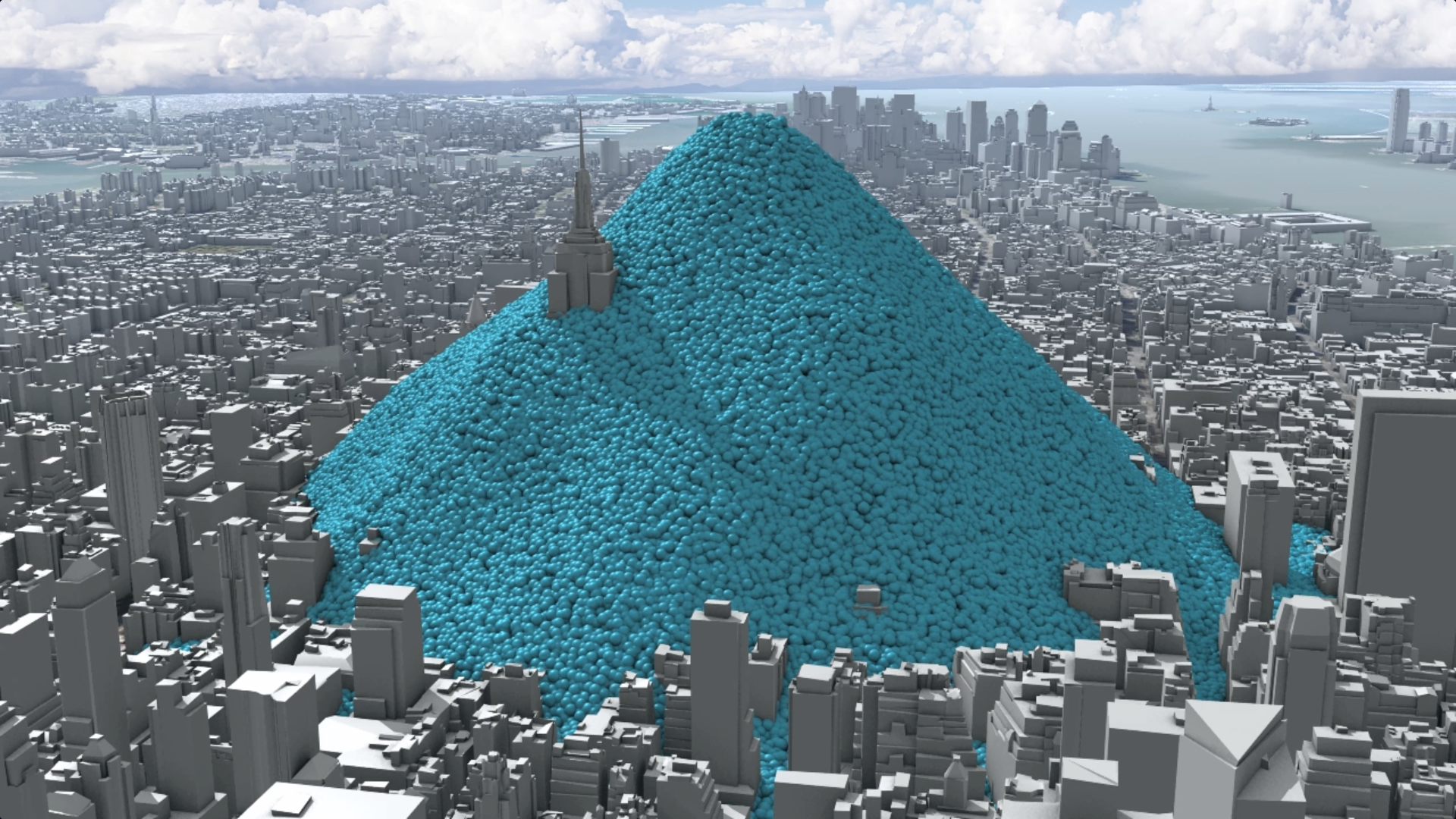
That giant balloon isn’t really a ton (or even a tonne) of carbon dioxide. It’s full of air. But it represents a ton of the greenhouse gas in a way that you can see and touch. The inflatable, made a few years ago by our friends at EcoMotion, is a recent example of one important way to make key quantities intelligible.
That’s not a thing that happens naturally. Few handy phrases are less accurate than saying that “the facts speak for themselves”. The growth of data visualisation underlines that. We have to decide what we want the data to tell people - or what questions we’d like them to ask. And we should try as many ways of doing that as possible.
That means looking beyond the displays on screen, or graphics in print, that are most commonly used for data visualisation. There are a host of ways of representing key quantities that take material form. People call this not data visualisation but “physicalisation”. It’s an ugly new word for a realm of sometimes elegant invention.
As the invaluable catalogue at the data physicalisation wiki shows, it relates to an ancient tradition. http://dataphys.org/list/
That catalogue begins with clay tokens used in Mesopotamia 7000 years ago. But the most striking examples tend to come from later eras that were grappling with data and statistics.
At the start of the 20th century Charles Davenport, for instance, depicted statistical distributions by “displaying” the variation of some character or trait of objects or people by using the very items in question.
Easy for seashells.

Image Credit: Charles Davenport
Website: http://dataphys.org/list/davenports-physical-distributions/
And a little more trouble for people.

Image Credit: Charles Davenport
Website: http://dataphys.org/list/davenports-physical-distributions/
More common, not surprisingly, are less direct representations, such as the celebrated substitution of rice grains for people in Stan’s Cafe’s artwork depicting the global population. One of our own physicalisations Precious ozone: counting on ozone (2015) used rice to visualise the composition of CO2 and ozone in the atmosphere.
Outside the art world, the late Hans Rosling - aided by his son Ola - developed a whole set of physical props to help him tell stories about global development. Ikea boxes, pebbles, toy building sets, fruit juice and snowballs all featured in his talks and videos at various times. Here’s a nice example, relying entirely on Lego bricks.
The possibilities for using physicalisation in new ways - as simple as this, or more complex - are endless. They call on skills a bit different from those that produce digital depictions of data. Like a sculptor, you have to investigate the materials to make sure they will do what you want and, perhaps, be reproducible in a live display or survive interaction with lots of people who want to handle them. That would point to uses beyond art display or demonstration. And there are exciting speculations about ways this sort of work would exploit computerised data handling - abolishing the boundary between the physical and the digital to create new, hybrid displays that have some of the affordances of both.
There are already artists working with “data sculpture”, as in this rather wonderful depiction of EEG data by Refik Anadol, who has made many other striking exhibits.
Looking ahead, a paper by authors who include the compilers of the data physicalisation catalogue proposes a challenging research prospectus for data physicalisation, including what it can do and how one could demonstrate its benefits. It also envisages some exciting future possibilities that may be technologically realisable soon. For instance, imagine a science museum where a visitor:
“walks into a room which describes the Earth’s changes in climate. She picks up stones that physicalize the change of temperatures on Earth backwards in time. She can get a good sense of the differences between ice ages and hotter periods – but when she gets to the volcanic beginnings and the stones quickly heat up, she drops them. At the hurricane diorama, miniature hurricanes of the past 50 years move over a map of North America covered in dense fog, with only the eyes of the storms allowing a peak inside. The visitor places her hands over two of the eyes, and the differences in pressure give her the sensation of the intensity of the hurricanes at their peak. She reaches into the eye of the stronger hurricane and feels a strong drag on her hand when it crosses the eyewall. She can easily judge how devastating it was.”
That kind of experience is a way off, but there are already data physicalisations that exemplify such approaches. Sociologist Deborah Lupton cites Michael Whitelaw’s “weather bracelet” that allowed residents of Canberra, Australia, to wear a representation of local meteorological data, and the Melbourne-based “sweat atoms” project that materialised personal data via 3D printing. She describes how the artefacts made there included,
“A 3D-graph of heart rate data, a flower shape where the length and width of the petals represent heart rate duration and intensity, a frog shape that changed in size according to the amount of physical activity carried out that day, a die representing the six zones of heart beat data and a ring displaying the number of hours the person was active. Participants in this project could hold or display their artefacts and compare the size of each one with others.”
The research team involved found that people developed a stronger emotional connection with their data when it was turned into these personalised objects, “showing them to others and arranging them as decorative items in their homes or on their desks at work “.
These examples are intriguing, and leave the thought that we have only scratched the surface of data physicalisation so far (the physical metaphor seems appropriate). Real World Visuals is keen to try out new realisations of these ideas alongside our more regular digital projects. One experimental technology we’re involved with deserves another post of its own, which we’ll put up soon. Meanwhile, if you have ever wondered how to make your data more tangible, even tactile, do get in touch to discuss the possibilities.
References:
Jansen, Y. et al.. (2015) Opportunities and Challenges for Data Physicalization. Proceedings of the ACM Conference on Human Factors in Computing Systems (CHI) NY, United States, 15 April, 2015. Available online: http://chi2015.acm.org/
Lupton, D. (2017) Feeling your data: Touch and making sense of personal digital data. New Media and Society. 19 (10), pp. 1599-1614. Available online: https://doi.org/10.1177/1461444817717515

Rethinking data visualisation
In a piece that originally appeared Climate Outreach, Jon Turney discusses best-practice in visual climate communication.

In a piece that originally appeared in Climate Outreach, Jon Turney discusses best-practice in visual climate communication.
In a striking scene in An Inconvenient Truth, Al Gore mounts a hydraulic platform so he can be lifted into the upper reaches of a giant graph of atmospheric CO2 concentration over time.
That’s state of the art climate communication, circa 2006. More than a decade later, we’ve thought harder about how to do it. And there’s a growing body of research-based advice on how to mix words, images and data graphics to best effect. We’ve had a bunch of useful reports just recently, geared to the IPCC’s latest reporting on the 1.5 degrees C target, not least the handbook produced by the Tyndall Centre and Climate Outreach.
Most of this advice is great. How to understand audiences? How to tell stories that engage? How to show data clearly? All taken care of. Is there anything to add?
We think there is. Real World Visuals is a small data visualisation outfit that specialises in quantitatively rigorous, science-based image and film-making, helping people relate more directly to abstract data. As we ponder climate change communication, we agree with pretty much all the advice that’s been published.
Some of it can be developed a bit more, though. Take this enjoinder, the second headline recommendation from the IPCC guide just published:
“Talk about the real world, not abstract ideas - Although they define the science and policy discourse, the ‘big numbers’ of climate change (global average temperature targets and concentrations of carbon dioxide) don’t relate to people’s day-to-day experiences. Start your climate conversation on common ground, using clear language and examples your audience is likely to be familiar with.”
Well, yes. Except that it’s not exactly straightforward to find examples of concentrations of carbon dioxide that people are familiar with. And if there’s more of it does not register on the human senses until we’re in danger of suffocation. This is the awkward fact that had Al Gore climbing on that hoist. Carbon dioxide, like the other greenhouse gases, is invisible. As Richard Hamblyn and Martin Callaghan remark in Data Soliloquies, “Increases in atmospheric greenhouse gases occur invisibly, and though they can be measured and plotted on scary-looking graphs, the fact of their invisibility remains a constant barrier to action. If the sky changed colour as a result of increased carbon dioxide, there wouldn’t be a problem now.”
But how to overcome that gaseous invisibility? Our approach draws on our wider thinking about how people relate to presentations of quantity. (explained in more detail here http://www.realworldvisuals.com/about/). The key thing, we’ve found, is to represent a quantity physically, rather than just numerically. More, the physical representation needs to be on a scale that is comparable to the ones we relate to in every day life. We intuitively relate to things that happen on a bodily scale and tempo. Things happening outside that realm are harder to engage with. That goes with the invisibility problem to ensure that most people have no sense of ‘how much’ a kilogram or a tonne of carbon dioxide is.
We’ve done lots of visualisations of carbon emissions now - from global output to greenhouse gas produced by a whole city, a single building, or an individual car. An approach that seems to work is to translate mass into volume, and display volumes against a backdrop that helps people grasp their scale.
Like this, which shows one metric tone of CO2 at atmospheric pressure.

Pile those up, and you can depict a day’s worth of global emissions, like this.

Or, perhaps giving a better sense of scale, like this.

This is just one example of an approach that, cumulatively, begins to allow one to ‘see’ carbon dioxide as a presence in the world. It isn’t a substitute for the excellent image libraries about climate change, such as the one on this site, but can complement them. One does notice, for instance, that images of causes - as opposed to consequences - of climate change still lean heavily toward smokestacks (or plumes of steam) as surrogates for the actual greenhouse gas that we are concerned about. The carbon dioxide, as ever, remains invisible in the photos.
And one can build on this approach to help instil new intuitions about local emissions, as we have done with a simple real-time emissions tool, which allows anyone to create a moving image of CO2 emissions by entering some basic data.
We still admire Al Gore for having the chutzpah to be hoisted aloft while talking to a live audience and being filmed. But we like to think we could offer him other ways to make his point now.
References:
Principles for effective communication and public engagement on climate change: A Handbook for IPCC Authors. Climate Outreach, January 2018
Richard Hamblyn and Martin Callaghan, Data Soliloquies, UCL Environment Institute, 2009, p41.
Images:

Trees for the people
If we shared British land equally amongst its 63 million inhabitants, we'd each have just over a third of a hectare. We'd also have 60 trees each.

Unusually, the UK government found a way to spend money that met pretty general approval last month (January). It gives a boost to a feature of our landscape many feel strongly about: trees.
Specifically, it will support a new “Northern Forest”, covering a stretch of countryside between Liverpool and Hull. It’s a modest (£6m) first step toward a £500m, project that will see 50 million new trees planted over 35 years in a region that currently has poor tree cover. That’ll help flood prevention, reduce soil loss, and lock up carbon, as well as creating new woodland for people to enjoy.
That’s a lot of trees, right? It’s certainly a lot larger than most such schemes. A planting plan announced last year for £600,000 trees covering 350 hectares on Doddington Moor in Northumberland was touted at the time as the largest in the UK for decades.

If we shared Britain's land, and trees, equally amongst its 63 million inhabitants this is what we'd each have.
But is it enough to alter the picture, nationally? As it happens, we’ve been thinking about our tree population. Trees aren’t that easy to count once you go beyond your local park. A major reappraisal published in the science journal Nature in 2015 estimated that there were more than seven times as many trees in the whole world as previously believed - around three trillion.
A global figure like that takes in lots of variation in types of landscape, plant growth (when does a sapling become a tree?) and rates of deforestation - legal and illegal - and replanting. Still, the data for some individual countries is pretty accurate, relying more on counts on the ground, less on satellite imaging. Britain is one.
That’s partly because we have relatively few trees. Brazil, with its tropical rain forest, has 35,000 trees for every square kilometre. Some northern nations, with tracts of conifers, have a lot more - Finland and Sweden can boast 70,000 trees per square kilometre.
Britain has only a sixth of that tree density, roughly 12,000 per square kilometre, according to the Nature report. However, we chose a different starting point. The Forestry Commission has lots of statistics of tree cover - but up to date ones are only given in terms of area of woodland. We wanted to show how our trees might look if they were shared equally between everyone on the country - 63 million people.
That means using some slightly older figures, from a tree survey in 1995-1999, which indicates there were 3.8 billion trees altogether. That means that “your” trees, if they were shared equally, would number just 60.
We used the inventory to sketch the diagram below, as part of a conversation about trees with the Woodland Trust.
Those 60 trees, if they were average size, would fit onto a plot of land measuring just under 450 square metres. The graphic shows how that compares with one person’s share of the total land area of Great Britain, which is much bigger at 3,750 square metres. Our representative citizen also enjoys wetland, grassland, pasture, heath, as shown. And “their” trees - a number, perhaps, that you could imagine taking a personal interest in - occupy only a little more than an individual’s portion of cityscape. The great new Northern Forest, adding a bit less than one tree per person, won’t change the picture perceptibly in this “little Britain” way of looking at things. But it’s a start.
Sources:
T.W. Crowther et al. Mapping tree density on a global scale. Nature, 523, p201-207. 10 Sep, 2015
National Inventory of woodland and trees 1995-99
National inventory of woodland and trees (1995–99): methodology
Jawed Khan and Tamara Powell, ONS, Land Use in the UK


Area per person in square metres:
Urban and associated developed areas: 434
Rainfed herbaceous crops: 657
Permanent crops: 8
Pastures: 824
Semi-natural grassland: 638
Broadleaved, mixed and yew woodland: 224
Coniferous woodland: 219
Shrubland, bushland, heathland: 202
Barren land/Sparsely vegetated areas: 15
Open wetlands: 430
Inland water bodies: 48
Coastal margins: 23
Unknown : 28
Total: 3,750

New York carbon footprint - five years on
The recent cluster of hurricanes seem to count against the optimists’ hope that it’s an ill wind that blows no-one any good. Nonetheless, a hurricane hitting the USA five years ago helped an experimental film with a New York City backdrop go global.
In 2010 New York City added 54 million metric tons of carbon dioxide (equivalent) to the atmosphere. This image shows the daily emissions - 148,903 tons a day
The recent cluster of hurricanes seem to count against the optimists’ hope that it’s an ill wind that blows no-one any good. Nonetheless, a hurricane hitting the USA five years ago helped an experimental film with a New York City backdrop go global.
Our trial three minute animated film showing the carbon emissions of New York City was unveiled in October 2012. The film was part of work commissioned by the Environmental Defense Fund to see if our techniques could help the US public to a better understanding of carbon emissions, the primary cause of climate change.
A few weeks later Hurricane Sandy hit New York City. We were bombarded by requests to use the video. In the next few months it appeared on the web pages of over 100 media organisations including Scientific American, Mashable and New Scientist. We even featured in the Daily Mail Online, a site not usually associated with useful information on climate change.

In fact, the film does not mention climate change. It is simple, and non-judgmental. It just says: this is what 54 million tonnes of carbon dioxide would look like if it wasn’t invisible. There’s no proselytising - just data-visualisation using an iconic approach to demonstrate scale – a movie -style intro to the streets of New York City, which pretty well everyone can relate to.
The film won a clutch of awards - the Silver Prize in the Information is Beautiful Awards in London, an award from the American Clean Skies Foundation, The Energy Vision Prize in Washington DC ,and stills appeared in The Best American Infographics 2013. It brought Carbon Visuals (as we were then called) global recognition. Commissions to create more films included one for the UN Ozone Secretariat. New York and the United Nations building became a favourite location and scaling device.

Our Creative Director, and Producer and co-Director of the winning film, Adam Nieman attending the Information is Beautiful Awards in London, 2013.

And the idea evolves... Real time global emissions (set in New York), an extract from a film for the World Business Council for Sustainable Development.
Our creative style has evolved, but we maintain the key techniques of the New York Video in much of our work, including short video, GIFs and interactives designed for sharing on social media.
Five years on, we’re in hurricane season again with a vengeance. The need for seeing what is invisible in this story of our climate is more acute than ever before.

Working with us - a client’s perspective
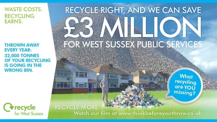
Our local residents are doing a great job – 80% of the material that can be recycled is, but that meant that 20% wasn’t, and at a significant cost. The brief to Real World Visuals was to produce visuals and creative that would break through people’s apathy and get their attention - reengaging residents the cost benefits of recycling.
Following production of film and graphic assets for West Sussex County Council Waste Management Service our Communications Manager (Anna Lodge) talked to Communications and Campaigns Manager Nicola Cosson about her experiences running online and offline campaigns with Real World Visuals materials.

Anna Lodge (AL): What was the brief for this project?
Nicola Cosson (NC): Our local residents are doing a great job – 80% of the material that can be recycled is, but that meant that 20% wasn’t, and at a significant cost. The brief to Real World Visuals was to produce visuals and creative that would break through people’s apathy and get their attention - reengaging residents in the cost benefits of recycling.
Having comprehensive data from a waste composition analysis we had already completed, we knew what was being thrown away rather than being recycled. And whilst the data showed that our residents were having a really positive impact and were well educated about waste in the main, there were clearly areas for improvement and common mistakes being made. The overall strap line for the campaign ‘Think before you throw’ was about getting a resident to do exactly that and think ‘Wow! There is still more that I can do.’ This is where the Real World Visuals came into their own, I was looking to them to provide that visual ‘Wow!’ - no mean feat.
AL. In practice, what were you looking for to support your overall communications campaign?
NC: Within the film, I was particularly keen on quality of the graphics in the individual pile of waste as a key point to trigger engagement at an individual level. The film as a whole but that part specifically, has really resonated with people. They are then ‘wowed’ by the figure of £3million savings with increased recycling rates – it allows all inside the council and residents to see the benefit whatever their views or politics.
Real World Visuals produced a main film with voiceover and subtitles as well as the creative design for the offline materials like railway station posters and leaflets. Using the same team to produce the online and offline materials was key for me, to ensure consistency and impact of the campaign as everyone was on the same page, and understood what we were trying to achieve.
AL. How did the creative team work, from your perspective?
NC: Trust was important for me, particularly in the early scamp stages, but I trusted Adam implicitly to turn the ideas and early images into high quality rendered graphics, and was so pleased with the end results. Dave really listened and did a fantastic job translating that visual imagery into a design that could accommodate a clear messaging hierarchy, to ensure that the offline visuals that communicated to people reading billboards, adverts as well as on social media. The final creative met my brief of ensuring each resident comes away with a message wherever they see the visuals.
AL. Tell me more about the campaign assets.
NC: Railway 6 sheet advertising was new for us, we had used bus stops and buses previously but have had great anecdotal feedback from staff and residents particularly with commuters on trains seeing the key £3 million figure and those waiting at stations having time to look at the more detailed messaging and note the website. We also tried the creative out on a new channel we developed with our library service. Sleeves over the entrance security scanners in the 4 key West Sussex libraries has had a tremendous impact supporting the engagement with events we ran in launch week. Our events team were on hand to provide detailed information and practical recycling advice to help residents ‘think before you throw’.
AL. Was the social media campaign successful?
NC: We ran the film on Facebook page, Twitter and our website to minimise the number of clicks people needed to make to view. We have seen a clear spike in resident engagement with the activity on social media. At this point the main campaign film has had over 43,000 views on Facebook alone, with other posts and ads from the campaign receiving over 130,000 Facebook engagements and impressions from targeted West Sussex residents. The campaign has had 17,989 reactions on Twitter. The analysis for the website engagement is being processed and we look forward to similar hugely positive stats.
AL. Overall, was the project sucessful in meeting the brief?
NC: In terms of my original objective – to reengage with residents – looking at the analytics and comments we have had on Facebook alone I feel confident the images from Real World Visuals have absolutely achieved that objective. From the engagement we received from the original film – call to action on all materials drove people to our website to view the film or to Facebook – we were able to then drill down into more material specific messaging, to highlight exactly what that missing 20% was made up of and educate residents on recyclable materials like foil, plastic pots, aerosols etc. The campaign has generated online engagement, we have been answering questions constantly on our Facebook page and even better, we are now finding residents acting as advocates for us and advising each other, with no involvement from us at all!
From concepts to finished assets, it has been a really positive experience to work with Real World Visuals. I knew from the first face to face meeting that they ‘got it.’ Our residents, like all consumers these days, have very high expectations when it comes to being communicated with, I have always thought local government campaigns should aim to meet these expectations. The quality of the CGI visuals was essential to make convincing and engaging material that would grab residents’ attention. This campaign for me, shows that not only are high quality creative visuals effective for resident engagement, but that is absolutely possible to produce them within a local government setting and that real value for money in terms of the production and impact can be achieved.
Visit this project page.
Visit the Think Before You Throw campaign.

The carbon footprint of cement
We have been looking at how carbon can be released in the production of some materials common to modern construction.

The images show a tonne of cement (20 x 50kg) alongside the 1.25 tonnes of carbon dioxide gas associated with production. The spheres are kg spheres. The 1.25 tonnes is taken from the IPCC.
We have been looking at how carbon can be released in the production of some materials common to modern construction. These sketches show the carbon footprint of a tonne of cement. The bubbles show emissions of carbon dioxide (a release of carbon dioxide from the manufacture of the material).

You can contrast this with images we have done showing a carbon saving from natural materials. This is carbon that is ‘banked’ within the construction of a building using these materials.

A Breath of Fresh Air: Visualising Air Pollution
Air pollution is notably an issue that is gaining considerable attention around the world in all sectors of society - public policy, industry and health... We have been thinking about air pollution for some time: why it needs visualisation and how best to visualise it for all these audiences; for those dealing with the problems air pollution causes, those creating the problem and all of us seeking a solution. Happy National Clean Air day if you are in the UK... now take a deep breath....

Air pollution is notably an issue that is gaining considerable attention around the world in all sectors of society - public policy, industry and health... We have been thinking about air pollution for some time: why it needs visualisation and how best to visualise it for all these audiences; for those dealing with the problems air pollution causes, those creating the problem and all of us seeking a solution. Happy National Clean Air day if you are in the UK... now take a deep breath....
“We want to show what air quality is like right now. That’s what our particle visualiser (above) is designed to do.”
Awareness of this important topic is in part due to epidemiological studies in recent years that have revealed how deadly air pollution is on a global scale. Air pollution is estimated to cause 7 million premature deaths per year; that’s about 20 thousand deaths a day.
We think we can help reduce the impact by making the invisible threat visible – giving vulnerable people a better chance to protect themselves and keeping it on the political agenda. We tackled air pollution before as part of the Environmental Defense Fund's Clean Heat campaign in New York, but we are keen to explore other ways in which visualisation can help. As with much of our data visualisation work, our focus is on ‘non-engaged’ audiences – people who don’t yet know that they are interested in the topic and so don’t bring questions of their own to the data. How can we make air pollution real for such audiences?
London has had a reputation for air pollution since the thirteenth-century. During frequent ‘pea-soupers’ in the 1950s the smog would get so bad that it would stop traffic, but even though the pollution was visible, few people considered smog a serious risk to health. It was an unpleasant inconvenience yes, but it was not considered to be something either politicians or individuals had to worry about. Nobody had really noticed the sharp spike in deaths associated with air pollution events.
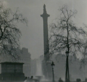
Nelson's column viewed through the Great Smog of 1952, By N T Stobbs (CC BY-SA 2.0)
That changed during the ‘Great Smog’ of 1952. The first hint that smog was dangerous after all was when undertakers ran out of coffins and florists ran out of flowers. It is estimated that 4,000 people died in the Great Smog, and a further 8,000 died in the following weeks and months. Despite resistance from the Conservative government of the time, the impact of the Great Smog eventually led to legislation in the form of the Clean Air Act, 1956.
The Clean Air Act did much to improve air quality, mainly by reducing the use of brown coal in cities, but there was an unfortunate side-effect: the remaining air pollution was invisible. Air pollution is still deadly. A report by Kings College London published in July 2015 estimated that 9,416 Londoners were killed by air pollution in 2010, which is 26 Londoners a day on average – and it is getting worse. This year (2016) London breached its cumulative annual pollution limits in the first week of January . (Under EU rules, sites are only allowed to breach hourly limits of 200 micrograms of NO 2per cubic metre of air 18 times in a year, but Putney broke that limit for the 19 th time on 8 January 2016.)

Kings College London estimate that air pollution killed 9,416 Londoners in 2010. We have produced this Crowd Visualisation this as spots representing an individual life lost.
Road vehicles are a major source of air pollution. In many countries, emissions regulations have been getting steadily tougher. This should have led manufacturers to improve their engines but Volkswagen adopted a cheaper approach. In September 2015, the United States Environmental Protection Agency discovered that Volkswagen had programmed its engines to recognise when it was being tested and switch to a less polluting mode until the test was over. That is, Volkswagen cars only appeared to meet US standards. In real-world driving Volkswagen cars emit up to 40 times more NOx.
The problem with invisible pollution is that even when we know its real it doesn’t feel real. We know for instance that Volkswagen was dishonest but few of us have a feel for how significant their deception was. Does it really affect us? How can we answer that question visually?
We have identified a number of motivations for visualising air pollution:
- Visualising it to make it visible – it is easier to engage with visible threats
- Visualising its overall impact to give a sense of how important it is as an issue
- Visualising particular sources of air pollution both to make them real and to give them a sense of scale (both absolute and relative)
- Visualising the immediate threat in a way that allows people to take action
Different motivations for visualising air quality will generally result in different visualisations. Telling a story like the Volkswagen emission scandal requires a combination of the above. The main visualisation would be one that shows the difference between the claims and the reality for VW cars, but this would need some context: What does a dangerous level of pollution look like? How much pollution do we actually breathe? How much pollution do cars emit?
We are still at the early stages of working out how best to communicate quantities and concentrations of air pollution, but we have some sketches of starting points:
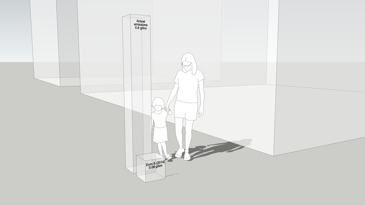
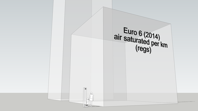
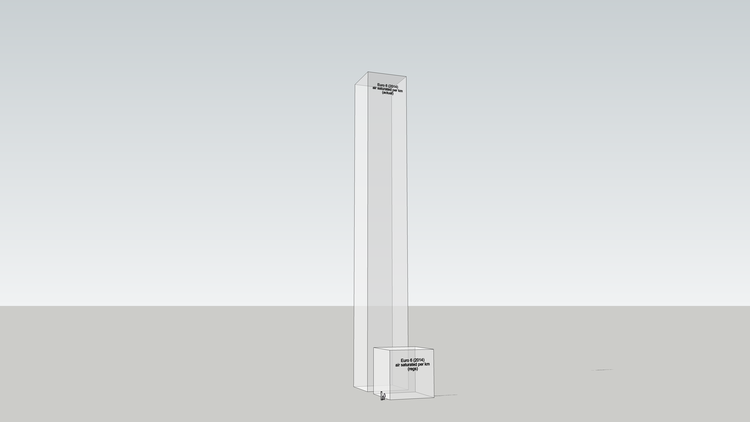
We are trying to make purely numerical emissions standards physically meaningful. We've tried a range of physical metrics including the volume of the pollutants themselves and the volume of air that they saturate to the legal limit (National Objective). So far I think it helps. It makes the invisible threat feel real, which in turn gives us agency: invisible air pollution is just scary, like cancer or something, but visible air pollution is fixable. We are trying to speed up the recognition of the problem so we don't have to wait until air pollution makes itself visible, like London in the 1950s or Beijing today, before something is done about it.
Refs:
This article has be edited from that which appeared on the Carbon Visuals website in February 2016 where there is an interactive version of the particle visualiser (see the top of this post).
For work we have done as Real World Visuals visualising air pollution from cruise ships click here.

United States' daily contribution to global warming
The carbon dioxide emissions of the USA in 2014 - 6,870 million metric tons - makes up about 14% of global emissions. This image set shows that amount as a daily pile of spheres / bubbles in Washington DC, cascading over The White House.
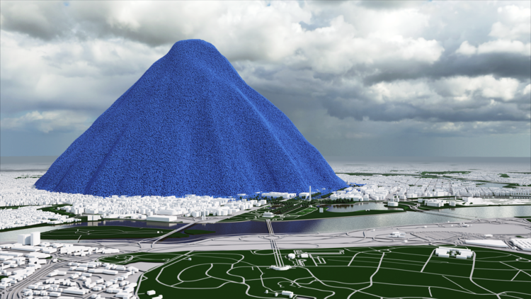
In 2014, the United States added the equivalent of 6,870,000,000 metric tons of carbon dioxide to the atmosphere * (6,870 million metric tons). On average that is:
- 218 metric tons every second
- 13 thousand metric tons every minute
- 784 thousand metric tons every hour
- 18.8 million metric tons every day
One metric ton of carbon dioxide gas would fill a sphere just over 10 metres across (33 ft) ** . To give a sense of scale to these emissions, we've made a pile of 18,809,437 one-ton spheres (US emissions for one day). The pile is 2,367 metres high (1.5 miles).


High resolution versions of these images are available with a 'Creative Commons Attribution' license from our Flickr page: US Daily CO2
To put these emissions into a global context, this image shows all the emissions from all countries in 2013. If you mouse-over the image you will see all emissions since 1750. (Note that the figures in this image are given in terms of carbon, not carbon dioxide. To convert to carbon dioxide multiply by 3.6642.)
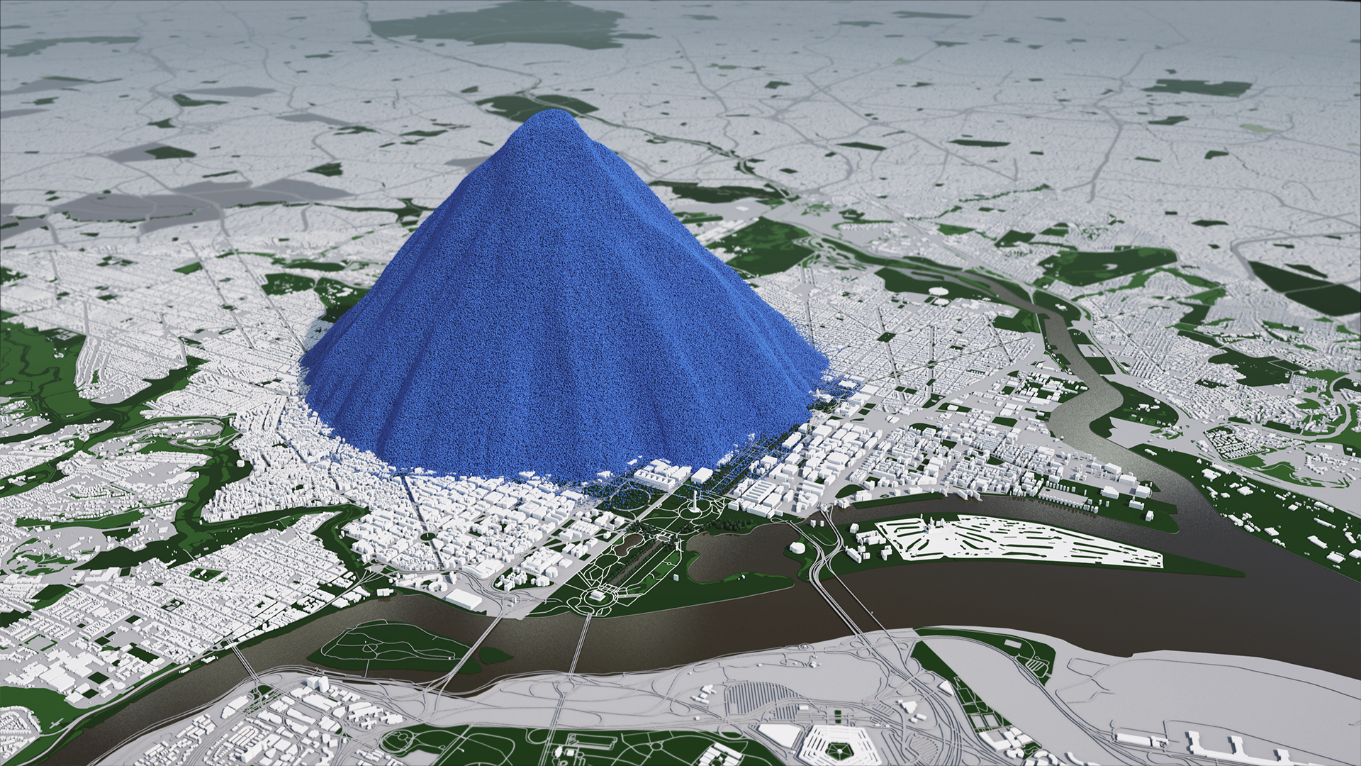
US emissions are currently about 14% of global emissions. This film shows how much carbon dioxide the planet as a whole is adding to the atmosphere all the time.
In 2012 human activity added over 39 billion metric tons of carbon dioxide to the atmosphere, The pile of one metric ton spheres in the film, which represents one day’s global emissions, is 3.7 km high (2.3 miles) and 7.4 km across (4.6 miles).
Footnotes
* U.S. Environmental Protection Agency, 2016, Inventory of U.S. Greenhouse Gas Emissions and Sinks, Table ES-2, pp ES5-7
** At standard pressure and 15 °C (59 °F) carbon dioxide gas has a density of 1.87 kg/m3
Little Britain – exploring populations
Population Explorer is a new crowd-vis tool. Pick a number and Population Explorer will create a population of that size that matches the British population. For instance, in a population of 100 there will be 59 Christians and 25 people with no religion. Population Explorer can be used for any population, but more interestingly it can allow us to use population as a way to understand natural and financial resources.
Our crowd visualisation research is progressing as we continue to explore ways of helping people see themselves in statistics. Recently we built an experimental tool for looking at population statistics. For those who have seen the book: If the world were a village, the idea is similar.
(Also available: full-size Population Explorer)
The book asks you to imagine 100 people who live in village whose population maps directly to the global population and tells you, for instance, that 9 speak English, 24 have a television and 17 cannot read. Population Explorer allows you to choose the size of a community – it doesn’t have to be 100 people, it can be a number more meaningful to you – and then it maps the British population to that. For instance, you could choose the size of your school or workplace or housing estate and see what that population would look like if it matched the British population as a whole. How many people would be in full-time employment? How many would be Jewish? How many living in poverty? Etc.
We will add more statistics to Population Explorer soon including education and housing. We also plan a global version that works in a similar way. Later we will add other ways of visualising the crowds to better see distributions (for example - the distribution of ages in the population). Later still we will add the ability to explore individual parts of the country right down to the level of census ‘Output Areas’ – the lowest geographical level at which census estimates are provided. But we have more interesting plans also.
Little Britain
What if we scaled the rest of the World in the same way we scaled the population? That is, what if we also scaled the land, the natural resources, the financial resources? If the population of the Great Britain were just 100 people but we had the same area of land per person, the same number trees per person what would this ‘Little Britain’ be like? It turns out that the whole country would have an area of 36 hectares (0.36 km2). That’s the same area as a square 600 x 600 metres. The urban area would be 4.4 hectares. The area per household in Great Britain and Little Britain alike is 0.9 hectares – equivalent to a square 95 x 95 metres.
There would be just under 6,000 trees in a Little Britain with 100 people. The distance between Scilly and Shetland (as the crow flies) would be 1.6 km (the actual distance is 1,270 km).
The total wealth in a Little Britain with 100 people would be £17,600,825. £7.0m would be in pensions, £6.2m would be in property, £2.5m would be financial wealth (money) and £1.8m would be physical wealth (things). There would be 40 households in a Little Britain with 100 people. The richest household would have £3.6m (over 20% of the total wealth).
When we get a chance we will extend Population Explorer to give insight into land and resources interactively. Look out then for:
More statistics in the basic tool
A global version of the basic tool
Visualisations of distributions as well as simple crowds
Ways to explore the populations of very specific areas
‘Little World’ – a way to explore national and global land and resources through populations


Crowd visualisation: seeing yourself in statistics
When you can see yourself in statistics you engage with them on a wholly different level. That’s why at Real World Visuals we help people to see people in statistics about people. Sometimes we need reminding that it is not just numbers we are talking about and sometimes we need reminding to pay attention to the actual numbers rather than misguided intuition.

When you can see yourself in statistics you engage with them on a wholly different level. That’s why at Real World Visuals we help people to see people in statistics about people. Sometimes we need reminding that it is not just numbers we are talking about and sometimes we need reminding to pay attention to the actual numbers rather than misguided intuition.
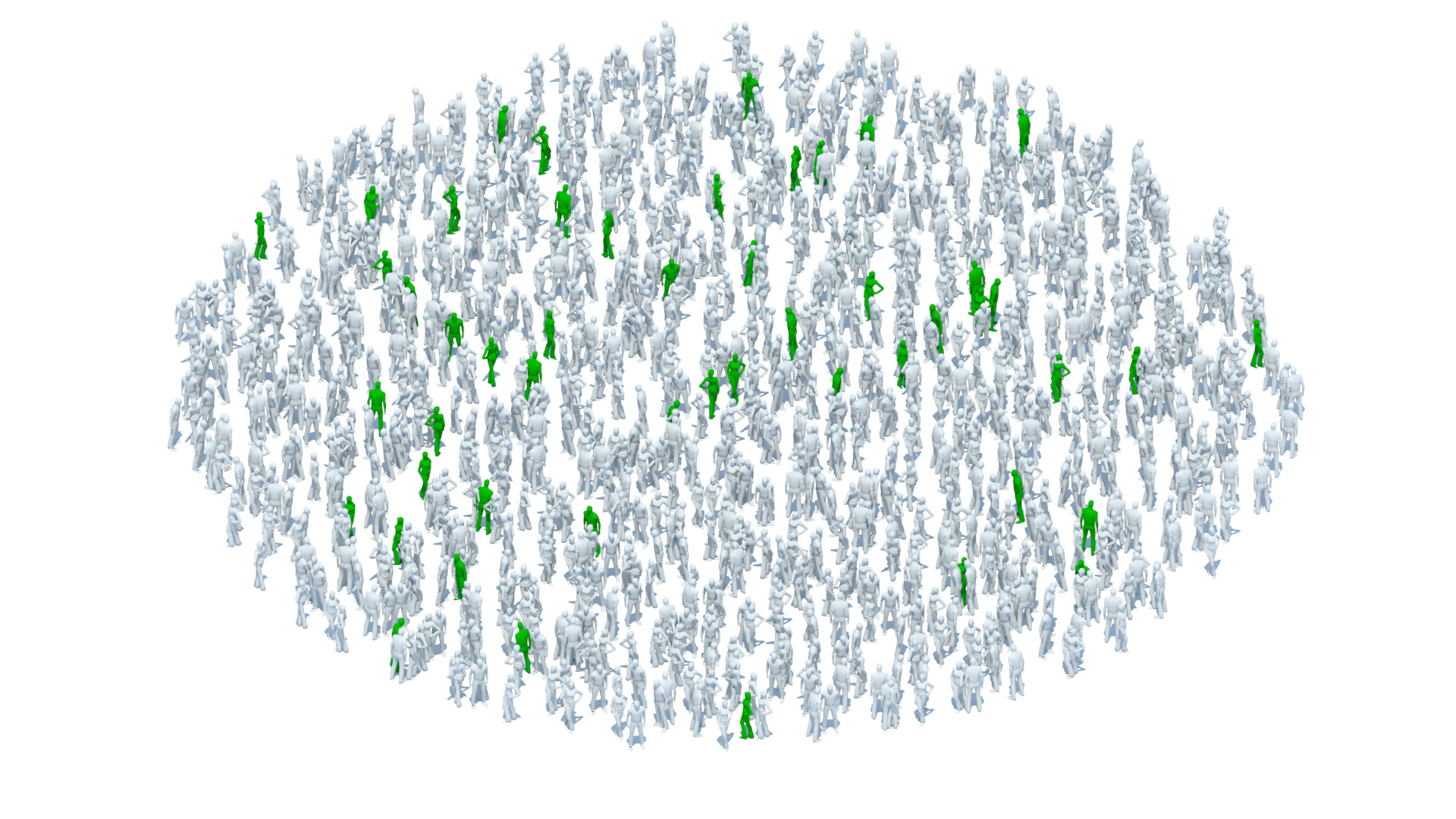
Our simple, but powerful approach is to illustrate individuals. Pie charts might be OK for statisticians who just want answers to their questions about populations, but they ask a lot of audiences who don’t have questions of their own. A pie chart can be about anything, which is, of course, the advantage of abstract visualisation. Showing individual, countable objects makes the chart about things rather than numbers.
“We help people to see people in statistics about people”
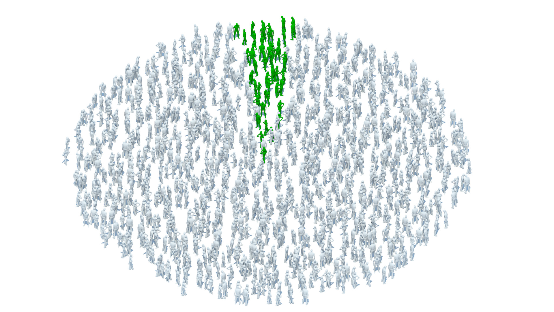
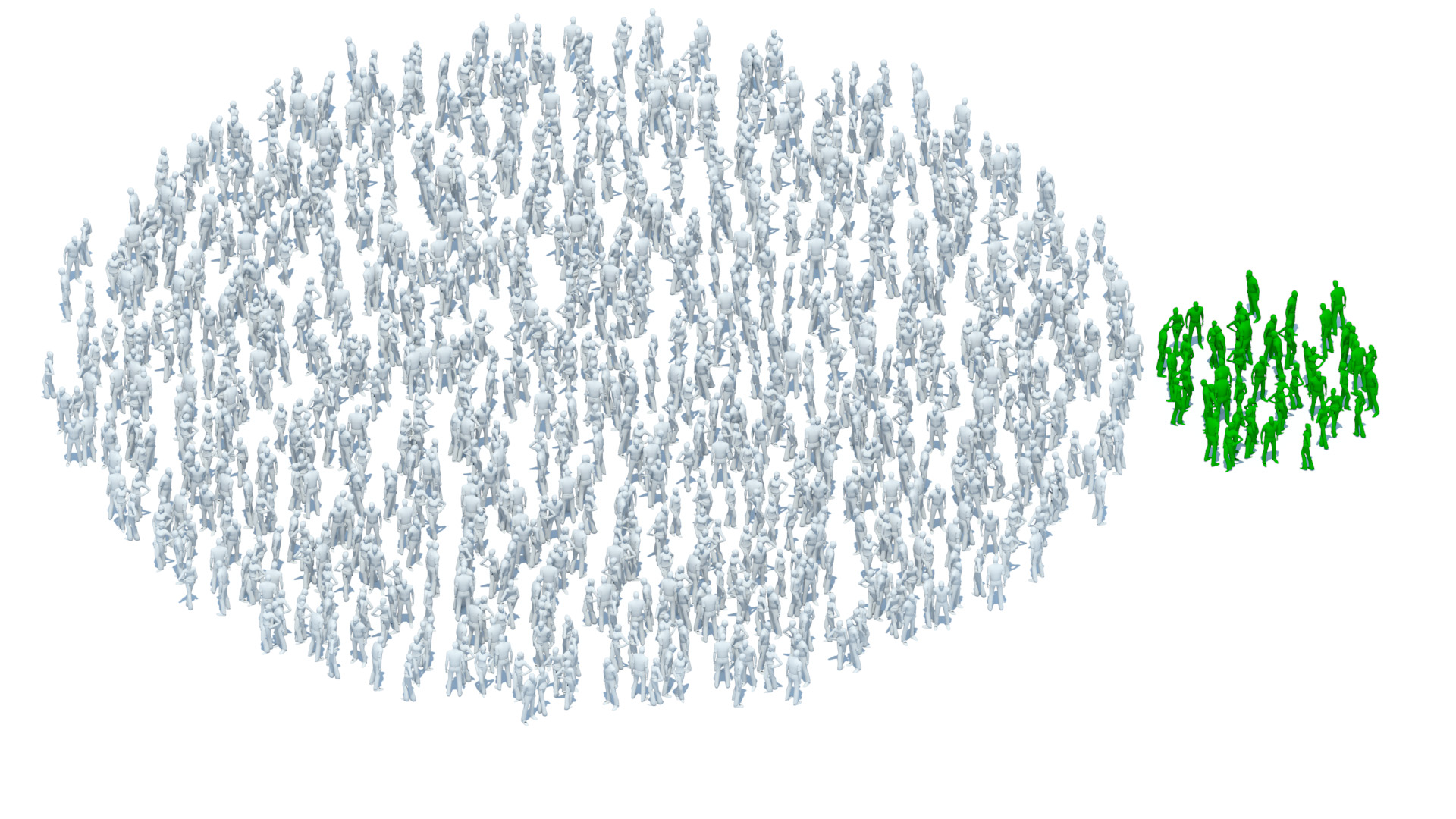
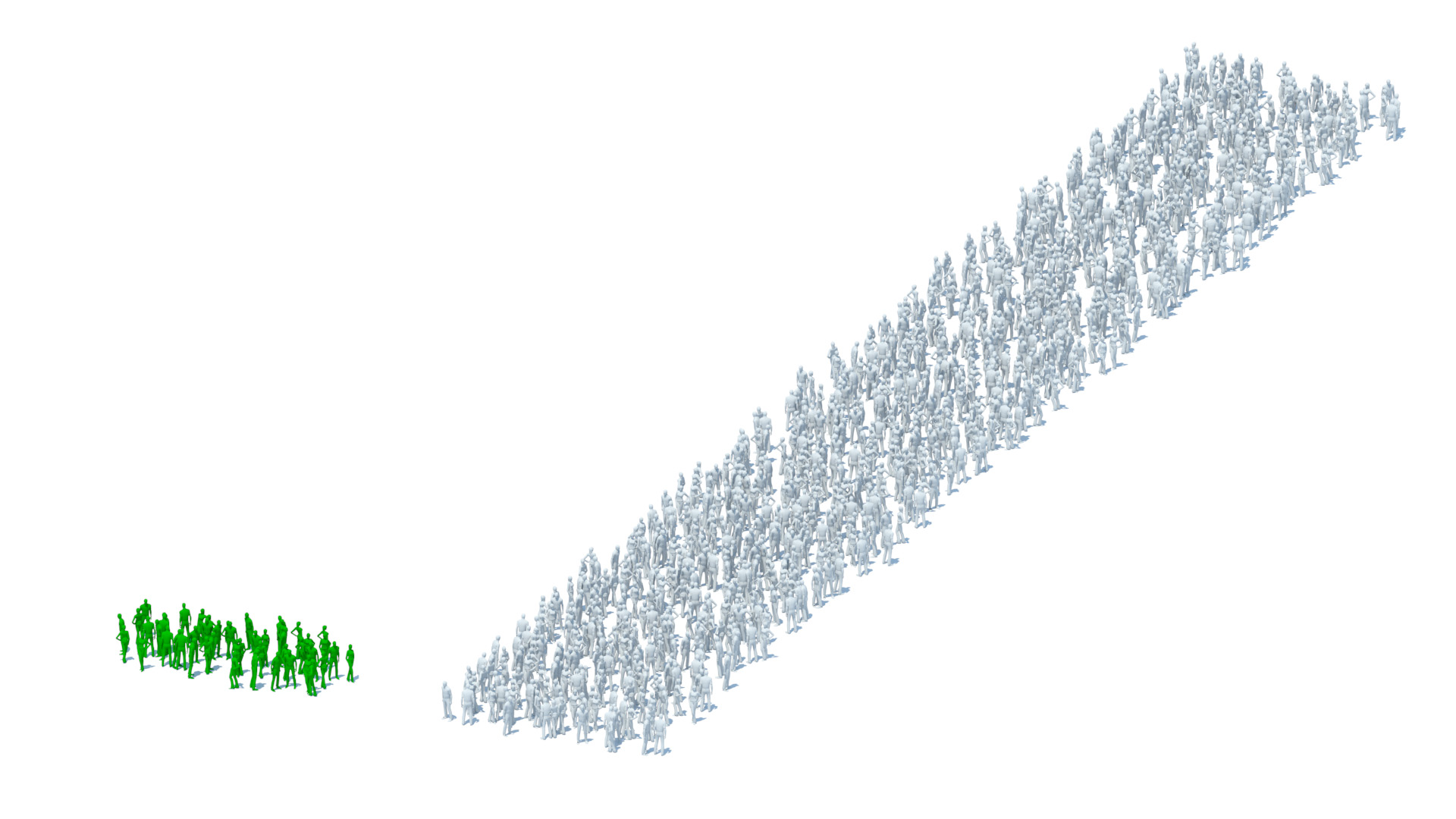
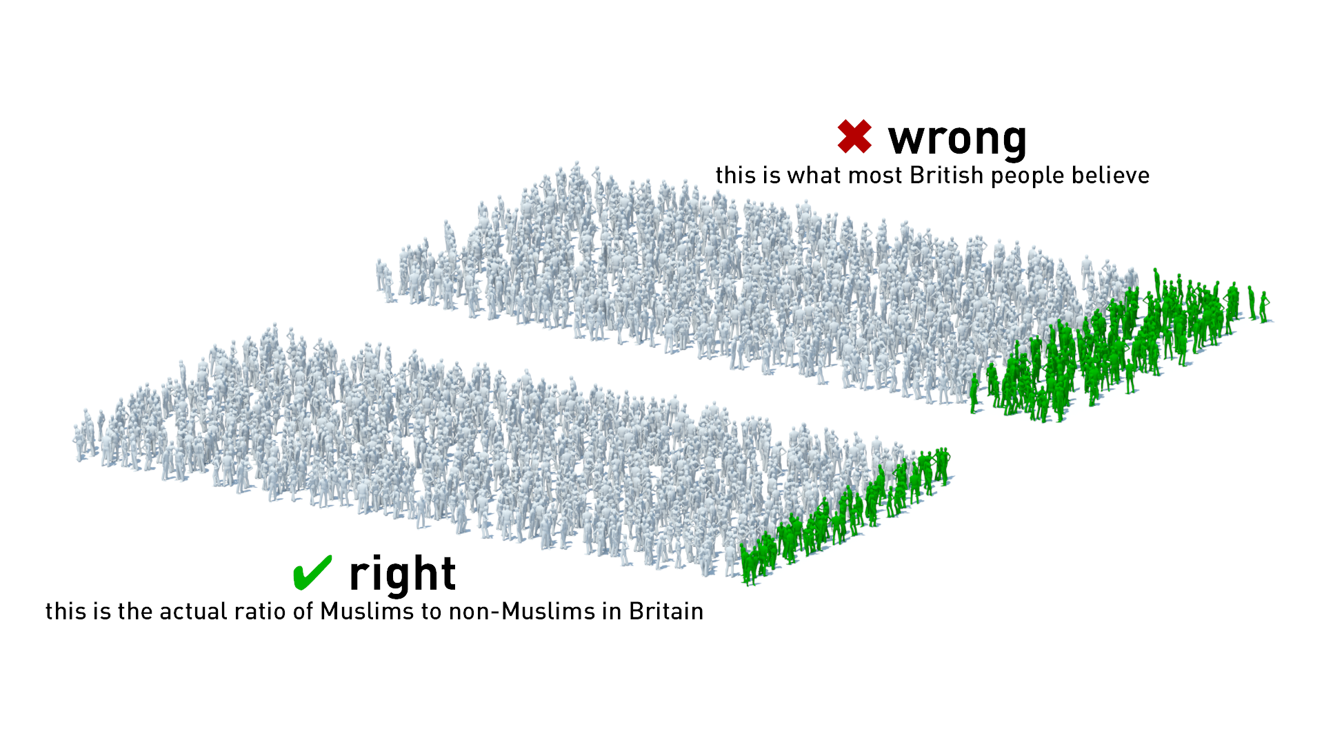
The example at the top of the page shows a number of different ways of representing the proportion of the British population who are Muslim. This is a number for which most people’s intuition is wrong. In a survey (discussed in this Guardian article) most people overestimated the proportion by a factor of 3. In other Western countries the error was even greater, so it is an interesting number to look at. We think it makes a difference to see it represented like this.
In the Muslim charts we are visualising a proportion. They are not actual individuals. But crowd-vis has even more impact when each object represents a real person. We have two political examples below, which each work on different scales. The General Election Visualiser shows every registered voter in every constituency. If you are registered to vote, you will be represented by one of those spots. When you've chosen a constituency, click the circles to zoom in.
Full size version of election-vis tool (opens in new window)
In the Division Visualiser we used the data.parliament.uk API to extract what we could from each division (vote by MPs). It does seem to make a difference to be able to see not just numbers but how particular MPs voted which way and who went through the lobby with them. Currently the API won’t allow us to identify MPs who didn’t vote or the reasons why. The default gender for the unknown politicians is female, but don’t let that confuse you – the actual proportion is 191 women to 459 men.
Full size version of divisions tool (opens in new window)
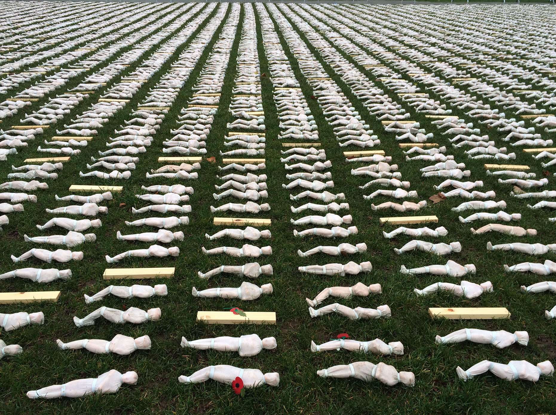
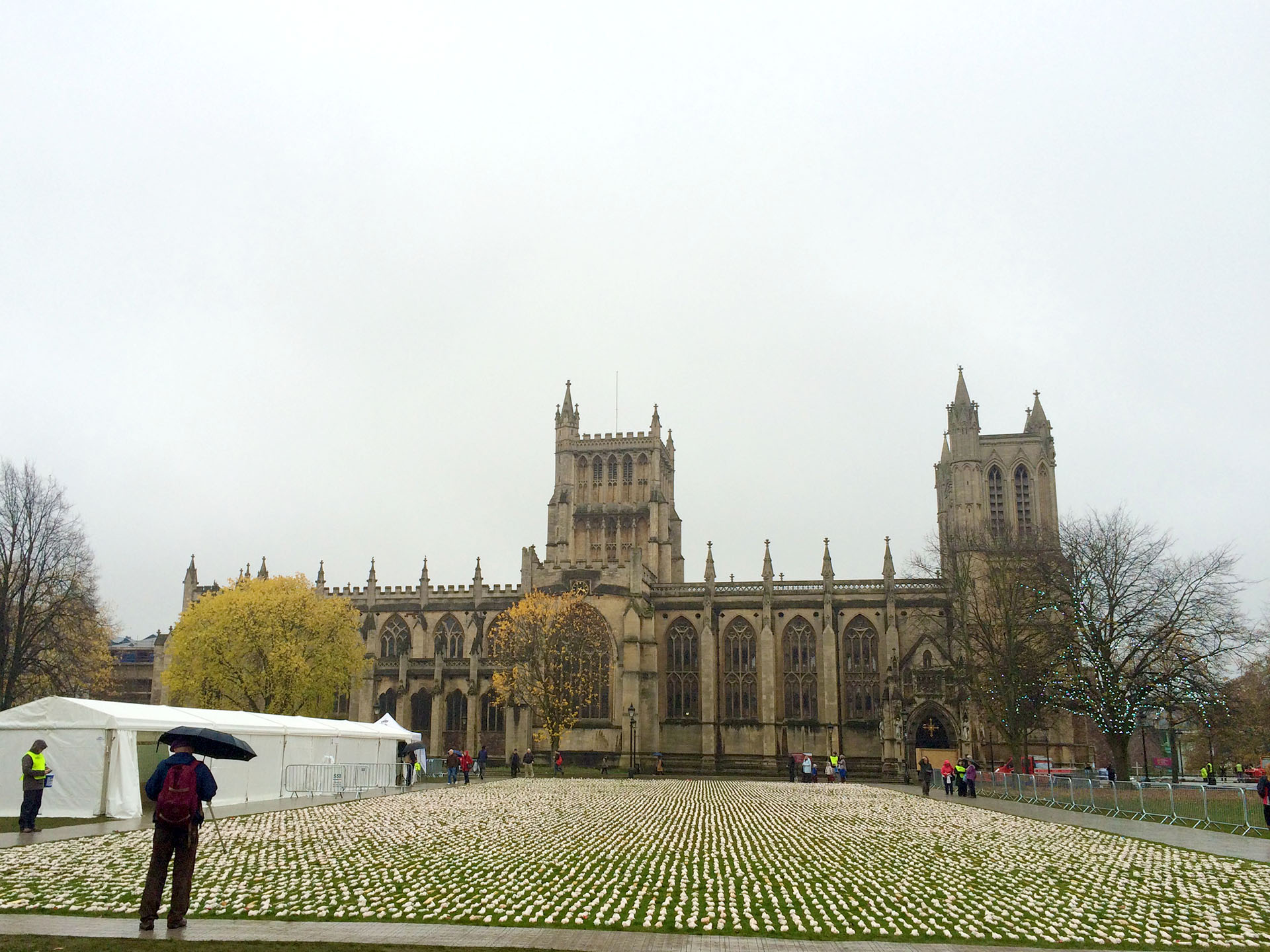
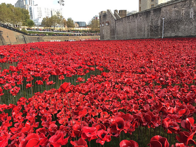
Two particularly affecting examples of crowd-vis commemorate soldiers who died in the First World War. In one, 19,240 Shrouds of the Somme, each fatality on 1 July 1916 (the first day of the battle of the Somme) is represented by a 12 inch shrouded figure. The other, Poppies in the Moat commemorates each of the 888,246 British and Commonwealth soldiers who died in the First World War with a ceramic poppy. The installation filled the moat of the Tower London. These works of art help bring meaning to the numbers, which otherwise may remain just numbers.
The most ambitious crowd-vis to date is Of All the People In All the World by Stan's Cafe - a theatre company. In a series of performances/installations around the world they represented every living person in the world as an individual grain of rice, and then explored particular populations in relation to the whole.
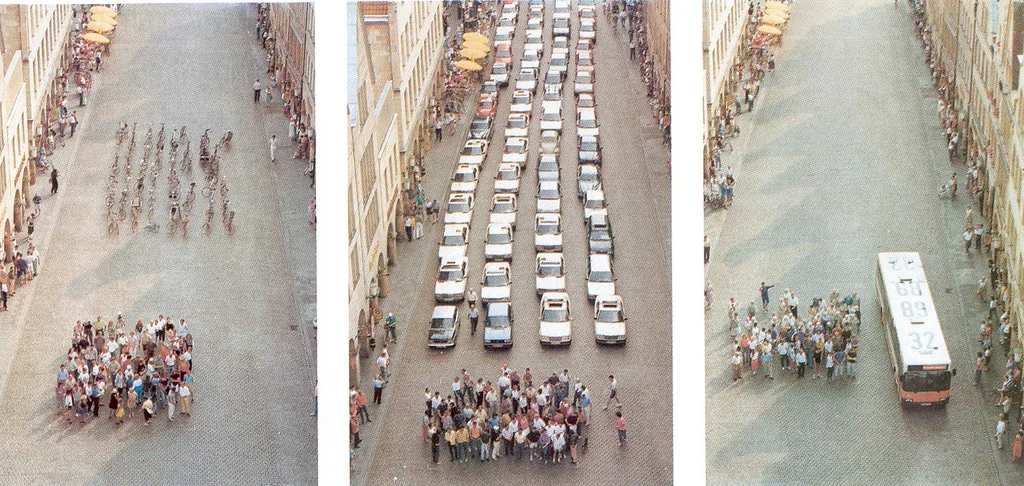
Crowd vis is not just about populations. It can also help make sense of other data, as in this final example, which is not so much about people as space. Crowd visualisations are used here to show how much space cars take up in cities. The image is from a poster created by the City of Munster. See: How Much Space do Cars Take?
We see opportunities for crowd-vis in many types of statistics, but we are particularly excited by opportunities to help viewers make sense of epidemiology, population statistics and economic statistics (e.g. distribution of wealth & income).
We also see opportunities to make sense of the rest of the planet by visualising animal populations and even numbers of trees. According to a recent study, there are 417 trees for each human alive today – but that’s for another blog.
See our new crowd-vis tool: Population Explorer.

Cruise ship air pollution
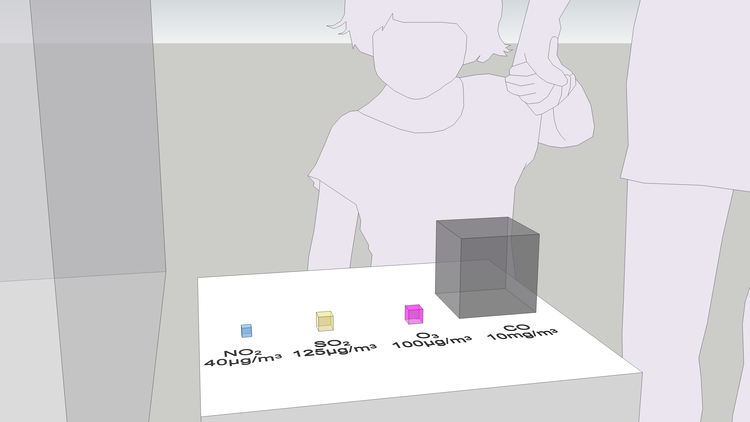
We have created a set of images that show the pollution from a cruise ship docked at the proposed terminal at Enderby Wharf, Greenwich, London. The images show the total volume of exhaust gas created each day, the volume of specific pollutants, and finally the volume of saturated air to the levels that are considered ‘safe’ to breathe.

“Air pollution effects everybody. If you could physically see it then a lot of people would take action on it.”
We at Real World Visuals have been working on ways to visualise air quality for some time, which also means understanding the different reasons for visualising it. Some of the time we want to show what air quality is like right now. That's what our particle visualiser (above) is designed to do. Visualising current conditions is important for people who already understand the risks and want to take steps to protect themselves, but visualisation has a role in planning and mitigation also. In a sense, if you need to visualise ambient air quality you have already failed. We believe visualisation should also help avoid pollution becoming a problem in the first place.
“We can provide most insight by visualising air itself”
In this blog we present some early sketches based on numbers from a report commissioned for a planning enquiry*. Quantifying emissions does not provide much insight by itself. On the other hand, quantifying the atmospheric ‘services’ required by an emitter is much more useful to decision makers in a planning department. We still see value in visualising absolute quantities of pollutants and visualising concentrations of pollutants, but we have come to realise that we can provide most insight by visualising air itself. That is, we have set out to answer visually the question: how much clean air does this emitter need to dilute its emissions to safe levels? This gives an immediate, intuitive sense of how viable an emitter is in any particular environment.
According to the consultants’ report, a typical cruise ship docked at Enderby Wharf would emit 1.4 million m3 of exhaust each day (15.7 m3 per second).
THE PROBLEM
This set of sketches was inspired by a Costing the Earth programme BBC Radio 4, which highlighted the problems of air pollution from cruise ships docked in Southampton and Greenwich, London. Greenwich Council has approved plans for a cruise ship terminal at Enderby Wharf, so we looked at a Technical Report prepared for the planning process just to get a sense of what the numbers ‘look like’.
First we looked at how much exhaust the ‘typical’ cruise ship represented in the report emits each day (see above). Much of the exhaust is just normal air plus a bit of relatively benign carbon dioxide and water vapour, but a significant amount of it is oxides of nitrogen and sulphur. It also contains particles.
The exhaust from the cruise ship also contains oxides of nitrogen and sulphur, and particles. The cubes show the actual volume of the gases (at a pressure of 1 atmosphere and temperature of 15 °C) emitted over 24 hours. These toxic gases and particles need a lot of air to dilute them until they are at levels safe enough to breathe.
22 kg of sulphur dioxide may not seem much, but if not dispersed it is enough to do a lot of damage. One way of quantifying the damage is the number of people it could potentially affect. It turns out, that a cruise ship adds a quantity of SO2 to the air that is equivalent to the maximum daily dose for 16 million people, which is fine as long as there is enough air to dilute it.


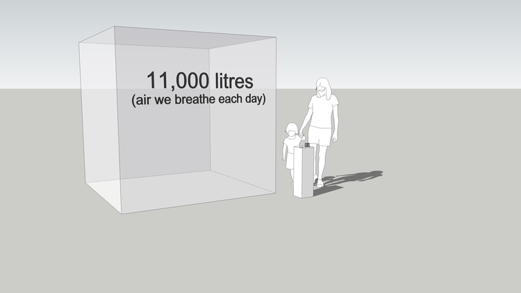
The two images above show the volume of air that passes through our lungs each day and the maximum volume of pollutants. The coloured cubes show the maximum daily ‘dose’ of pollutants given that adults breathe about 11 m3 of air every day (11,000 litres). (The diagram takes values for concentration in air quality objectives and converts them into an absolute quantity of gas. See below for more details.)
So how much air do the emissions need to dilute them to safe levels?
The oxides of nitrogen would need 19 cubic kilometres of air each day to dilute the NOx to a concentration of 40 μg/m3, which is the air quality objective annual mean concentration. (Note that this assumes that all the NOx is eventually converted to NO2. The Environment Agency assumes 70% of NOx is converted to NO2, so we should probably reduce this volume by 30% to 13 km3. London’s air already carries a heavy load of NOx, SO2, PM10 and PM2.5 pollution.
A view of the same volumes in Google Earth
The volume of air saturated to the air quality objective concentration each minute for (left to right): NOx, SO2, PM10 and PM2.5 pollution
“We have been thinking about how to visualise local air pollution for some time. This was an opportunity for us to show not just the volumes of pollutants, but more importantly the volume of air required to safely hold those pollutants. We think seeing the volumes in this way makes it real - a pre-requisite for better decision making.”
The consultants' report provides figures for cruise ship they deem typical. Elsewhere in the Report the cruise ship Crystal Symphony is mentioned as the largest that can get into the new dock. This vessel would emit 2.5 to 3 times as much NOx as shown in the images.
An argument used by supporters of the terminal was that the vessels would be using 'low sulphur' diesel which is ‘very similar to automotive diesel’. This is misleading. Since 2009 in the EU the maximum sulphur content for automotive diesel has been 10 ppm, which is 10,000 times less than ‘low sulphur’ marine diesel (we are looking at creating an image to show this too).
THE SOLUTION
The problem of excessive air pollution from stationary cruise ships in cities is however easily solved by installing shore-to-ship power systems, so the national grid can be used and onboard diesel power is not required.
In Europe, ports such as Gothenburg, Lübeck, Oulu, Zeebrugge and Antwerp have installed such systems. In North American cities such as Los Angeles, Long Beach, Seattle, Juneau (Alaska) and Vancouver have already implemented shore-to-ship power in close cooperation with the shipping industry. Princess Cruises, a subsidiary of Carnival Corporation, has fitted eight ships with shore-to-ship power capability and has plans to retrofit to the entire fleet. There are several suppliers who can install such systems on vessels and at UK ports.
HAS THIS VISUAL METHOD BEEN USED BEFORE?


We used this same methodology three years ago to visualise data from the Clean Heat project - helping New York property managers, building co-op boards and community groups reduce local air pollution from their buildings. See here for more details.
NEXT STEPS
The simple images above begin to explore ways of making these numbers meaningful for decision makers and stakeholders, but there is more work to be done. They have given us important starting point for visualising sources of pollution - not just ambient conditions. We can see ways of improving their impact and their readability. An animation would help us unpack the story. Showing both emissions, and air needed to accommodate them, in real time would also help a viewer see just how polluting a source is.
For cruise ship air pollution our aim would be to use similar images as the basis for a short animation that shows both the problem and the solutions. We are now actively looking for any applications where these technique can be used more widely to help facilitate better planning outcomes. If you think you can help please contact us on info@realworldvisuals.com.
Finally a comment from one of the leading authorities in the field of allergy, both in the UK and internationally.
“I am enthusiastic about the potential of your imaging of Air Pollution being used to inform the health profession and the wider public.”
* Report from the consultants Royal Haskoning DHV can be downloaded here.
More information on the planning process of the Greenwich Terminal can be found here.
An earlier blog about visualising air quality: A BREATH OF FRESH AIR: VISUALISING AIR POLLUTION
Further details about calculations above:
'Daily dose': On average, an adult breathes about 11 m3 of air each day. According to air quality objectives, over 24 hours the concentration of SO2 in air should not exceed 125 μg/m3 (125 millionths of a gram per metre cubed). That makes a daily ‘dose’ 11 x 125 μg, which is 1.375 mg. In other words, the quantity of SO2 a cruise ship adds to the atmosphere each day (22 kg) is equivalent to the maximum daily dose for 16 million people. Note: 'daily dose' is not a metric used in air quality regulation, it is just a way to get a handle on the numbers.
'Particles': Particle pollution is classified into three main categories: PM10, PM2.5 and PM1 , i.e. particles smaller than 10 microns, 2.5 microns or 1 micron. A micron is a thousandth of a millimetre.
Tables from Royal Haskoning DHV, 14 July 2015 Air Quality Assessment Report, for Rolyal Borough of Greenwich
Table 6, p10: Pollutant Emission Rates Utilised in the Dispersion Modelling
| Pollutant | Modelled Emission Rate (g/s) |
|---|---|
| Oxides of Nitrogen (NOx) | 8.65 |
| Sulphur Dioxide (SO2) | 0.26 |
| Particulate Matter (PM10) | 0.11 |
| Particulate Matter (PM2.5) | 0.11 |
Table 5, p10: Emission Parameters Utilised in the Dispersion Modelling
| Parameter | Value |
|---|---|
| Stack height (metres) | 35.00 |
| Stack diameter (metres) | 1.00 |
| Efflux velocity (Nm/s) | 20.00 |
| Gas exit flow rate (Nm3/s) | 15.71 |
| Temperature (K) | 423.15 |
Table 1 p 6: Relevant Air Quality Objectives
| Pollutant | Concentration (μg/m3) | Objective |
|---|---|---|
| Nitrogen dioxide (NO2) | 200 | 1 hour mean not to be exceeded more than 18 times per year |
| 40 | annual mean | |
| Sulphur dioxide (SO2) | 350 | 1-hour mean not to be exceeded more than 24 times a year |
| 125 | 24-hour mean not to be exceeded more than three times a year | |
| 266 | 15-minute mean not to be exceeded more than 35 times a year | |
| Particulate Matter (PM10) | 50 | 24-hour mean not to be exceeded more than 35 times per year |
| Particulate Matter (PM2.5) | 25 | Annual Mean Target Value |
Making a load of rubbish!
Over the summer Real World Visuals brought a pile of rubbish to life in Bristol. Commissioned by the Bristol Waste Company, the two films show dramatic piles of waste and recycling material in Ashton Court Estate in Bristol.
Over the summer Real World Visuals brought a pile of rubbish to life, in Bristol. Commissioned by the Bristol Waste Company, the two films show dramatic piles of waste and recycling material in Ashton Court Estate in Bristol. The aim was to actively engage residents and businesses in the opportunity to reduce waste on the streets and going to landfill. For more about the project see here.

Real World Visuals works with a range of specialist companies to complement our in-house creative team. Duncan Fraser (DF) is responsible for CGI (computer-generated imagery) at A Productions who partner on a number of Real World Visuals films. Chris Bates (CB) has been a Director and Cinematographer for a decade and in 2012 founded Skyhook, now a leading drone services provider which works across the UK and abroad. Data, concept and script in hand, Real World Visuals brought the talents of Duncan and Chris to help make piles of rubbish real and engaging.
Chris: I thought this was a really interesting task from the start – to shoot the Bristol skyline from above and combine it with CGI material to show clearly how much waste Bristol produces. We do a lot of Industrial surveying and filming for TV, and this project touched on both areas. This waste project was a form of digital design, a media product in essence but using a whole range of skills.
Duncan: Early on we saw how the combination of to-scale visuals, the setting, CGI and drone footage would create a truly real world feel for the waste data for the audience. Bringing the piles to life and helping people understand the scale. In the past we might have used a helicopter to get the best approach to physical projects like this. However, a drone is more flexible and cost effective.
CB: Movement is critical if you want something visually arresting as required by Real World Visuals projects. Drones can make that happen. The average audience has become more demanding, and they expect more from their visuals. It takes more effort to engage them - drone footage helps with that engagement.
DF: Adam and Antony from Real World Visuals always bring unusual projects to the table. And we have some really interesting conversations to get us to the point of production. For example, in this case we had to look at if we were going to show the material in piles or cubes. We look carefully at the dimensions given by Adam and I will say what is possible in terms of animation looking at several million items – as there are in a pile of rubbish.
CB: You can really see the importance of a storyboard in this work. Antony from Real World Visuals and Duncan wanted very specific shots, they were really clear about this and you can see the results in the film. Take a look at the footage of the drone curving around the table and then as it tracks over the park. Though it was created digitally for the film, the rubbish pile is a real thing and its size has to be visually accurate. On the ground we had to work out the correct flight altitude so that once the rubbish pile was created afterwards, we didn't cut the top off it by flying too low!

Duncan Fraser of A Productions
DF: Back in the studio we used cones and spheres to roughly in position on the footage so that we can check it all going to work. Then we make the lighting work using exposures from the filming session, and realistic piles of waste using CGI. A pile of hundreds of thousands of objects is actually made from 8 or 9 different objects replicated. Actually, in the computer’s mind the pile is one sided and hollow so that we don’t need to process data of the unseen objects within the pile. Shadows are added between the litter, each one. We then pass the film on to have sound added for the final bit of atmosphere!
CB: The drone world is now about more than just shooting pretty pictures from above. Drones provide access and visuals like nothing else does, to give valuable real-life data. For example you can monitor heat loss from building, inspect flare stacks in oil refineries without having to shut them down, and model the quantity and value of material leaving a quarry each day. Understanding resource use information from above will help whatever data we are trying to visualise. Using drones can provide lots of potential in the fields of resource efficiency and environmental data.
For more on the technique, data and visual process uses on the Bristol Waste Company films please visit the project page.

Chris Bates of skyhook
Happy Christmas from The White House
In Santa’s world the air is just emptiness. It’s also limitless - after all you can see the stars through it. That’s how he and the reindeers can deliver gifts so effortlessly to the world’s children on a single night.
In Santa’s world the air is just emptiness. It’s also limitless - after all you can see the stars through it. That’s how he and the reindeers can deliver gifts so effortlessly to the world’s children on a single night.
In the real world that’s not true. Every space, even the office of the most powerful person on the planet, has an amazing mix of gases without which we would be unable to live. But that mix is being changed by burning coal, oil and gas.
That’s why Santa is rather puzzled to see this shiny bubble, representing the exact amount of man-made carbon dioxide in the Oval Office (or indeed in any room of the same size the world over). Perhaps it is a suitable gift and reminder to the next occupant (and us all).
Thanks to all our clients and partners for your support in 2016. Special thanks to Dave Forman for design input, and Anna Lodge who looks after our comms and social media, without whom we would be ... invisible!
“We have shown Father Christmas as being 6’1” (1.85 metres) tall. Please contact me if you think this is not true - or should we care in a post-truth world?”
Feel free to download and share this image which is available under Creative Commons licence on our Flickr page.
Technical note
The volume of the Oval Office is approximately 399 m3 (14,100 ft3). Its major axis is 10.9 metres and its minor axis is 8.8 metres. The line of rise (point at which the ceiling starts to rise) is 5 metres and the height at the centre of the domed ceiling is 5.6 metres. (https://en.wikipedia.org/wiki/Oval_Office)
On 11 December 2016 the carbon dioxide in the atmosphere was at a concentration 404.36 parts per million by volume (ppmv) (https://www.esrl.noaa.gov/gmd/ccgg/trends/monthly.html). That means, in 399 m3 of air there will be 162 litres of carbon dioxide (43 gallons).
The pre-industrial concentration of carbon dioxide was 280 ppmv, which means in 399 m3 of air there will be 112 litres of ’natural' carbon dioxide (30 gallons). The remaining 50 litres (13 gallons) is man-made carbon dioxide (which wouldn’t be there if we had not been burning fossil fuels since 1750). 50 litres would fill a sphere 456 mm in diameter (18 inches).
About 1.8 litres of the man-made carbon dioxide in the air in the Oval Office is attributable to fossil fuel sold by Chevron.
Chevron: 1.8 litres (59 fl oz)
ExxonMobil: 1.6 litres (54 fl oz)
BP: 1.2 litres (41 fl oz)
Shell: 1.1 litres (36 fl oz)
(Note: figures have been rounded).
Helping lions and people co-exist
How do you stop lions eating livestock, and people from killing lions in retaliation? How do you improve the relationship between people and one of the worlds biggest carnivores? These are the challenges that have faced renowned lion researcher Alayne Oriol-Cotterill (Lion Landscapes) for the last thirteen years.
How do you stop lions eating livestock, and people from killing lions in retaliation? How do you improve the relationship between people and one of the worlds biggest carnivores? These are the challenges that have faced lion researcher Alayne Oriol-Cotterill, Lion Landscapes together with collaborators Ewaso Lions and University of California.

Photo: Ewaso Lions
New high-tech collars allow Alayne and her team to collect movement and activity data from lions who live in Kenya outside of protected areas, sharing the landscape with people and livestock. Lions are nocturnal and very elusive, particularly in areas where they are in conflict with people, and so without this technology very little is known about this uneasy coexistence.
To help communicate this normally 'invisible' story we have created a proof-of-concept web-tool that uses a month's worth of historic data on three pride movements. At this stage the tool shows historic pride movements and kill information but it could be developed to reveal real-time aspects of the lions lives, sending particular interesting information as text alerts. Note that the tool has not been designed for viewing on smartphones yet, and no design work has been done to make this acceptable for public viewing - that will be for the next stage!
“Understanding more about these collared ambassadors, informs conservation efforts and fosters greater tolerance amongst those that share their land with lions.”
The first application for the tool would be as part of a livestock protection system; lion friendly livestock owners could easily track the location of their local lion prides, and plan the movements of their livestock herds to avoid them. Alerts could be sent whenever a lion moves close to livestock, makes a kill, meets up with another collared lion, or other potentially useful information.
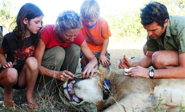
Alayne Oriol-Cotterill and family, Laikipia, Kenya
This tool could also be used as part of an adoption or education program; people and schools who adopt a lion could receive regular alerts, as well as watch their lion's movements on the map and learn about the challenges their lion faces in the wild. Understanding more about these collared ambassadors, informs conservation efforts and fosters greater tolerance amongst those that share their land with lions.
Alayne is now seeking funding to develop the tool to use real-time data for livestock protection. That working tool could then be further developed to provide the core of an engaging adoption / education program.
See more here about the lion conservation work of Alayne and her partners.
World Bank Award for our young film-makers
We’re delighted that two of our colleagues, who took on the tricky topic of carbon-pricing, have won a worldwide film-makers competition run by the World Bank.
Bristol-based Dani Tinez and Jay Carter-Coles put together a film that lasts just a minute, and confronts the viewer with the question: Pay now, or pay later for carbon emissions?
We’re delighted that two of our colleagues, who took on the tricky topic of carbon-pricing, have won a worldwide film-makers competition run by the World Bank.

left to right: Dani Tinez, Jay Carter-Coles
Bristol-based Dani Tinez and Jay Carter-Coles put together a film that lasts just a minute, and confronts the viewer with the question: Pay now, or pay later for carbon emissions?
It rises to the challenge set by the Competition organisers, who included a special category in their larger climate information contest for films highlighting carbon pricing. It’s not the easiest subject to visualise, to say the least, and the shortlisted film – Your Choice - combines striking film footage with freely available material from Real World Visuals showing daily global carbon emissions. And it's a by-product of our commitment to encouraging wider adoption of our visualisations.
“We have always wanted people to use and reuse our visuals to engage more people in important issues such as carbon pricing. This was a golden opportunity for Dani and Jay to present an animation about carbon emissions we made for World Business Council for Sustainable Development - in a new context.”
Dani has been involved with our team since 2015. He created a highly engaging animation to illustrate The Ozone Song. This film, part of our communications package for UNEP to commemorate the 30th anniversary of The Montreal Protocol, was seen globally by hundreds of thousands of people. He also worked on a set of short films that explain the Copernicus Climate Change and Atmosphere Monitoring Services that ECMWF (European Centre for Medium-range Weather Forecasts) carries out on behalf of the European Commission.
Jay we met at Knowle West Media Centre (KWMC) in Bristol when we ran a workshop for their Creative Leadership programme Change Creators. The programme supports 18-25 year olds who want to make a positive change in the world “using the power of arts, media and technology”.
“Working with Jay on Change Creators was a truly inspiring experience. His creative skills were instrumental to the development of his group’s social change campaign and it’s great to see his work, commitment and passion for environmental change recognised on an international stage.”
We saw the potential of these two young film makers working together, put Dani and Jay in touch, and the two hit it off. Winning the World Bank Award is a fitting recognition of their work, taking the top spot alongside a group of other talented international young film makers across the competition.
See the World Bank Connect4Climate page here.

The Real World Visuals team with our young film-makers: (left to right) Adam Nieman, Jon Turney, Antony Turner, Dani Tinez, Jay Carter-Coles, Martha Hearn

Let there be light…
"Sir, Writing by Candlelight…" was the unimprovable title for a collection of essays by the radical historian Edward Thompson. It captured the aggrieved tone of a particular class of person firing off a letter to the press, during the three day week in the UK, perhaps, when Edward Heath's government confronted the coal miners, or the all out miners' strike a decade later. Don't these people realise how I and others are suffering here? Get them back to work. They have a duty to keep things going; but I (we) have no obligations to them.
"Sir, Writing by Candlelight…" was the unimprovable title for a collection of essays by the radical historian Edward Thompson. It captured the aggrieved tone of a particular class of person firing off a letter to the press, during the three day week in the UK, perhaps, when Edward Heath's government confronted the coal miners, or the all out miners' strike a decade later. Don't these people realise how I and others are suffering here? Get them back to work. They have a duty to keep things going; but I (we) have no obligations to them.

An image from a film visualising global oil consumption from an animation produced by Carbon Visuals for World Business Council for Sustainable Development. The world uses enough oil every 15 seconds to fill an Olympic swimming pool. That is 92.7 million barrels of oil a day. Watch in motion.
It's a kind of taking-things-for-granted that has other roots, though, apart from assumed privilege. Electricity, like carbon-dioxide in the atmosphere, is essentially invisible. We only see its effects. And, seeing being the ground of many evocative metaphors, light is the effect that comes most readily to mind. So it's no surprise that when huge decisions like the much-deferred go-ahead for Britain's next planned nuclear power station at Hinkley Point are discussed in the press, they invariably refer to the need "to keep the lights on".
It's an impoverished way to talk about such things. Domestic electrification isn't that old. (Parts of rural Ireland didn't get it until well after World War Two). But we've got used to it. We just want that light to come on when we move the switch. But it's a poor symbol for the entire energy system. It effaces all the other things we do with electric power. It points away from questions about what kind of light we're activating (incandescent bulb; low-energy fluorescent bulb; LED?). And, on a larger canvas, it diverts attention from how the wires connecting the light (or anything else) are fed.
In short, electricity has properties that help keep our energy infrastructure invisible, too.
It sounds an odd thing to say, when electricity involves colossal extractive industries, massive installations, trillions of dollars. But the whole point about essential services becoming part of a society's infrastructure, in a way, is that they achieve a kind of invisibility. Places without a reliable grid haven't done that yet - the smoky diesel generator that keeps the lights on is all too visible.
But for most of us in old, industrialised countries, the grid separates user from source. That's a problem when we need to think hard, and urgently, about decarbonising our economies. Renewables, in some of their incarnations, make infrastructure visible again - fields of solar panels, wind turbines on hilltops - and some object. That's partly novelty: pylons seem to have gone from being objectionable to inconspicuous to, for some, objects of aesthetic contemplation.
But it's also an indication, I think, of how little awareness we have of where the energy comes from. Improving that - first of all raising consciousness, then developing a more sophisticated understanding of the options for different kinds of use - would surely help enrich policy debates about future energy supply. How to do that?
The other customary invocation just now is "maintaining energy security". At its simplest, that's pretty much synonymous with keeping the lights on. Get it wrong, we're told, and we'll be freezing in the dark. (Remember when some winters used to be really cold?)
Beyond that, security is a tricky term these days. On one hand, it is used to browbeat people - any policy, no matter how foolish, seems beyond criticism if it has the handy word "security" attached. And it's an abstraction that comes loaded with symbolism, and charged with feeling, when we try and make it tangible. Seeing a fellow passenger reading Arabic on a phone screen makes some people on aeroplanes feel "insecure".
However, I fancy it's expansiveness as a concept has good possibilities, too. True, there are simple, concrete uses that don't move energy debates in the right direction. Promoting onshore fracking for natural gas, as the UK government does, as a contribution to energy security, is a poorly disguised compression of "get fossil fuels from our own land instead of importing them from other countries who don't like us".
But security crops up in lots of other contexts, not least global change. It's not too hard to convey to people that bush fires, floods, droughts, storms and heat waves are threats to security - and food security embraces all that, along with plenty of other factors, too. So it ought not to be hard, either, to connect energy security to other forms of security. That means, among other things, asking:
When you turn the light on, what had to happen to make that possible? And what else happens as a consequence? It means adopting a mindset that turns an event back into a process.
One way to encourage that is to help us all visualise the process - which is part of our business at RealWorldVisuals. Some of us already find it hard not to see our energy system, from power stations to phone chargers, as a set of installations that leave trails of carbon bubbles, some large, some small, all contributing to atmospheric load. Now we want to build on that by making interactives that help everyone get a grasp on how infrastructure can be changed - and which changes can work together. Our latest project Ireland 2050, launched this week, is a useful (we hope) move in that direction.
I wonder what else we might usefully do in this vein that nudges thinking about energy security in the right fashion? And helps keep the lights on, of course.
Blog by Jon Turney, Real World Visuals
What is the carbon footprint of a VW Golf?
Buying an electric car is good for the environment. But how good? Although there are no emissions from the exhaust pipe, the electricity has to be produced somewhere. And the carbon intensity of that electricity varies hugely from country to country depending on the fossil fuel, renewable and nuclear energy mix.
Buying an electric car is good for the environment. But how good? Although there are no emissions from the exhaust pipe, the electricity has to be produced somewhere. And the carbon intensity of that electricity varies hugely from country to country depending on the fossil fuel, renewable and nuclear energy mix.
But there is another factor. In many countries, including the UK, consumers are able to choose to purchase ‘green’ electricity where the carbon footprint is low (but not zero). So showing the carbon footprint of an electric vehicle is not that simple, particularly as most countries have committed to de-carbonising the grid electricity.
We wanted to find a way to quickly get across this message and so produced this demo visual of the weekly emissions of three different VW Golf models based on a 7,900 annual mileage - the UK average. In addition to the electric version charged from grid average electricity we have included a view of the footprint for green electricity from Ecotricity.


These images can be downloaded from our Flick page.
Ultimately our aim is to build a simple app that would enable dealers to show customers a clear demonstration of the actual carbon emissions associated with their existing vehicle compared to the potential electric replacement. This could be tailored to the customer's own driving habits, commuting mileage etc. And it could also show the (lack of) local air pollutants and other useful information - whether a VW Golf or any other make.
See the video we made for the University of Cambridge Institute for Sustainability Leadership (CISL) that shows the volumes of metal, glass, rubber and plastic used in the world's cars here. It also shows why we need to move to electric cars powered by renewable electricity!
Data is from Next Green Car
An Earth changing combination: Science, visuals, strategy
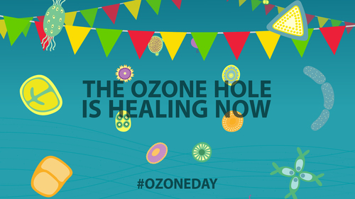
What connects international agreements, spray-on deodorants, minute organisms floating near the ocean surface and incoming solar radiation? The answer, if you’re still guessing, is the ozone layer. And ozone protection – one of the great environmental successes of the last 30 years – is a story that isn’t over yet.
What connects international agreements, spray-on deodorants, minute organisms floating near the ocean surface and incoming solar radiation? The answer, if you’re still guessing, is the ozone layer. And ozone protection – one of the great environmental successes of the last 30 years – is a story that isn’t over yet.
It has things to tell us about tackling global change, about how science makes unexpected new linkages, and how communications have to be fashioned to explain them. For us, the lesson is that people are all potentially agents of change, if the information is conveyed in the right way, and we understand what we are looking at.

Taken from the 'Ozone Song' World Ozone Day, 2015 produced by Carbon Visuals.
2015 was an important year for Ozone protection. The 30 anniversary of the Vienna Convention for the Protection of the Ozone Layer brought evidence that the hole in the ozone layer was beginning to heal. This was coupled with COP21 in Paris and the need to galvanise action around climate change, in part based on the global success of ozone protection.
We were commissioned by the UNEP Ozone Secretariat to design the visuals for a public campaign that wove together a complex set of messages tailored to this context. We were also asked to support delivery through a range of communications materials and plans for the public and policy makers. It was a communications opportunity to seed several new phases of work through the celebration of decades of effort and a recognition of challenges ahead. That called for integrating images in a communications strategy, for maximum impact.
“The innovative communications products produced and disseminated by Carbon Visuals as part of the digital campaign were very effective in reaching various stakeholders with key messages on achievements of the ozone protection regime and the need for continued efforts to protect the ozone layer and the climate. ”
The visuals we produced told a scientific story of what has happened, and depicted the impact of humans (positive and negative) in this relatively recent history of the ozone layer. The creative team needed to delve into the complexity of ozone science and find ways of sharing key details. Their materials built up an all-purpose library, from cartoon animation, visualisation showing scale, country by country interactives and explanatory video to show the link between the ozone layer and climate change.
The communications plan needed to deploy all these, along with posters and social media posts, to deliver the visualisations effectively. We wanted to catch potential viewers for visuals designed to empower them to understand and choose how to act: to form a new generation of lay-scientists, ozone protectors and emissions reduction participants. There was a celebratory mood – marked by dancing phytoplankton – but a message about work still to do, too.
Within the campaign policy makers needed to get information about some of the most constructive scientific findings of the century (so far), about Ozone protection. This includes the link between industry and public support for emissions reduction. Added to this is the unfortunate kicker: HFCs (a replacement for CFCs that damage the ozone layer) are also greenhouse gases.
So policy makers didn’t just get another report from UNEP. This one came with one of the animations (see above) we produced that distilled the science behind this challenge. It’s a strategy that should be widely applied. Don’t deliver an unadorned report: deliver the science as well - tell the story and help even those with experience of the science to understand the next step and make decisions.
“‘The Precious Ozone - the climate connection film’ produced by Carbon Visuals powerfully showed the Montreal Protocol’s contribution to the protection of the ozone layer and the climate and underscored the need to build on this success for further climate benefits, thus enhancing the ability of a range of stakeholders to understand this need and support the ongoing work. ”
Often the issue at hand is not black and white. There might be complex science to share, policies to explore and practical changes to make. Well-crafted visualisation helps achieve all three. When people understand what they see, they feel the force of the punch line, and they act. So in ozone protection we can celebrate a massive achievement to heal the hole, but must recognise that in doing so we have added to the problem of climate change. We can change that for the better too now we understand the problem.
For more about our work on the 30th Anniversary of the adoption of the Vienna Convention for the Protection of the Ozone Layer on the Real World Visuals website or the Carbon Visuals website.
For more about the UNEP Ozone Secretariat.
How can interactives help
Interactive visuals can enable the viewer to examine and interrogate data in depth and detail in ways that are immediate and intuitive. An apparently simple picture can be used to enable comparisons, relationships and insights with a flick of a cursor. The physical interaction can develop an engagement that can't be achieved with a static diagram, spreadsheet or other forms of database.
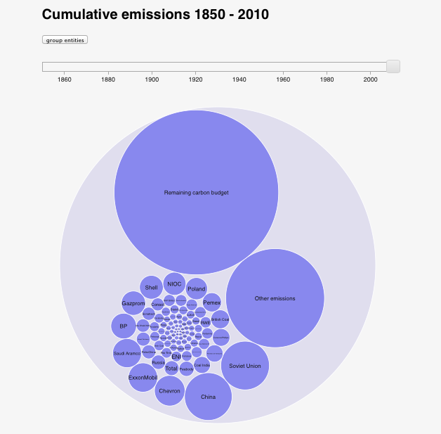
Interactive visuals can enable the viewer to examine and interrogate data in depth and detail in ways that are immediate and intuitive. An apparently simple picture can be used to enable comparisons, relationships and insights with a flick of a cursor. The physical interaction can develop an engagement that can't be achieved with a static diagram, spreadsheet or other forms of database. Here’s an example from a Carbon Visuals project.
CARBON MAJORS INTERACTIVE
The Carbon Majors report names the institutions responsible for extracting the oil, coal and gas that’s causing warming of the planet. Instead of allocating between countries, as has up to now been the case, any institution that produced more than eight million tonnes of carbon dioxide in any given year is identified in the study together with their cumulative contribution to the problem we all now face. This interactive allows you to explore the Carbon Majors data, but also shows the remaining atmospheric carbon budget available to have a reasonable chance of keeping average global warming below 2 degrees Celcius. Move the slider to see the rapidly diminishing global carbon budget.
See more on the Carbon Majors project here.
Interactive estates and campus visualiser
Energy use in buildings accounts for around 40% of global carbon emissions. Yet normally only buildings and energy managers - ‘engaged’ people are aware or concerned about this energy use. But ‘non-engaged’ building users can help energy reduction, and enable substantial cost savings, by changing their own behaviours if they are more aware of the challenge.
Energy use in buildings accounts for around 40% of global carbon emissions. Yet normally only buildings and energy managers - ‘engaged’ people are aware or concerned about this energy use. But ‘non-engaged’ building users can help energy reduction, and enable substantial cost savings, by changing their own behaviours if they are more aware of the challenge.
We have created a prototype tool for University of Exeter designed to engage students and others on two campuses in the energy consumption and carbon footprint of all the buildings in a non-technical and visual way. Initially sized for running on tablets, the tool runs on desk-tops and mobile phones with modern browsers and shows average real-time, daily and annual emissions, as well as energy use based on historic data.
A ‘Projects’ tab allows for additional information, images and energy savings advice specific to each building. At present this tab has not yet been populated. The inclusion of social media links and image saving allows easy sharing and opens the way for more dialogue with the Estates Department.
We are currently working to improve the prototype with the University of West of England (UWE) - this time using a 3D campus model as the main interface. Improvements we are making to the tool include:
- faster and smoother operation
- creation of a user interface that will enable easy data entry and amendment
- auto-sizing so the tool works optimally on smart-phones, tablets and full-size screens
Our aim is that the tool will intrigue and engage people on every platform from kiosks positioned in high footfall locations e.g. reception areas, to students’ individual smart phones.
We are now looking for more UK universities that would be interested in trialling this tool on their own campuses at the same time as helping us improve this unique tool.
If you would like more information please contact us at info@realworldvisuals.com
Engaged and Non-engaged audiences
We specialise in reaching ‘non-engaged’ audiences. People who do not feel ownership of the data you present and do not come to the data with prior questions of their own are what we call ‘non-engaged’ audiences. They have very different needs from other audiences for data visualisation, but the distinction is often ignored. Most data visualisation is created as if the audience already understands the significance of the data and are keen to explore it.
Engaged audiences include building managers and people charged with reducing environmental impact or cutting costs. To present energy data or emissions data to these audiences, graphs and other ‘abstract’ representations are appropriate. These audiences already know what they are looking at – they just want to scrutinise it for any trends that can provide insight or hints for improvement.


The dashboard of a building management system – efficiently displaying multiple key performance indicators – is the data display platform of choice for these audiences.
Whilst building users will be aware that buildings use energy and that greenhouse gas emissions are an issue, their awareness remains on an intellectual level – distant from their everyday experience. Most will have very little sense of scale for power, emissions or even water use.
Presenting building users with a really clear graph (e.g. a histogram of kWh per day over the past year) will have little impact on most of them. Where a building manager would see energy, the target audience would just see a graph. That is, for the target audience, energy and emissions would remain as pure abstractions.
Some context - making it real
This interactive can enable building users to engage with building data. To do that they first need a strong sense that there is something real to engage with. Once that is established questions will arise spontaneously (Is that a lot or a little? What causes the emissions? What is my share of the emissions?). Building users will then be in a position to make use of more detailed information.
Therefore, the vital first step in engaging with data is developing a sense of its reality. The target audience for this interactive knows that emissions are real but while they remain invisible emissions don’t really feel real. Engaged audiences already have a sense of reality because they own the data, or they pay for the energy or maintain the plant that generates the emissions, but the rest of us need a nudge before we will take notice.
A simple approach that Carbon Visuals has honed over many years is to show the actual volume of carbon dioxide gas attributable to a building’s energy use and waste management. This simple act of visualisation turns an abstract number into a concrete volume that viewers can relate to on a physical basis. The easier it is to relate to the number physically, the stronger the sense of reality. Ideally we would represent the volume in real space but this is rarely possible.
To help a viewer relate to a visual representation of volume it is preferable to provide a visual context that the viewer knows intimately. The space that the viewer is currently occupying is ideal, but buildings and areas that people walk through are very effective scaling objects.

Contributions to 2009/10 emissions from individual institutions of the Kensington 1851 estate.
Time is also a very important factor in establishing the reality of data’s referents. In general we are communicating ‘rates’ rather than simple quantities – how much over how long. From a carbon accounting point of view units of tonnes per year are useful, but these units bring little insight to non-engaged audiences.
Unlike a year, which is a period we understand intellectually, a day is a period we actually ‘inhabit’. We can feel a day passing, but the passage of a year we understand intellectually rather than feeling. The here and now is a particularly powerful period of time to illustrate. Showing rates of emissions in ‘real-time’ makes those emissions seem particularly real. This does not necessarily mean showing current instantaneous values for the rates (which we call ‘live’ data). If the data we are working with is a single annual figure we can show this in real-time as an average rate.
So emissions per second or emissions per day are units that provide more insight than annual emissions, but the units are still problematic. Carbon dioxide is a gas but it is accounted for in units of mass. Because, for many people, mass is so closely associated with weight, and because gases have buoyancy, mass is a counterintuitive measure of ‘how much stuff’ there is. That is, units of mass, which are perfectly appropriate for accountancy purposes, create a barrier to developing a feel for emissions or a sense of scale.
Illustrating volume does provide an intuitive sense of scale. Illustrating volume as a collection of unit volumes corresponding to unit masses goes even further. One advantage of this approach is that human perception makes us quite good at intuiting value by ‘counting’ multiple objects, but very bad at judging volume visually.
Breaking volumes into units helps us judge scale visually. Another advantage of this approach is that it allows us to link abstract accounting units (kg, tonnes, etc.) with an intuitive picture of ‘stuff’.