
How can interactives help
Interactive visuals can enable the viewer to examine and interrogate data in depth and detail in ways that are immediate and intuitive. An apparently simple picture can be used to enable comparisons, relationships and insights with a flick of a cursor. The physical interaction can develop an engagement that can't be achieved with a static diagram, spreadsheet or other forms of database. Here’s an example from a Carbon Visuals project.
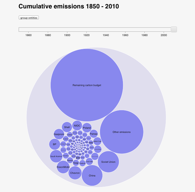
CARBON MAJORS INTERACTIVE
The Carbon Majors report names the institutions responsible for extracting the oil, coal and gas that’s causing warming of the planet. Instead of allocating between countries, as has up to now been the case, any institution that produced more than eight million tonnes of carbon dioxide in any given year is identified in the study together with their cumulative contribution to the problem we all now face. This interactive allows you to explore the Carbon Majors data, but also shows the remaining atmospheric carbon budget available to have a reasonable chance of keeping average global warming below 2 degrees Celcius. Move the slider to see the rapidly diminishing global carbon budget.
See more on the Carbon Majors project here.