

Investment Opportunity - Show Me
We have ambitious plans for expansion in 2026 with a game-changing new development. We are looking for early-stage investors to join us on this journey. Show Me allows anyone with access to the internet to visualise anything you can count or measure. It shows the scale of things in a physically relatable way. It creates beautiful and physically accurate animations and still images in seconds. It can be used for one-off animations or added to other developers’ apps with just a few lines of code.
We have ambitious plans for expansion in 2026 with a game-changing new development. We are looking for early-stage investors to join us on this journey. Show Me allows anyone with access to the internet to visualise anything you can count or measure. It shows the scale of things in a physically relatable way. It creates beautiful and physically accurate animations and still images in seconds. It can be used for one-off animations or added to other developers’ apps with just a few lines of code.
What is Show Me for?
For many audiences, numbers and graphs just don’t work, especially when you want to share new information. Our target market spans organisations that need to communicate quantitative information to audiences who respond better to visual storytelling than spreadsheets:
Corporate communications teams presenting sustainability data
Environmental campaigns making climate data relatable
Educational institutions bringing statistics to life
Media and PR organisations creating shareable content
Data scientists and researchers reaching broader audiences
The global data visualisation market is worth over $10 billion and growing at 12% annually. Our niche—automated storytelling with 3D animation for non-technical users—represents approximately $2.5 billion of this market.
At what stage of development is Show Me?
Following a successful period of research and development funded by Innovate UK, we have demonstrated that Show Me is fast, scalable and financially viable. We are now ready to build a product with our AI software partners Rocketmakers. We will transform our ShowMe demonstrator from something merely technical into a fully working viable product that can be trialled with partners in different market segments. And we have costed plans for how to do it.
The opportunity
We are now seeking individuals or organisations to invest in the business through the Seed Enterprise Investment Scheme (SEIS). As well as developing the ShowMe product we will expand our team with programming and animation talent, and a CEO with proven experience and enable us to increase bespoke project work alongside developing a service-based business.
If you are interested in participating in this project please get in touch with me (antony@realworldvisuals.com) and I can share our Investor slide deck.
Explanatory video:
Is Planet Earth alive?
What if every human on the planet woke up tomorrow to believe that the earth is alive? That we inhabit the surface of a living entity that self-regulates and is just bigger and older than other living beings.
What if every human on the planet woke up tomorrow to believe that the earth is alive? That we inhabit the surface of a living entity that self-regulates and is just bigger and older than other living beings.
This is not a new idea. For indigenous people around the world this underpins their belief systems. The Iroquois for instance refer to the earth as Turtle Island, a living entity that supports all life in their creation stories. And the Sungai Utik people in Indonesia view the forest as their "father" and the land as their "mother," believing that natural resources like water are their very blood.
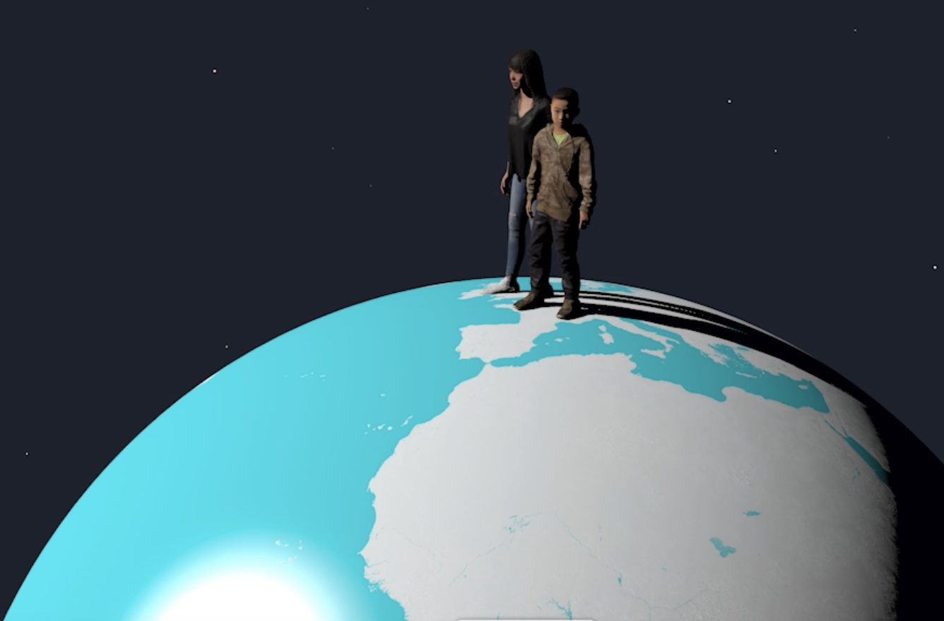
From a dimensional viewpoint humans on the planet are no different from the billions of bacteria that exist on our skin. The video shows a Staphylococcus bacteria magnified x 1.7 million, also people magnified x 1.7 million standing on planet earth.
The insight that the planet acts like a living entity was formulated by the chemist James Lovelock and co-developed by the microbiologist Lynn Margulis in the 1970s. It was his friend, the novelist William Golding who suggested naming the hypothesis after Gaia, the Greek earth goddess.
Gaia went down very well with the deep green section of society who were open to alternative ideas. But it didn't make an impression on the general public and certainly didn’t impress the scientific community of the time. It took another twenty years for climate scientists to accept much of Lovelock’s thinking, now renamed ‘ear systems science’. This sees earth as an interconnected system where the atmosphere, oceans, land, ice and life interact to regulate the planet's climate and environment.
But amongst scientists there is still a fear of going so far as to say the Earth is alive. My late friend Stephan Harding, who worked with James Lovelock, and taught deep ecology at Schumacher College was an exception. In his book Animate Earth he noted that the planet had all the attributes of “a living thing, which we do not realise to be such because it is too big, and its life processes too slow.”
Tim Lenton, who heads up the Global Systems Institute at Exeter University is renowned for his work in identifying the tipping points which can trigger accelerated climate disruption. His new book - Positive Tipping Points - articulates hopeful signs of change in a positive direction, whilst also reiterating that “..our impacts on nature are coming back to bite us globally, and occasionally in its history, the Earth’s atmosphere and climate have radically destabilised. This reinforced the scientific realisation that we are operating within, and dependent upon, a remarkable somehow ‘living’ system.”
The writer who has wholeheartedly promoted the idea of a living planet is journalist and author Ferris Jabr whose inspiring book Becoming Earth pulls no punches. He states that “the earth is not a single organism, not a product of standard Darwinian evolution. But is it nonetheless a genuine living entity, a vast interconnected living system. Earth is as alive as we are.”
The reality is that this thinking has still not entered the mainstream. Which is the reason that, together with colleagues, I have launched The Real Planet Earth as a Community Interest Company (CIC), a website and LinkedIn profile. Our mission is simple - wake up humans (all of them) using humour and sarcasm to engage with the climate crisis and underlying complex earth system issues. We start by asking a simple question - what if planet Earth could speak for itself?
Our plan is firstly to use LinkedIn to raise the profile and provoke comment. We are starting to work with researchers, climate scientists, sustainability geeks and activists who have important stories that aren’t getting mainstream attention. See our Case Study on forever chemicals. Then we will expand into all social media channels, education programmes, games, whatever works. We want to reach every generation — kids, teens, tired adults. Everyone.
In the epilogue of Tim Lenton’s Positive Tipping Points he suggests the need for a new human, cultural tipping point. Could this tipping point be reached if we humans began to realise that the Earth was not just alive, but starting to retaliate against an out-of-control bacteria-sized life form on its surface?

Show Me
A picture tells a thousand words. So imagine a world where anything you can count or measure can be automatically turned into beautiful and physically accurate images by anyone with access to the Internet.
They say a picture is worth a thousand words, so imagine a world where anything you can count or measure can be turned into beautiful and physically accurate images automatically, by anyone with access to the Internet.
We have made a big step towards that with ‘Show Me’ - a new tool for making anything that can be counted or measured visible. Show Me will let many more users to adopt our approach to making sense of twenty-first century challenges by turning complex data into meaningful images and animations.
In its simplest form, users will enter a number on a website. After a few seconds an embeddable animation will appear. A slightly more advanced interface will give users control of the whole visualisation process including styles, text, scaling objects and locations. Developers can add advanced visualisation capabilities to their own tools with a single API call.
Bespoke animations, like our award-winning film showing New York City’s carbon footprint, can have a big impact but also a hefty cost. Now, ShowMe, being developed with AI specialists Rocketmakers, will be available on a software-as-a-service basis. It will work within any third-party app or from its own Web-app.
Sustainability Managers, or anyone else with stories to tell about emissions, offsets, savings or targets, will be able to illustrate them with meaningful images of carbon dioxide gas. Journalists can instantly depict air pollution data in a way that engages the reader. And teachers can create custom animations to make any quantitative information relevant and relatable to their pupils - the number of people evacuated from Dunkirk filling the open areas near the school, or the school’s consumption of water visualised in real-time as a fountain in the playground. In fact, anyone will be able to turn raw numbers into engaging imagery that captures imagination and helps us better understand the world we inhabit.
Development of the prototype ShowMe tool is being funded by a grant from Innovate UK. The initial version will just show gases - in particular carbon dioxide - but it will soon visualise anything: any gas, liquid, solid or bulk quantity; any concentration (for example, to visualise air or water pollution); and any collection of discrete objects - such as a crowd of people.
Show Me can add custom, responsive 3D graphics to any ‘traditional’ app. without impact to performance
Real World Visuals is setting up a new company to commercialise the product and will be seeking SEIS (Seed Enterprise Investment Scheme) funding in the New Year. If you are interested in investing in the company and/or participating in a Beta testing phase please get in touch.

Real World or Diagram Land?
We give data a real-world context. Sometimes that means creating accurately measured objects with computer graphics, to give a sense of scale. Sometimes it means placing 3D representations of data in real-world footage. Sometimes it's both.
We give data a real-world context. Sometimes that means creating accurately measured objects with computer graphics, to give a sense of scale. Sometimes it means placing 3D representations of data in real-world footage. Sometimes it's both.
This video was made for Project Everyone who wanted to raise the issue of plastic in our oceans with an audience at the Cannes Lions Festival in 2018. We came up with the idea of using plastic ducks to represent the plastic pollution but wanted to engage the actual audience first seeing the film. So we found drone footage of Cannes and then segued into the CGI scene. More info here
It is not easy to make invisible things visible. Our approach is to keep things simple, to ensure our audience knows what they are looking at and why. The usual way we keep things simple is called ‘Diagram Land’, which is a magical computer-generated space in which everything scales perfectly.

In Diagram Land everything in the picture is either data or something that provides a physical context for data. For instance, there may be nothing in the picture except a floor, a volume containing a quantity of carbon dioxide gas and a well-chosen building. The Empire State Building may work well for a New York audience and the Houses of Parliament may work for a UK audience.
Sometimes our work requires a specific place or location. Library footage can be an option, but camera moves are actually a very important part of the visualisation toolkit. We can communicate a great deal about the scale of a number, or how it compares to another number by moving around the scene, so sometimes we need our own drone footage for real world simplicity. For this project we commissioned drone specialist Ed Smit of Herenow.film to take drone footage of two solar farms in Devon so that we could overlay CGI carbon savings. More info here
Another example was the launch of a Bristol Waste recycling project. The company were sponsors of a Solar Balloon at the International Balloon Fiesta in August 2016 which took place at the Ashton Court estate on the edge of Bristol. So we decided to commission drone aerial photography of the estate as the background scene, rather than using a computer generated background. More info here
Finally, it can help the story to start a video piece with real ‘stuff’ then segue to an abstract graph to show more complex detail. This extract was part of a film made for UNEP to convey the scale and complexity of resource use in the Asia Pacific region at a conference of Environment Ministers and subsequently to other audiences. More here
If you have a comms challenge where you think live action footage could combine with CGI graphics do get in touch.

Oil company advertising
The Secretary General of the United Nations has asked countries to ban advertising from fossil-fuel companies. António Guterres has also urged news media and tech companies to stop taking fossil-fuel advertising. Part of the problem is that fossil fuel companies do not tell the whole story.
The Secretary General of the United Nations has asked countries to ban advertising from fossil-fuel companies. António Guterres has also urged news media and tech companies to stop taking fossil-fuel advertising.
Part of the problem is that fossil fuel companies do not tell the whole story. They are keen to flaunt any reduction in their ‘Scope 1’ emissions – the emissions from their own drilling, refining and distribution operations. But the main environmental impact comes from the emissions from their products – the ‘Scope 3’ emissions. Fossil fuel companies act as though the emissions from the coal, oil or gas itself is nothing to do with them.
We have made this short video ourselves to show the actual volume of carbon dioxide that Shell releases to the atmosphere, including the emissions from its products. Unfortunately we can’t at the moment show the volumes reducing over time in accordance with the Paris climate goals as that data is not available from Shell, or any other oil and gas companies. Which is why Mr Guterres has attacked fossil-fuel firms for their meagre investments in cleaner forms of energy and continuing investment in new reserves.
However this may be changing thanks to The Global Registry of Fossil Fuels, an open-source database of oil, gas and coal production and reserves globally, which aims to improve understanding of extraction impacts on the remaining carbon budget, thus enabling policy-makers, investors and others to make informed decisions to align fossil fuel production with 1.5°C. Watch this space!
Note: Shell data from their Annual Report 2022.

Data is boring?
How do you tie messages about carbon emissions and strategies, or waste and recycling challenges, to the real world? You need data - but data doesn’t speak for itself. Real World Visuals work convinces users that data does not need to be boring.
How do you tie messages about carbon emissions and strategies, or waste and recycling challenges, to the real world? You need data - but data doesn’t speak for itself. Real World Visuals work convinces users that data does not need to be boring.
Our images and animations have helped to inform and engage audiences across the business world and civil society. But as well as turning data into visuals we think deeply about how audiences differ. Hence this short ‘promo’ video to highlight how we can help businesses engage - with governments, employees, suppliers, the public and of course their customers.
All use imagery from real customer projects. Find more details on our ‘climate’ and ‘other’ project pages.
Note. The pile of CO₂ ‘bubbles’ in New York are from our award winning film showing New York City’s carbon footprint. The video has been viewed on YouTube over 440,000 times.
Get in touch if we can help your audience, see it, believe it and act on data that is relevant to them.

All the water in the world
Way back in 2003 I made picture of all the water in the world. I was curious to see it all together and a bit surprised when I’d done the calculation to see how small it looked. Many other people were surprised too. “That can’t be all the water” they’d tell me confidently, “That’s just the fresh water”. But no – all the water in the world could fit into a sphere 1,391 km across (864 miles).
Way back in 2003 I made picture of all the water in the world. I was curious to see it all together and a bit surprised when I’d done the calculation to see how small it looked. Many other people were surprised too. “That can’t be all the water” they’d tell me confidently, “That’s just the fresh water”. But no – all the water in the world could fit into a sphere 1,391 km across (864 miles).
The original 2003 image won a ‘Visions of Science’ award and is still popular in social media. But with current CGI tools I thought it would be good to create a new animated version that shows freshwater too. The large sphere is the total volume of all the water in the world: oceans; icecaps and glaciers; deep groundwater (750-4000 metres); shallow groundwater (< 750 metres); lakes; soil-moisture; atmosphere; rivers; biosphere.
The smaller spheres show the volumes of two subsets of freshwater. The combined total of all the volumes is greater than the total volume of water on Earth. The large sphere shows ALL of it and the small spheres show subsets.
All the water in the world was one of my first ‘concrete visualisations’. A concrete visualisation turns the usual process of visualisation on its head – instead of providing insight into data through abstraction, it provides insight by illustrating data as actual stuff. By some standards of data visualisation All the water in the world is pretty poor!At Real World Visuals we use the world itself as its own explanation. The total volume of water in all forms - fresh and salty - is 1,408.71 million km³. That’s equivalent to a sphere 1,377,973 metres in diameter.
We have been making pictures of water for many years. It is interesting to see the true scale of such an important component of our planet. Interesting too that much of that water was delivered to Earth by comets, who transported ice from much further out in the Solar System. See:
Resource efficiency in Asia Pacific
Volume in millions of cubic kilometres
Oceans: 1370
Icecaps and glaciers: 29
deep groundwater (750-4000 metres): 5.3
Shallow groundwater (< 750 metres): 4.2
Lakes: 0.125
Soil-moisture: 0.065
Atmosphere: 0.013
Rivers: 0.0017
Biosphere: 0.0006
Table adapted from Elizabeth Kay Berner and Robert A. Berner, 1987, The Global Water Cycle: Geochemistry and Environment, Prentice Hall, Inc., Englewood Cliffs, N.J, Table 2.1, p 13


Communicating ‘big carbon’
The fact that fossil fuels were included in the text from COP28 is cause for celebration. But scientists are warning that time is running out if we want to avoid widespread climate chaos. That means that communication of the size of the challenge is critical and should not be restricted to stories of climate breakdown. We all need to get better at communicating ‘big carbon’.
The fact that fossil fuels were included in the text from COP28 is cause for celebration. But scientists are warning that time is running out if we want to avoid widespread climate chaos. That means that communication of the size of the challenge is critical and should not be restricted to stories of climate breakdown. We all need to get better at communicating ‘big carbon’.
We can help do this by creating stunning images, animations and tools. Some make the world itself as part of its own explanation – using geography to make sense of large numbers. But we have also developed some novel approaches using more traditional (and abstract) visualisation techniques.
This animation was made to show the remaining global CO₂ budget - if we want to limit global warming to 1.5°C. According to the 2021 IPCC Report the most we could afford to release from all human activity was 400 billion tonnes CO₂. For an average country, its share of this global CO₂ budget will run out in 7 years. For a high emission country such as the UK, our share of the carbon budget will run out in 2 years.
But how can we make these figures easier to grasp? Our view is that conventional graphics must be augmented by other approaches. This animation is only a first draft. We have ideas about how to make it more intuitive and compelling.
Another way to help people understand ‘big carbon’ is to create simple interactive tools like this one we created, along with a variety of other visual imagery, for the launch of the Carbon Majors Report in 2013. The report showed the extent to which corporations are responsible for the cumulative emissions causing climate change. The tool allows users to explore the Carbon Majors data, but also shows the remaining atmospheric carbon budget available if we are to keep average global warming below 2 °C. Move the slider to see the rapidly diminishing global carbon budget.
Note that this only shows the budget available to 2010. We would love to create a contemporary version of this tool to show a variety of carbon budget scenarios.


These are some other projects where we have shown ‘big carbon’ data in different ways.
Top left is Bill McKibben, founder of 350.org in 2012 on his global Do the Math tour where he successfully used our (then very basic) visuals to get across the size of the carbon budget. To the right is a recently created GIF that shows 2019 ‘big carbon’ data as one tonne bubbles of carbon dioxide in real time. Below is an image showing global emissions with 1000 metric tonne bubbles of carbon dioxide appearing in real-time. This was created for a G7 summit in 2018. Finally we wanted to show the carbon footprint of the Qatar FIFA World Cup 2022, and the ‘carbon bombs’ in Qatar.
“This is such amazing stuff - this series of slides tell the story more eloquently than anything else...”
We think that showing ‘big carbon’ flows between natural and human-created sources and sinks could be particularly useful for policymakers. The animation above is a ‘work-in-progress’ using abstract data-visualisation. It shows the flows of ten-billion tonne carbon blocks between sinks and sources since the Industrial Revolution.
This short animation - very much a ‘work in progress’ - explains the carbon cycle and provides a physical sense of scale for the impact of the injection of carbon from fossil fuels. We have developed a visual language of ‘stores’ and ‘transfers’ (sinks and fluxes). It shows the flow of carbon since the Industrial Revolution not just between fossil fuels and the atmosphere, but also to and from land-based stores and shallow and deep ocean. The blocks each represent a billion tonnes of carbon – not carbon dioxide. (Data is from MacKey, et al 2013 | DOI: 10.1038/NCLIMATE1804 ) We would like to make a version of this by putting the rate of change into context in a relatable way, comparing changes brought about by long term cycles with recent and projected changes.
Please get in touch if you would like in helping communicating your ‘big carbon’ stories. If you don’t immediately have funding available we would be happy to collaborate with applications for funding our work.

The Planetary Wrap Pavilion
Imagine a mobile pavilion in a city centre giving ordinary a real insight into the causes and effects of the climate crisis: A pavilion that links the human suffering and environmental damage caused by wildfires, flooding and heatwaves with actual amounts of greenhouse gases emitted in the past and today. It will do this by bringing our concept of the Carbon Quilt to life.
Imagine a mobile pavilion in a city centre giving ordinary people a real insight into the causes and effects of the climate crisis: A pavilion that links the human suffering and environmental damage caused by wildfires, flooding and heatwaves with actual amounts of greenhouse gases emitted in the past and today. It will do this by bringing our concept of the Carbon Quilt to life.
The Carbon Quilt is a new way of understanding how we are changing the atmosphere. Burning fossil fuels adds another 100 million tonnes of CO2 to the atmosphere every day. If this were a single layer of the pure gas at sea level it would cover the entire Earth with a blanket 100 microns deep - the thickness of a piece of paper. One Gigatonnne of CO2 would be almost exactly 1mm thick. And the ‘natural’ thickness of the Carbon Quilt would be XXX mm, while human society has added another YYY to that - the reason that the planet is now overheating.
We want to create a mobile pavilion , topped by a roof thatmatches the Carbon Quilt. This is an animation ’sketch' showing the idea. The structure would be a rigid frame with translucent architectural fabric stretched over the top. Projectors inside the frames pointing outwards could project explanatory text (as illustrated).
The pavilion would incorporate interactive video displays explaining the emissions stories, directly linking to images of wildfires, flooding and other climate effects. We would also show how the Carbon Quilt thickness can be dramatically reduced by scaling up natural sequestration effects -
One additional idea is to incorporate performance art by every day unfurling another thin layer over the roof. The layer could be pre-printed with imagery showing the respective current contributions by fossil fuel companies.
So we are looking for anyone who would be interested in helping us take this project forward. You might be an architect, an engineer, an activist or a funder. If you are interested please get in touch.

Carbon Quilt - a visual metric for understanding the cause of climate change
Burning fossil fuels adds another 100 million tonnes of CO2 to the atmosphere every day*. If this were a single layer of the pure gas at sea level it would cover the entire Earth with a blanket 100 microns deep - the thickness of a piece of paper. And one Gigatonnne of CO2 would be almost exactly 1mm thick. Welcome to the Carbon Quilt, a new way to understand how we are changing the atmosphere - an intimate and human-scale visual tool for understanding global-scale carbon stories.
Burning fossil fuels adds another 100 million tonnes of CO2 to the atmosphere every day*. If this were a single layer of the pure gas at sea level it would cover the entire Earth with a blanket 100 microns deep - the thickness of a piece of paper. And one Gigatonnne of CO2 would be almost exactly 1mm thick. Welcome to the Carbon Quilt, a new way to understand how we are changing the atmosphere - an intimate and human-scale visual tool for understanding global-scale carbon stories.
“Every day we wrap the planet in a paper thick layer of CO2”
Why is this useful? Metrics of climate change usually focus on the effects, rather than the cause. Temperature and sea level rise, increasing intensity of heat waves, rainfall depth, areas of flooding, and numbers of wildfires to name but a few. And the warming effects of CO2 emissions are estimated to have a time lag of at least ten years**.
But there are major barriers to the public’s engagement with what causes all this. The gases are invisible - we don't see the problem. And it is hard to relate to the measurements commonly used. Parts per million (PPM) and Gigatonnes of CO2 mean nothing to most people. Often used comparisons - a gigatonne is the mass of all land mammals apart from humans, or 200 million elephants, or three million 747s - are little help.
In our early days Carbon Visuals, Real World Visuals’ forerunner, came up with a different way of looking at atmospheric CO2 – the Carbon Quilt. We proposed showing patches of a ‘Carbon Quilt’, but the idea did not catch on then and we concentrated instead on images and animations that show CO2 as piles and stacks of bubbles/spheres. These have proved useful in conveying the reality of emissions. And they have helped tell countless stories of carbon reduction and challenges at every scale - from the individual to the corporate.
Now, as the the climate crisis gathers pace, we are re-launching the Carbon Quilt so that scientists, policymakers, businesses and NGOs have a dynamic image that can be easily communicated. In particular it ought to help members of the public who care about climate and the environment but need help in understanding the numbers.
We can throw the quilt over the planet in one piece, or use it to visualise the main sources of anthropogenic CO2, historic emissions associated with particular fossil-fuel companies or countries, end uses, reduction scenarios, carbon sequestration potential and much more. In principle, it can be used to visualise any breakdown of past, present and possible future emissions.
Do get in touch if you have a suitable application for the Carbon Quilt.
*Global energy-related CO2 emissions were 36.8 Gt in 2022 https://www.iea.org/reports/co2-emissions-in-2022
** https://iopscience.iop.org/article/10.1088/1748-9326/10/3/031001

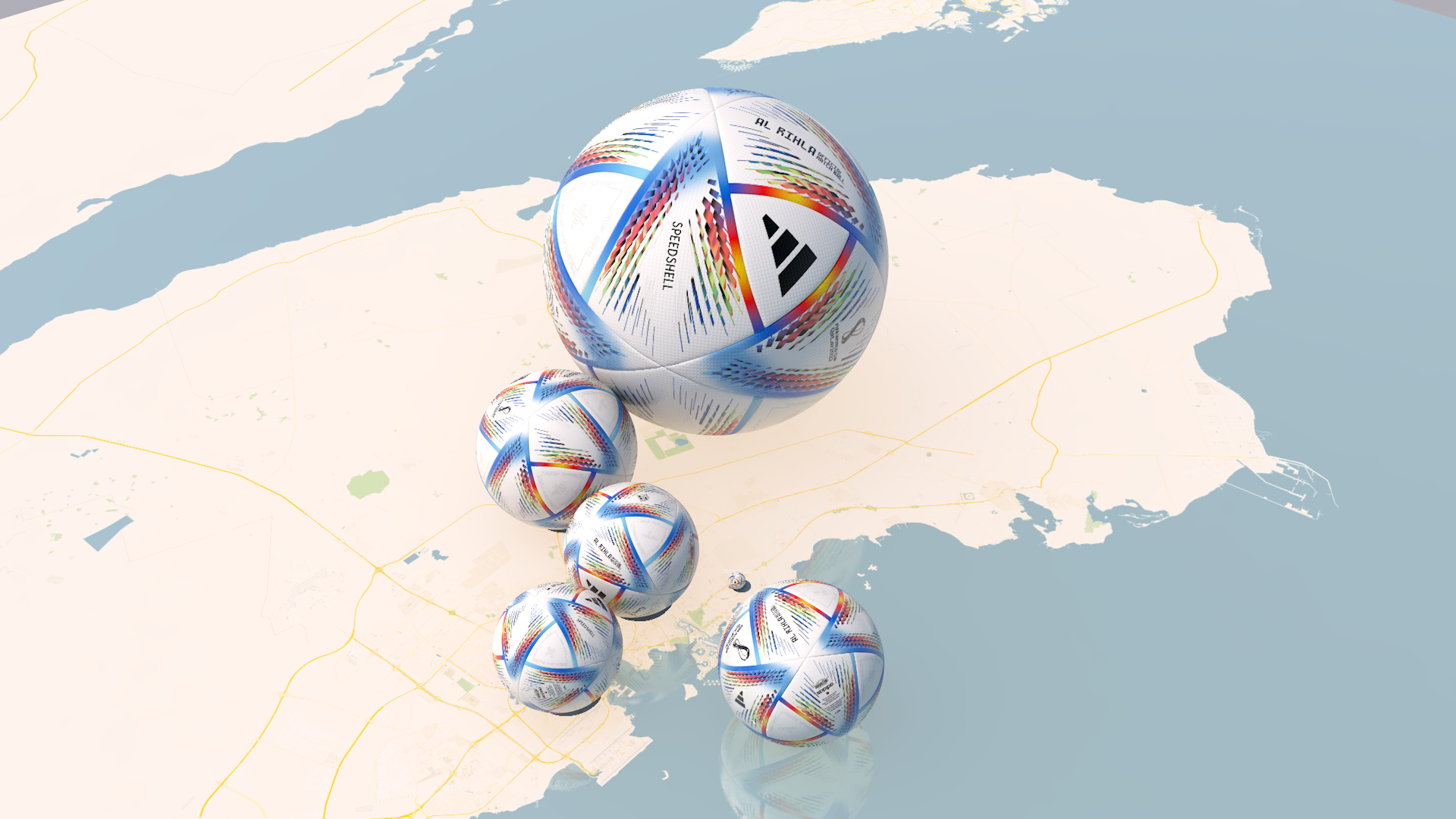
Qatar’s Carbon Bombs
We all love football and most of us are watching the FIFA World Cup taking place in Qatar. But what about the planet?
We all love football and most of us have been watching the FIFA World Cup taking place in Qatar. But what about the planet? FIFA acknowledges that the Earth’s climate is changing due to human activity. But, as pointed out by Wired, FIFA’s efforts to reduce the huge carbon footprint of 3.6 million tons of carbon dioxide emissions, have failed according to a number of experts.
However this high-carbon event is dwarfed by the emissions that will be released if the country fully exploits its oil and gas fields. It is estimated that these giant ‘Carbon bombs’ will add 50 billion metric tons of carbon dioxide to the atmosphere. To raise some awareness of the Carbon Bombs issue we thought it would be useful to show the actual volume of that gas, as giant footballs. Our belief is that we can both enjoy the spectacle of national football AND strive to create a green, renewably powered planet for our children.


More information on this from BankTrack here.
High resolution images are available in this Flickr album: https://flic.kr/s/aHBqjAikp6
Notes
Fossil gas is only required in the short term as a transition energy source as the world switches to properly insulated buildings and renewables like wind and solar backed up by large-scale battery storage.
A Carbon Bomb is a coal, oil or gas project that can cause over a gigatonne of CO₂ emissions during its lifetime. That's a billion tonnes – more than twice the UK's annual emissions from a single project.
FIFA estimate of CO₂ emissions: qatar2022.qa/sites/default/files/2022-08/greenhouse-gas-accounting-report-en.pdf
Potential emissions estimates: Kühne et al, 2022 “Carbon Bombs” - Mapping key fossil fuel projects doi.org/10.1016/j.enpol.2022.112950
Analysis of 1.5 °C compatible scenarios from the IPCC Special Report on 1.5 °C shows unabated use of natural gas in primary energy supply globally should already have peaked and be declining globally, and that it needs to drop by more than 30% below 2020 levels by 2030, and 65% below 2020 levels by 2040 (https://climateanalytics.org/media/gas_is_new_coal_nov_2021.pdf
Data is from Bank Track

Useful (free) images & animations
The climate crisis is now unfolding. Images of flooding, droughts, wildfires and heat waves are hard to avoid. But in order to genuinely engage we need to see the causes as well. The carbon emissions coming from human activities.
The climate crisis is now unfolding. Images of flooding, droughts, wildfires and desperate people are hard to avoid. But in order to genuinely engage we need to see the causes as well. We need to see the carbon emissions coming from human activities.

New York City's daily carbon dioxide emissions as one-tonne spheres - nearly burying the Empire State building. This is an image from our award-winning video made in 2012 and seen on Youtube over 400,000 times. More…
The world’s fossil fuel use
In 2014 we made a film for the World Business Council on Sustainable Development (WBCSD) whose purpose was to engage world leaders, industry experts, campaigners and scientists at the UN Climate Summit, New York, September 2014. The film’s purpose was to show the part that carbon capture and storage (CCS) can play in limiting global climate change. But we thought it would be useful to first show the global fossil fuel consumption and carbon emissions to give context. These three short films show the world’s coal, oil and gas use in 2013. This is our webpage with the complete film. And this is a blog that disusses the challenges of making the film.
The world’s emissions
For many people the climate crisis is not really relevant to them. Something in the future. Something for other people to sort. We believe that ‘seeing’ the world’s emissions as real volumes of gas can change that. Which is why we have made a number of animations over the years showing human society’s ongoing contribution to atmospheric change.
We can easily create animations like this first one to represent any carbon emissions. And we can put company logos on the CO2 bubbles too. The full WBCSD film can be seen here. The 2018 G7 Summit film can be seen here.
Countries & Cities
The ‘New York’ film is our most well known - details are here But we have also made animations to show the carbon footprint of various countries and cities, as well as carbon reduction strategies and targets.
The ‘New York’ film details are here. Global Cities was made for a COP21 event (here). And we have used cities as landscapes to tell bigger stories - like the film made in 2015 set in Piccadilly Circus showing the carbon reduction target for UK emissions.
Oil Companies
Fossil fuel companies are now keen to show that their carbon emissions are falling. Some provide targets for aligning with the Paris climate goals. But these targets are for their direct (Scope 1&2) emissions for extraction, refining and transport operations. We show the emissions resulting from combustion of the products that they produce and sell.
These short animations are quick and easy for us to create for any CO2 amount - and we can customise the ‘bubbles’ with any logo. Get in touch if you would like one for your own use or campaign.
Household
We created a set of simple images showing the carbon emissions associated with an average UK home. They show the carbon emissions associated with energy, transport e.g. car use, food, goods and services. Because they were created for posters they are portrait format. More.


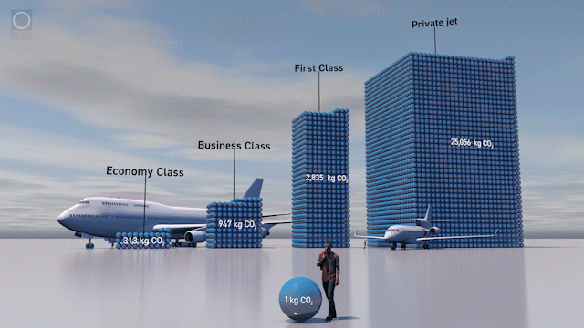
Air Travel
Here are images to show the total emissions of a 747 flight London to New York, per passenger emissions for different classes and comparison with a Falcon 8X private jet. More information here.


Nature
The biggest stores of carbon in the natural world are in forests, soils and oceans. Slowing the climate crisis will require a better understanding of natural carbon emissions and sequestration.
This is a set of animations we made for Wood for Good, the UK timber industry's wood promotion campaign, explaining the role of carbon dioxide in plant growth as well as showing how much is stored in trees and forests. More information here.
We made two videos about primary ‘old growth’ forests which store vast amounts of carbon from the atmosphere, half of which is locked up in the massive old trees which tower over the forest canopy. They show how much forest remains - we are currently losing a hectare of these forests every two seconds - and how much has been lost to degraded, regrowth and plantation forest. More here.
Why we made this page
Real World Visuals (previously Carbon Visuals) have specialised in making greenhouse gases visible and real by converting mass to volume (using standard density of 15 deg C, sea level pressure). Over the years we have created a number of animations and images for a variety of clients - governments, corporations, NGOs and sometimes just for ourselves to illustrate something important . So we thought it would be a good idea to put the most useful ones all in one place. They are all available to use in presentations, seminars or workshops under Creative Commons Licence (provided Real World Visuals is shown as the creator).
Please get in touch if you would like a link to a high-resolution image, video or if you would like us to create something bespoke - new tools and methods mean we can create short and effective animations for social media sharing.
One-percenters take to the air
Flying accounts for about two percent of the worlds greenhouse gas emissions, but the impact of some passengers is greater than others. Just one percent of the world’s population account for half of all aviation emissions. In a week when the great and good are flying into the World Economic Forum at Davos by private jet, we have decided to take stock.
Flying accounts for about two percent of the worlds greenhouse gas emissions, but some passengers’ impact is far greater than others. In a week when the great and good are flying into the World Economic Forum at Davos we have decided to take stock.

Each sphere is a kilogram of carbon dioxide gas at 15 °C and atmospheric pressure.
A jumbo jet flight from London to New York adds about 200 metric tons of carbon dioxide to the atmosphere. Divided between 349 passengers (84% occupancy) that’s 572 kg each. But Business Class passengers take up more space than Economy Class, and First Class passengers even more space.

Emissions from travelling from London Heathrow Airport to John F Kennedy Airport (New York City)
So a transatlantic passenger in Economy Class adds greenhouse gas to the atmosphere equivalent to 4 weeks of emissions from a typical European household. But each First Class passengers contributes more than 38 weeks emissions.
Many invited to Davos, though, choose to travel by private jet. This is far less efficient than a scheduled flight. A private jet uses as much fuel as 9 First Class passengers, 26 Business Class passengers, or 80 Economy Class passengers. Crossing the Atlantic in a private jet adds about 25 metric tons of carbon dioxide to the atmosphere. That’s 6 years of emissions from an average European household (each way).
This is why, overall, just one percent of the world’s population account for half of all emissions from aviation. Our Prime Minister Boris Johnson is likely one of them. He famously left the COP 26 meeting in Glasgow by private jet because some old colleagues of his were having a knees-up in London.
Notes
1% of the world’s population is responsible for 50% of aviation emissions: Stefan Gössling, Andreas Humpe, ‘The global scale, distribution and growth of aviation: Implications for climate change’, Global Environmental Change, Volume 65, 2020, https://doi.org/10.1016/j.gloenvcha.2020.102194
(Hat tip: Transport & Environment, 2021. Private jets: can the super rich supercharge zero-emission aviation?)
Emissions for a Boeing 747 were calculated with reference to Boeing documents. The particular model was the 747-400ER with GE engines. Typical mission rules were assumed (Fuel burn / seat 6,000 nmi = 304.5 kg).
The distribution of the 747’s emissions by passenger class was calculated with reference to a World Bank Report: Heinrich Bofinger & Jon Strand 2013, Calculating the Carbon Footprint from Different Classes of Air Travel , Policy Research Working Paper #6471
The private jet calculation assumes a Falcon 8X. Emissions were determined with reference to a commercial off-setting company: https://www.paramountbusinessjets.com/private-jet-carbon-offset-system/
The density of carbon dioxide gas at 15 °C and 1 atm is 8.714 kg.m⁻³. 1 kg of CO₂ gas would fill a sphere 1,006.8 mm in diameter.
See the world's carbon emissions (in several ways)
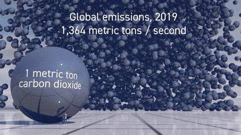
36.7 billion metric tons. That’s the world’s annual carbon dioxide emissions in 2019. But what about if you could ‘see’ this number? Would it help ordinary people realise the extent of the challenge?
36.7 billion metric tons. That’s the world’s annual carbon dioxide emissions in 2019. But what about if you could ‘see’ this number? Would it help ordinary people realise the extent of the challenge? Over the last few years we have made several images and animations showing global CO2 emissions. So we decided to put them all in one place. Enjoy. And please share!

We are now able to create simple GIFs like this swiftly and economically. They can be easily shared on social media so feel free to download and share under Creative Commons licence
If you have a little more time you can watch this short videoIf you have a little more time you can watch this short video showing real time emissions as well as the daily total - 107 million tons. It appears in a longer film designed to engage world leaders, industry experts, campaigners and scientists at the UN Climate Summit, New York, September 2014. The film shows actual quantities of global fossil fuel consumption and carbon emissions (and the part that carbon capture and storage could play in limiting global climate change to 2 degrees). More here
.This film was made for the G7 summit in Charlevoix, Quebec, Canada in June 2018. As well as showing 1000 metric tonne bubbles of carbon dioxide appearing in real-time in downtown Toronto, the film shows the exponential decrease needed (halved by 2030 then halved again by 2040) to reach net zero by 2050. More here.
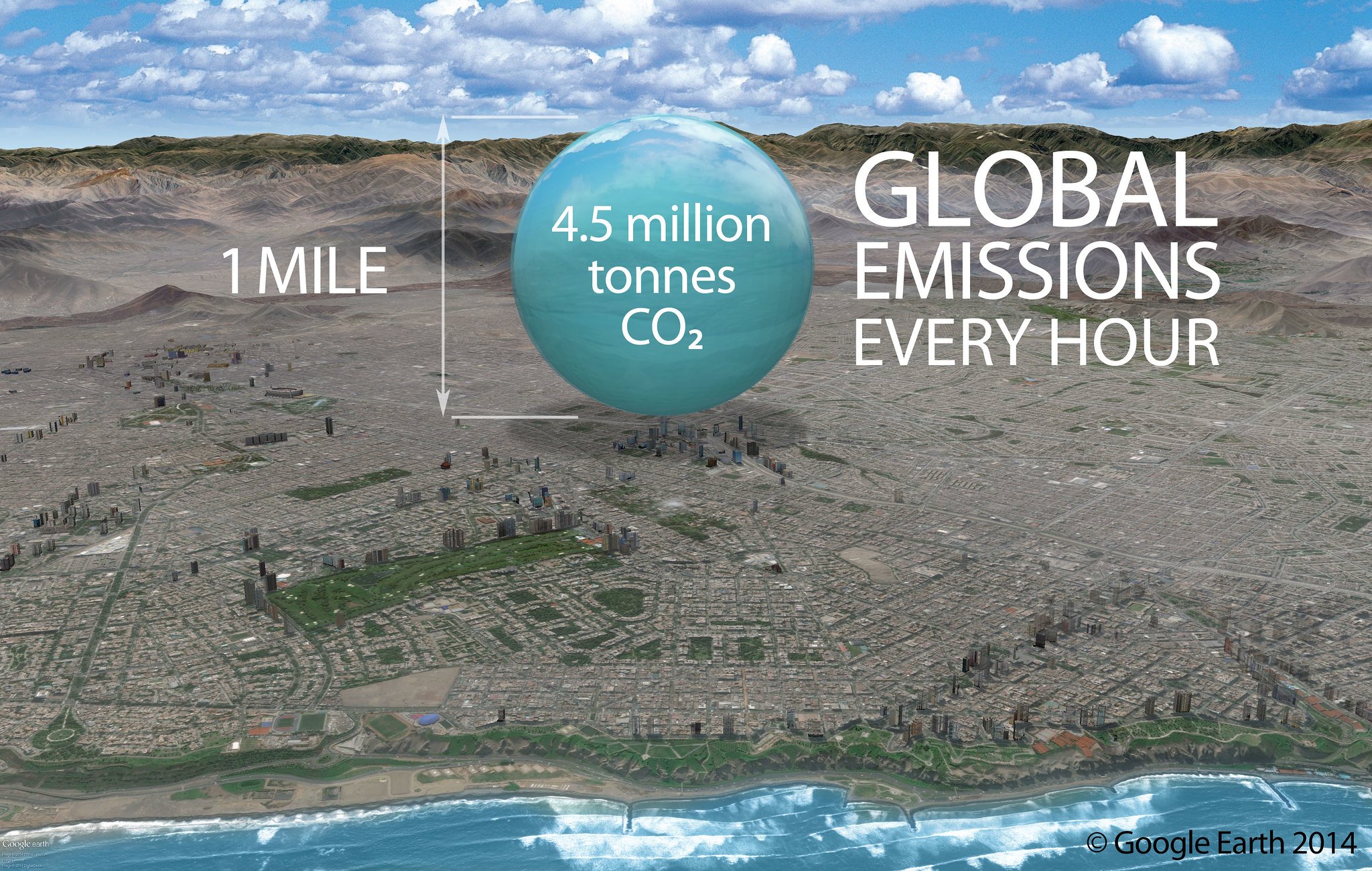
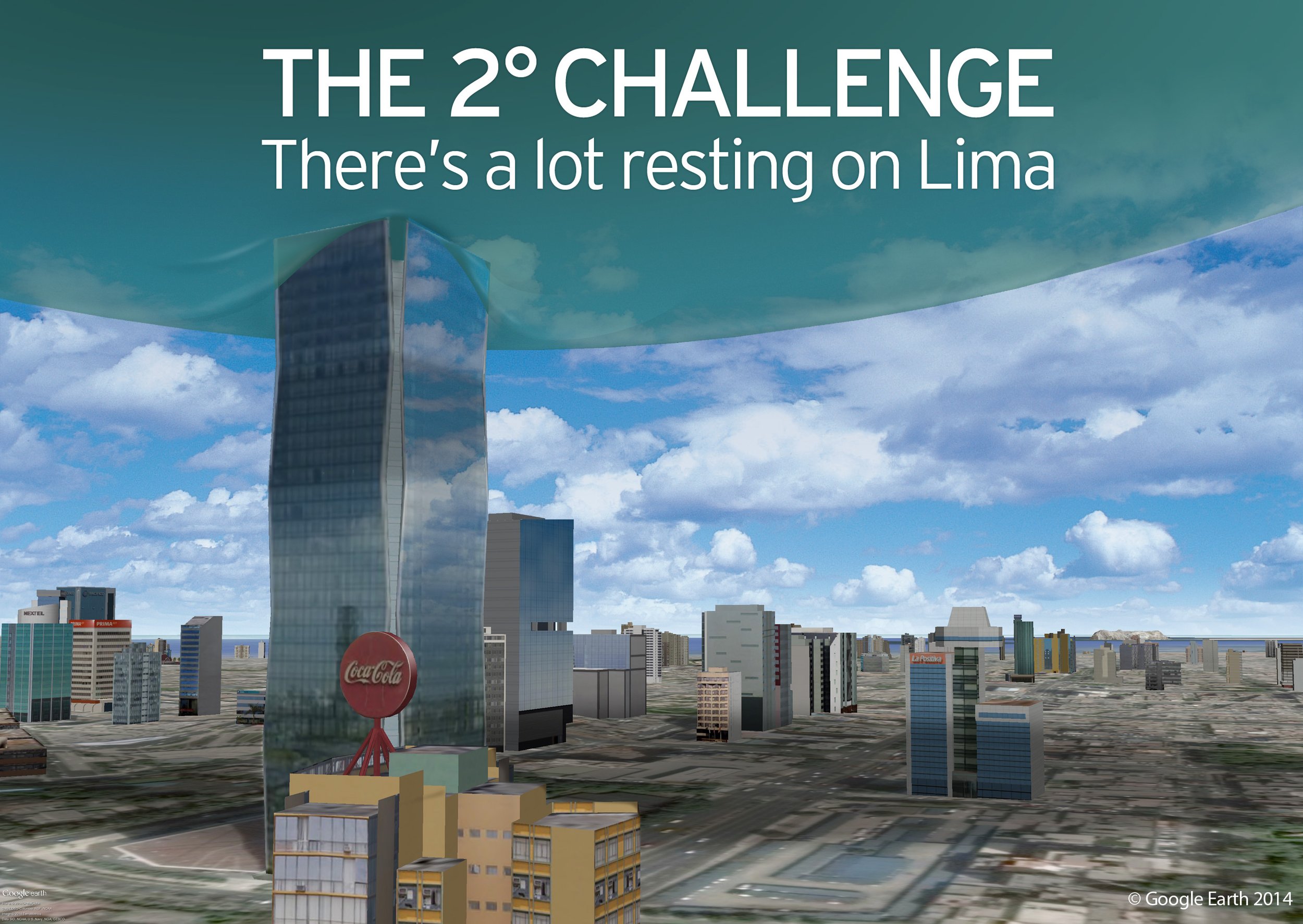
And finally a couple of images created for the Climate Change Conference in Lima in December 2014. This is what an hour's worth of global CO2 emissions would look like resting on the tallest building in Lima - the Westin Hotel.

A new coal mine in Cumbria, England
Few people have an intuitive feel for what’s at stake when a new coal mine is proposed. So we thought it would be useful for those making the decision to have another view of the coal that will be produced over fifty years, and the carbon dioxide that will be added to the atmosphere too.
The UK government is making the final decision on approval for a new coal mine in Cumbria UK. Few people have an intuitive feel for what’s at stake. We thought it would be useful to have another view of the coal that will be produced over fifty years, and the carbon dioxide that will be added to the atmosphere when it burns. The film doesn’t comment on the quantities, it simply shows how much there will be if the mine goes ahead.
The mine will produce nearly 3 million tonnes of coking coal every year for 50 years*. Coking coal (also known as metallurgical coal) is used in steel production, though forward-thinking steel producers are already scaling up climate friendly steelworks powered by hydrogen produced with clean electricity.
While steel remains a much-used material in many infrastructure projects, it does not have to be produced using coal at all. Coking coal can also be replaced with natural gas in a process called Direct Reduced Iron (DRI) which creates about 40% less CO₂ emissions. Natural gas based DRI already accounts for 5% of global steel making.
Steel making techniques are developing quickly, driven by the imperative to reduce greenhouse gas emissions. The steel industry accounts for around 7% of global carbon dioxide emissions, so there is a lot at stake. As early as 2026, fossil fuel free steel production will begin in Sweden . The production of ‘green’ hydrogen, produced entirely from surplus renewable electricity, is being actively pursued worldwide.
This animation and images have been created using Real World Visuals new in-house production techniques which enable fast and economical production of high-quality visual representation of any invisible environmental challenge.
High resolution still images, with a Creative Commons (Attribution) license are available for download from the Real World Visuals Flickr pages.
Notes:
* At the time we made this animation the mainstream news outlets all reported that the mine would operate for 50 years. It has been pointed out to us by the Coal Action Network that the coal mine will not run for 50 years, but will shut by 2049 - with the application submitted in 2019. At earliest the coal mine would start 2025. So that's 24 years. The correct calculations made by CAN are here. We apologise for this unintentional error. If any one or any organisation has some spare budget we could remake the animation..
These are the original calculations based on 50 years operation:
Annual production of coal from Woodhouse Colliery, Cumbria: 2,780,000 tonnes
Page 8, Part 2 Chapter 19 (Greenhouse Gas Emissions) Planning Application
Mine production lifetime: 50 years
Total coal (50 x 2,780,000): 139,000,000 tonnes
Coking coal bulk density: 833 kg.m⁻³ (typical value for bituminous coal)
Total volume of coal (1000*mass/density): 166,866,747 m³
Coking coal conversion coefficient: 3,222.04 kgCO₂e.t⁻¹
Greenhouse gas reporting conversion factors 2020
Total mass of CO₂: 447,663,560 CO₂e
Density of CO₂ at 15 °C and 1 atm (101,325 Pa): 1.8714 kg.m⁻³
Diameter of a 1 tonne sphere of carbon dioxide gas: 10,068 mm
Packing density of random spheres: 0.64
Volume of spheres (including spaces in between): 373,937,593,513 m³ (374 km³)
Households in UK in 2018: 27,576,000
Office for National Statistics, 2020, Families and Households
Emissions classified as ‘domestic’ in 2018: 96,430 ktCO₂
UK local authority and regional carbon dioxide emissions national statistics: 2005-2018
Domestic emissions per household in 2018: 3,497 kgCO₂ per annum (days per tonne: 104)

How Smart Homes Help the Environment
In this guest blog JBigelow discusses the role of smart tech in reducing households’ impact on the environment
In this guest blog JBigelow discusses the role of smart tech in reducing households’ impact on the environment
New technology in the home can make life easier - but what role does it have in living more sustainably? The combination of sensors and intelligent controls that make a home “smart” offer a range of possibilities for using less water, gas or electricity.
Less household water waste
Water is abundant, but only 2.5% of Earth’s water is fit for consumption. The Environment Agency urges people to be more cautious with their water, since there’s a very real threat of water shortage and environmental damage due to water misuse.
Low-flow showerheads and taps with smart home tech can significantly reduce water wastage. These fixtures are fitted with sensors and timers that regulate the water you’re using depending on the activity. Modern showerheads release 9.5 liters of water per minute, while low flow showerheads only release 5.7 liters per minute. Along with digital timers installed on your showerheads this can help save almost 30% in your daily water use.
Sensors can also check if your pipes are starting to leak. Once the sensors are triggered by signs of dripping, flooding, or condensation, they will send an alert on your phone to call your plumber. This is a great pre-emptive approach to avoid waste, since almost 3 billion litres of water are lost every day through our leaky pipe networks.
Smart home automation for less power consumption
The yearly average domestic use of gas and electricity in the UK is 12,400 kWh and 4,000 kWH, respectively. Smart homes have the potential of lowering these stats. They offer more than just controlling gadgets remotely. Sensors and software together can collect insightful data, to create a model of the modern sustainable home.
Modern appliances are constantly being optimised to save electricity — and making the switch can reduce power consumption. For one, old school incandescent light bulbs turn 90% of the power they consume into heat, so only 10% actually goes into producing light. Smart light bulbs that use LEDs consume 75% less energy and can last 20 times as long.

The actual volume of carbon dioxide gas emitted by a day’s use of a single lightbulb using UK electricity
Furthermore, smart appliances can be connected to a central smart home hub via your phone so you can control them remotely. Or homeowners can simply talk to their homes through smart hubs like Amazon Echo and Google Home. Voice commands allow you to schedule when your appliances are turned on or off.
If you have ‘dumb’ appliances, you can use smart plugs to shut these down straight from your smart home hub. This could mean substantial savings, as 5-10% of residential electricity is used by appliances that are plugged in for 24 hours a day. However, smart plugs only deliver when used properly, by making a habit of checking the smart home hub for plugged appliances.
Smarter temperature systems
Most heating systems run by burning unsustainable resources like gas or wood. This is bad for CO2 emissions and, as our post A Breath of Fresh Air notes, for air quality.
A typical UK home’s heating system can consume at least 85% of its total gas use - something smart homes can begin to reduce. In a model smart home, electric heaters are partnered with smart thermostats to help optimise heat production. A smart thermostat senses which rooms are occupied and adjusts accordingly to make the room warm. Ideally, solar panels are also fitted to be the smart home’s main energy source.
Article specially prepared for realworldvisuals.com
Prepared by: JBigelow

Beware the invisible...
Humans are not good at responding to invisible threats. We react quickly if something with claws and horns charges towards us out of the forest, but anything invisible tends to be ignored.
Humans are not good at responding to invisible threats. We react quickly if something with claws and horns charges towards us out of the forest, but anything invisible tends to be ignored.
So it is with COVID-19, a disease caused by a tiny and invisible virus that is highly infectious. The two week time lag between initial infections and onset of symptoms has caught the strongest of countries off guard, shut down the world economy and exposed the fragilities of our global industrial dream.
A video created in 2008 to show global carbon emissions and the need for rapid decarbonisation.
But there is another invisible global threat which has the potential to cause far more damage than COVID-19. This is the climate crisis that is caused by the carbon emissions from burning fossil fuels, clearing forests and destructive agricultural practices. Though unlike the virus the time lag between cause and effect is much longer - measured in decades rather than weeks.
Every day we add another 112 million tonnes of invisible carbon gases to the atmosphere. We don’t see or smell these gases, yet they are the result of a mindset that has treated the atmosphere as a dustbin, rather than a fragile and critical part of the earth’s life support system.
The UK emits 14 metric tons of CO₂(e) every second. That's 858 tons a minute; 1.2 million tons a day. This film shows how much that is. Data source: UK greenhouse gas emissions national statistics
So over the weeks and months ahead, as the world gets to grips with the coronavirus outbreak, let us hope that we also remember the other invisibility crisis. Lessons will be learned on how to respond to a pandemic, but the most important lesson could be that we disregard the invisible at our peril.
Note: Project Everyone commissioned us to make the global emissions film with our iconic carbon bubbles to show at the 44th G7 summit 2018 in Charlevoix, Quebec, Canada in June 2018. The model of Toronto city is used as a real-life scaling landscape to show the rate of global greehouse gas emissions in realtime. The film begins with 1000 metric tonne bubbles of carbon dioxide appearing in real-time. In 13 minutes the rate of production is 1 million metric tonnes of CO₂ and in a day the global rate of production is 112 million metric tons. More info here.
The UK carbon footprint video was created during lockdown for coronavirus in April and May 2020.

Visualisation of carbon sequestration in temperate peatlands
Dr Paul Lunt from the University of Plymouth talks about a recent study into peatlands and how they are the world’s best long term biological carbon stores.

From his recent study on peatlands Dr Paul Lunt from Plymouth University explains how these landscapes are the world’s best long term biological carbon stores.
Long-term storage of carbon matters to us all if we want to reduce future climate change. Photosynthesis is one route, and the amount of forest cover worldwide gets lots of attention. But this neglects another vitally important biological carbon store - peat.
Peatlands only cover 3% of the Earth’s land area but are by far the most significant long-term stores of organic carbon. They hold twice as much carbon as all of Earth’s forests combined. In total, carbon in peat is equal to ~1800 gigatons of CO2, or over half of the total in the atmosphere.
Our Environmental Science, Dartmoor Mires Team at Plymouth University probed the carbon capacity of peatlands on Dartmoor. In the west of Britain rainfall totals in the uplands result in saturated soils with limited oxygen availability. This is where peat forms, as an accumulation of a surface layer of un-decomposed wetland vegetation. Over time peat deposits become deep where the growth of vegetation outstrips the rate of decomposition. The uplands of Dartmoor with cool, wet and long growing seasons have particularly high rates of plant growth and carbon sequestration.
For a Creative Associates Project promoted by the university, we worked with Real World Visuals to show the carbon sequestration in peatlands. As a colourless, odourless gas, CO2 is difficult for the public to visualise, and peat accumulation cannot be readily observed above ground. The challenge was to produce a video that would capture the imagination of the public and landowners. And we wanted to allow policy makers to see the significant long-term opportunities that upland areas, like Dartmoor, can offer for carbon capture and storage.

Figure 1. Environmental Science, Dartmoor Mires Research Team (2011)
The project draws on a paper currently under review in the Journal Geoderma. The data was collected over six years by Masters students from the MSc Environmental Consultancy programme (Figure 1). The research site was Fox Tor Mire, 4 km south-west of Princetown - a site better known for providing the inspiration for Grimpen Mire, in the Sherlock Holmes story The Hound of the Baskervilles (Figure 2).

Figure 2. Fox Tor Mire location, Dartmoor National Park

Figure 3. Aerial photograph of Fox Tor Mire, the white line shows the extent of the 58.3 hectare peat body
We took peat cores and depth measurements across the mire to find the rate of peat accumulation, going back to 1876. Accurate dating of cores was possible because the site is in a valley basin below the ancient Whiteworks mine site. Fox Tor Mire was cut for peat prior to the 1850’s, creating a pool filled basin which became a dump for fine alluvial china clay from the mine. Mining stopped in 1876, leaving a distinctive white colouration in the lowest segment of peat cores (Figure 4). The top of this whitish zone provided a date marker of 1876. All subsequent peat growth occurring between 1876-2011. Measuring the carbon and CO2 content of these cores provided the data used to make the video.

Figure 4. Peat core with white china clay deposit centre. The picture shows peat above (RHS) and below (LHS). This is a gravel layer from tin mining. Followed by the white china clay. You can see a distinct transition from the white to the dark brown of the peat above and a good marker for the year 1876.
That depicts the mean rates of annual sequestration we found 1.1 kg CO2 per m2 (Figure 5). This produced an average rate of peat growth of 9.5mm per year, which over the 134 years resulted in peat 127cm deep (Figure 6). Over the entire 58.3 hectare peat mass at Fox Tor Mire this depth holds the equivalent of 88,000 tonnes of CO2 gas. The video shows as the volume this would occupy as pure CO2 at 1 atmosphere pressure and 27oC. So we see how a significant sink of CO2 is stored in a relative small area, which if free in the atmosphere would occupy a space 2,500 times this size. To give this figure context this amount of CO2 over 134 years is equivalent to the annual present day carbon footprint of ~8,800 UK citizens - taking the carbon footprint for the average British citizen as ~10 tons CO2 equivalent per year (Figure 7).

Figure 5. Average annual CO2 capture and storage in 1 m2 (each sphere represents 1kg of CO2)
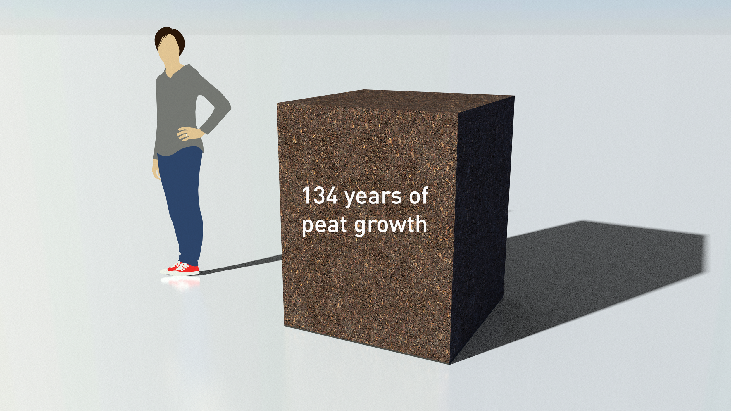
Figure 6. Peat developed over in 1 m2 over 134 years, total accumulated peat depth equals 127cm

Figure 7. Total volume of pure CO2 gas captured and stored at Fox Tor Mire since 1876, representing 88,000 tonnes over 134 years.
Fox Tor Mire has just 1% of the 8,000-10,000 hectares of deep peat (more than 40cm) in Dartmoor National Park. If peat growth continues to occur under future climates, then globally peatlands are the most significant and cost effective long-term and large scale option for CO2 capture and storage.
Thank you to the research students from MSC Environmental Consultancy who helped with the collection of the data.
Thank you to the Sustainable Earth Institute for their support.
Useful Links:
Plymouth School of Geography Earth and Environmental Science

A look at life: Biomass-how much?
How much living stuff is the Earth supporting? In this article we investigate Biomass and some recent data visualisations.
Living Planet. Blue Planet. Blue Planet 2: Deservedly popular, beautiful to watch, natural history series these days promise a view of the big picture. But planetary thinking is harder to do than the film-makers suggest - and that’s true, too, when it comes to considering life as a whole.
Take the basic question: can we quantify life? That could be taken as an invitation to probe biodiversity, an urgent task when we know we are ensuring there will soon be less of it. But there’s a still more basic question. How much living stuff is the Earth supporting? In a word: biomass. How much?
Not easy to say. We can count some big creatures, survey greenery from satellites, sample insects. But piecing together a global view is a complex, painstaking job, full of assumptions and guesstimates. And then there is the other world of the oceans, which is harder to get at, and the many types of microbial life, both on the surface and buried deep.
A new go at all this delivered results the other week that have got a lot of attention. An Israeli-US team published estimates of the biomass on Earth in all the main categories of life. Well, not biomass precisely, but a proxy - carbon content. A defensible choice, but not the only possible one. Most life is mainly water. So we’re not talking about actual tonnage of, say, cows, here.
But their numbers do allow some eye-opening comparisons (take a look at the open access paper) and the findings have got a lot of attention. Expressed as gigatons of carbon, the mass of plants dominates everything else. Then bacteria. Other creatures, especially humans are much less important in these crude terms. True, much of plant matter (stems, tree trunks) is barely alive, but even correcting for that, plants are still the most important form of life.
This is an essential contribution to understanding the planet. But how to represent it? Assessing all life involves an unusual combination of trying to get to grips with things that are not readily visualisable because they are too large - life as a whole on the planetary scale - as well as too small - bacteria, viruses. Viruses, incidentally, aren’t included in the sums, although their total mass is presumably pretty small.
The key summary diagram from the paper looks like this:

Reference: Bar-ON, Y. Milo, R. Phillips, R. (2018)
This is what’s known as a Voroni diagram, where the area of each section is proportional to the biomass of the category labelled. As the lines indicate, the right-hand square is an expansion of the small corner of the left hand diagram. This both emphasises how relatively unimportant (on this measure) animals are, and draws attention to the relations between humans, wild mammals and livestock.
Much media comment has focussed on the last point. Folk who didn’t have time to get a graphic together mainly used pics of cows, or chickens (farmed fowls account for most bird biomass just as livestock are dominant for mammals.) The Guardian went one better with a diagram of a giant cow (standing for the 60% of mammals that are livestock), towering over a man (36 % of mammalian biomass is human) and a teen-tiny rhino, for the remaining 4%.

Guardian (2018)
Quite effective, that. But how can we relate better to the big picture? Vox went to town on the numbers, with an elaborate but clear diagram using cubes of carbon stacked up - a “tower of life”. Each of their cubes represents a gigaton of carbon, and the plants do indeed tower impressively over everything else - including humans. Take a look here:

Vox (2018)

Vox (2018)
To our way of thinking, though, that visual - it’s an elaboration of a bar chart really - lacks something. As we often point out, there are many important quantities that people can’t be expected to have a intuitive feel for. A gigaton of carbon is almost certainly one of them. So while the relative proportions come across clearly in Vox’s diagram, you don’t get any real sense of how much living stuff we are actually talking about.
That’s a comment, not a criticism. Visuals that do one thing well often achieve it at the expense of some other plus point. And we’re not sure how one would depict biomass in more intelligible terms. Our past work gives us lots of ways of indicating what a gigaton of carbon might look like. Below we have visualised a cube of CO2 over New York, with another ten alongside rendered as a heap of coal.


These images show one gigatonne of carbon (one billion tonnes) in the form of carbon dioxide gas (3.6642 GtCO2) and alongside in the form of coal. Real World Visuals (2018)
Not much help? Maybe not. Still it at least gives a start in imagining what 450 gigatons might look like if you smooshed all life together. And we could bring in other, larger contexts for scaling if it turned out Manhattan is too small to be helpful - as it probably would - though they in turn would quickly become less intuitive because unfamiliar.
Then we need to ask: how one could combine this approach with a depiction of the various different kinds of life, and their relative abundance? We’re not sure. Perhaps a single human could contemplate their personal share of the planetary biomass of plants, animals or insects. We’ve done this for trees and grassland in one country, so it seems a logical extension of that approach. But the actual graphic might fall down on the bacteria. A few tons of bacteria is not something one ever sees, but if you did it would just look like a vat of sludge to the unaided eye. Hmm, work still to do here!
References
Bar-On, Y. Philips, R and Milo, R. (2018) The biomass distribution on Earth. Proceedings of the National Academy of Science [online] 21st May Available from: www.pnas.org/cgi/doi/10.1073/pnas.1711842115
NB; the paper is open access and creative commons licensed, so we may use the diagram. This open access article is distributed under Creative Commons Attribution-NonCommercial- NoDerivatives License 4.0 CC BY Bar-On, Y. Philips, R and Milo, R. (2018) YNC-ND.
Guardian (2018) Humans just 0.01% of all life but have destroyed 83% of wild mammals – study [online] 21st May. Available from: https://www.theguardian.com/environment/2018/may/21/human-race-just-001-of-all-life-but-has-destroyed-over-80-of-wild-mammals-study
Resnick, B & Zarracina, J (2018) All life on Earth, in one staggering chart. Vox [online] 29th May. Available from: https://www.vox.com/science-and-health/2018/5/29/17386112/all-life-on-earth-chart-weight-plants-animals-pnas
Could rocks falling into the oceans cause sea levels to rise?
Republican Congressman Mo Brooks earlier this month states that sea-level rise is caused by masses of rocks falling into the sea, not thermal expansion. How can a quick calculation and a sketch help to visualise this?

According to Republican Congressman Mo Brooks earlier this month, sea-level rise is caused by rocks falling into the sea, not thermal expansion. He's a member of the House of Representatives Science, Space and Technology Committee, and he told them that the California coastline and the White Cliffs of Dover tumble into the sea every year, and that contributes to sea-level rise:
"Every time you have that soil or rock or whatever it is that is deposited into the seas, that forces the sea levels to rise, because now you have less space in those oceans, because the bottom is moving up," (Reference: Science Magazine)*
At Real World Visuals we think the World itself has a role to play in its own explanation. If Congressman Brooks is correct, what would that mean in terms of erosion? A quick calculation and visualisation can help.
Between 1880 and 2009, sea levels rose by 210 mm (Church, J.A. & White, N.J. 2011)*.
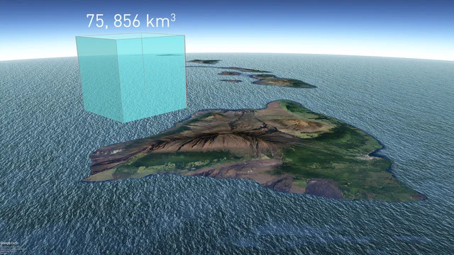
The total area of ocean is 361,219,073 km2 , so a simple calculation tells us that each millimetre of sea-level rise corresponds to a volume of 361 km3. Multiply that number by 210mm and we get a volume of 75,856 km3.
So far so good, but how big is that, actually? How does it compare, for instance, to the volume of Hawaii?

The total area of the Hawaii Archipelago is 28,310 km2 and its mean elevation is 920 metres. That means that the total volume of Hawaii (above sea-level) is 26,045 km3. This means that sea level rise so far, is equivalent to the entire Hawaii Archipelago falling into the sea not just once, but three times.
That's a lot of "soil or rock or whatever" and a lot more than the White Cliffs of Dover. We knocked up a very quick sketch with Google Earth to get a sense of scale.

Sea-level rise since 1880 is about 210 mm. This corresponds to a volume of about 76 thousand km3 almost 3 times greater than the total volume of the Hawaii Archipelago (above sea-level).
References:
Church, J.A. & White, N.J. 'Sea-Level Rise from the Late 19th to the Early 21st Century', Surveys in Geophysics (2011) 32: 585-602. Available online: https://link.springer.com/article/10.1007%2Fs10712-011-9119-1
Waldman, S. (2018) 'Republican lawmaker: Rocks tumbling into ocean causing sea level rise'. Science Magazine. 17th May. Available online: http://www.sciencemag.org/news/2018/05/republican-lawmaker-rocks-tumbling-ocean-causing-sea-level-rise