
Trusting our senses
Our senses, yours and mine, are well-tuned to the things that matter to us. Well, some of them at least. That rustle that suddenly startles in a nearby bush could be a sabre-toothed tiger hunting for supper. The minute departure from a natural smile betrayed in the fine musculature of someone’s face may mean they are no longer telling the truth.
Our senses, yours and mine, are well-tuned to the things that matter to us. Well, some of them at least. That rustle that suddenly startles in a nearby bush could be a sabre-toothed tiger hunting for supper. The minute departure from a natural smile betrayed in the fine musculature of someone’s face may mean they are no longer telling the truth.
But our developed culture reveals other things that ought to matter that we may not notice. That’s partly because we’re swamped with messages about things that matter less. But separate signal from noise, and it’s still hard to pay the right kind of attention to things that are outside our normal perception.

In 2012 we added over 39 billion metric tons of carbon dioxide to the atmosphere. This pile of one metric ton spheres represents just one day’s emissions. It is 3.7 km high (2.3 miles) and 7.4 km across (4.6 miles).
That’s always been a problem with greenhouse gases, but it’s been bothering me more lately. Climate change has gripped me with new urgency – in a ways both good and bad. Bad because the news about global warming over the last year has been impressively bleak, with CO2 and temperature rises breaking records almost every week and the longer-term trend looking seriously worrying. Good because, as better-informed folks than me are arguing, we finally seem to have reached a point where the great 21st-century project of decarbonising energy production is feasible – technologically, financially, maybe even politically.
What bothers me is how I can contribute to moving that good possibility on faster, and helping reduce the chances of the really bad (we’re going to see some bad now whatever we do). I’ve been a science writer, among other things, for 35 years or so, and my first impulse is to write more things. And it’s true language is what we use to wrap our thoughts round things we can’t perceive directly.
But this issue has been around half my life. What am I actually going to do? I’m thinking anyone who is going to be prodded into action by words has probably already got the message. Writing more stuff speaks to my ingrained habits, but maybe not to the issue at hand.
Really, I need to set aside the fact that I love words, and that turning them into more or less coherent sentences is pretty much the only thing I know how to do well. I reckon what we need now to get people’s attention here are pictures. And that’s why I’ve backed the team from Carbon Visuals in their new company Real World Visuals.
And I believe not just any pictures will do. They need to be the right kind of images. I’m still a science writer, so for me that means images that convey data creatively, in ways that people engage with readily, and that are built with an effort at scientific rigour. Polar bears on ice floes, baked mud in drought-wracked reservoirs, and forest fires blazing all get my attention, too, for a bit. But they mobilise feeling without giving you a clue what to do next.
The images from Adam Nieman’s team aren’t about evoking protest, or even raising concern (though some of the work could lend itself to that…). It’s credo, as I understand, is to help people grasp what underlies the things they are concerned about. More, the company always works with the scales that our senses are tuned in to – with a world of things the size of our bodies, or a little larger or smaller, things that we can see with the unaided eye, relate to other everyday objects, maybe pick up and feel their heft. That helps us all get a real sense of how something abstract and global relates to things individual humans do.
Becoming collectively conscious of that in a way we can use means showing people, lots of people, how the facts of global change connect to billions of daily decisions. One way to do that, as Carbon Visuals demonstrated so well, is to show each of those decisions trailing its little string of bubbles of carbon dioxide. Yes, it is humanity in the mass, and our cars, cattle coal plants and cement works, that is changing the composition of the atmosphere. But the global effect is the sum of how each person deals with the world, and the choices they make.
It’s not always a comfortable thing to contemplate, but it is absolutely necessary. I think Carbon Visuals was all about creative, effective and well-grounded ways of getting people to realise this, and involve them in doing something about it. I can’t wait to see what the team do next
Jon Turney is a science writer based in Bristol. His Rough Guide to the Future was short-listed for the Royal Society Science Book Prize in 2011. www.jonturney.co.uk twitter @jonWturney
A breath of fresh air: visualising air pollution
At Carbon Visuals we have been thinking about air pollution: why it needs visualisation and how best to visualise it. The topic is finally getting the attention it deserves thanks in part to recent epidemiological studies that have revealed how deadly it is on a global scale. Air pollution is estimated to cause 7 million premature deaths per year; that’s about 20 thousand deaths a day.
Test-rig for experiments in particulate visualisation using real PM2.5 data from Marylebone Road, London in 2014. Each spot on the screen represents a million PM2.5 particles. The size of each spot on the screen corresponds to the size of the particles it represents, and so the distribution of sizes is apparent.
At Real World Visuals we have been thinking about air pollution: why it needs visualisation and how best to visualise it. The topic is finally getting the attention it deserves thanks in part to recent epidemiological studies that have revealed how deadly it is on a global scale. Air pollution is estimated to cause 7 million premature deaths per year; that’s about 20 thousand deaths a day.
We think we can help reduce the impact by making the invisible threat visible – giving vulnerable people a better chance to protect themselves and keeping it on the political agenda. At Carbon Visuals we tackled air pollution before as part of the Environmental Defense Fund's Clean Heat campaign in New York, but we are keen to explore other ways in which visualisation can help. As with much of our data visualisation work, our focus is on ‘non-engaged’ audiences – people who don’t yet know that they are interested in the topic and so don’t bring questions of their own to the data. How can we make air pollution real for such audiences?
London has had a reputation for air pollution since the thirteenth-century. During frequent ‘pea-soupers’ in the 1950s the smog would get so bad that it would stop traffic, but even though the pollution was visible, few people considered smog a serious risk to health. It was an unpleasant inconvenience yes, but it was not considered to be something either politicians or individuals had to worry about. Nobody had really noticed the sharp spike in deaths associated with air pollution events.

Nelson's column viewed through the Great Smog of 1952, By N T Stobbs (CC BY-SA 2.0)
That changed during the ‘Great Smog’ of 1952. The first hint that smog was dangerous after all was when undertakers ran out of coffins and florists ran out of flowers. It is estimated that 4,000 people died in the Great Smog, and a further 8,000 died in the following weeks and months. Despite resistance from the Conservative government of the time, the impact of the Great Smog eventually led to legislation in the form of the Clean Air Act, 1956.
The Clean Air Act did much to improve air quality, mainly by reducing the use of brown coal in cities, but there was an unfortunate side-effect: the remaining air pollution was invisible. Air pollution is still deadly. A report by Kings College London published in July 2015 estimated that 9,416 Londoners were killed by air pollution in 2010, which is 26 Londoners a day on average – and it is getting worse. This year (2016) London breached its cumulative annual pollution limits in the first week of January . (Under EU rules, sites are only allowed to breach hourly limits of 200 micrograms of NO 2 per cubic metre of air 18 times in a year, but Putney broke that limit for the 19 th time on 8 January 2016.)

Kings College London estimate that air pollution killed 9,416 Londoners in 2010. (Each spot represents an individual life lost.)
Road vehicles are a major source of air pollution. In many countries, emissions regulations have been getting steadily tougher. This should have led manufacturers to improve their engines but Volkswagen adopted a cheaper approach. In September 2015, the United States Environmental Protection Agency discovered that Volkswagen had programmed its engines to recognise when it was being tested and switch to a less polluting mode until the test was over. That is, Volkswagen cars only appeared to meet US standards. In real-world driving Volkswagen cars emit up to 40 times more NOx.
The problem with invisible pollution is that even when we know its real it doesn’t feel real. We know for instance that Volkswagen have been dishonest but few of us have a feel for how significant their deception was. Does it really affect us? How can we answer that question visually?
We have identified a number of motivations for visualising air pollution:
Visualising it to make it visible – it is easier to engage with visible threats
Visualising its overall impact to give a sense of how important it is as an issue
Visualising particular sources of air pollution both to make them real and to give them a sense of scale (both absolute and relative)
Visualising the immediate threat in a way that allows people to take action
Different motivations for visualising air quality will generally result in different visualisations. Telling a story like the Volkswagen emission scandal requires a combination of the above. The main visualisation would be one that shows the difference between the claims and the reality for VW cars, but this would need some context: What does a dangerous level of pollution look like? How much pollution do we actually breathe? How much pollution do cars emit?
We are still at the early stages of working out how best to communicate quantities and concentrations of air pollution, but we have some sketches of starting points:
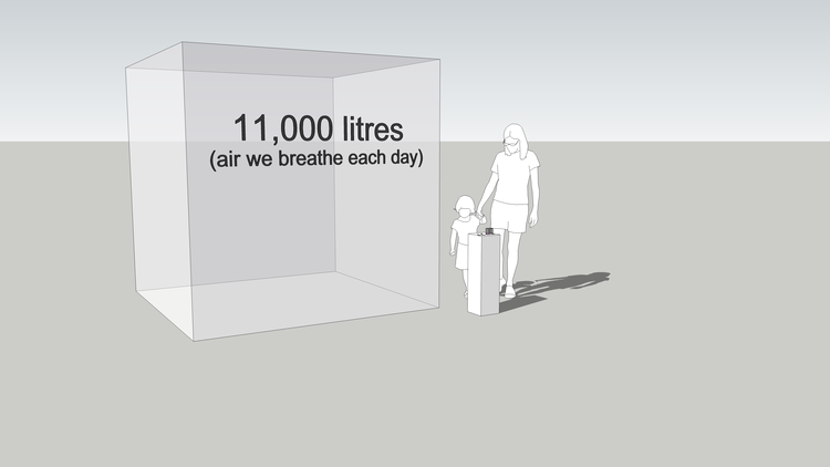
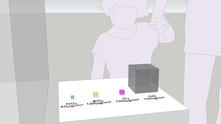
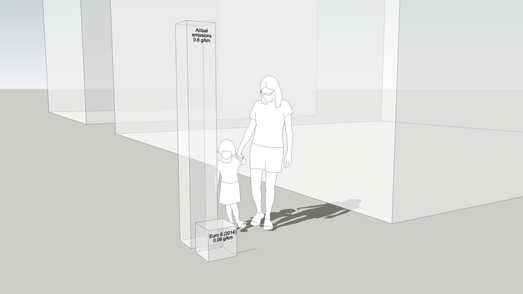
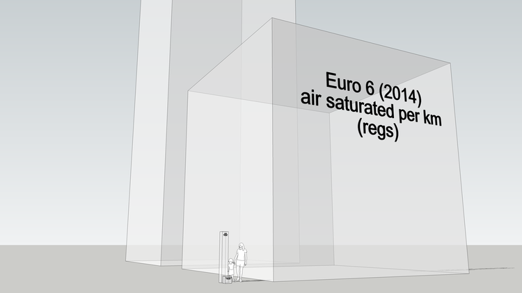
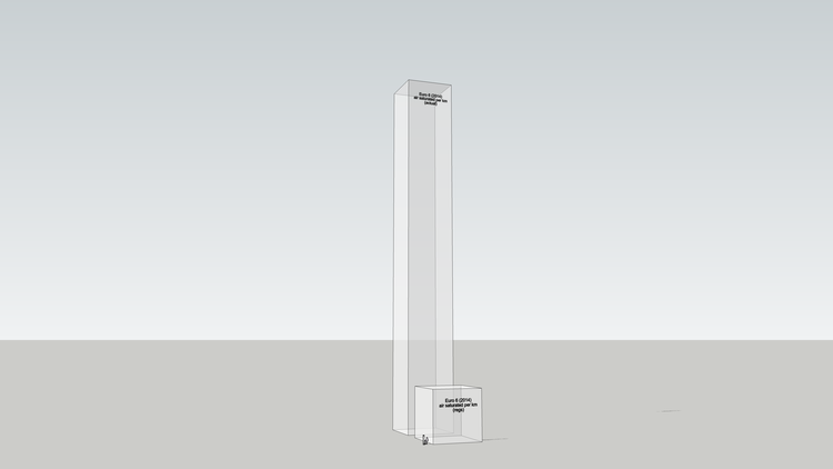
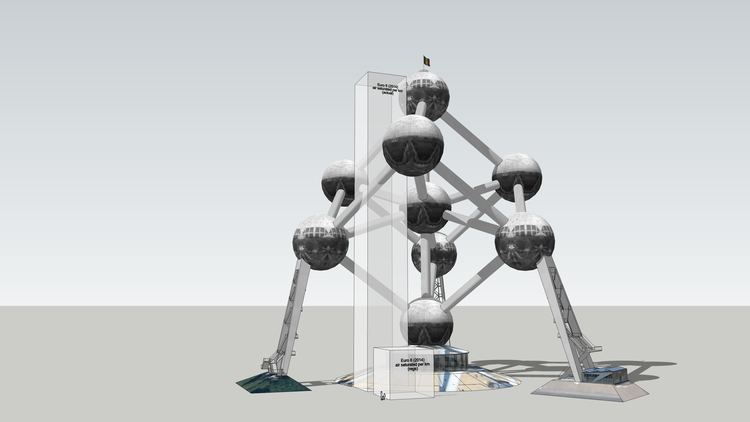
We are trying to make purely numerical emissions standards physically meaningful. We've tried a range of physical metrics including the volume of the pollutants themselves and the volume of air that they saturate to the legal limit (National Objective). So far I think it helps. It makes the invisible threat feel real, which in turn gives us agency: invisible air pollution is just scary, like cancer or something, but visible air pollution is fixable. We are trying to speed up the recognition of the problem so we don't have to wait until air pollution makes itself visible, like London in the 1950s or Beijing today, before something is done about it.
Refs:
COP21 - Seeing the Invisible
A selection of projects that we worked on for COP21, the Paris Climate Change meeting. We created short animations to show carbon reduction targets in a selection of global cities, and much more…
The outcome of COP21 extends well beyond national governments and those with a seat at the table at the events themselves. This is about people around the world ‘getting it’ including staff in companies, the data crunchers who analyse the impact of changing CO2 levels and the person on the street feeling informed enough to make the difference through their domestic choices.
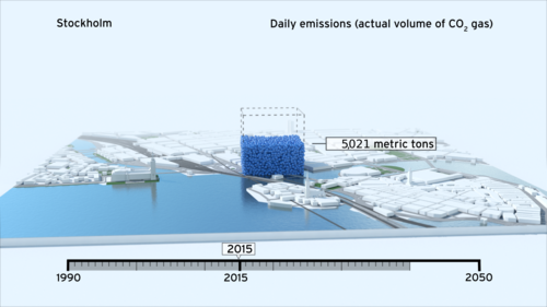
For six years, we have been working with organisations to show that if you can see carbon dioxide you do something about it. Recently we have been supporting several organisations in their preparation for COP21.
In our experience, the informed engagement of people everywhere supports the actions of our leaders and decision makers during and after these conferences. The impact of a team of people, a community, or a nation who ‘get it’ means that the agreements reached at COP21 actually become real.
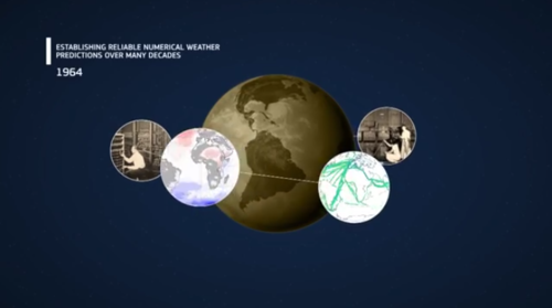
For a COP21 event we created short animations to show carbon reduction targets in a selection of global cities (see video here). We have helped with staff engagement at a number of companies including Kingfisher PLC. Our design team have produced films for ECMWF to show how the Copernicus climate data services also play a critical role in enabling change (read more here).
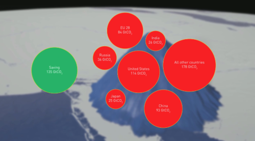
So whilst this is about showing the climate and carbon challenges it is also about visualising success and paths we can follow to meet them. We created visuals to celebrate the Montreal Protocol earlier this year. Ozone protection efforts stemming from the Montreal Protocol have significantly contributed to the mitigation of climate change by preventing more than 135 billion tonnes of carbon dioxide equivalent emissions going into the atmosphere (read more here).
There is a lot resting on COP21 but then the future starts. When you can see the difference working together makes, it can help you keep the faith in each other – the world over.
If you can see it, you can do it. Together.
A Carbon Visuals blog
A Real Bubble / Animation Combo
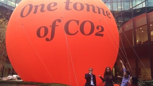
Staff at PwC UK have come in to work to see that a giant 10 metre diameter CO2 ‘bubble’ has appeared in the atrium of their London head office. In addition a complimentary 90 second film shows how the bubble arrived in this unusual setting.
If you want to get an issue noticed be bold! Staff at PwC UK have come in to work to see that a giant 10 metre diameter CO2 ‘bubble’ has appeared in the atrium of their London head office.
A well as a “mahoosive CO2 bubble” as one member of PwC staff put it on Twitter, a complimentary 90 second film shows how the bubble arrived in this unusual setting.

Timed, of course, to get attention before the COP21 climate talks get underway in Paris later this month, this combination of sculpture and film helps people see that CO2 is real and not just something abstract. It also gets across the message that PwC is serious about being part of the solution to the issue.

The animation shows the UK’s daily carbon footprint and the target reduction for 2030 and 2050.

See more Twitter images here
Timed, of course, to get attention before the COP21 climate talks get underway in Paris later this month, this combination of sculpture and film helps people see that CO2 is real and not just something abstract. It also gets across the message that PwC is serious about being part of the solution to the issue.
We love it. Wonder who made the video…
A Carbon Visuals blog